국보디자인 아이덴티티 리뉴얼KUKBO DESIGN Identity Renewal
오랜 실내건축 업력을 가진 국보디자인의 규모와 전문성을 ‘업계의 기준’이라는 태도로 재정리했습니다. KUKBO와 DESIGN을 두 줄로 쌓은 워드마크, 세리프 K 심볼, Black & White와 KUKBO Green, 그래픽 모티프와 그리드까지 하나의 시스템으로 구축했습니다.The scale and expertise of Kukbo Design, built over decades in interior architecture, were reorganised around the attitude of setting the standard for the industry. A wordmark stacking KUKBO and DESIGN on two lines, a serif K symbol, black and white with KUKBO Green, graphic motif and grid were built as one system.
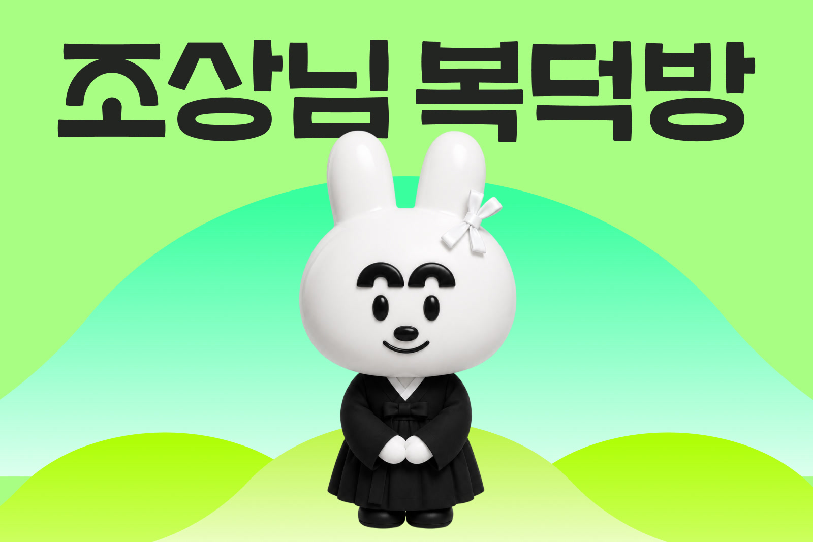
조상님복덕방(메모리올) 서비스 리뉴얼Memoriall / Josangnim Bokdeokbang Service Renewal
조상님복덕방을 운영하는 메모리올의 브랜드와 디지털 서비스 경험을 함께 재정비했습니다. 엔딩케어 서비스가 확장되는 과정에서 회사와 서비스의 관계, 메시지와 시각 기준을 정리하고, 고객이 서비스를 탐색하고 이용하는 UX/UI까지 같은 원칙으로 연결했습니다.The brand and the digital service experience of Memoriall, which operates Josangnim Bokdeokbang, were rebuilt together. As the ending care service expanded, the relationship between company and service, the messaging and the visual standard were settled, then carried into the UX and UI where customers search for and use the service.
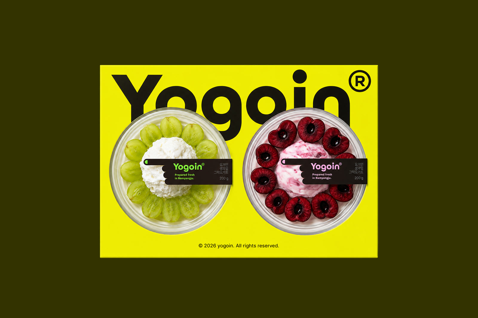
요거인 브랜드 디자인Yogoin Brand Design
생과일과 수제 그릭요거트의 신선한 제품 인상이 이름을 보는 순간부터 이어지도록, 네이밍에서 시각화까지 하나의 흐름으로 설계했습니다. 제품의 맛과 재료가 중심에 남으면서도 ‘요거인’이라는 이름 자체가 브랜드의 기억점이 되도록 기본 아이덴티티를 정리했습니다.The fresh impression of real fruit and handmade Greek yoghurt was designed to carry from the moment you read the name, in one flow from naming to visualisation. The base identity keeps the taste and the ingredients at the centre while making the name Yogoin itself the memory point of the brand.

비쥬웍스 아이덴티티 리뉴얼VISUWORKS Identity Renewal
안과 AI·빅데이터 기업 VISUWORKS가 가진 기술적 신뢰를 유지하면서, 더 유연하고 확장 가능한 기업 브랜드로 아이덴티티를 리뉴얼했습니다. 기존 이름은 유지하고 심볼과 워드마크, 컬러·타이포그래피, 그래픽 시스템을 재정비해 기술·조직·콘텐츠 커뮤니케이션을 하나의 시각 언어로 연결했습니다.VISUWORKS, an ophthalmic AI and big data company, renewed its identity into a more flexible and extensible corporate brand while keeping its technical credibility. The name stayed and the symbol, wordmark, colour, typography and graphic system were rebuilt to connect technology, organisation and content communication in one visual language.
웰믹스 리브랜딩wellmixx Rebranding
샐러드 매장을 건강식 카테고리에 머무르게 하지 않고, 앱에서 재료를 고르고 내 방식대로 조합하는 ‘프로덕트형 패스트푸드 브랜드’로 재정의했습니다. W와 X를 결합한 심볼을 서비스 아이콘처럼 작동시키고, 그 언어를 앱과 매장, 지점별 그래픽 경험까지 확장했습니다.A salad shop was redefined as a product style fast food brand where you pick ingredients in the app and combine them your own way, rather than being left in the health food category. A symbol combining W and X works like a service icon, and that language extends across the app, the stores and the graphics of each location.
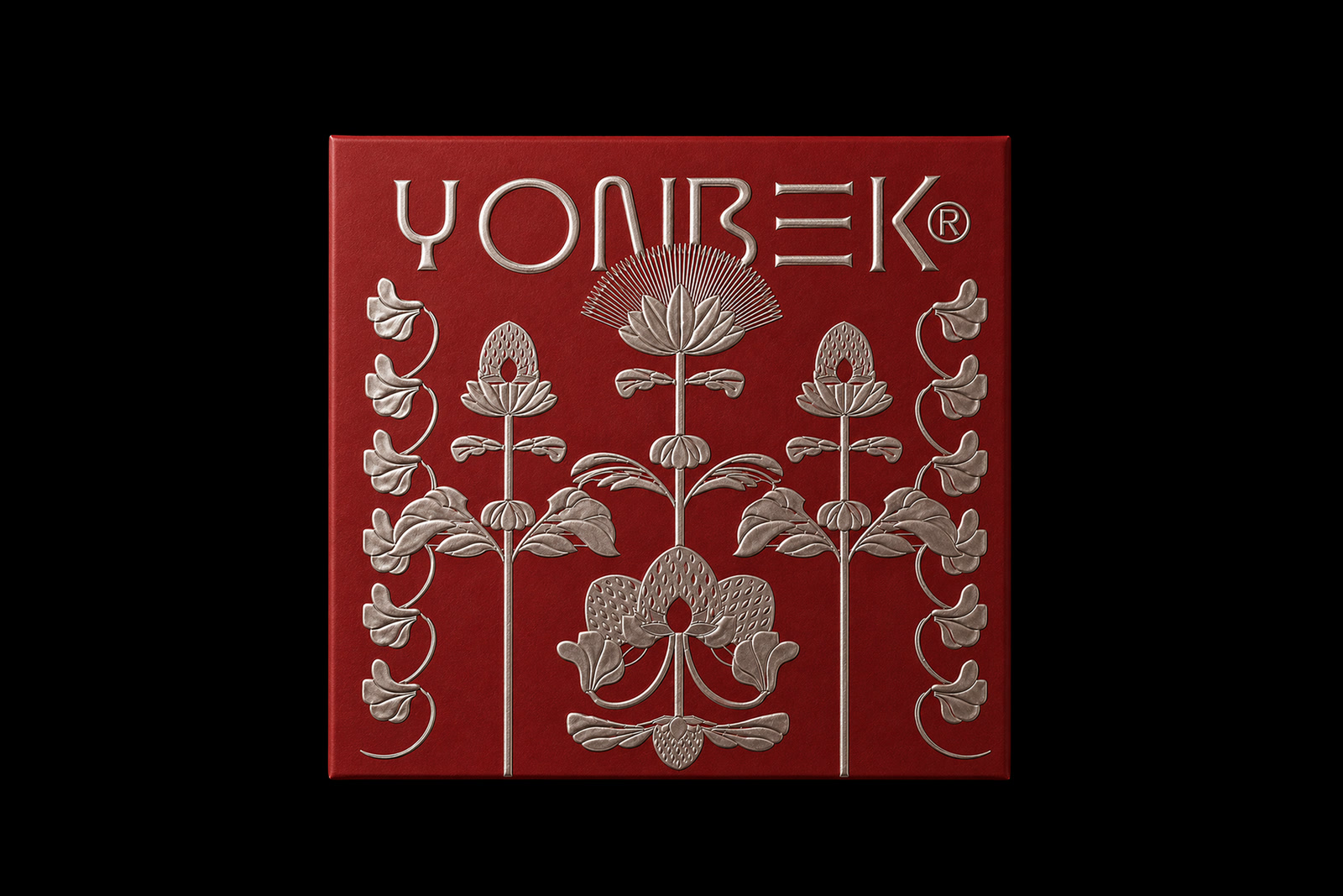
연백딸기모찌 리브랜딩Yonbaek Strawberry Mochi Rebranding
연백딸기모찌가 가진 수작업의 가치와 제품 기준을 더 넓은 브랜드 자산으로 전환했습니다. ‘연백1227’이라는 이름과 딸기꽃을 중심으로 아이덴티티를 재구성하고, 패키지와 팝업·리테일 환경까지 하나의 경험으로 확장했습니다.Yonbaek turned the craft behind its strawberry mochi into a brand asset that reaches far past one menu item. The name Yonbaek 1227 and a strawberry blossom now carry the identity across packaging, popups and retail as a single experience.
큐플레이스 리브랜딩Qplace Rebranding
상업공간 인테리어를 비교하고 선택하는 Qplace의 서비스 경험을 ‘열린 문’이라는 직관적인 상징으로 재구성했습니다. 평면도에서 볼 수 있는 문이 열리는 궤적을 말풍선의 꼬리와 연결해, 공간을 여는 서비스와 자영업자 커뮤니티의 대화를 하나의 심볼에 담았습니다.Qplace helps people compare and choose commercial interior partners, and that experience was rebuilt around one intuitive symbol, an open door. The arc a door traces on a floor plan doubles as the tail of a speech bubble, holding both the opening of a space and the conversation between owners in a single mark.
플렉스매치 리브랜딩Flexmatch Rebranding
크리에이터 탐색과 매칭을 ‘어디를 봐야 할지 모르는 상태에서 방향을 발견하는 경험’으로 해석했습니다. 방향을 찾는 컴퍼스와 가능성의 발견을 상징하는 스파클을 중심으로, Flexmatch의 아이덴티티를 랜딩페이지와 크리에이터 커뮤니케이션까지 연결했습니다.Creator discovery and matching was read as the experience of finding a direction when you do not know where to look. A compass for orientation and a sparkle for the moment of discovery carry the Flexmatch identity through the landing pages and creator communications.
탈잉 리브랜딩Taling Rebranding
배우고 싶지만 쉽게 움직이지 못하는 사람을 실제 행동으로 끌어내는 브랜드로 탈잉을 다시 정의했습니다. ‘카우치 포테이토에서 벗어나는 서비스’라는 문제의식에서 출발해, 정적인 학습 이미지보다 움직임과 에너지, 경계를 넘어서는 태도를 브랜드 경험의 중심에 두었습니다.Taling was redefined as a brand that moves people who want to learn but never quite start. Beginning from the idea of a service that gets you off the couch, movement, energy and the attitude of crossing a line sit at the centre of the brand experience rather than static images of study.
크몽 리브랜딩Kmong Rebranding
크몽을 단순한 프리랜서 거래 플랫폼이 아니라 새로운 방식으로 일하는 사람들을 대표하는 ‘일의 플랫폼’으로 확장했습니다. 캐릭터 중심의 인상에서 워드마크 중심의 성숙한 브랜드로 전환하고, 기존 옐로 자산을 Kmong Green으로 재정비했습니다.Kmong was expanded from a freelance marketplace into a platform that represents people working in new ways. The brand shifted from a character led impression to a mature wordmark, and the existing yellow equity was rebuilt as Kmong Green.
소크라 AI 브랜딩SOCRA AI Branding
Riiid에서 SOCRA AI로 이어지는 사명 변경을 하나의 로고 교체가 아니라 브랜드 운영 체계의 전환으로 설계했습니다. 기업명과 제품·서비스명의 표기 규칙을 정리하고, 구성원이 매일 사용하는 포스터·사원증·스티커·PPT까지 같은 언어로 연결했습니다.The change of company name from Riiid to SOCRA AI was designed as a shift in brand operations rather than a logo swap. Notation rules for the corporate name and the product and service names were settled, then carried through the posters, ID cards, stickers and decks employees use every day.
트릴리온랩스 브랜딩Trillion Labs Branding
AI·LLM 연구 기업 Trillion Labs의 이름이 가진 거대한 수의 스케일을 사자와 수학적 구조로 압축했습니다. 삼각형으로 구성된 사자 얼굴과 12개의 점으로 이루어진 갈기를 통해 기술적 정밀함과 원초적인 힘이 공존하는 아이덴티티를 만들었습니다.The scale held inside the name of AI and LLM research company Trillion Labs was compressed into a lion and a mathematical structure. A lion face built from triangles and a mane of twelve dots create an identity where technical precision and raw force sit together.
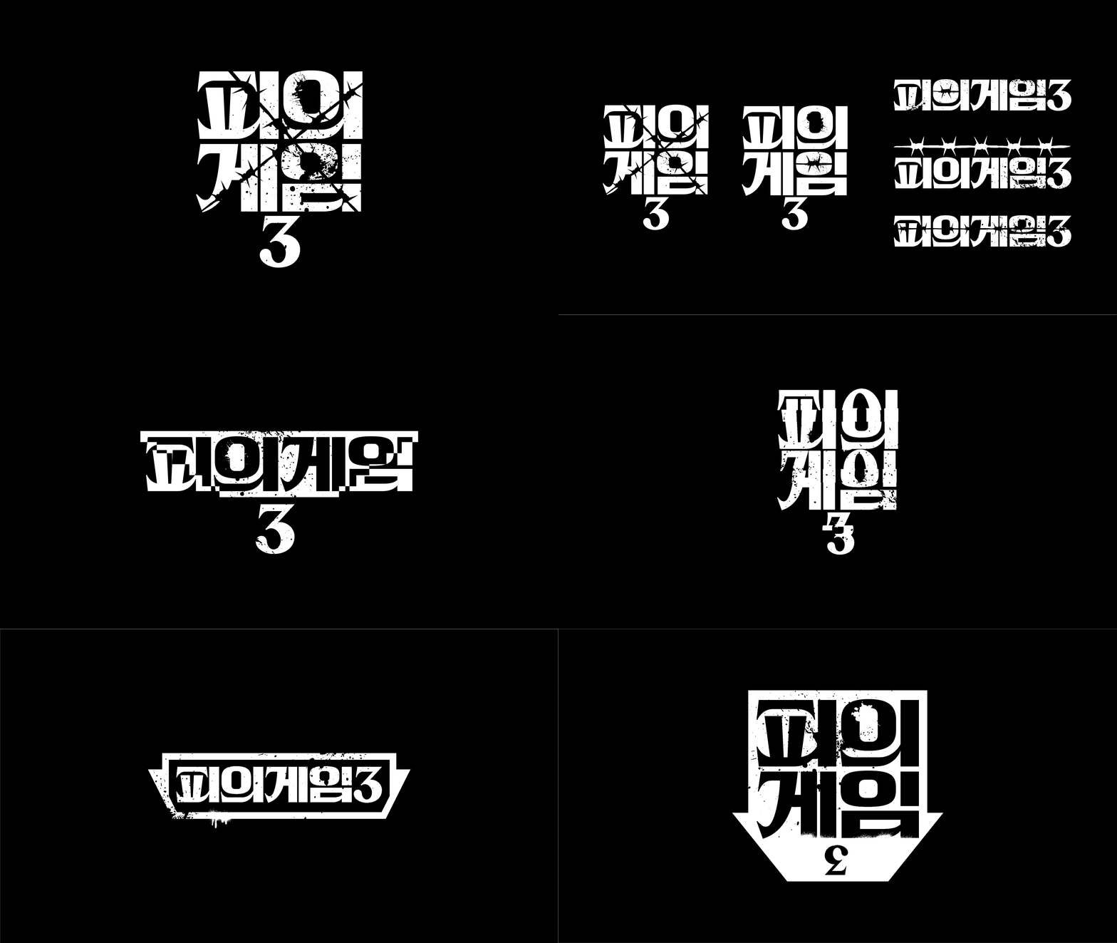
피의게임3 프로그램 아이덴티티 디자인Bloody Game 3 Program Identity
<피의게임3>의 프로그램 아이덴티티는 이전 시즌의 삼각형 상징을 뒤집고, 시즌을 관통하는 3단계 계급 구조로 확장했습니다. 하나의 심볼이 세 개의 상태로 변형되는 구조를 통해 경쟁과 위계가 끊임없이 뒤집히는 서바이벌의 긴장을 시각화했습니다.The program identity for Bloody Game 3 inverts the triangle of the previous season and extends it into a three tier hierarchy that runs through the whole season. One symbol shifts between three states, visualising the tension of a survival format where competition and rank keep flipping.
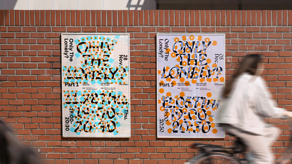
외로움에 대한 대화: ONLY THE LONELY?Goethe-Institut: Only the Lonely?, Graphic Design
괴테-인스티투트의 ‘Only the Lonely?’는 외로움을 단순한 결핍이 아니라, 사회적 규범 밖에서 스스로 선택하고 존재하는 방식까지 포함해 바라보는 두 차례의 대화 프로그램입니다. 정해진 틀을 벗어나는 사각형과 원, 강한 색과 큰 타이포그래피로 서로 다른 삶의 위치와 소통을 시각화했습니다.Only the Lonely? at the Goethe Institut is a two part conversation program that treats loneliness not only as a lack but as a way of choosing and existing outside social norms. Squares and circles that break out of a fixed frame, strong colour and large typography visualise different positions in life and the exchange between them.

스매치 코퍼레이션 리브랜딩Smatch Corporation Rebranding
오피스 중개, 인테리어, 공간 경험으로 확장된 스매치코퍼레이션의 사업을 하나의 기업 브랜드와 운영 기준으로 재구조화했습니다. 브랜드 코어와 디자인 원칙부터 웹사이트, PR, 포트폴리오 운영 방식, 디자인 조직까지 연결해 브랜드가 실제 업무에서 반복적으로 작동하도록 했습니다.Smatch Corporation had grown from office brokerage into interior work and spatial experience, and the business was restructured under one corporate brand and one operating standard. Brand core and design principles connect through to the website, PR, portfolio operations and the design organisation so the brand keeps working in daily practice.
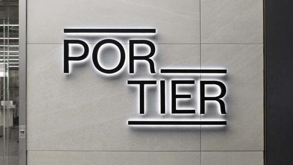
포티에 브랜드 경험 디자인Portier Brand Experience Design
완성형 오피스 ‘Portier’를 단순한 공간 상품의 이름이 아니라 입주자가 접하는 전체 경험을 설명하는 브랜드로 설계했습니다. 오피스 브랜드 아이덴티티와 주요 적용물을 디렉팅하고, 공간 안의 카페 브랜드까지 네이밍·아이덴티티·BX 관점에서 연결했습니다.Portier, a fully serviced office, was designed as a brand that describes the whole experience a tenant meets rather than the name of a space product. The office brand identity and its main applications were directed, and the cafe inside the space was connected through naming, identity and BX.

플리즈 체크인 브랜드 디자인Please Check In Brand Design
호텔식 '체크인' 감도를 담은 오피스 스페셜티 커피 카페. 포티에(Portier) 오피스 브랜드와 나란히 소개된다.An office specialty-coffee café with a hotel check-in sensibility, presented alongside the Portier office brand.
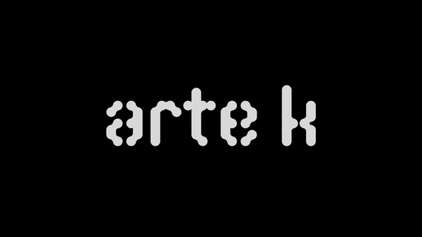
아르떼케이 브랜드 디자인Arte K Rebranding
대출 중심의 기존 사업에서 미술품 판매와 작가 매니지먼트로 전환한 Arte K의 새로운 사업 방향을 브랜드 언어로 재정비했습니다. 금융 서비스에서 축적된 신뢰의 인상을 유지하면서도, 동시대 미술을 다루는 브랜드로 자연스럽게 전환되는 것이 핵심이었습니다.Arte K had moved from a lending focused business into art sales and artist management, and its new direction was reorganised as brand language. The core was carrying over the trust built in financial services while shifting naturally into a brand that handles contemporary art.
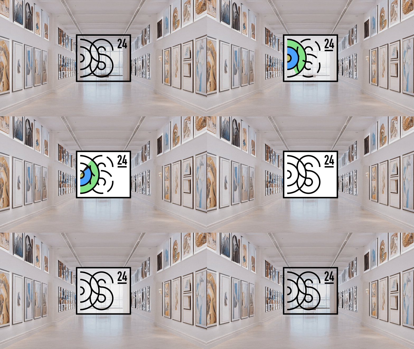
도슨트 학교 브랜드 디자인Docent School Brand Design
도슨트 교육·인증 프로그램의 전문성을 유지하면서도 다양한 배경의 참여자가 들어올 수 있는 ‘열린 아이덴티티’를 설계했습니다. Docent School의 D와 S를 출발점으로 형태가 매년 변화할 수 있는 구조를 만들고, 연도 표기를 통해 프로그램의 축적과 갱신을 동시에 보여줬습니다.The docent training and certification program needed an open identity that keeps its expertise while letting people from many backgrounds in. Starting from the D and S of Docent School, the form can change every year, and the year mark shows both accumulation and renewal.
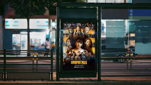
여왕벌게임 그래픽 디자인The Game of Queen Bee Graphic Design
Wavve <여왕벌게임>의 홍보 그래픽은 여왕벌과 수벌의 위계·경쟁 관계를 인물의 크기와 배치만으로 즉각 이해할 수 있도록 설계했습니다. 강한 사진 보정과 질감, 벌의 이미지를 사용해 프로그램의 공격적인 생존 경쟁과 관계 구조를 포스터에 압축했습니다.The promotional graphics for Wavve's The Game of Queen Bee let you read the hierarchy and rivalry between queen and drones from scale and placement alone. Heavy retouching, texture and the image of the bee compress the aggressive competition and the relationships of the show into a poster.
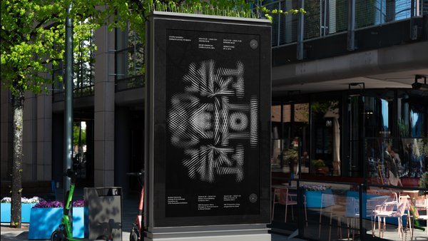
형태의 궤적 전시 아이덴티티 디자인Trajectory of Shape Exhibition Identity
건국대학교 GLOCAL캠퍼스 금속공예전공 졸업전시 ‘형태의 궤적’의 아이덴티티를 디자인했습니다. 서로 다른 재료와 조형을 탐구한 작업들이 한 학년의 시간 안에서 이어지고 흔적을 남긴다는 전시 제목의 인상을 시각 구조로 연결했습니다.Trajectory of Shape is the graduation exhibition of the metal craft major at Konkuk University GLOCAL Campus, and its identity was designed around the title. Works exploring different materials and forms continue through one academic year and leave traces, and that impression was carried into the visual structure.
피의게임2 프로그램 아이덴티티 디자인Bloody Game 2 Program Identity
<피의게임2>의 프로그램 아이덴티티와 주요 소품 그래픽을 디자인했습니다. 음모와 감시, 계급 경쟁이 반복되는 프로그램의 긴장을 ‘시선’과 ‘눈’의 이미지로 구조화하고, 포스터와 게임 접점까지 일관된 분위기로 연결했습니다.The program identity and the main prop graphics for Bloody Game 2 were designed around the image of the gaze and the eye. Conspiracy, surveillance and class competition run through the show, and that tension carries consistently from the posters to the game touchpoints.
로톡 리브랜딩LawTalk Rebranding
법률 소비자 서비스 로톡의 브랜드 전략과 리브랜딩을 프로덕트 경험과 함께 재정비했습니다. 브랜드를 별도의 캠페인 이미지로 분리하지 않고, 서비스 우선순위와 디자인 시스템, 정보 콘텐츠까지 연결해 고신뢰 서비스에서 일관된 경험이 만들어지도록 했습니다.Brand strategy and rebranding for the legal consumer service LawTalk were rebuilt together with the product experience. Instead of separating the brand into campaign imagery, service priorities, the design system and information content were connected so a high trust service delivers a consistent experience.
땡스 벤처스 브랜드 디자인Thanks Ventures Brand Design
‘Thanks’를 THNX로 압축하고, 문서의 마지막에 찍히는 마침표처럼 브랜드를 설계했습니다. 투자 관계의 시작과 끝에 남는 ‘고마움’이라는 태도를 과장된 상징 대신 짧은 워드마크와 마침표의 위치로 표현했습니다.Thanks was compressed into THNX and the brand was designed like the full stop that ends a document. The attitude of gratitude that remains at the beginning and end of an investment relationship is expressed through a short wordmark and the position of a period rather than an inflated symbol.
건국대학교 예술디자인대학원 브랜드 아이덴티티Konkuk University Graduate School of Art & Design Identity
건국대학교 예술디자인대학원의 독립적인 정체성과 구성원의 자부심을 높이기 위한 브랜드 아이덴티티를 설계했습니다. 본교의 선명한 그린과 구분되는 차분한 색을 사용하고, 다양한 전공과 연구가 공존하는 대학원의 성격을 유연하게 변형되는 패턴으로 표현했습니다.A brand identity was designed to raise the independent standing of the Konkuk University Graduate School of Art and Design and the pride of its members. A calm palette distinct from the vivid green of the main university, and a pattern that flexes freely, express a school where many majors and lines of research coexist.
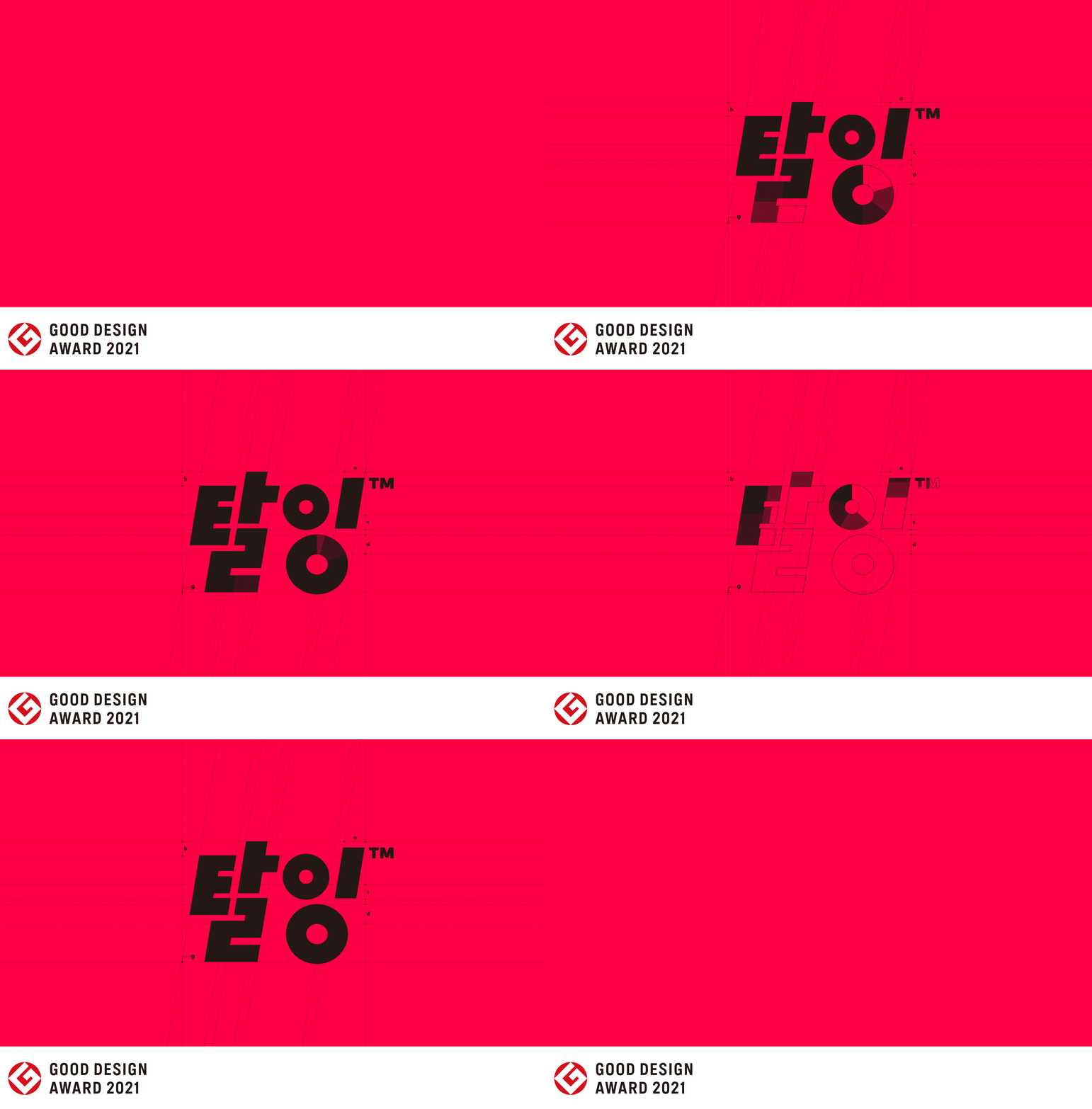
탈잉 브랜드 아이덴티티Taling Brand Identity
읽기 어려웠던 기존 서비스 이름을 명확한 한글 로고타입으로 재정비하고, 탈잉이 가진 자유로운 배움의 문화를 브랜드 아이덴티티로 정리했습니다. 전사 인터뷰를 통해 내부의 언어를 수집하고, 유기적인 형태와 선명한 핑크를 중심으로 디지털 환경에서 강하게 인식되는 브랜드를 만들었습니다.A service name that was hard to read was rebuilt as a clear Korean logotype, and the free culture of learning at Taling was organised into a brand identity. Company wide interviews gathered the internal language, and organic forms with a vivid pink created a brand that registers strongly in digital environments.
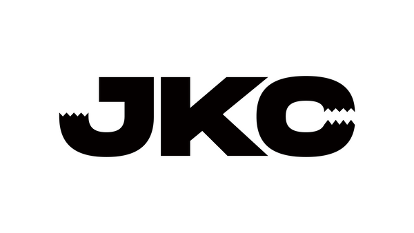
밴드 잭킹콩 아이덴티티 디자인Jackingcong Band Identity Design
밴드 Jackingcong의 이름이 가진 King Kong의 힘과 밴드의 유쾌한 리듬을 하나의 로고타입에 담았습니다. J와 C에 킹콩의 이빨을 연상시키는 형태를 적용해 강하고 거친 인상 안에 귀여운 표정을 만들고, 긴 이름은 JKC로 축약해 다양한 환경에서 사용할 수 있도록 했습니다.The force of King Kong inside the name Jackingcong and the band's cheerful rhythm were put into a single logotype. Forms recalling Kong's teeth in the J and the C create a playful expression inside a strong, rough impression, and the long name shortens to JKC for wider use.
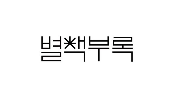
별책부록 브랜드 디자인Byeolcheck Brand Design
독립서점 ‘별책부록’의 이름을 한글 자소 안에 압축했습니다. ‘책’의 ㅊ을 열린 책의 형태로 바라보고 동시에 별을 연상시키는 구조를 결합해, 작은 문화 공간의 실험성과 친근함을 하나의 가변형 기호로 만들었습니다.The name of the independent bookstore Byeolcheck was compressed inside a Korean letterform. The consonant in the syllable for book was read as an open book and combined with a structure that also recalls a star, turning the experimental and friendly character of a small cultural space into one variable sign.
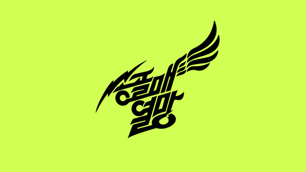
송골매 공연 아이덴티티 디자인Songgolmae Concert Identity Design
송골매 전국투어 콘서트 ‘열망’의 아이덴티티를 디자인했습니다. 밴드가 오랜 시간 축적해온 기존 아이덴티티를 적극적으로 활용하고, 공연 타이틀 ‘열망’의 레터링을 새롭게 결합해 익숙한 기억과 새로운 무대를 연결했습니다.The identity for Songgolmae's national tour concert Yeolmang was designed around what the band had already built. The existing identity accumulated over decades was used actively, and new lettering for the concert title joins familiar memory to a new stage.
사보텐 스토어 브랜드 디자인Saboten Store Brand Design
사보텐 한남동 플래그십 스토어를 위한 로고타입을 시작으로, 익숙한 돈카츠 브랜드의 아이덴티티를 새로운 리테일 환경에 맞게 재정비했습니다. 기존 인지 자산을 지우기보다 축적된 브랜드의 인상을 더 단정하고 현대적인 형태로 정리하는 데 집중했습니다.Starting from a logotype for the Saboten flagship store in Hannam dong, the identity of a familiar tonkatsu brand was rebuilt for a new retail setting. Rather than erasing existing recognition, the work concentrated on organising the accumulated impression into a cleaner and more contemporary form.
슬릿 브랜드 디자인SLIT Brand Design
‘SLIT’이라는 단어가 가진 좁고 날카로운 틈의 이미지를 로고와 그래픽 시스템의 원리로 사용했습니다. 글자를 부분적으로 절단하고 빛과 그림자의 대비를 강조해, 블랙&화이트 중심의 절제되고 시크한 카페 아이덴티티를 설계했습니다.The narrow, sharp opening held inside the word SLIT became the operating principle of the logo and the graphic system. Letters are partially cut and the contrast of light and shadow is pushed, giving a restrained black and white cafe identity.
프리베다 브랜드 디자인Priveda Brand Design
인도의 Ayurveda에서 출발한 자연 건강·뷰티 브랜드가 전통적 이미지를 그대로 복제하지 않고 현대적인 글로벌 시장에서도 자연스럽게 읽히도록 아이덴티티를 설계했습니다. 기하학적 패턴과 전통 모티프를 단순화하고, 어스 톤·허브 그린·골든 옐로우로 자연과 활력을 표현했습니다.A natural health and beauty brand rooted in Indian Ayurveda was given an identity that reads naturally in a contemporary global market without copying traditional imagery. Geometric patterns and traditional motifs were simplified, and earth tone, herb green and golden yellow express nature and vitality.
행즈 브랜드 디자인HaengZ Identity Design
제주도의 게스트하우스 ‘행원장’과 피자숍 ‘HaengZ(행즈)’를 함께 다룬 아이덴티티 디자인 프로젝트입니다. 서로 다른 성격의 두 브랜드가 각자의 이름과 역할을 명확하게 갖도록 기본 시각 체계를 정리했습니다.An identity project covering both the guest house HaengWon Jang and the pizza shop HaengZ on Jeju Island. The base visual system was organised so two brands of different character each hold a clear name and role.
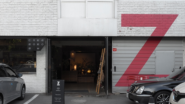
자그마치 카페 아이덴티티 디자인Zagmachi Identity Design
서울 성수동의 인쇄공장을 개조한 라이팅 갤러리 카페(현재 폐점)A lighting-gallery café in a converted Seongsu-dong print factory in Seoul (now closed).
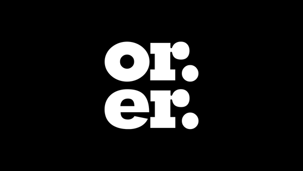
오르에르 카페 아이덴티티 디자인Orer Identity Design
서울 성수동의 카페 겸 디저트 공간(수제 케이크·정원형 테라스, 지하 갤러리)A café and dessert space in Seongsu-dong, Seoul, with handmade cakes, a garden terrace and a basement gallery.
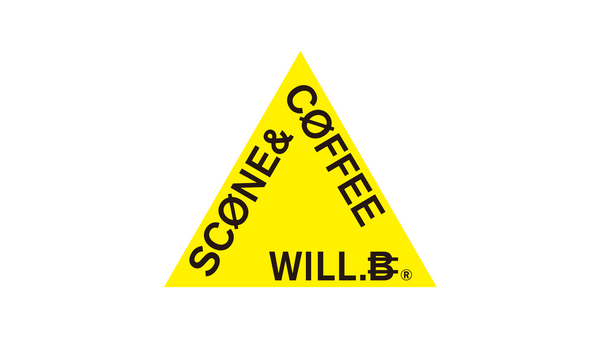
윌비 아이덴티티 디자인Will.B Café Identity Design
카페 Will.B의 브랜드 이름이 매장과 커뮤니케이션에서 일관되게 작동하도록 아이덴티티를 설계했습니다. 브랜드명을 중심으로 기본 시각 체계와 적용 방향을 정리한 카페 아이덴티티 프로젝트입니다.An identity was designed so the brand name of the cafe Will.B works consistently in the store and in communication. It is a cafe identity project organising the base visual system and the direction of application around the name.
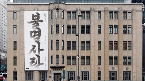
불멸사랑 전시 그래픽 디자인Immortality in the Cloud, Exhibition Graphic Design
2019년 일민미술관 ‘불멸사랑: Immortality in the Cloud’의 그래픽 디자인을 진행했습니다. 디지털 정보의 최소 단위인 0과 1을 수없이 모아 한글 ‘불멸사랑’ 타이포그래피를 구성하고, ‘클라우드 시대의 불멸’이라는 전시의 질문을 제목 자체의 구조로 시각화했습니다.Graphic design for Immortality in the Cloud at Ilmin Museum of Art in 2019. Countless zeros and ones, the smallest unit of digital information, were gathered to build the Korean title typography, making the exhibition's question about immortality in the cloud visible in the structure of the title itself.