탈잉 리브랜딩Taling Rebranding
배우고 싶지만 쉽게 움직이지 못하는 사람을 실제 행동으로 끌어내는 브랜드로 탈잉을 다시 정의했습니다.Taling was redefined as a brand that moves people who want to learn but never quite start.
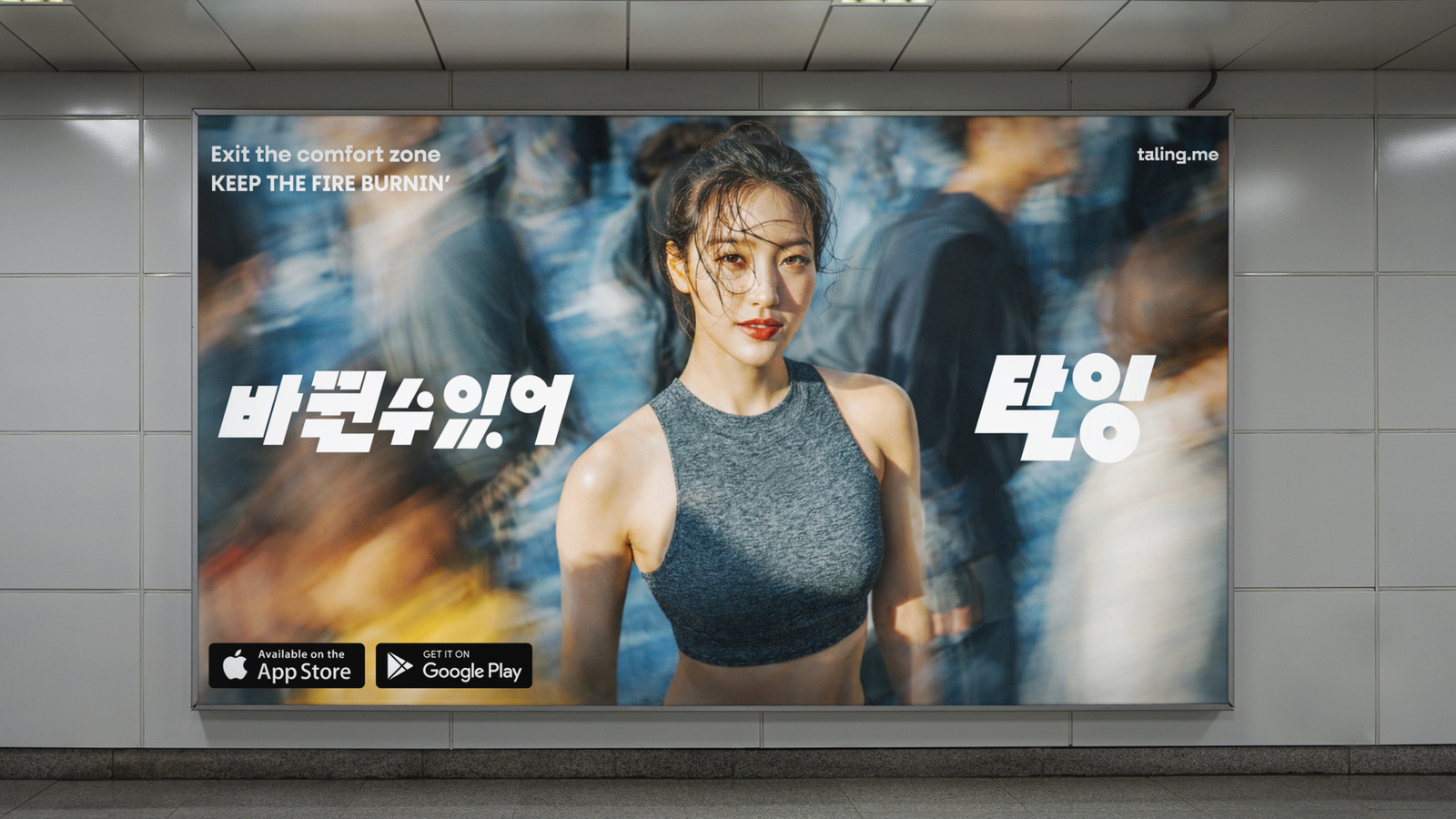
‘카우치 포테이토에서 벗어나는 서비스’라는 문제의식에서 출발해, 정적인 학습 이미지보다 움직임과 에너지, 경계를 넘어서는 태도를 브랜드 경험의 중심에 두었습니다.Beginning from the idea of a service that gets you off the couch, movement, energy and the attitude of crossing a line sit at the centre of the brand experience rather than static images of study.
배경Background
탈잉은 취미와 자기계발을 넘어 다양한 배움의 경험을 제공해왔습니다. 리브랜딩에서는 ‘무엇을 배울 수 있는가’만 보여주는 대신, 배우기 전의 망설임에서 실제 행동으로 전환되는 순간을 브랜드가 어떻게 만들 수 있는지에 집중했습니다.Taling has offered learning experiences well beyond hobbies and self improvement. The rebrand focused less on showing what you can learn and more on how a brand can create the moment where hesitation turns into actually doing something.
과제The Challenge
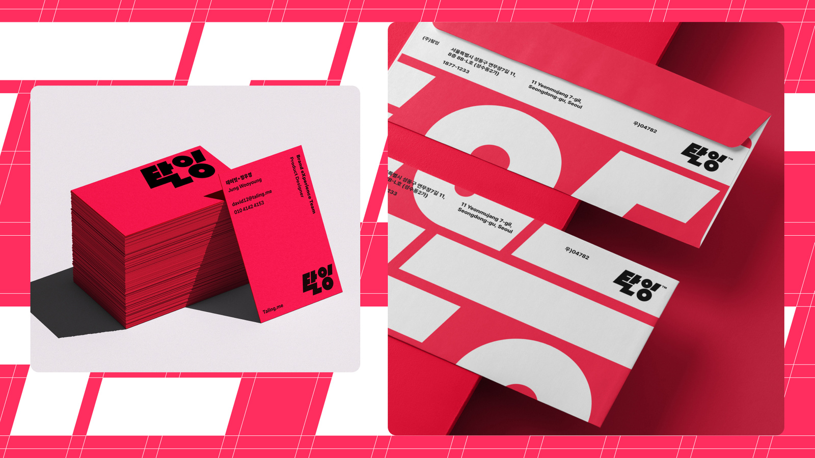
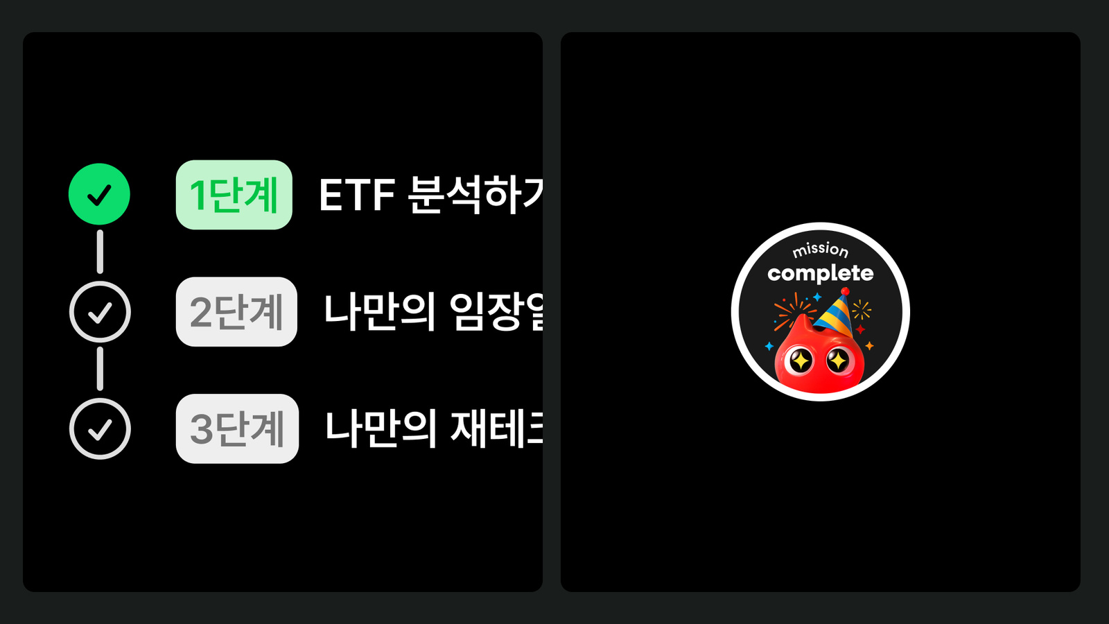
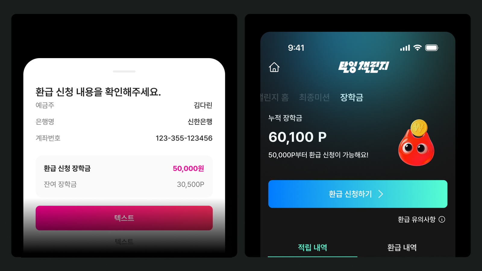
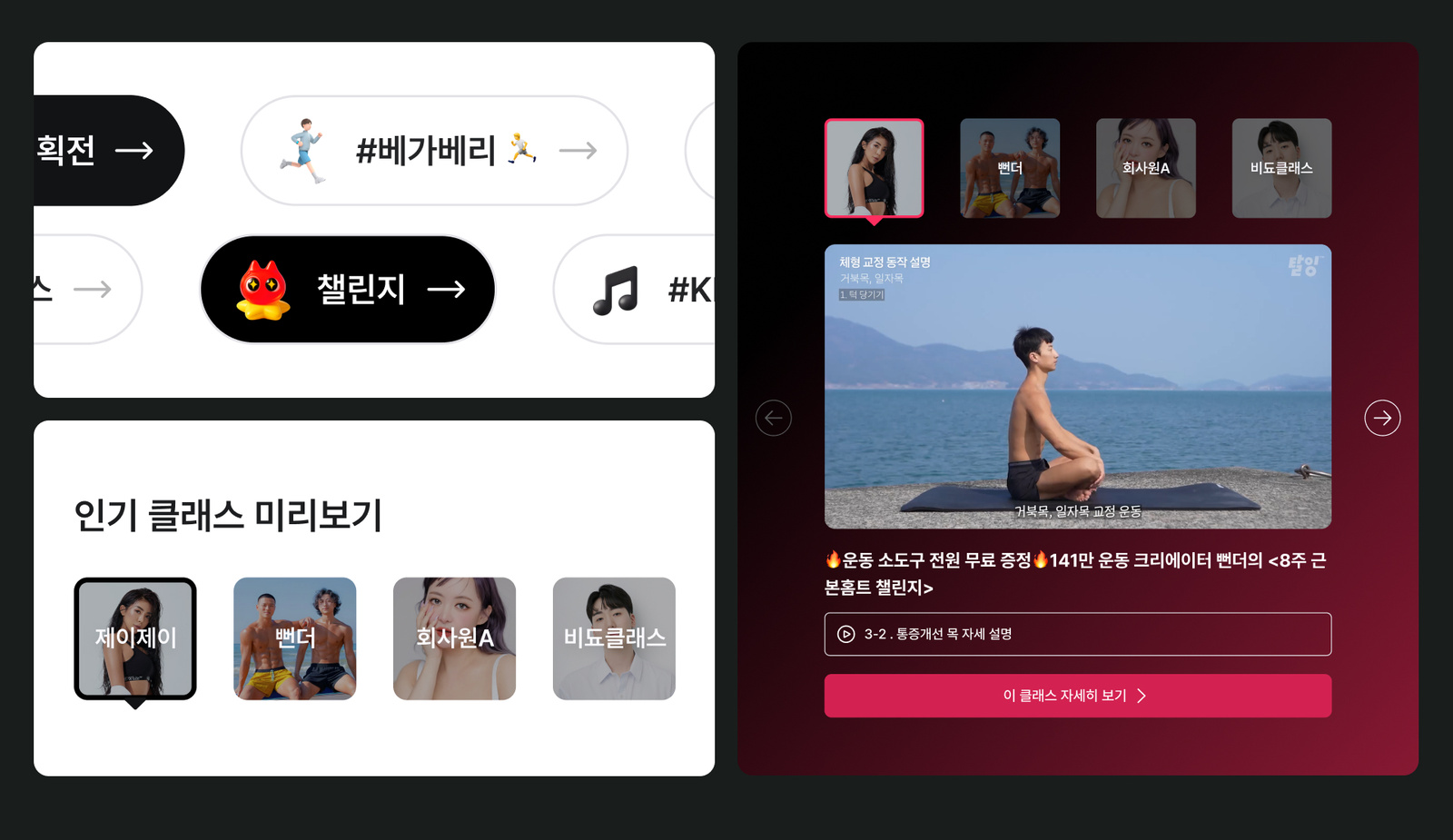
교육 서비스의 신뢰를 유지하면서도 기존 학습 브랜드에서 반복되는 진지하고 정적인 인상과 구분되어야 했습니다. 브랜드 그래픽이 광고와 콘텐츠에서 눈에 띄는 동시에, 서비스 화면과 캐릭터, 운영 콘텐츠에서도 같은 에너지를 유지할 수 있는 구조가 필요했습니다.The work had to hold the trust an education service needs while breaking away from the serious, static impression that learning brands repeat. The brand graphics had to stand out in advertising and content and hold the same energy inside service screens, characters and operating content.
디자인 접근Design Approach
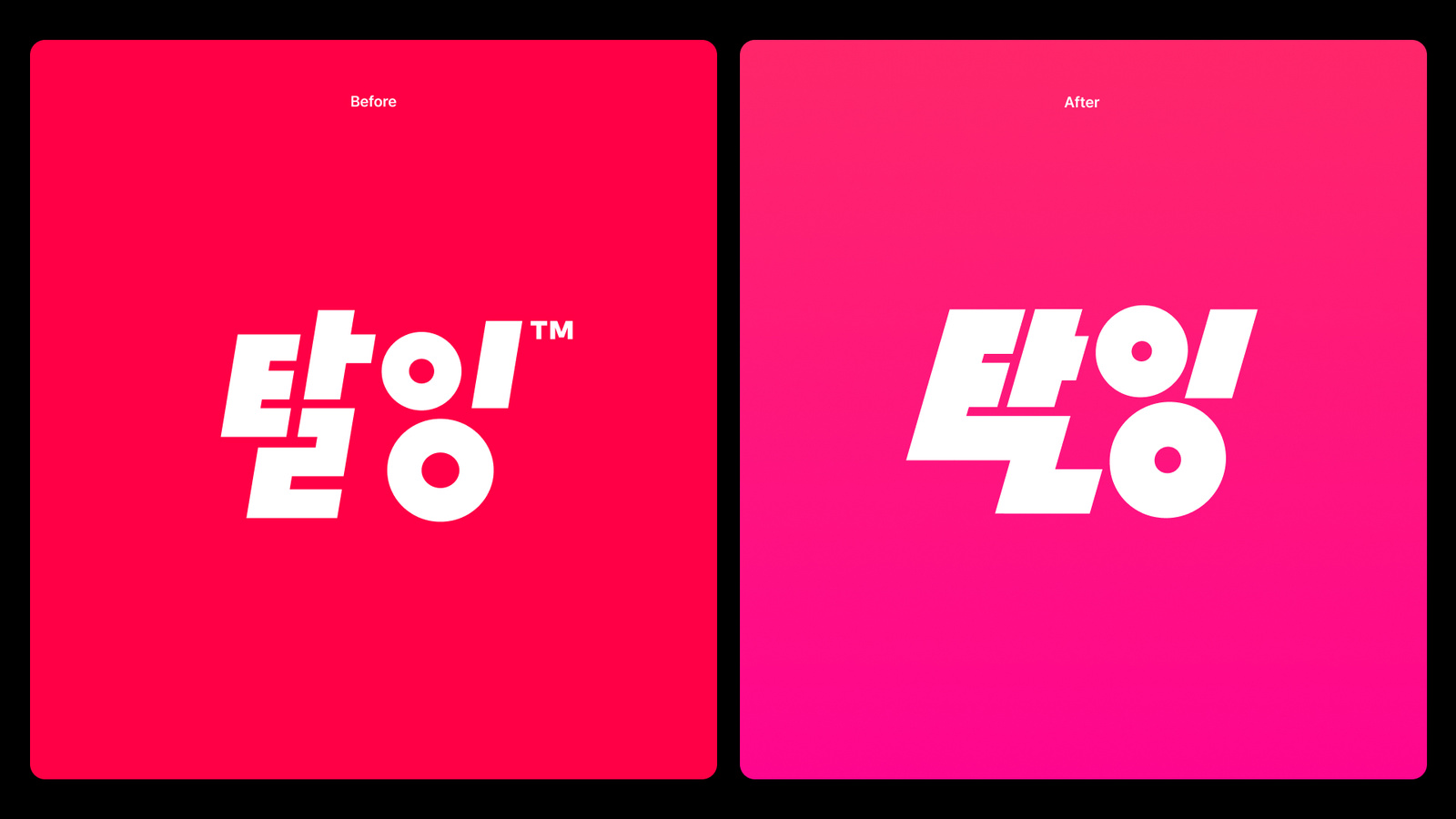
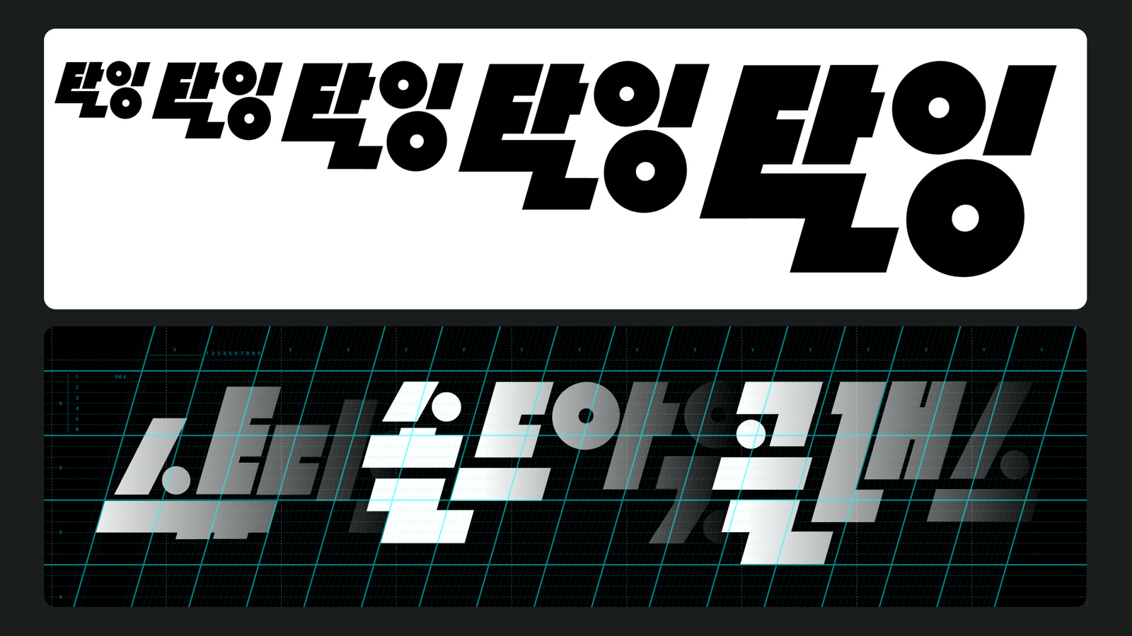
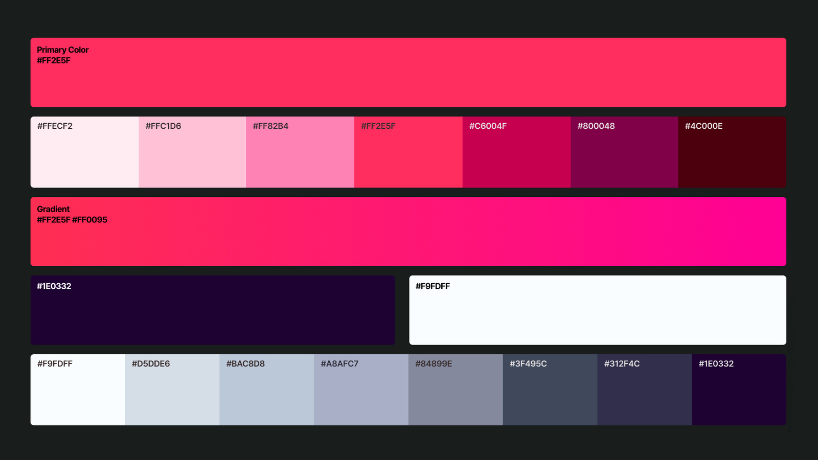
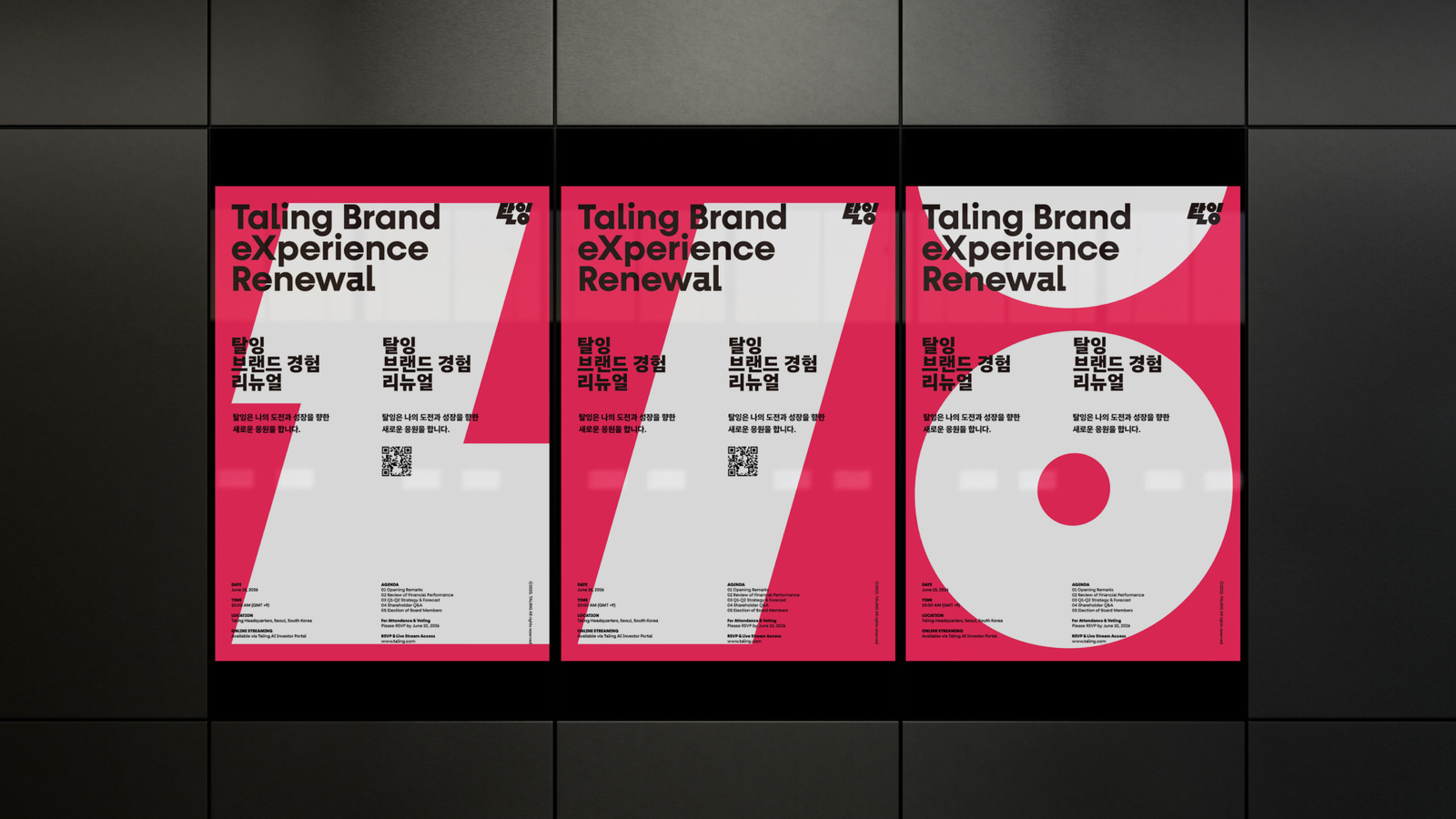
멈춰 있는 상태보다 ‘밖으로 나가는 움직임’을 시각적 기준으로 삼았습니다. 고정된 프레임을 벗어나거나 요소가 서로 밀고 겹치는 방식, 강한 색과 큰 타이포그래피의 리듬을 통해 배움이 행동을 촉발하는 에너지를 표현했습니다. 그래픽은 한 장의 포스터보다 반복적으로 변형할 수 있는 규칙으로 설계했습니다.Movement outward became the visual standard instead of anything at rest. Elements escape their frame, push and overlap each other, and strong colour and large typography set a rhythm, expressing learning as energy that triggers action. The graphics were designed as rules that can be varied repeatedly rather than as one finished poster.
비주얼·경험 시스템Visual / Experience System
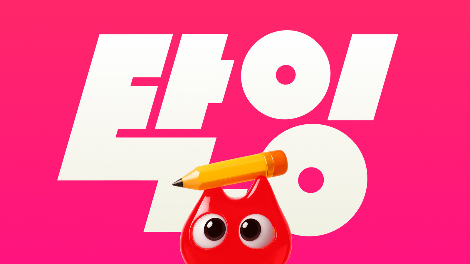
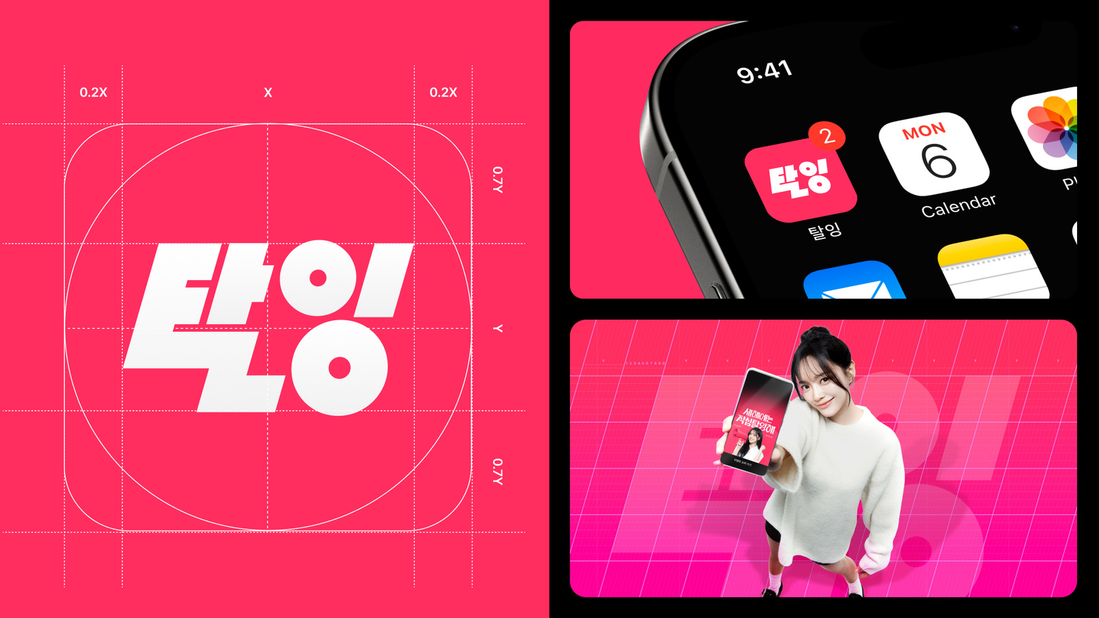
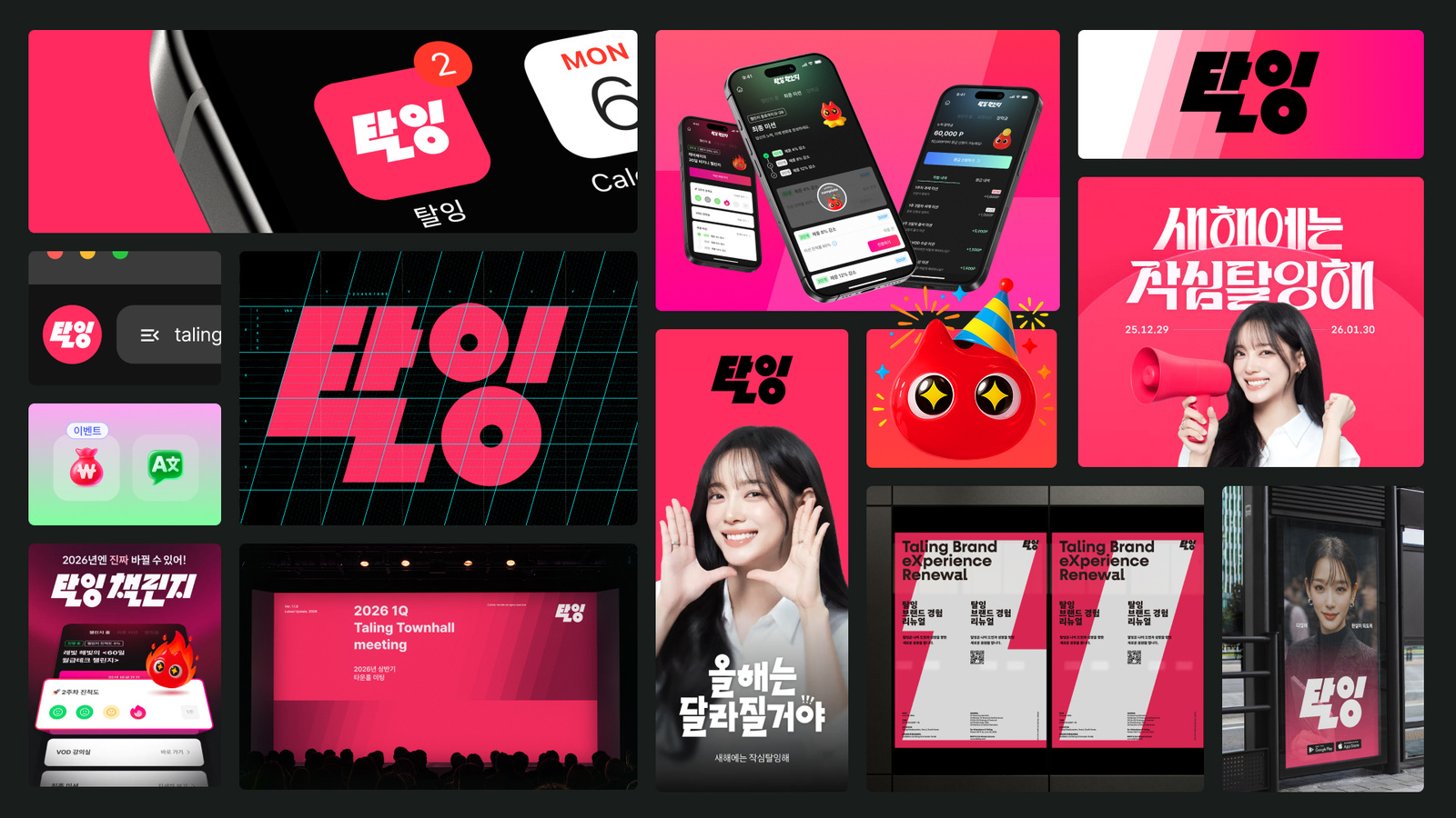
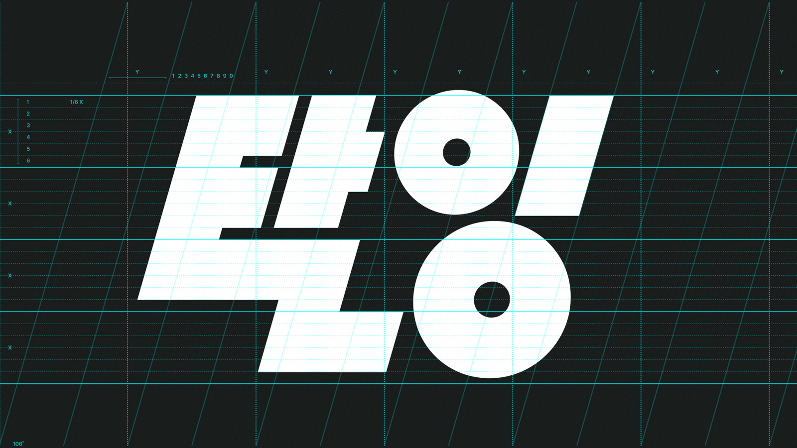
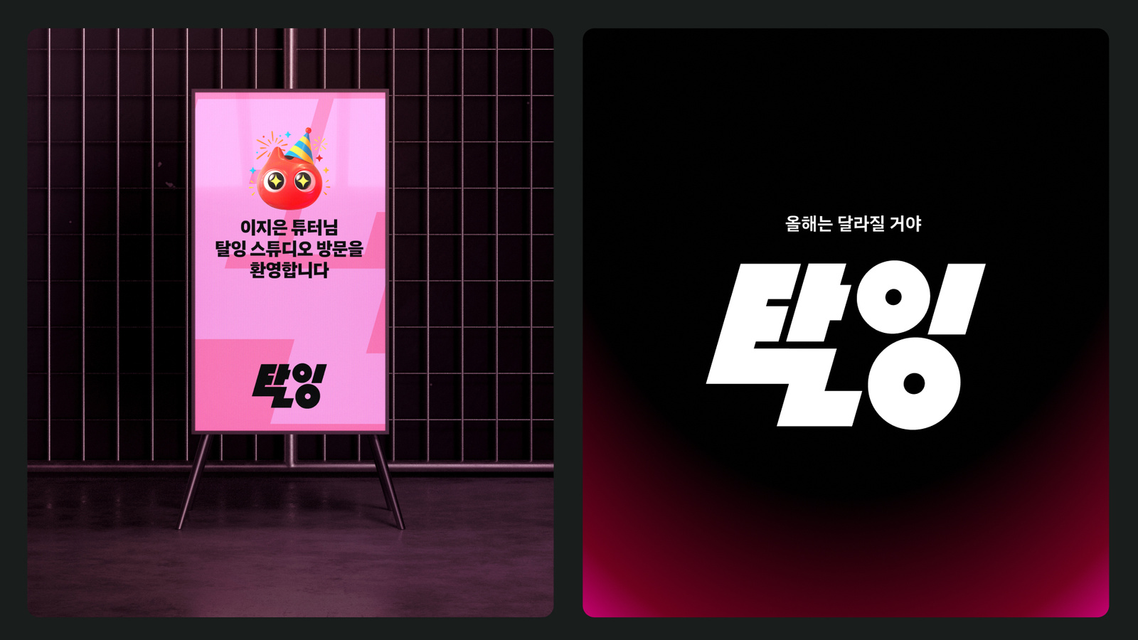
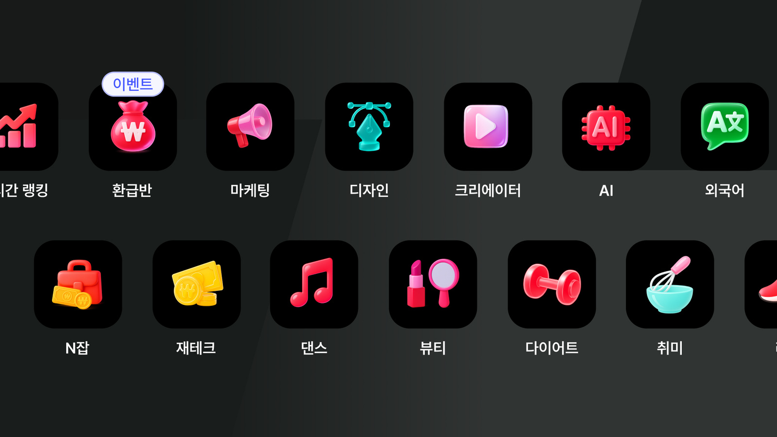
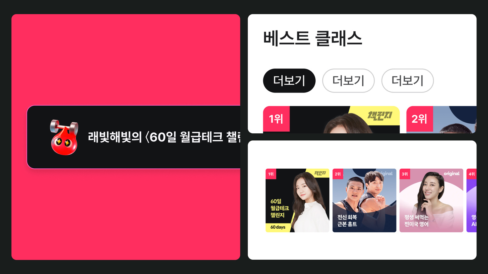
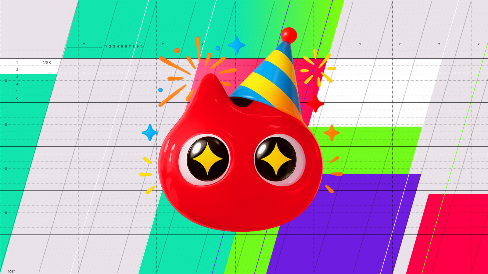
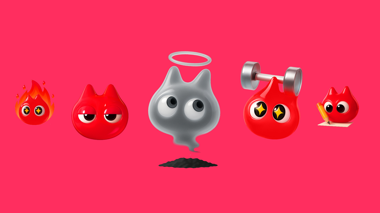
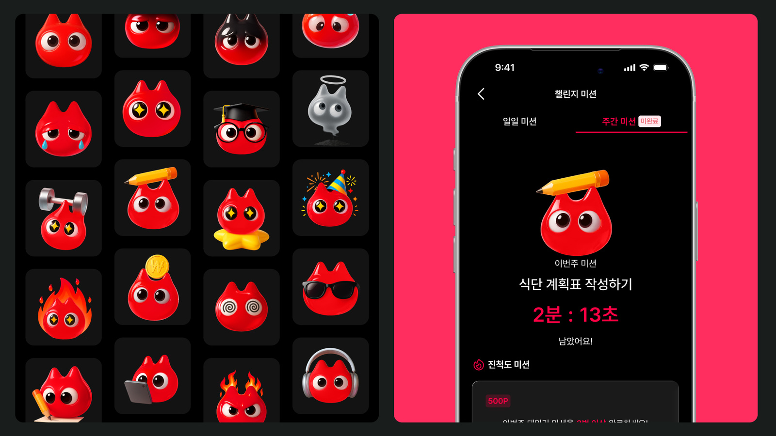
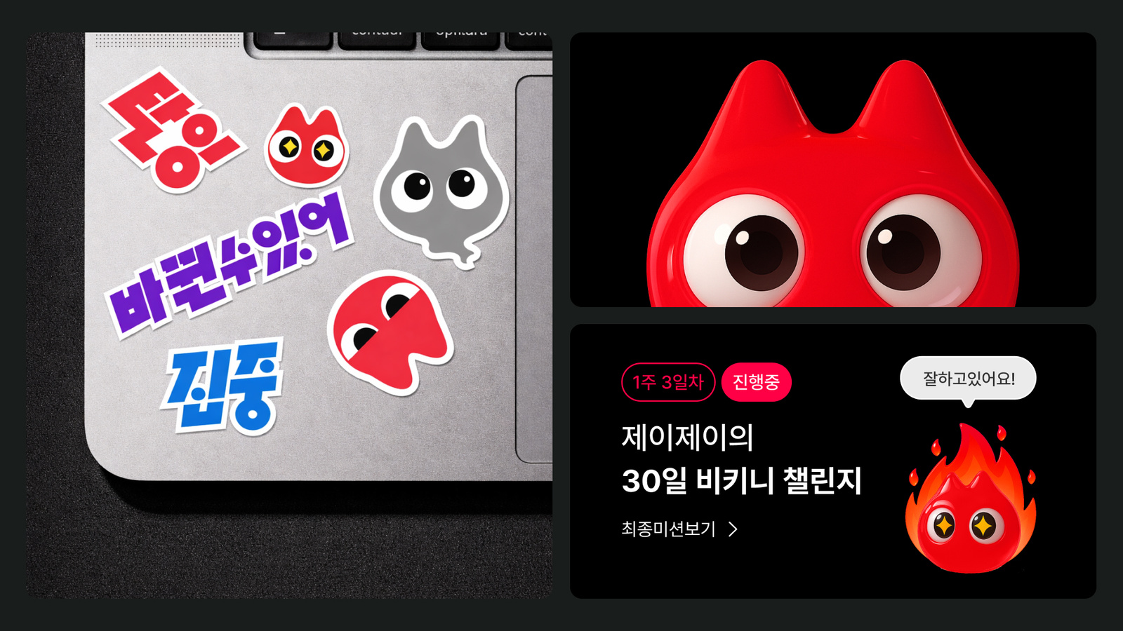
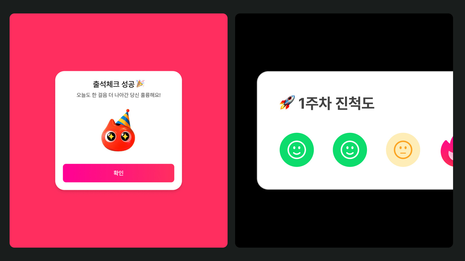
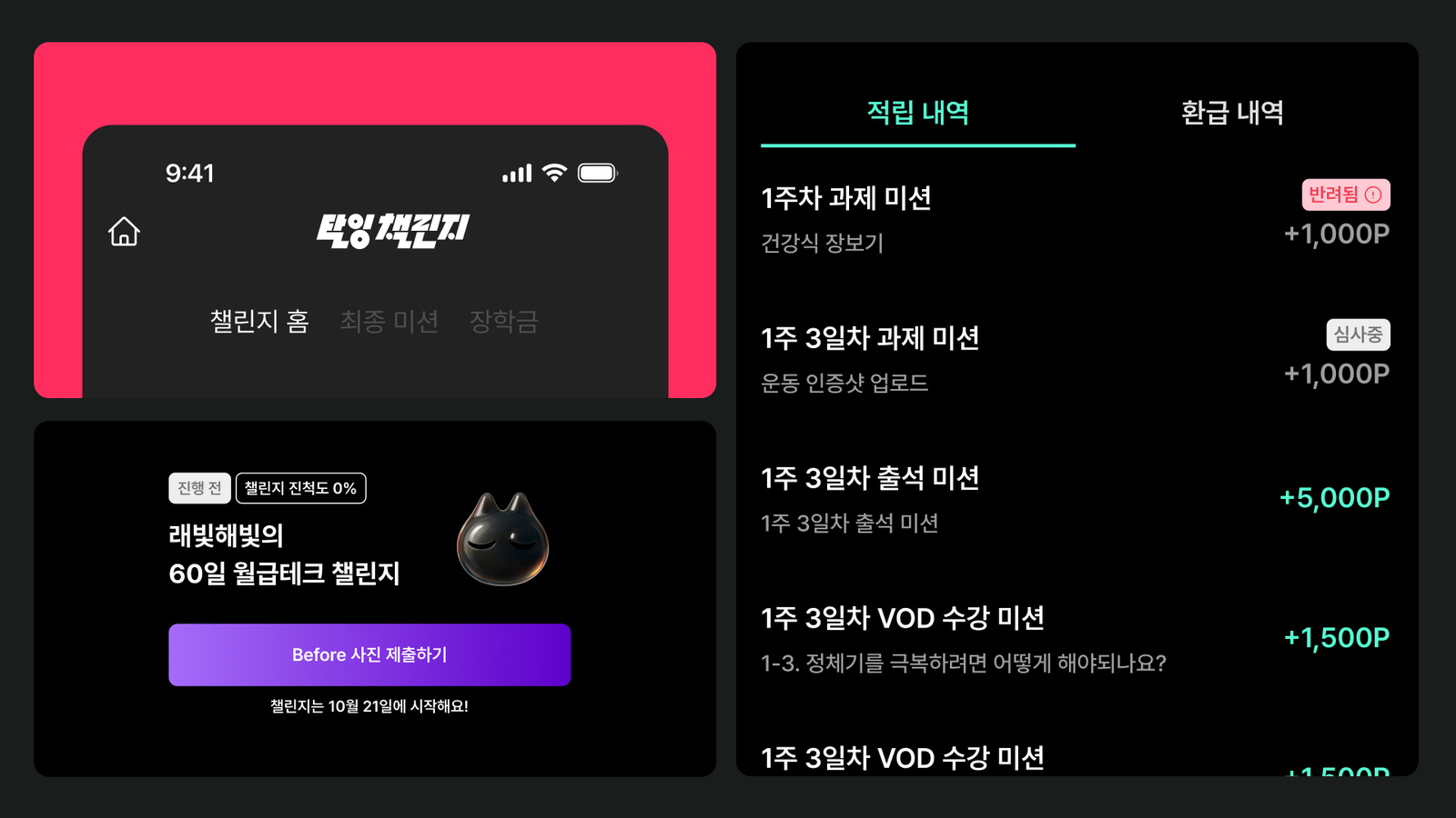
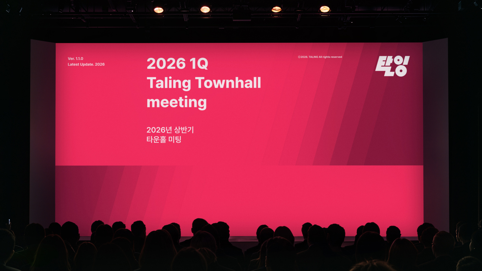
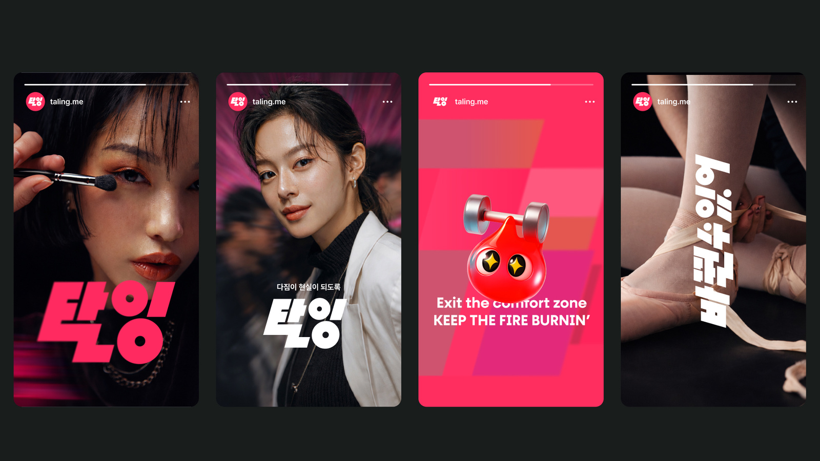
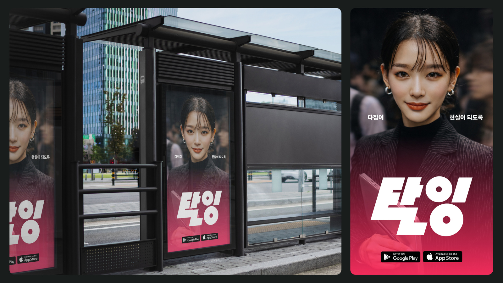
6×10 그리드와 106°의 사선 구조를 활용해 화면 안에 방향성과 속도감을 만들고, 캐릭터 ‘잉글’을 포함한 그래픽 자산이 같은 구조 안에서 움직일 수 있도록 정리했습니다. 광고, 콘텐츠, 서비스 접점에서 요소의 크기와 위치가 달라져도 탈잉 특유의 활력이 유지되도록 했습니다.A six by ten grid and a 106 degree diagonal structure create direction and speed inside the frame, and the graphic assets including the character Ingle move within that same structure. Across advertising, content and service touchpoints, the scale and position of elements can change while the vitality specific to Taling stays intact.
프로젝트의 의미What It Means
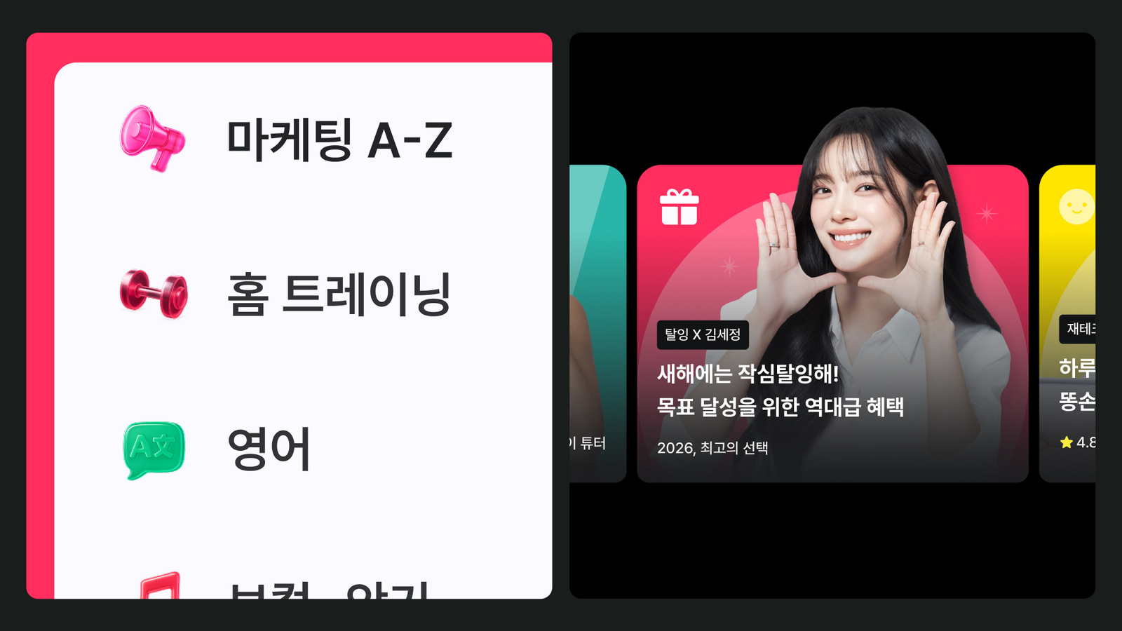
탈잉 리브랜딩은 배움을 설명하는 브랜드에서 사람을 움직이게 하는 브랜드로 시각적 역할을 확장한 프로젝트입니다. 정적인 교육 이미지 대신 행동과 변화의 순간을 반복적으로 보여줄 수 있는 그래픽 시스템을 구축했습니다.The Taling rebrand widened the visual role of the brand from explaining learning to moving people. In place of static education imagery, it built a graphic system that can show the moment of action and change over and over.
작업 범위Scope
- Brand Strategy / Reframing
- Visual Identity
- Grid / Graphic System
- Character: Ingle
- Campaign / Content Applications
- Digital Brand Experience