크몽 리브랜딩Kmong Rebranding
크몽을 단순한 프리랜서 거래 플랫폼이 아니라 새로운 방식으로 일하는 사람들을 대표하는 ‘일의 플랫폼’으로 확장했습니다.Kmong was expanded from a freelance marketplace into a platform that represents people working in new ways.
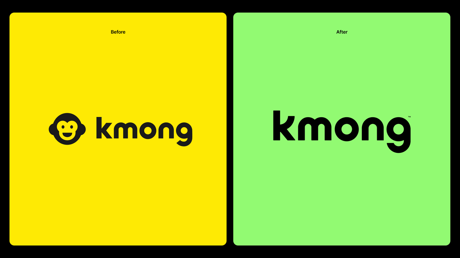
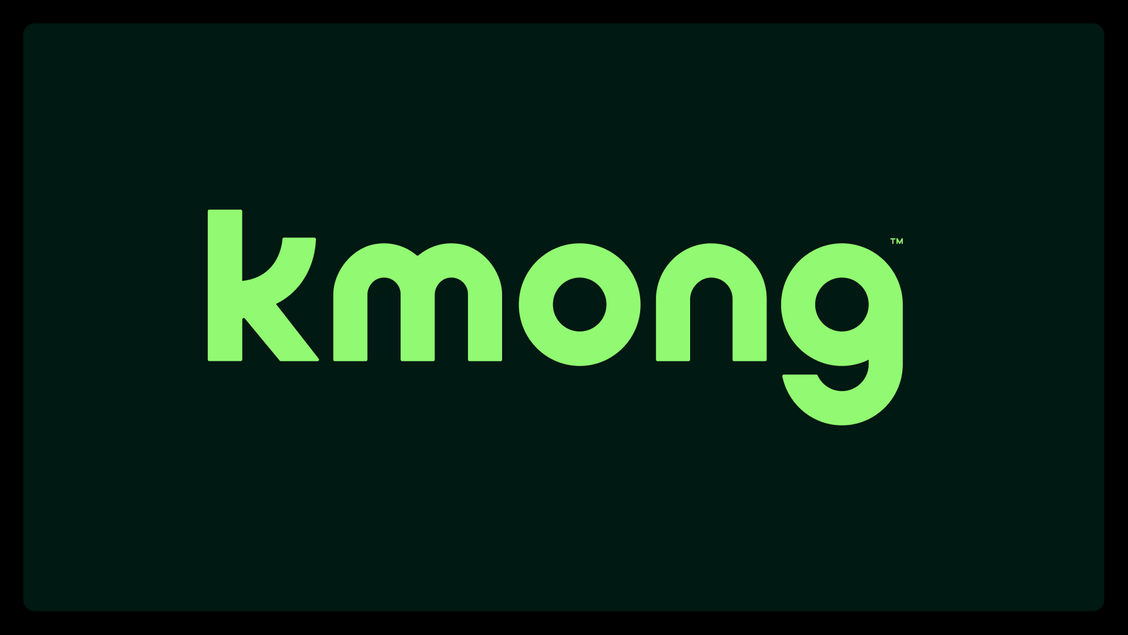
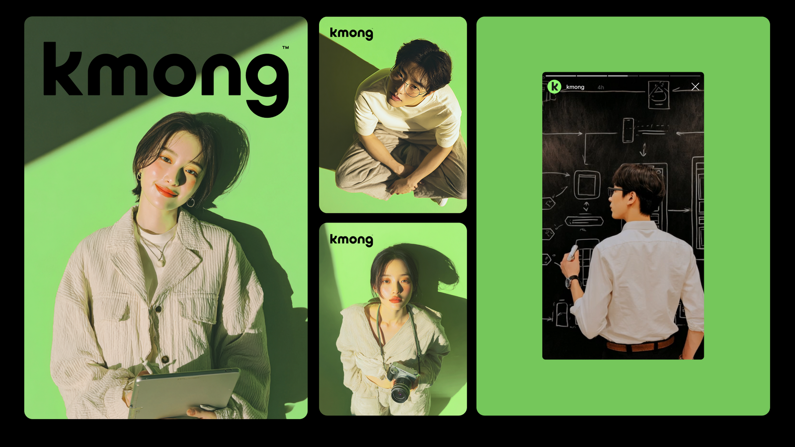
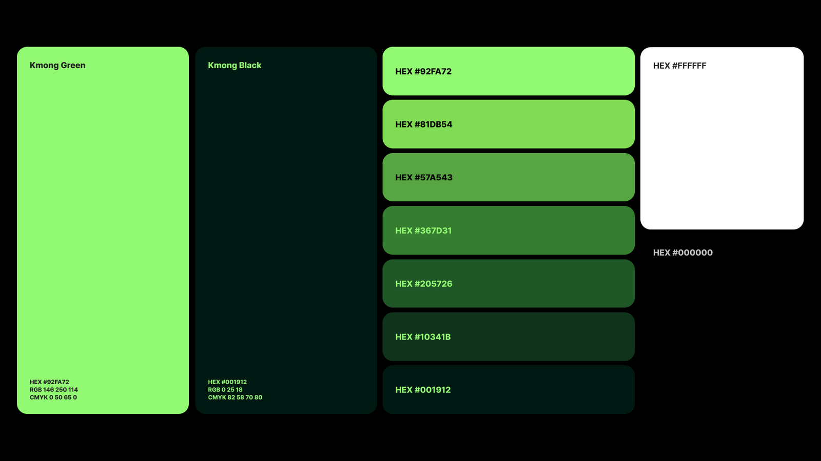
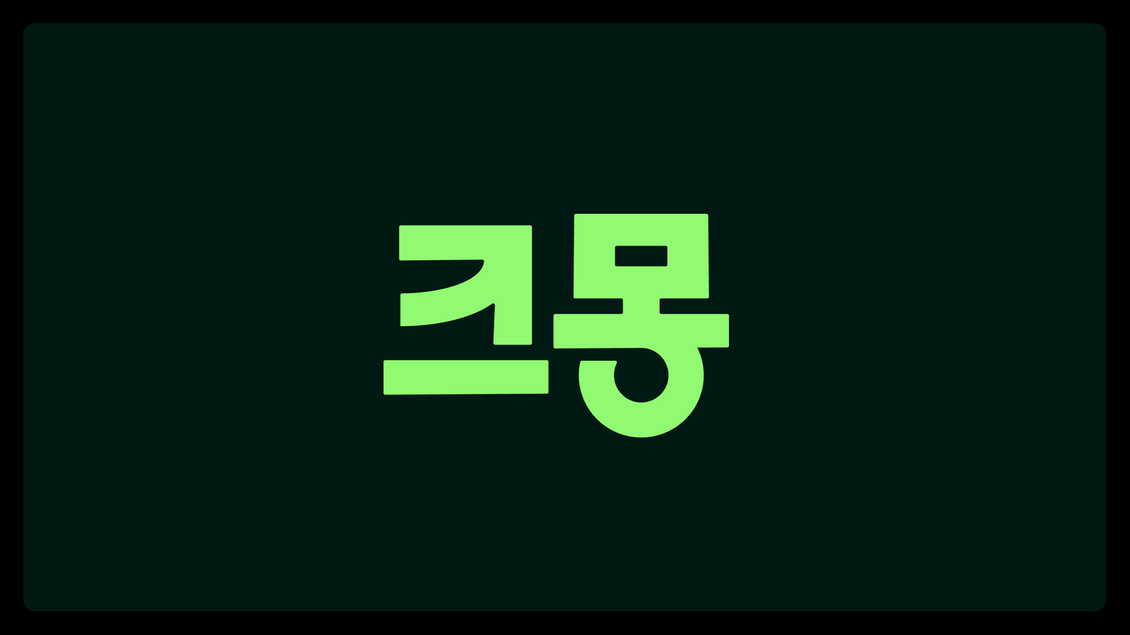
캐릭터 중심의 인상에서 워드마크 중심의 성숙한 브랜드로 전환하고, 기존 옐로 자산을 Kmong Green으로 재정비했습니다.The brand shifted from a character led impression to a mature wordmark, and the existing yellow equity was rebuilt as Kmong Green.
배경Background
프리랜서, 전문가, 사이드잡, 긱워커처럼 기존의 화이트칼라·블루칼라 구분으로 설명하기 어려운 일의 형태가 빠르게 늘어나고 있었습니다. 크몽의 리브랜딩은 거래 기능을 설명하는 것을 넘어 이 새로운 직업군과 일의 문화를 어떤 언어로 대표할 것인지에서 출발했습니다.Freelancers, specialists, side jobs and gig workers were multiplying faster than the old white collar and blue collar split could describe. The Kmong rebrand started from a question beyond transaction features: what language should represent this new class of work and its culture.
과제The Challenge
오랫동안 축적된 캐릭터와 옐로 컬러는 높은 인지 자산이었지만, B2B와 기업 고객까지 확장되는 시점에는 브랜드의 전문성과 확장성을 함께 보여줄 필요가 있었습니다. 기존 자산을 모두 지우지 않으면서도 ‘저렴한 외주 거래’의 인상을 넘어서는 변화가 필요했습니다.The character and the yellow built up over years were high recognition assets, but as the business extended into B2B and enterprise clients the brand needed to show expertise and room to grow. The change had to move past the impression of cheap outsourced work without erasing everything that had been earned.
디자인 접근Design Approach
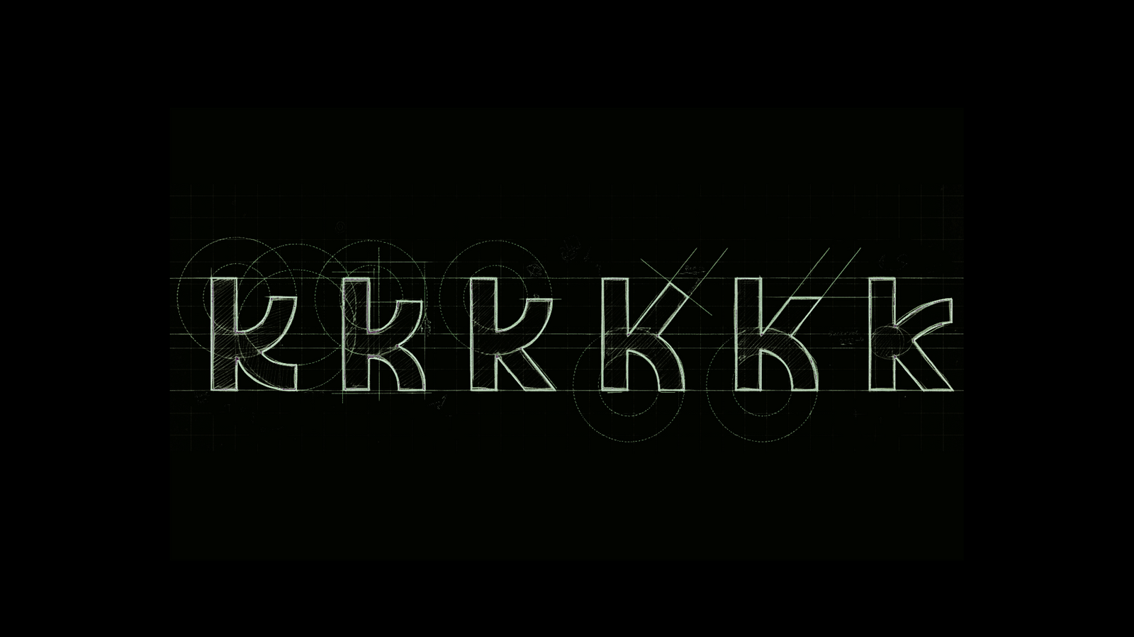
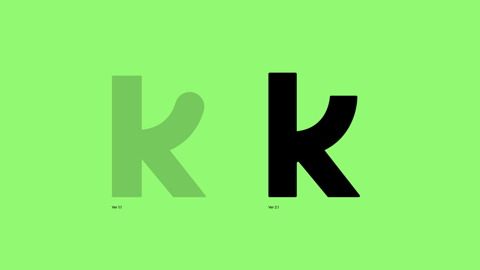
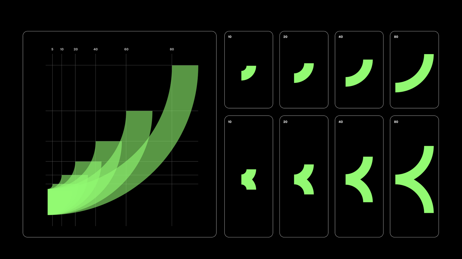
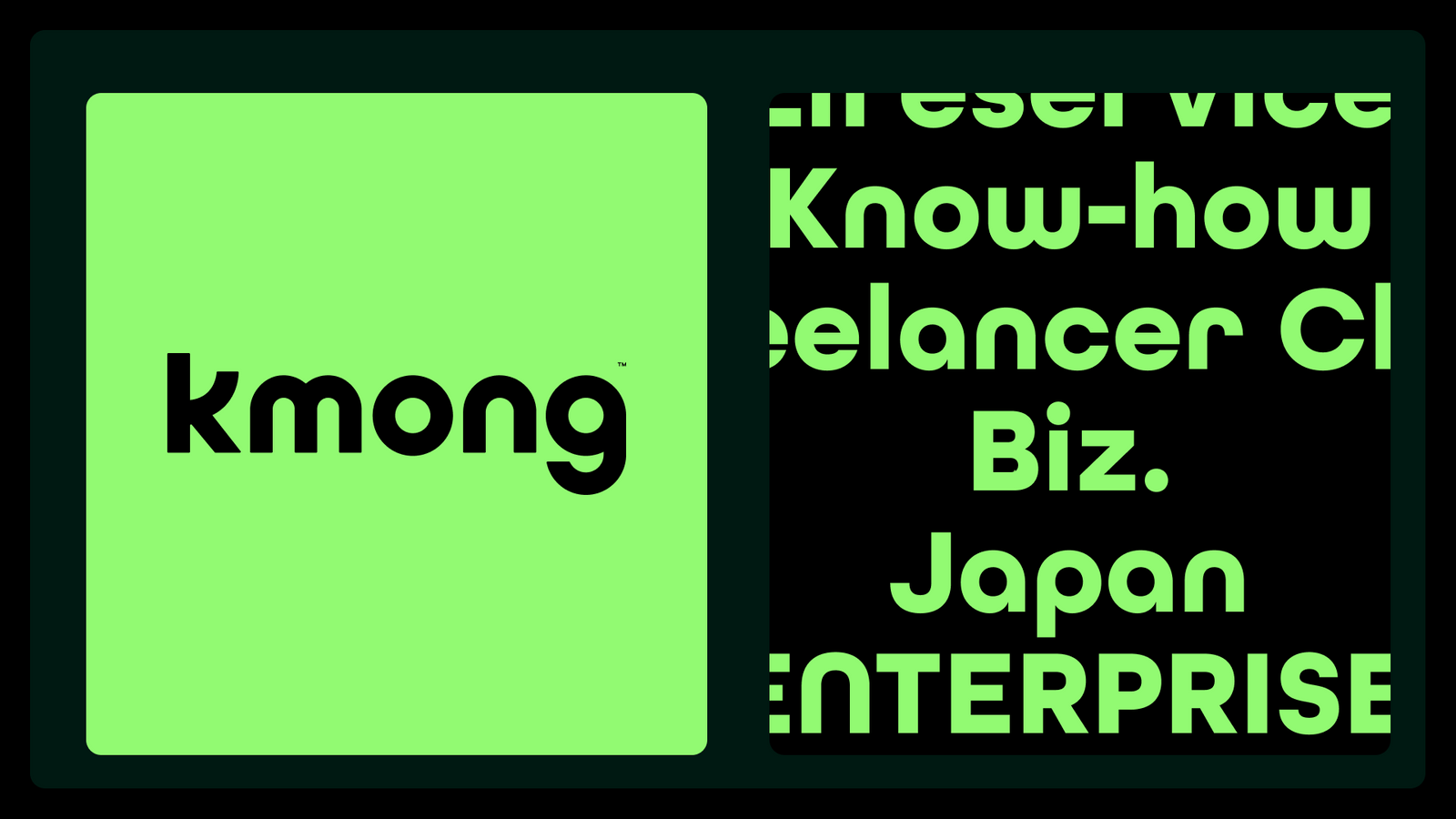
프리랜서와 전문가, 사이드잡과 긱워크를 하나의 새로운 직업 문화로 묶는 ‘Yellow-collar’ 관점을 전략적 프레임으로 제안했습니다. 시각적으로는 캐릭터보다 워드마크를 중심에 두고, 기존 K 형태의 기억점을 살리면서도 더 단단하고 확장 가능한 로고 시스템을 구축했습니다.A Yellow collar perspective was proposed as the strategic frame, binding freelancers, specialists, side jobs and gig work into one new working culture. Visually the wordmark took the centre over the character, keeping the memory of the existing K form while building a firmer and more extensible logo system.
비주얼·경험 시스템Visual / Experience System
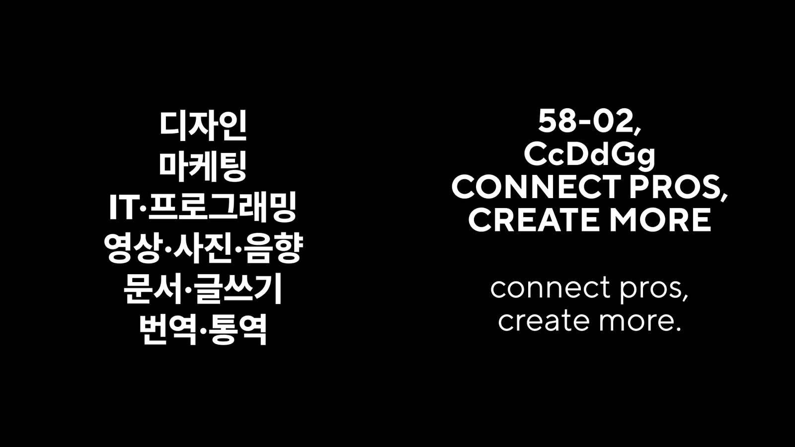
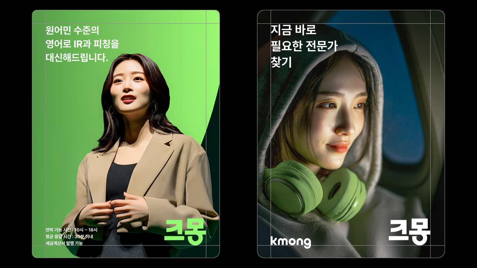
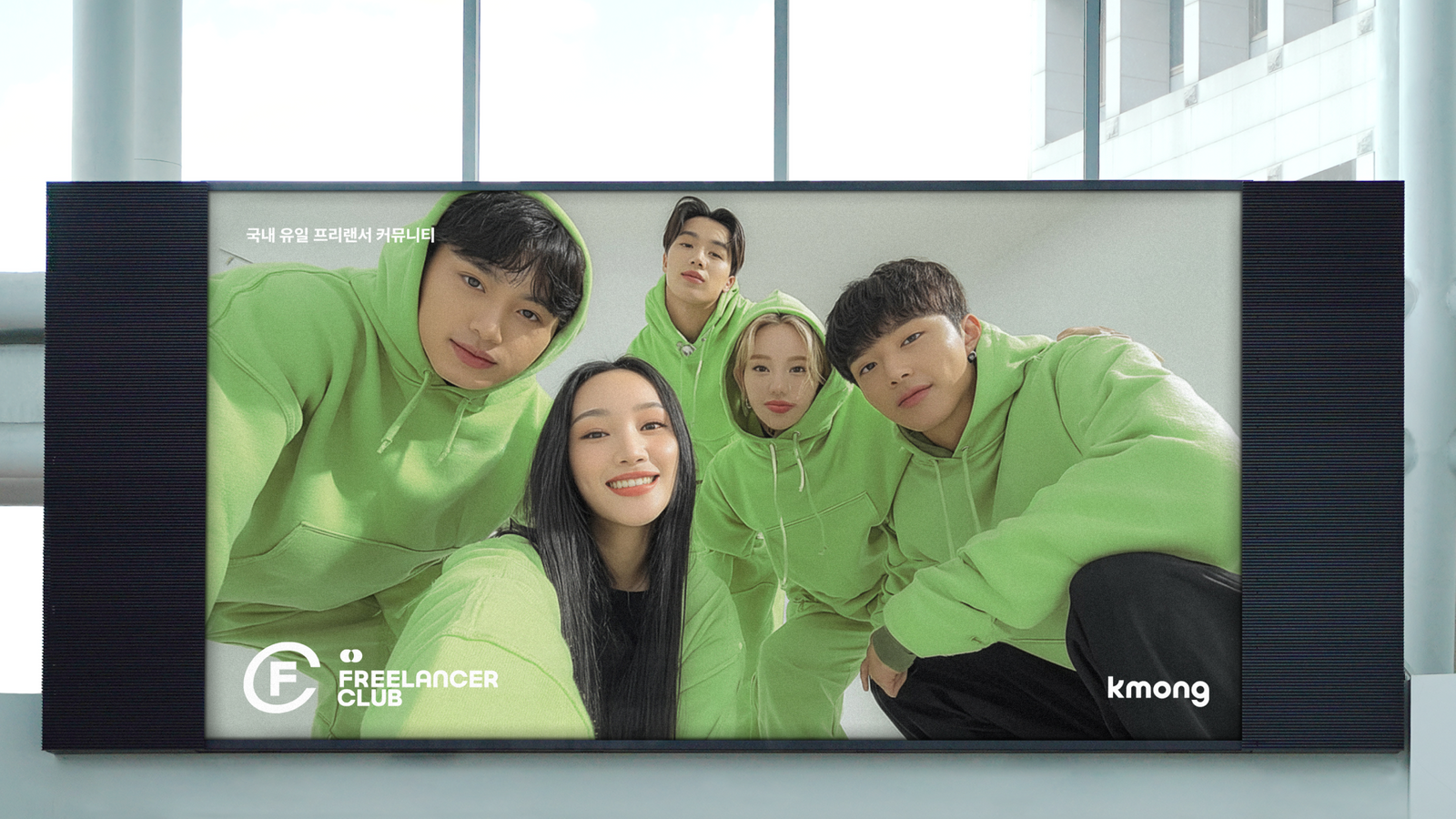
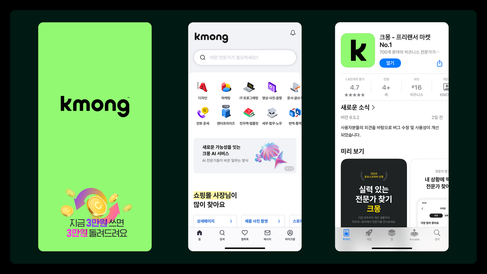
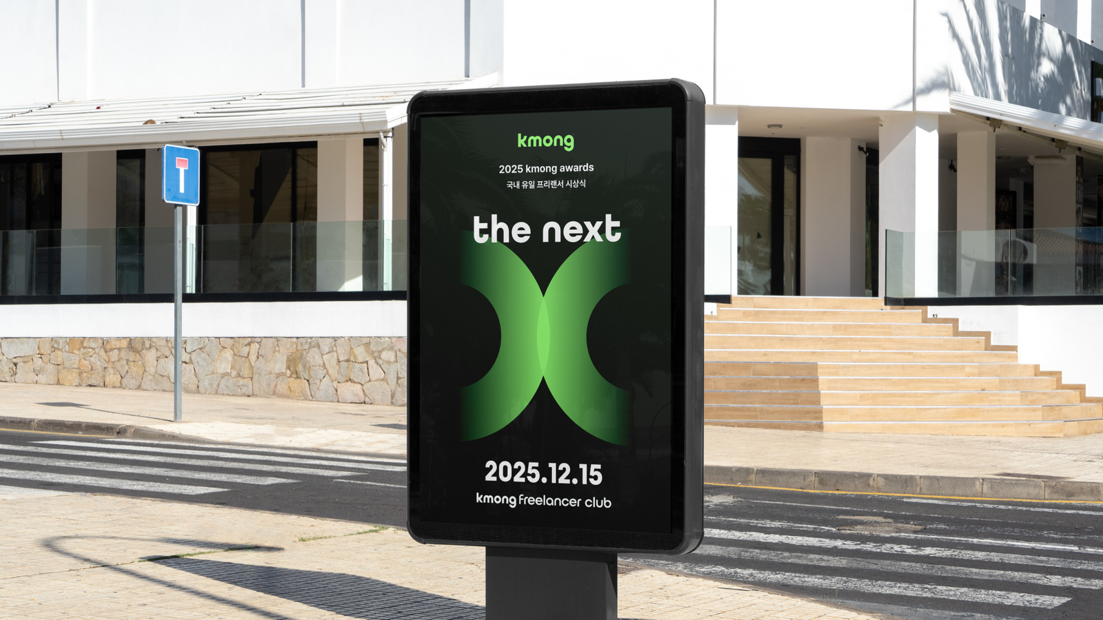
Kmong Green을 중심으로 앱 아이콘, 국·영문 표기, 서비스 도메인과 커뮤니케이션 접점까지 확장할 수 있는 체계를 정리했습니다. 사람과 기회가 연결되는 구조, 성장과 협업을 표현하는 그래픽 자산을 통해 플랫폼이 다루는 일의 범위를 하나의 브랜드 아래 묶었습니다.Around Kmong Green, the system was organised to extend across the app icon, Korean and English lockups, service domains and communication touchpoints. Graphic assets expressing connection, growth and collaboration gather the full range of work the platform handles under one brand.
프로젝트의 의미What It Means
크몽 리브랜딩은 서비스의 외형을 바꾸는 것보다 ‘크몽이 어떤 일의 문화를 대표할 것인가’를 다시 정의한 프로젝트입니다. 브랜드 인지 자산을 유지하면서도 개인 전문가와 기업 고객을 함께 수용할 수 있는 더 성숙한 플랫폼 언어를 만들었습니다.The Kmong rebrand redefined what culture of work the company represents rather than changing how the service looks. It preserved brand recognition while creating a more mature platform language that holds individual specialists and enterprise clients together.
작업 범위Scope
- Brand Strategy
- Positioning / Yellow-collar Framework
- Wordmark / Logo System
- Kmong Green Color System
- App Icon
- Service / Domain Architecture
- Graphic & Communication System