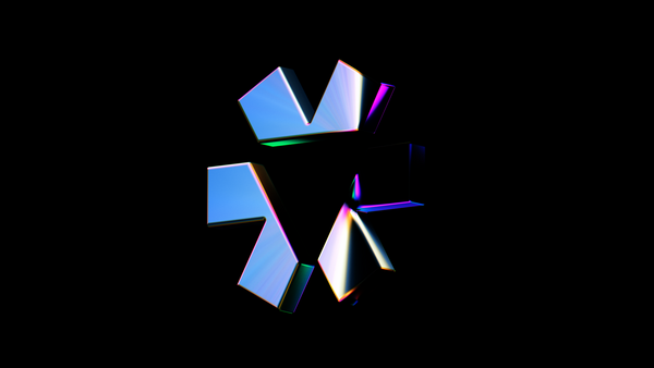
소크라 AI 브랜딩SOCRA AI Branding
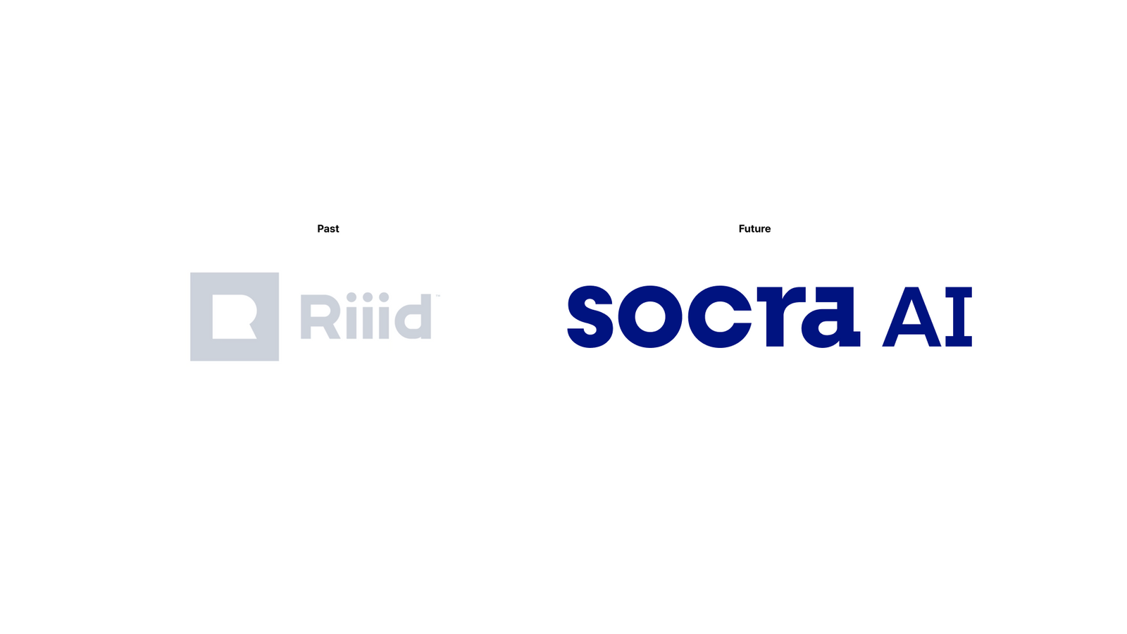
Riiid에서 SOCRA AI로 이어지는 사명 변경을 하나의 로고 교체가 아니라 브랜드 운영 체계의 전환으로 설계했습니다.The change of company name from Riiid to SOCRA AI was designed as a shift in brand operations rather than a logo swap.
기업명과 제품·서비스명의 표기 규칙을 정리하고, 구성원이 매일 사용하는 포스터·사원증·스티커·PPT까지 같은 언어로 연결했습니다.Notation rules for the corporate name and the product and service names were settled, then carried through the posters, ID cards, stickers and decks employees use every day.
배경Background
사명 변경은 새로운 이름을 발표하는 순간보다 이후 조직이 그 이름을 얼마나 일관되게 사용하는지가 중요합니다. SOCRA AI는 기업 브랜드와 하위 서비스·기술명이 함께 운영되는 구조였기 때문에, 이름의 대소문자와 조합 방식부터 내부 커뮤니케이션까지 하나의 기준이 필요했습니다.A name change matters less at the moment of announcement than in how consistently the organisation uses the name afterwards. SOCRA AI ran a corporate brand alongside sub service and technology names, so one standard was needed from capitalisation and lockup rules all the way through internal communication.
과제The Challenge
SOCRA AI, Socra AI/Test/Desk, Twin/Tutor처럼 서로 다른 위계의 이름이 문서와 화면마다 다르게 표기되면 브랜드 체계가 빠르게 산만해질 수 있었습니다. 동시에 사명 변경이 외부 발표에만 머무르지 않고 구성원이 실제 업무에서 체감하는 변화가 되어야 했습니다.With names at different levels such as SOCRA AI, Socra AI, Test, Desk, Twin and Tutor, inconsistent notation across documents and screens would scatter the brand system quickly. At the same time the new name had to become a change employees feel in their actual work, not only an external announcement.
디자인 접근Design Approach
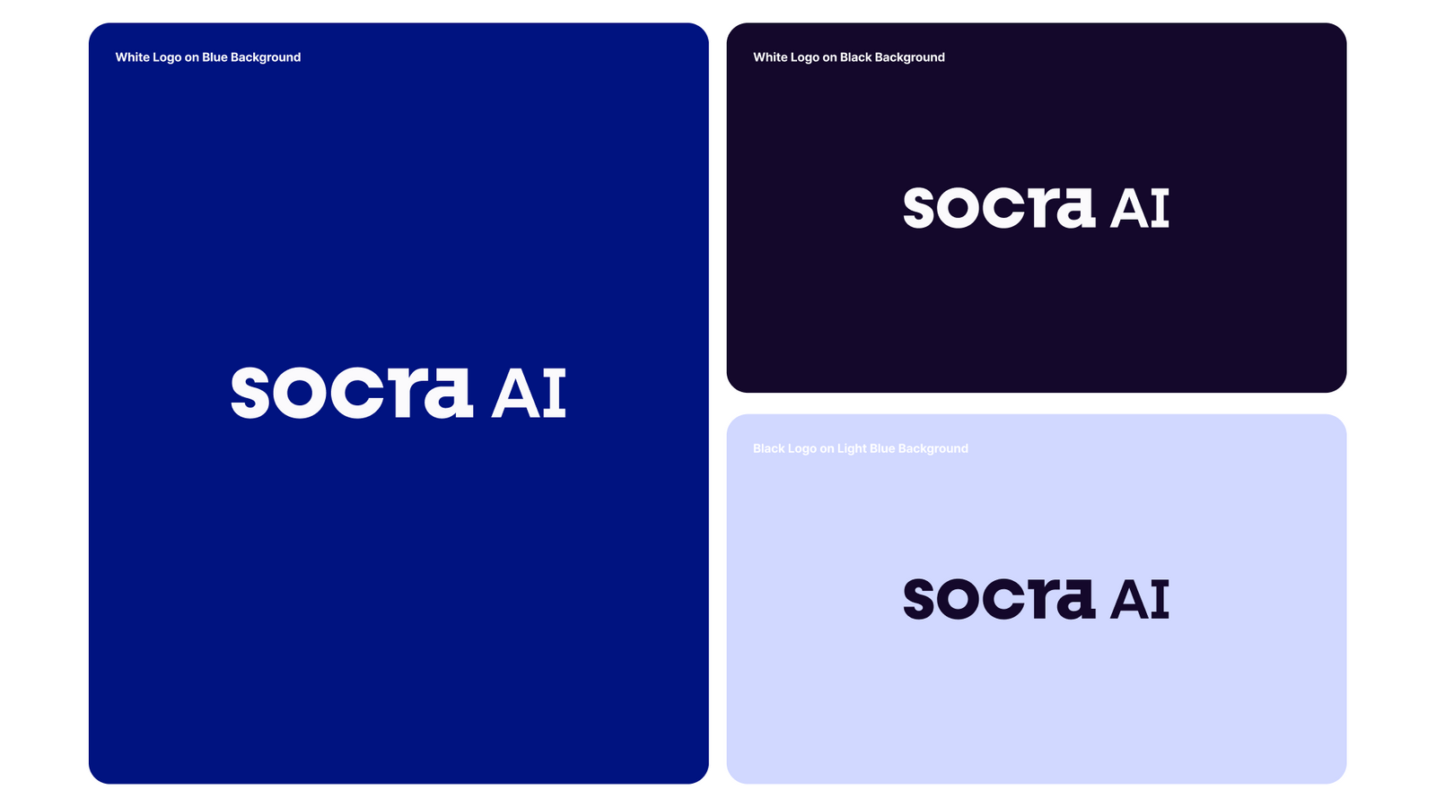
정식 기업 표기와 서비스·기술명 표기를 구분하고 대문자 사용, 결합 방식, 하위 명칭의 표기 원칙을 정리했습니다. 로고 자체보다 이름이 반복적으로 쓰이는 방식에 우선순위를 두어, 새로운 브랜드가 조직과 제품 커뮤니케이션에서 같은 규칙으로 축적되도록 했습니다.Formal corporate notation was separated from service and technology notation, and principles were set for capitalisation, lockups and sub names. Priority went to how the name gets used repeatedly rather than to the logo itself, so the new brand accumulates under the same rules across the organisation and its products.
비주얼·경험 시스템Visual / Experience System
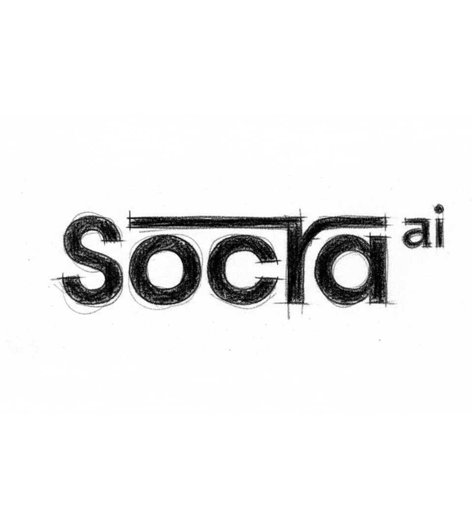
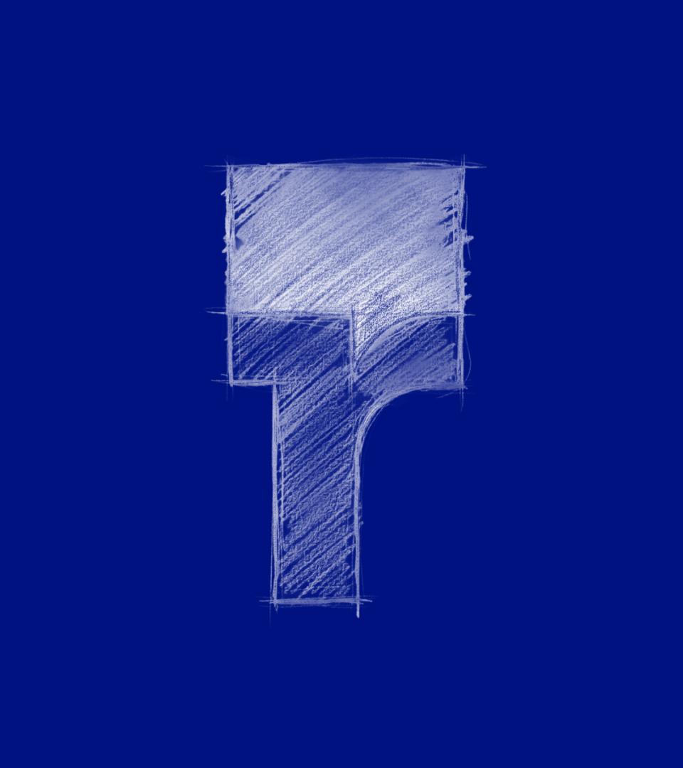
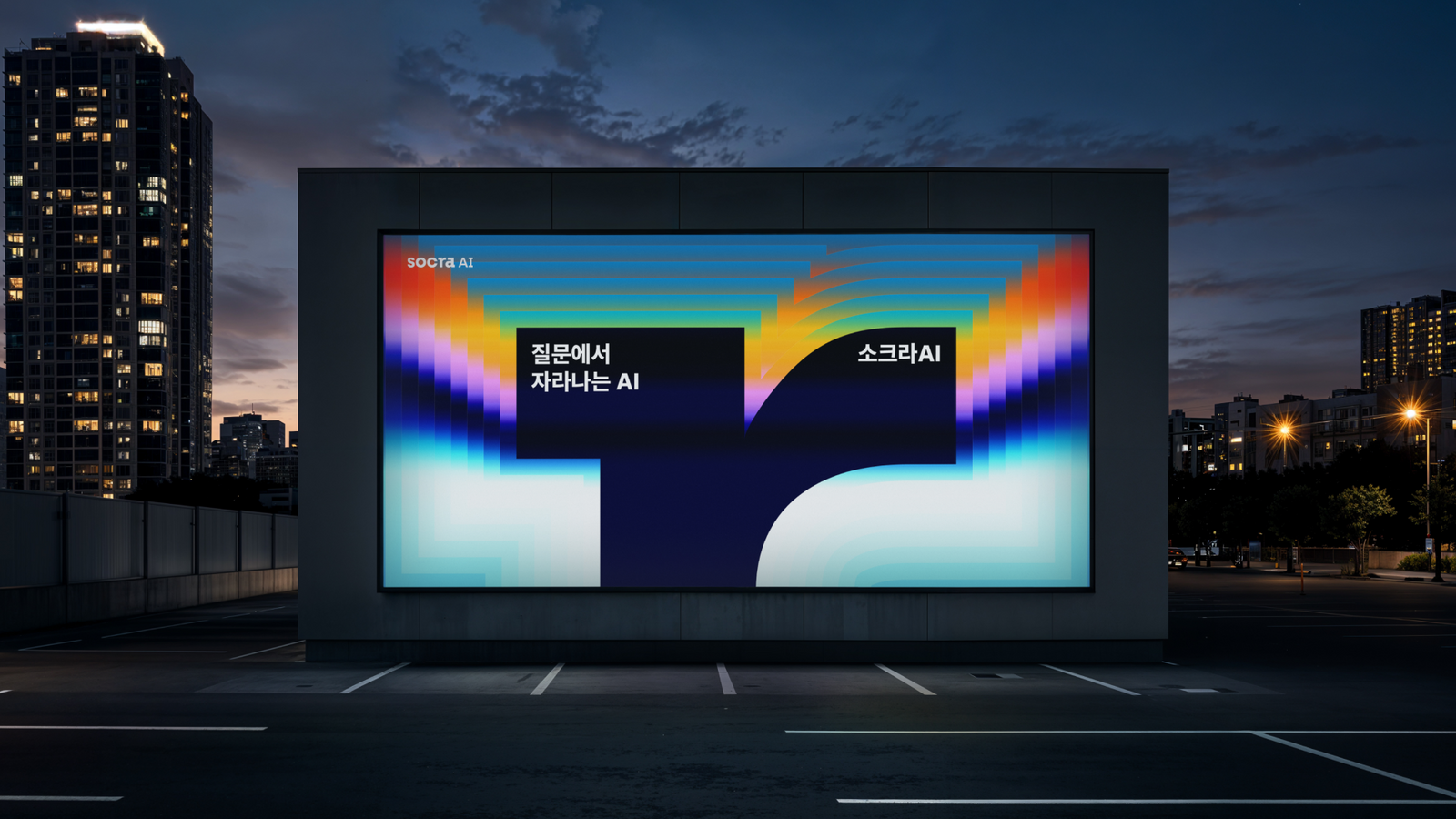
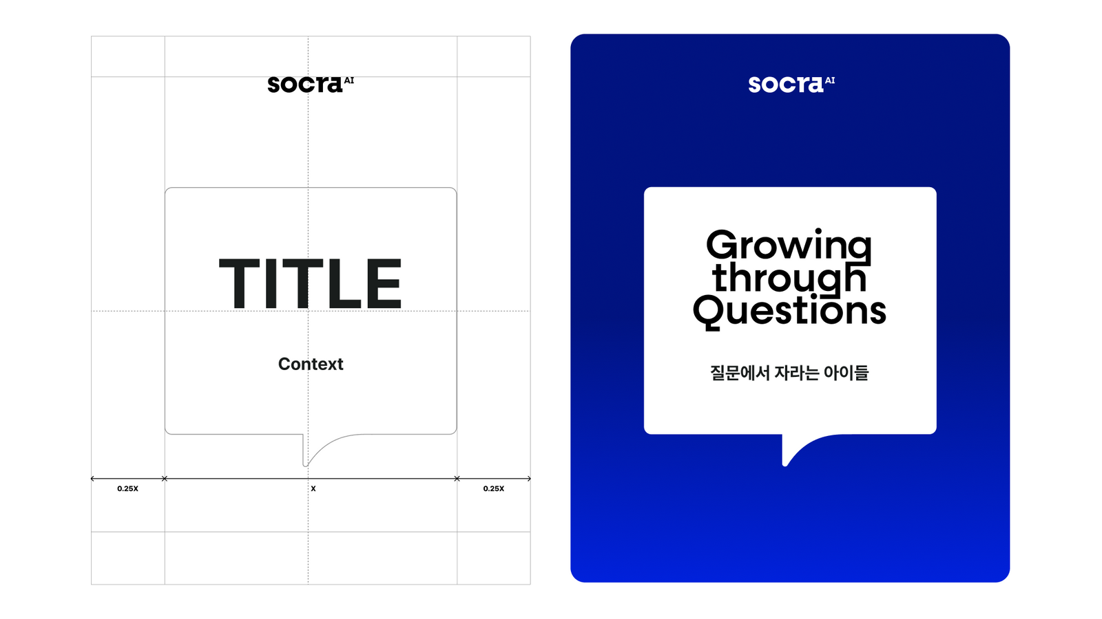
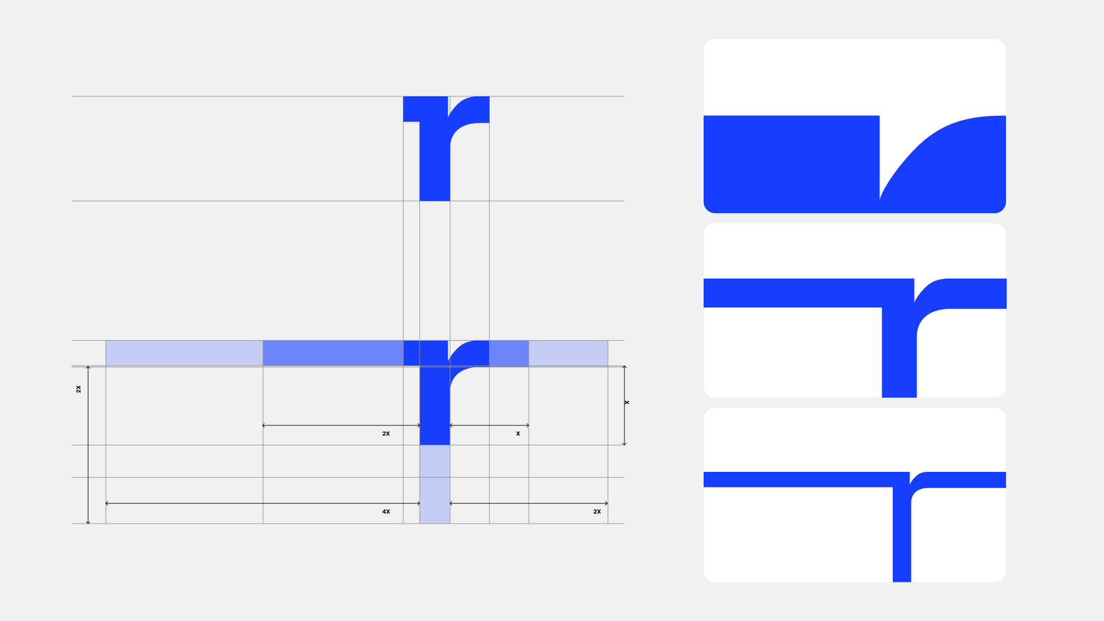
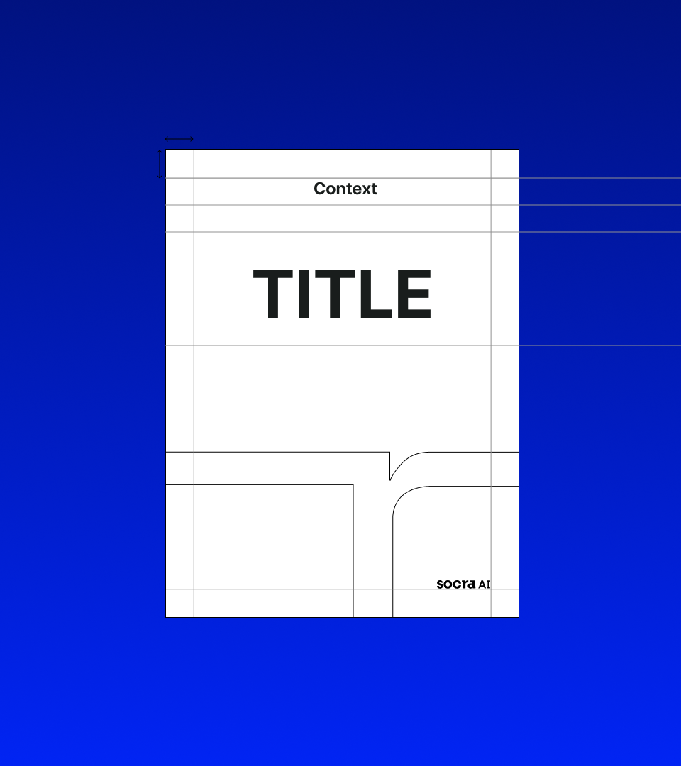
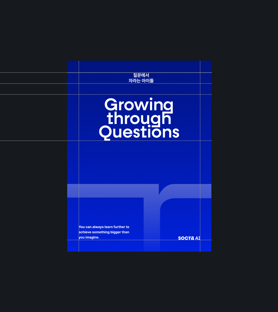
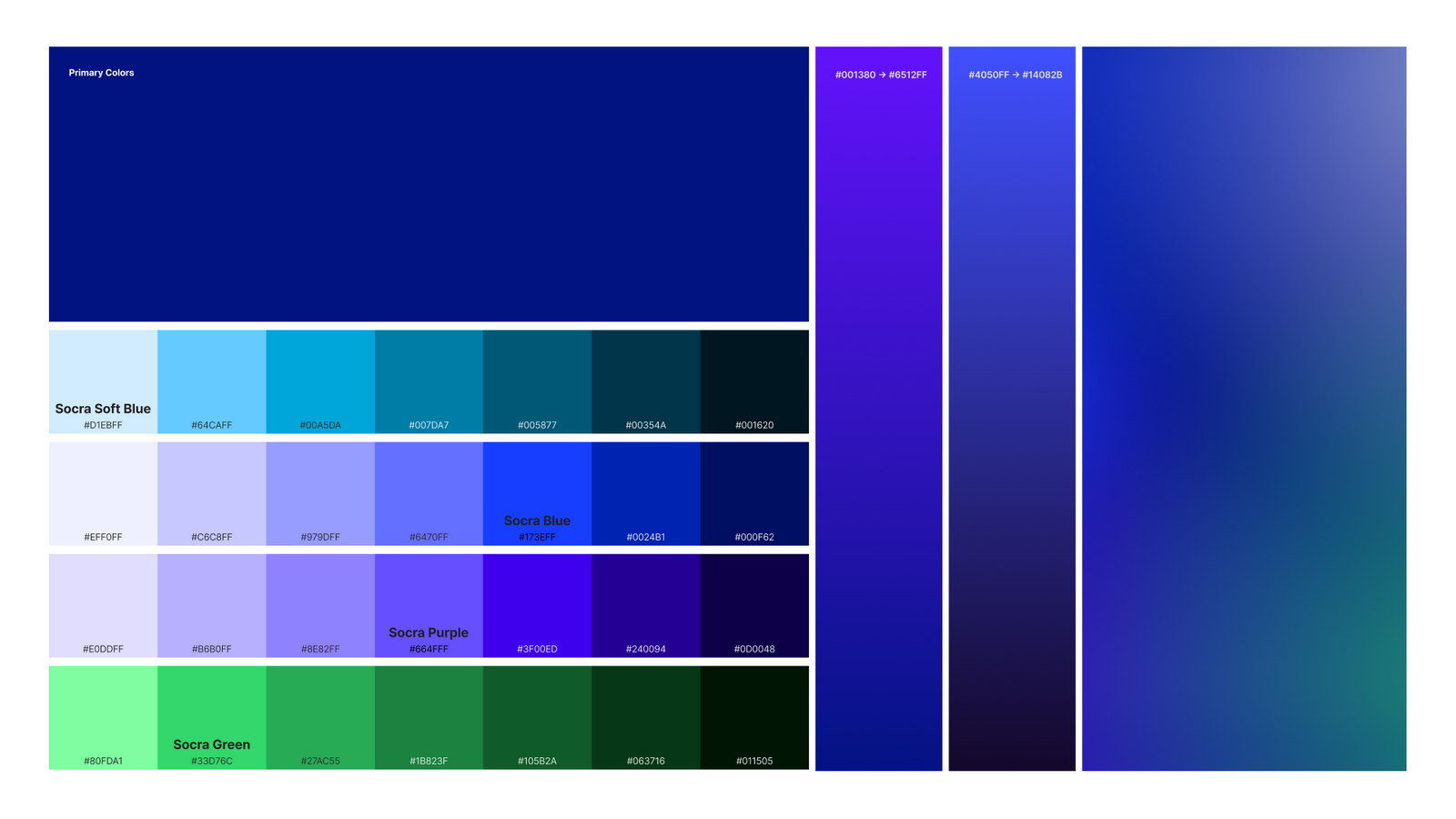
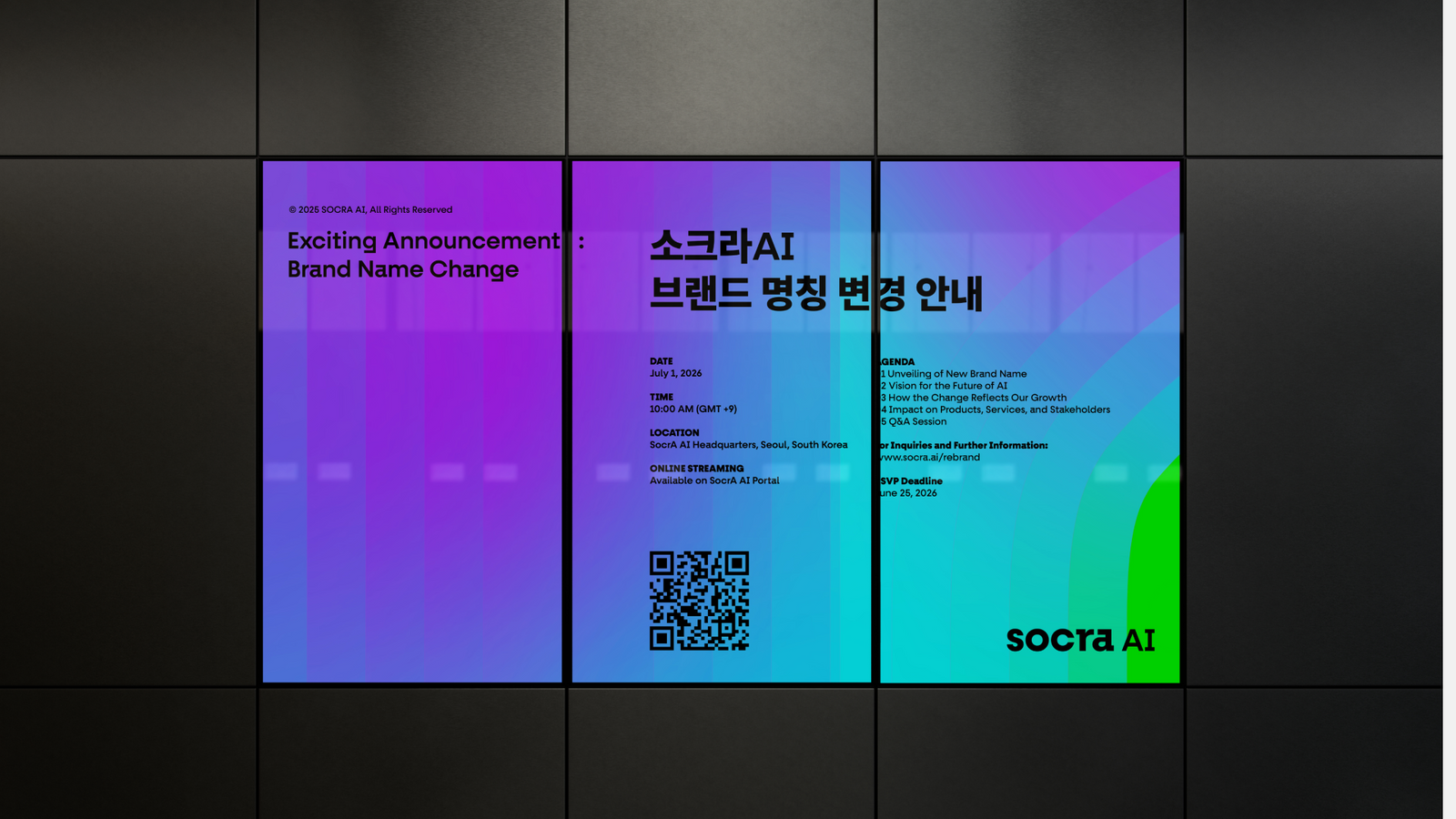
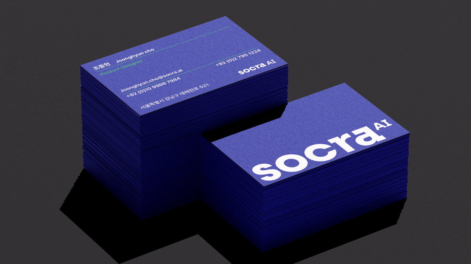
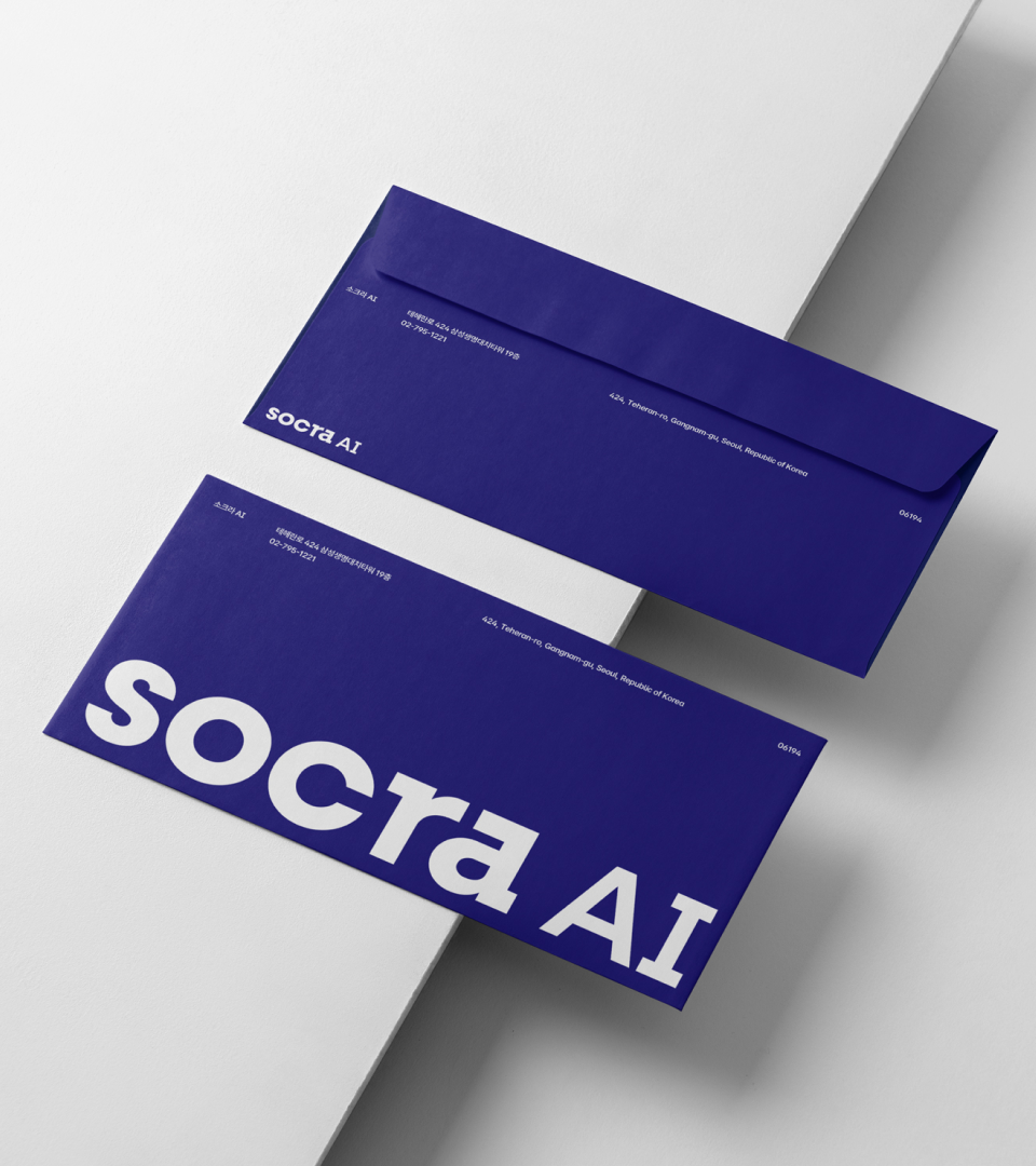
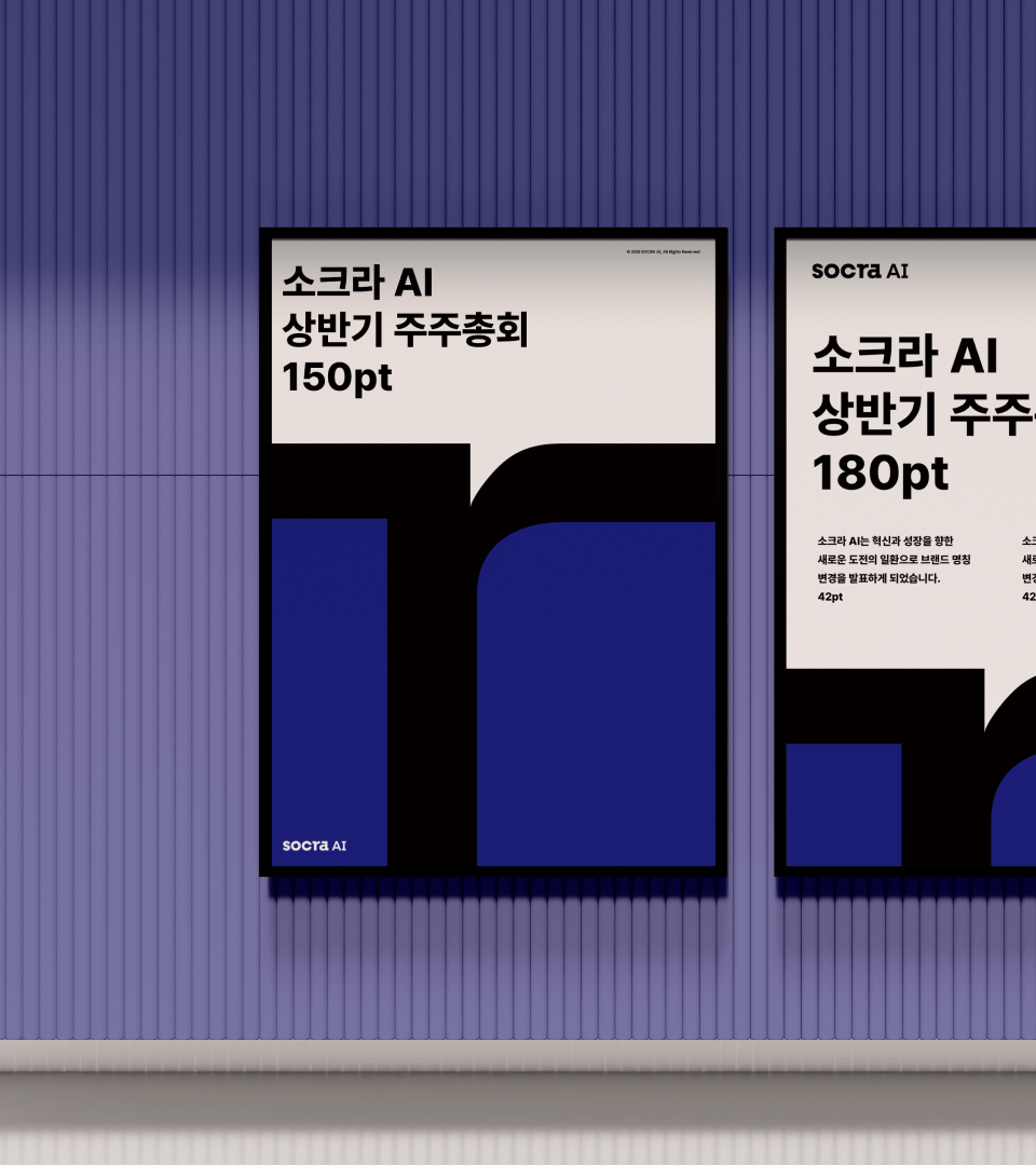
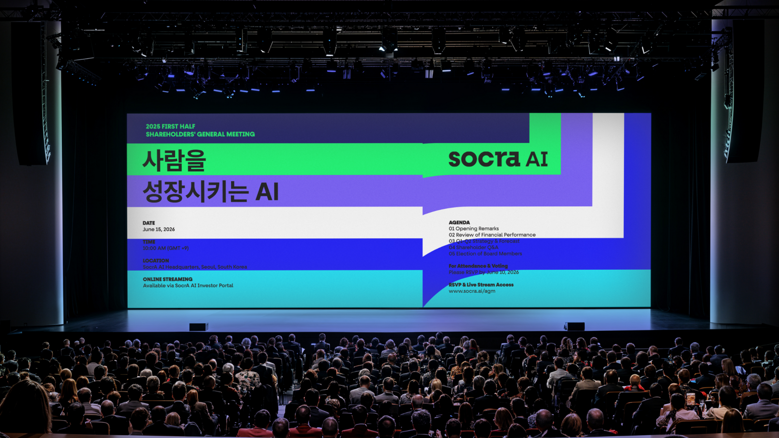
표기 체계를 로고, 컬러, 타이포그래피, 그리드와 연결하고 사내 포스터, 사원증, 스티커팩, PPT 등 내부 접점에 적용했습니다. 구성원이 직접 사용하는 매체부터 일관성을 확보해 사명 변경이 실제 조직 경험과 외부 커뮤니케이션으로 자연스럽게 이어지도록 했습니다.The notation system was linked to logo, colour, typography and grid, then applied to internal touchpoints including office posters, employee ID cards, sticker packs and presentation decks. Starting consistency with the media employees handle themselves let the name change flow naturally into organisational experience and outward communication.
프로젝트의 의미What It Means
SOCRA AI 브랜딩은 ‘새 이름을 만드는 일’보다 ‘모두가 같은 방식으로 새 이름을 사용하게 만드는 일’에 초점을 맞췄습니다. 브랜드 아키텍처와 표기 규칙, 내부 적용물을 하나의 운영 시스템으로 연결한 프로젝트입니다.SOCRA AI branding focused less on making a new name and more on getting everyone to use it the same way. Brand architecture, notation rules and internal applications were connected as a single operating system.
작업 범위Scope
- Corporate Rebranding
- Brand Architecture
- Naming / Notation Rules
- Logo & Visual System
- Typography / Grid
- Internal Posters
- Employee ID
- Sticker Pack
- PPT System