슬릿 브랜드 디자인SLIT Brand Design
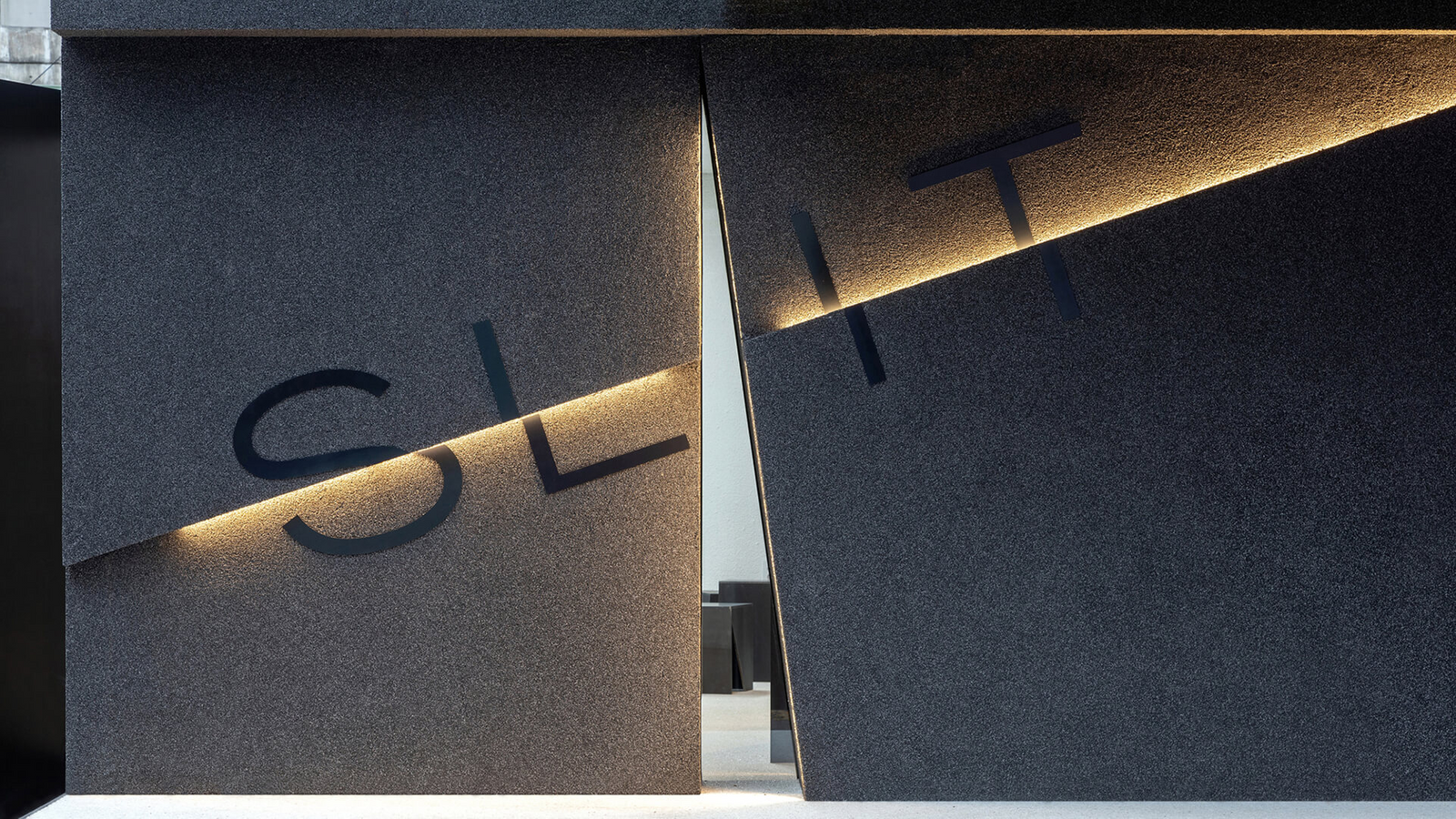
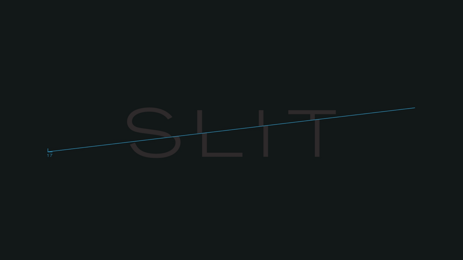
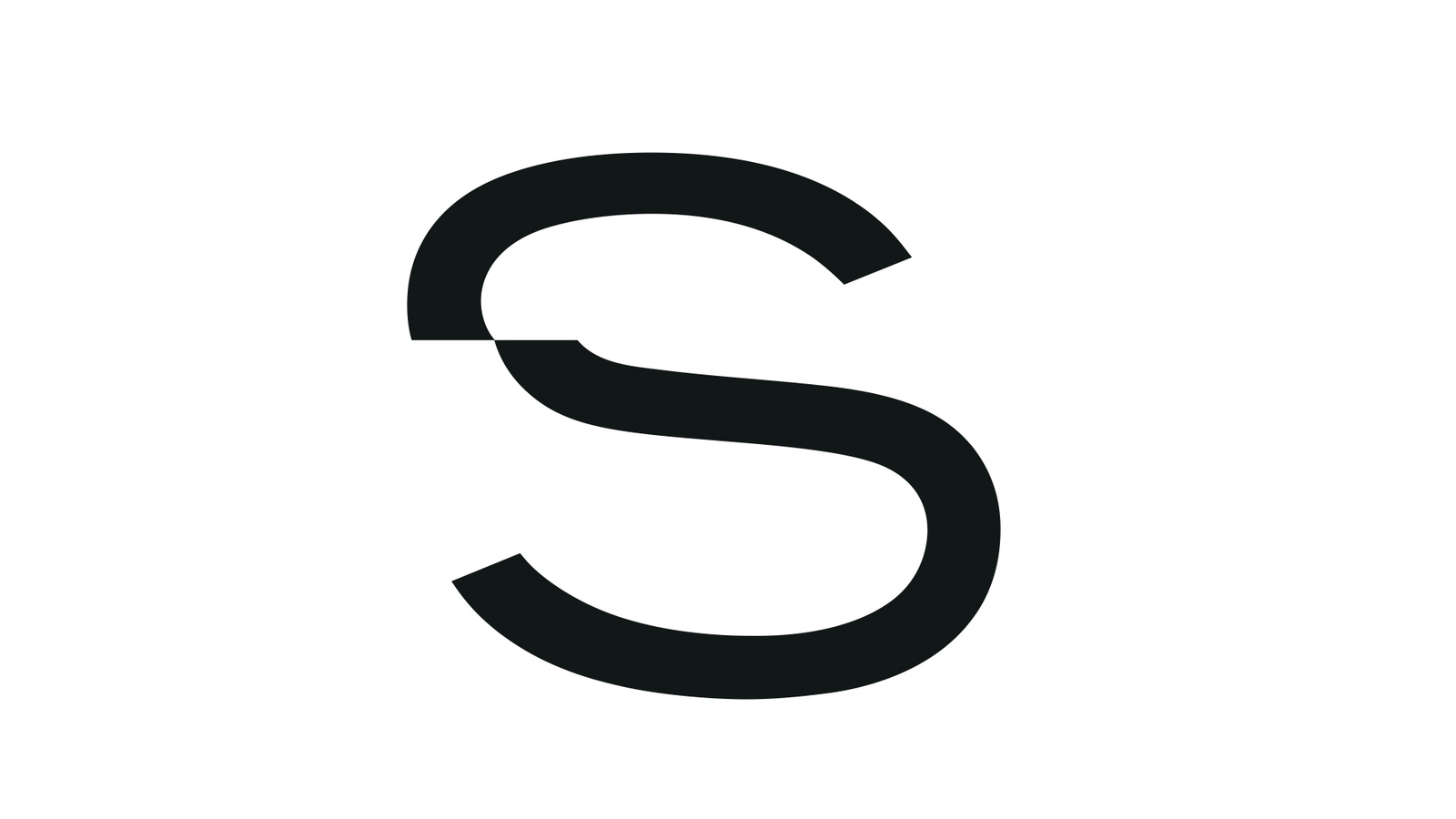
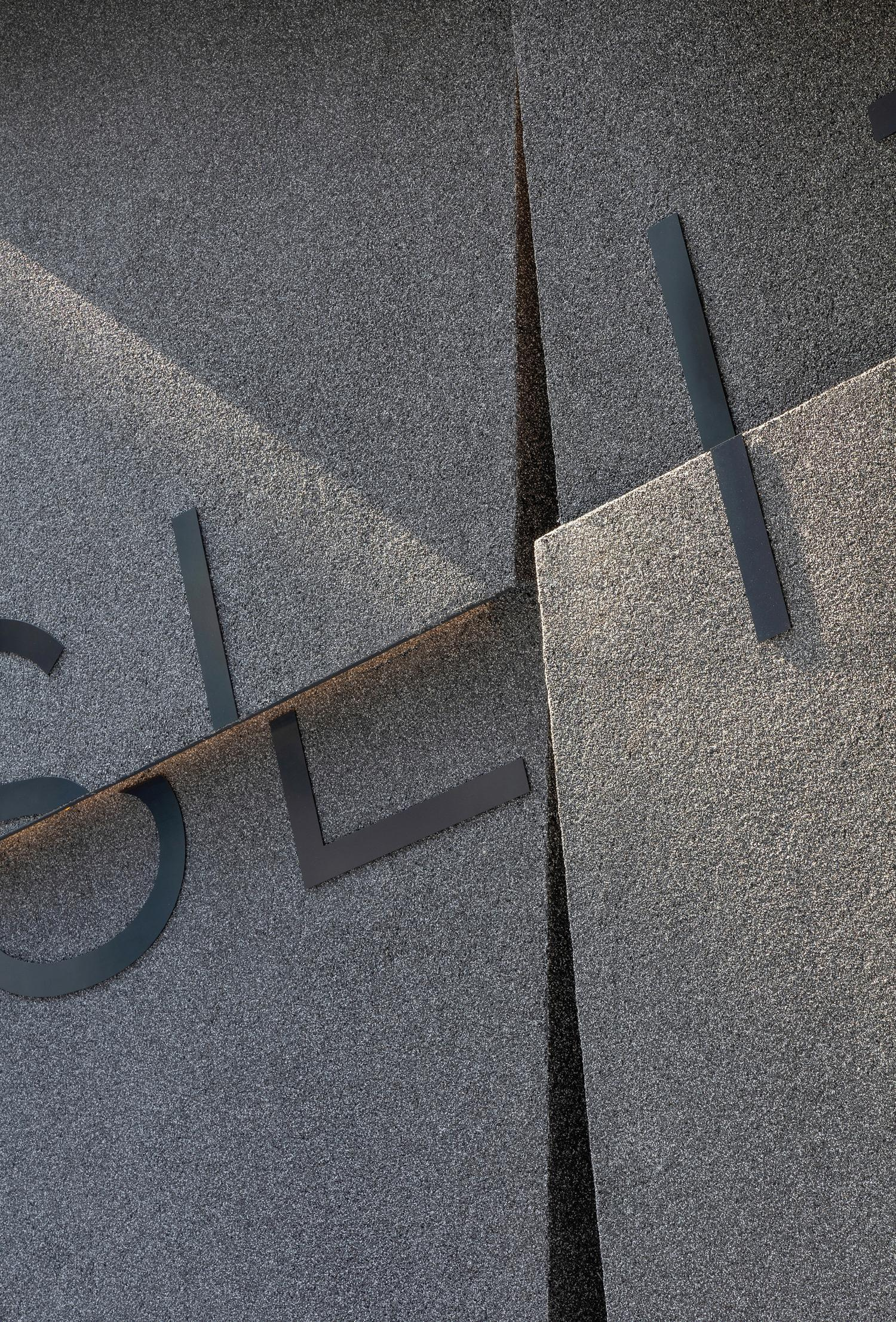
‘SLIT’이라는 단어가 가진 좁고 날카로운 틈의 이미지를 로고와 그래픽 시스템의 원리로 사용했습니다.The narrow, sharp opening held inside the word SLIT became the operating principle of the logo and the graphic system.
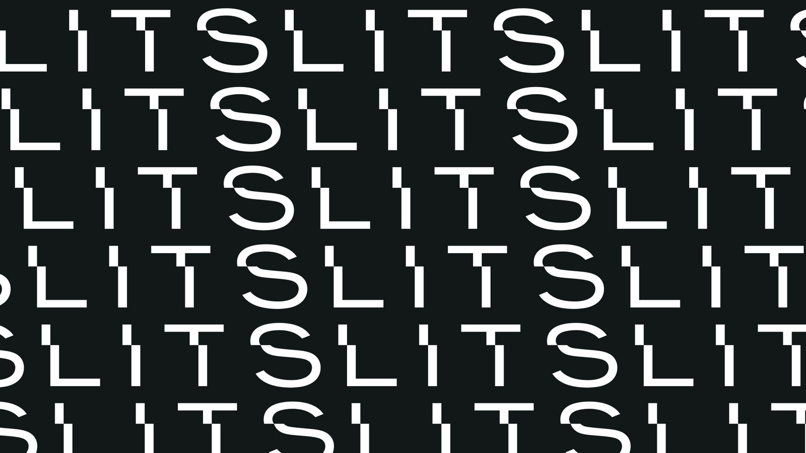
글자를 부분적으로 절단하고 빛과 그림자의 대비를 강조해, 블랙&화이트 중심의 절제되고 시크한 카페 아이덴티티를 설계했습니다.Letters are partially cut and the contrast of light and shadow is pushed, giving a restrained black and white cafe identity.
배경Background
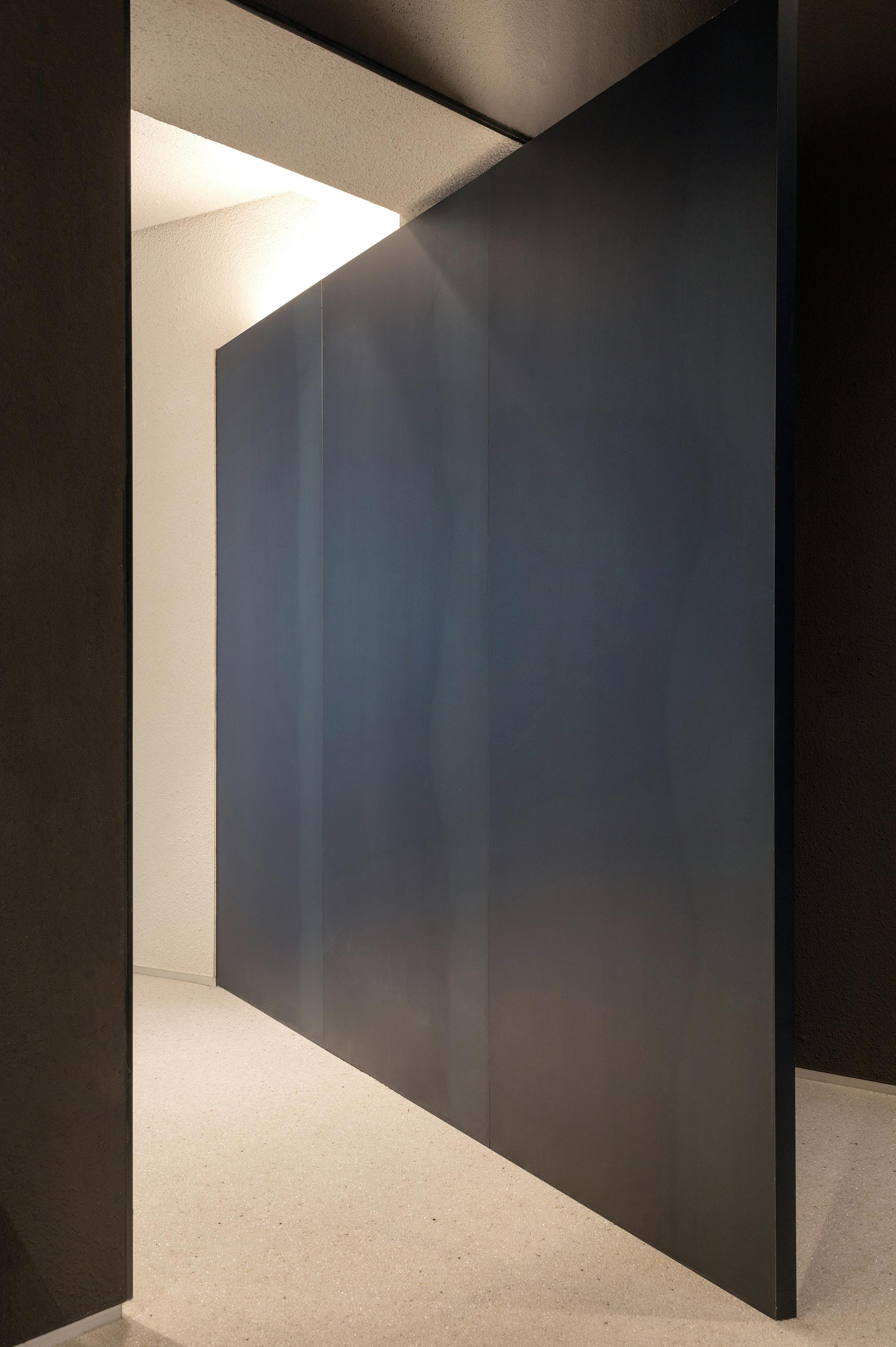
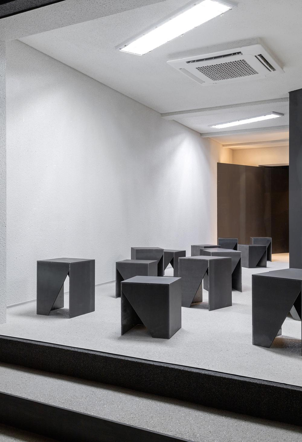
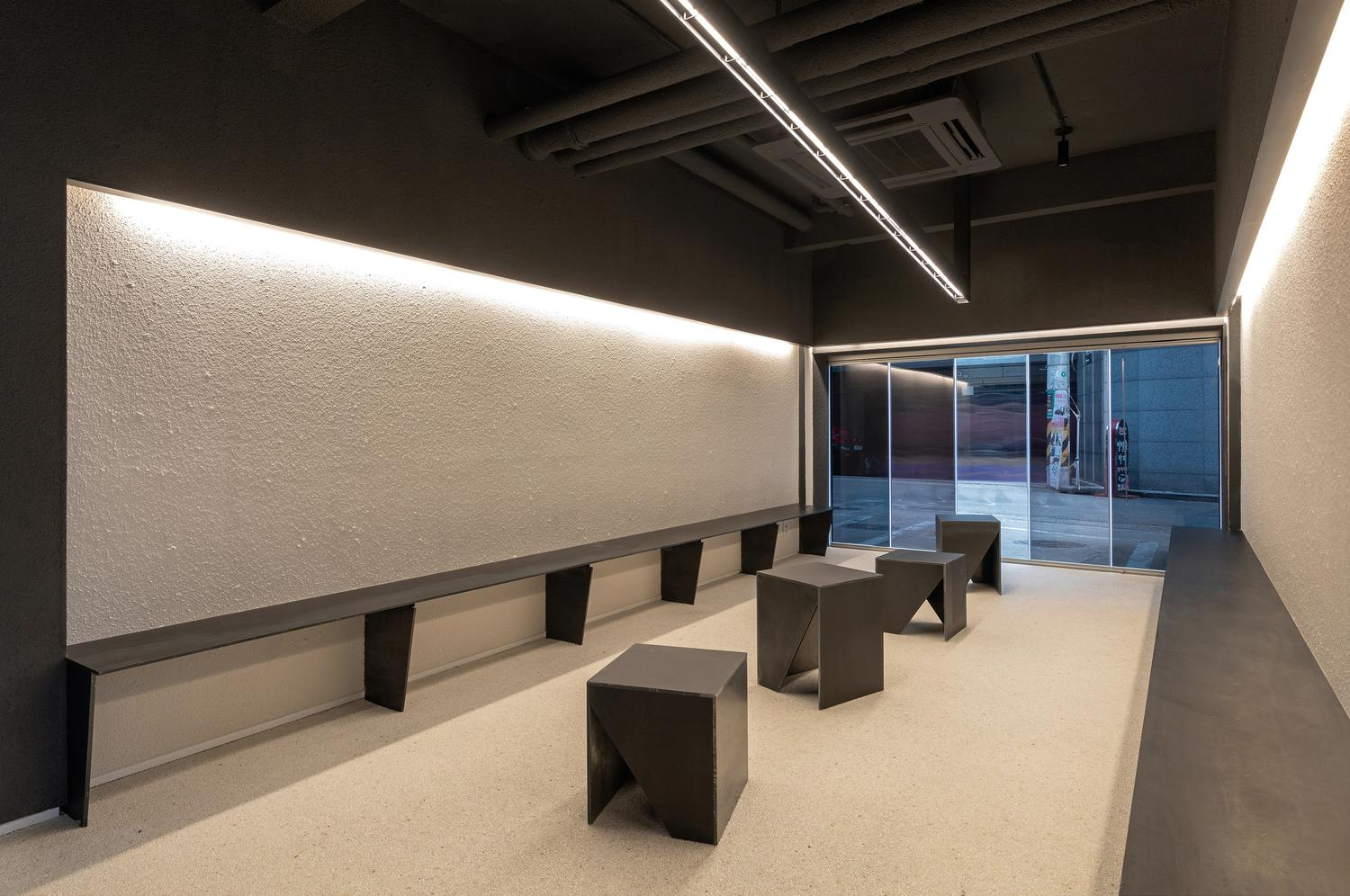
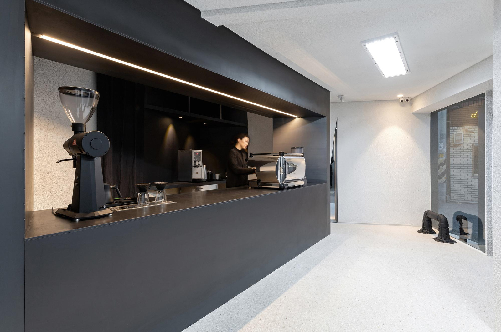
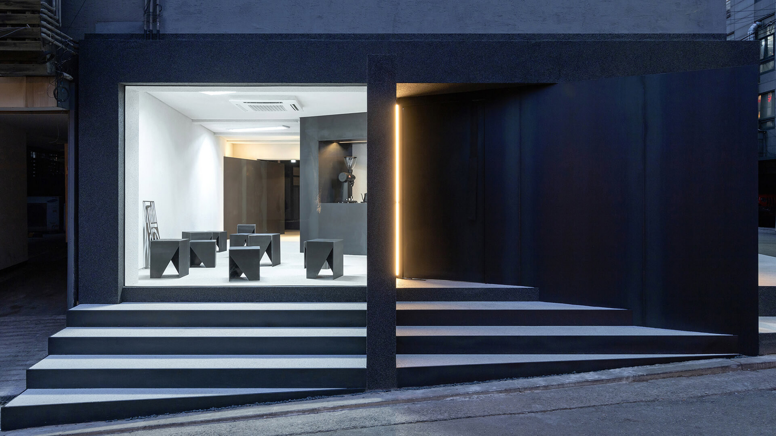
SLIT는 공간의 빛과 틈, 절제된 분위기가 중요한 카페 프로젝트였습니다. 브랜드 아이덴티티는 공간 설계팀과 협업하되, 공간 디자인 자체가 아니라 시각 아이덴티티와 그래픽 접점을 담당했습니다.SLIT was a cafe project where the light, the gaps and the restraint of the space mattered. The brand identity was developed alongside the spatial design team, taking on the visual identity and the graphic touchpoints rather than the space itself.
과제The Challenge
카페의 분위기를 그래픽이 과도하게 설명하지 않으면서도, 이름을 보는 순간 ‘틈’이라는 개념을 직관적으로 느끼게 해야 했습니다. 컵, 슬리브, 메뉴, 패키지처럼 크기와 재질이 다른 접점에서 동일한 인상을 유지할 필요가 있었습니다.The graphics could not over explain the atmosphere of the cafe, yet the idea of a gap had to be felt the moment you see the name. The same impression had to hold across cups, sleeves, menus and packaging, all at different sizes and in different materials.
디자인 접근Design Approach
문자의 일부를 날카롭게 잘라내거나 분리해 SLIT의 의미를 글자 구조 자체에 반영했습니다. 블랙과 화이트의 강한 대비, 견고하고 날카로운 타이포그래피를 사용해 빛이 좁은 틈을 통과할 때 생기는 명암을 시각적으로 연상시키도록 했습니다.Parts of the letters were sharply cut or separated so the meaning of SLIT sits in the structure of the type itself. Strong black and white contrast with firm, sharp typography recalls the light and shade created when light passes through a narrow opening.
비주얼·경험 시스템Visual / Experience System
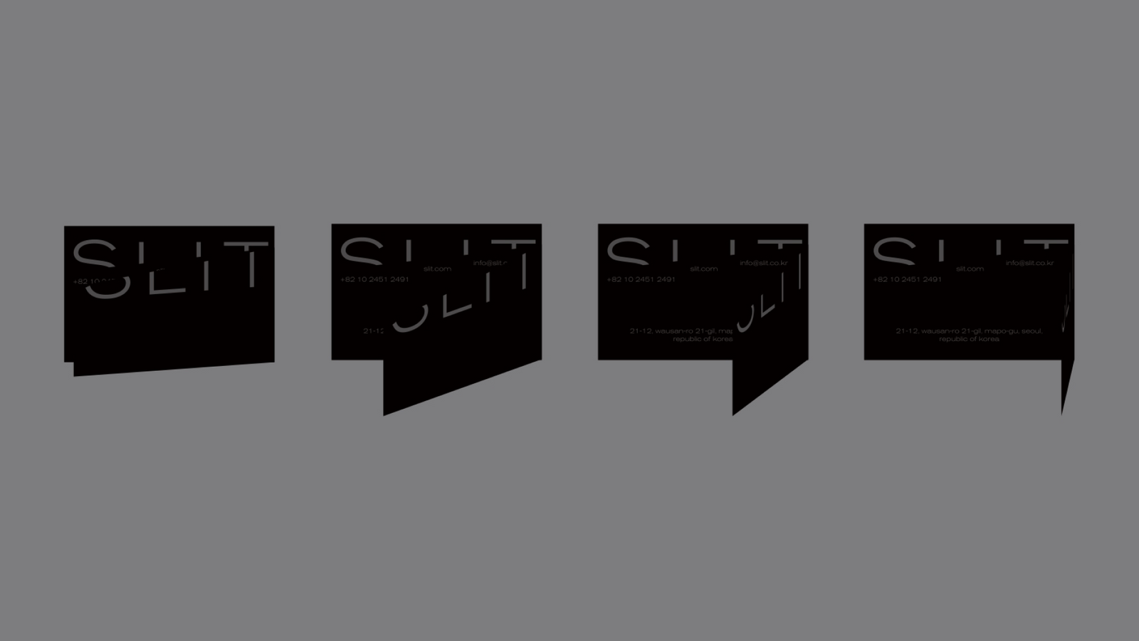
컵과 슬리브, 테이크아웃 패키지, 절개감을 활용한 메뉴, 티셔츠, 머그, 포스터, SNS 그래픽으로 확장했습니다. 각 매체의 형태 자체를 ‘slit’의 개념과 연결해 단순히 로고를 반복하지 않는 브랜드 경험을 만들었습니다.The system extended to cups and sleeves, takeaway packaging, menus using the sense of a cut, t shirts, mugs, posters and social graphics. The form of each medium was tied to the idea of the slit, building a brand experience that does more than repeat a logo.
프로젝트의 의미What It Means
SLIT는 공간의 콘셉트를 그대로 그래픽으로 복사하지 않고, 이름이 가진 ‘틈’의 조형 원리를 문자와 응용물에 공유한 프로젝트입니다. 공간 디자인과 시각 아이덴티티가 각자의 역할을 유지하면서도 하나의 경험으로 연결되도록 했습니다.SLIT shared the formal principle of the gap inside the name across the letters and the applications rather than copying the concept of the space into graphics. Spatial design and visual identity kept their own roles while connecting as one experience.
작업 범위Scope
- Brand Identity
- Logotype
- Black & White System
- Packaging
- Cup / Sleeve
- Menu
- Merchandise
- Poster / Social Graphics