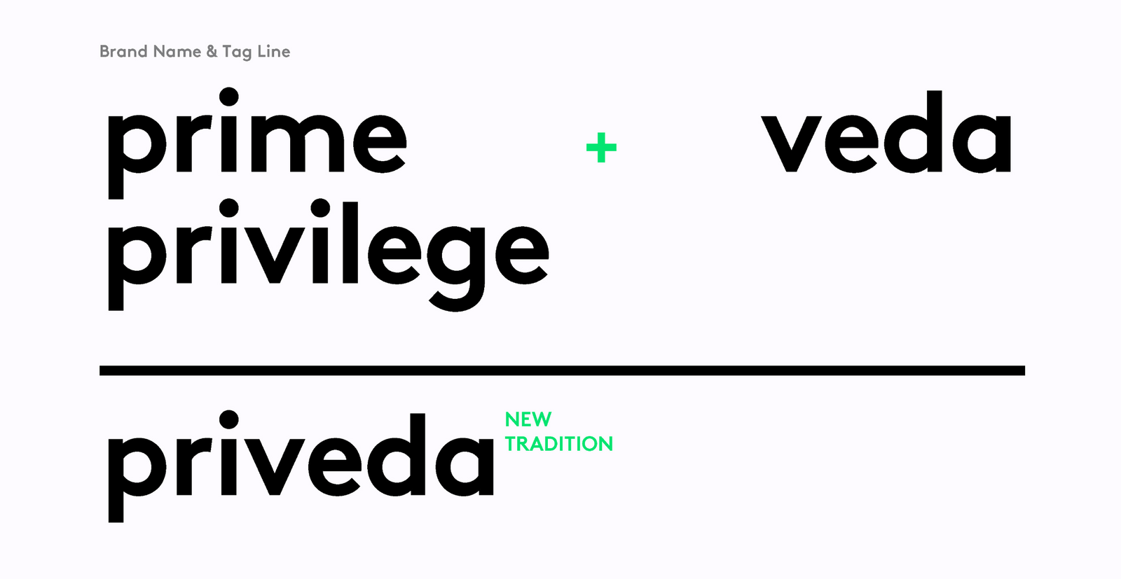
프리베다 브랜드 디자인Priveda Brand Design
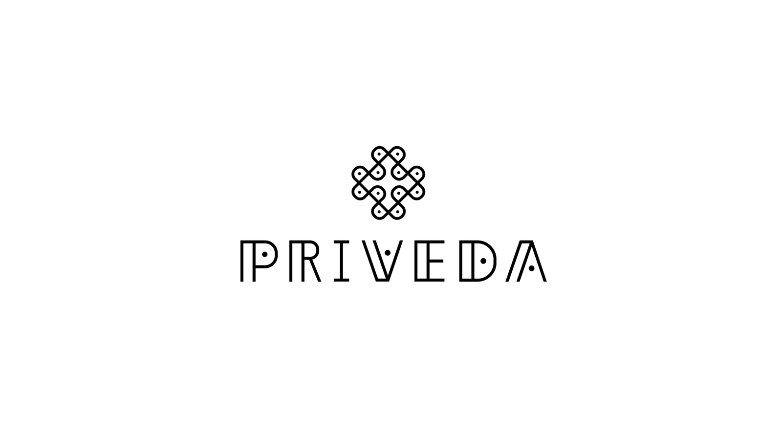
인도의 Ayurveda에서 출발한 자연 건강·뷰티 브랜드가 전통적 이미지를 그대로 복제하지 않고 현대적인 글로벌 시장에서도 자연스럽게 읽히도록 아이덴티티를 설계했습니다.A natural health and beauty brand rooted in Indian Ayurveda was given an identity that reads naturally in a contemporary global market without copying traditional imagery.
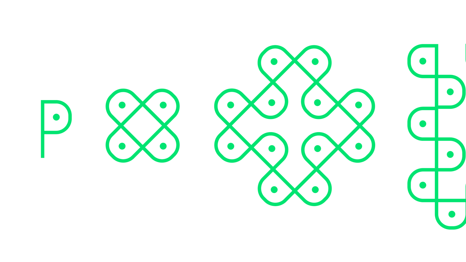
기하학적 패턴과 전통 모티프를 단순화하고, 어스 톤·허브 그린·골든 옐로우로 자연과 활력을 표현했습니다.Geometric patterns and traditional motifs were simplified, and earth tone, herb green and golden yellow express nature and vitality.
배경Background
Priveda는 Ayurveda의 철학과 허브 문화에서 영감을 받은 브랜드로, 인도적 기원을 유지하면서도 특정 지역의 전통 상품처럼 보이지 않는 현대적인 인상이 필요했습니다.Priveda draws on the philosophy of Ayurveda and its herbal culture, and needed a contemporary impression that keeps the Indian origin without looking like a regional traditional product.
과제The Challenge
전통 문화에서 영감을 받은 브랜드는 상징을 직접적으로 차용할수록 진부하거나 장식적으로 보일 수 있습니다. 반대로 모든 전통적 단서를 지우면 브랜드의 출발점이 사라집니다. 기원의 맥락과 글로벌 사용성 사이의 균형이 핵심이었습니다.Brands inspired by traditional culture look dated or decorative the more directly they borrow symbols. Erase every traditional clue and the starting point of the brand disappears. The balance between the context of origin and global usability was the core question.
디자인 접근Design Approach
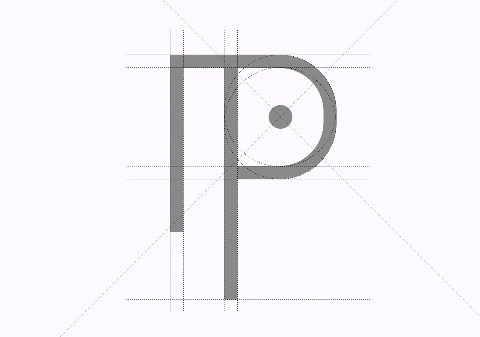
Ayurveda에서 관찰되는 기하학적 구조와 반복 패턴을 연구해 핵심 형태만 추출하고, 이를 더 단순한 현대적 기호로 재구성했습니다. 시각적 장식보다 구조와 비례를 중심으로 전통 모티프를 번역했습니다.Geometric structures and repeating patterns observed in Ayurveda were studied, the essential forms extracted, and those forms recomposed as simpler contemporary signs. Traditional motifs were translated through structure and proportion rather than visual decoration.
비주얼·경험 시스템Visual / Experience System
자연을 연상시키는 Earth Tone, Herb Green, Golden Yellow를 중심으로 컬러 체계를 구성해 건강·허브·활력의 인상을 만들었습니다. 브랜드가 패키지와 제품 커뮤니케이션에 확장될 수 있도록 반복 가능한 패턴과 그래픽 원칙을 함께 설계했습니다.A colour system built on earth tone, herb green and golden yellow creates an impression of health, herbs and vitality. Repeatable patterns and graphic principles were designed alongside it so the brand extends into packaging and product communication.
프로젝트의 의미What It Means
Priveda는 전통 이미지를 그대로 복제하지 않고, Ayurveda의 기하 구조와 색의 원리를 현대적인 제품 환경에 맞게 번역한 프로젝트입니다. 문화적 기원을 유지하면서도 다양한 제품과 커뮤니케이션에 확장할 수 있는 브랜드 기반을 만들었습니다.Priveda translated the geometric structure and colour principles of Ayurveda for a contemporary product environment rather than reproducing traditional imagery. It keeps the cultural origin while building a brand base that extends across many products and communications.
작업 범위Scope
- Brand Identity
- Geometric Motif
- Pattern System
- Color System
- Packaging / Product Graphic Direction