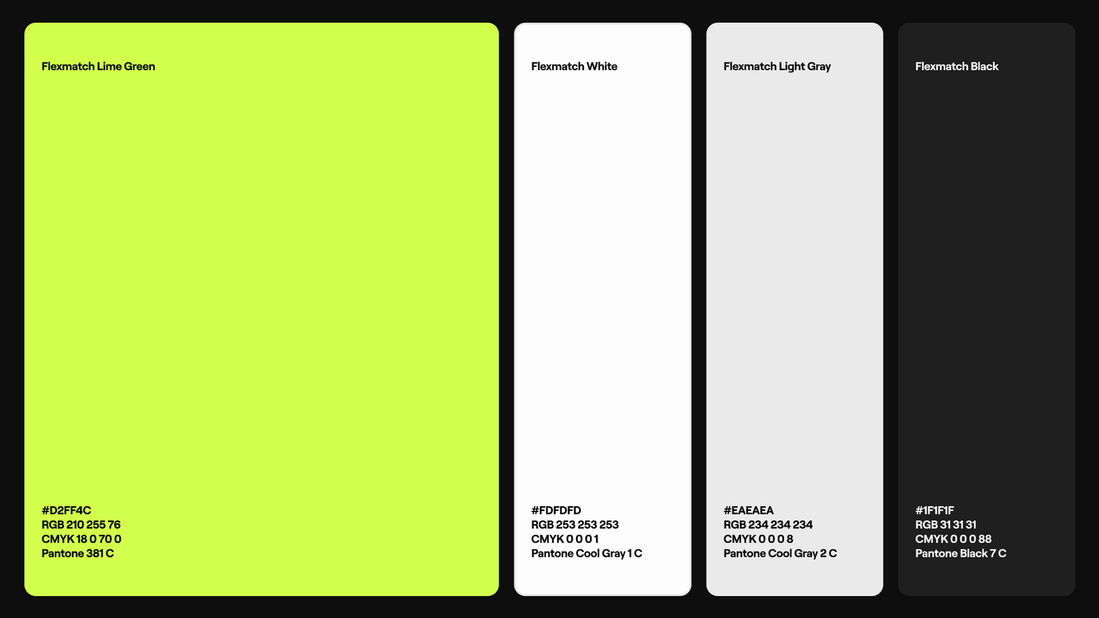
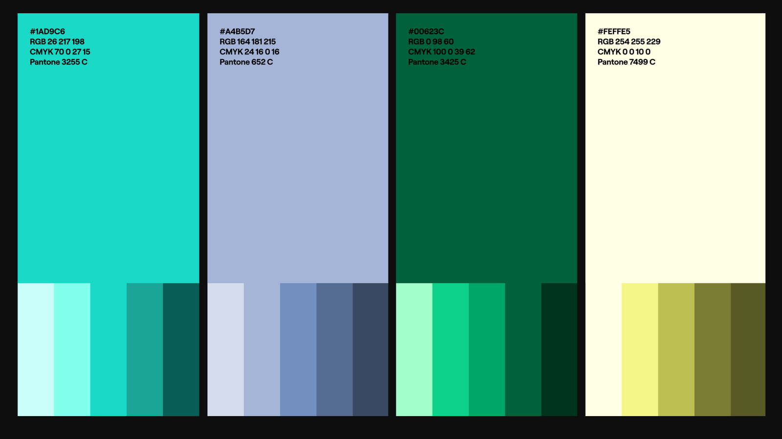
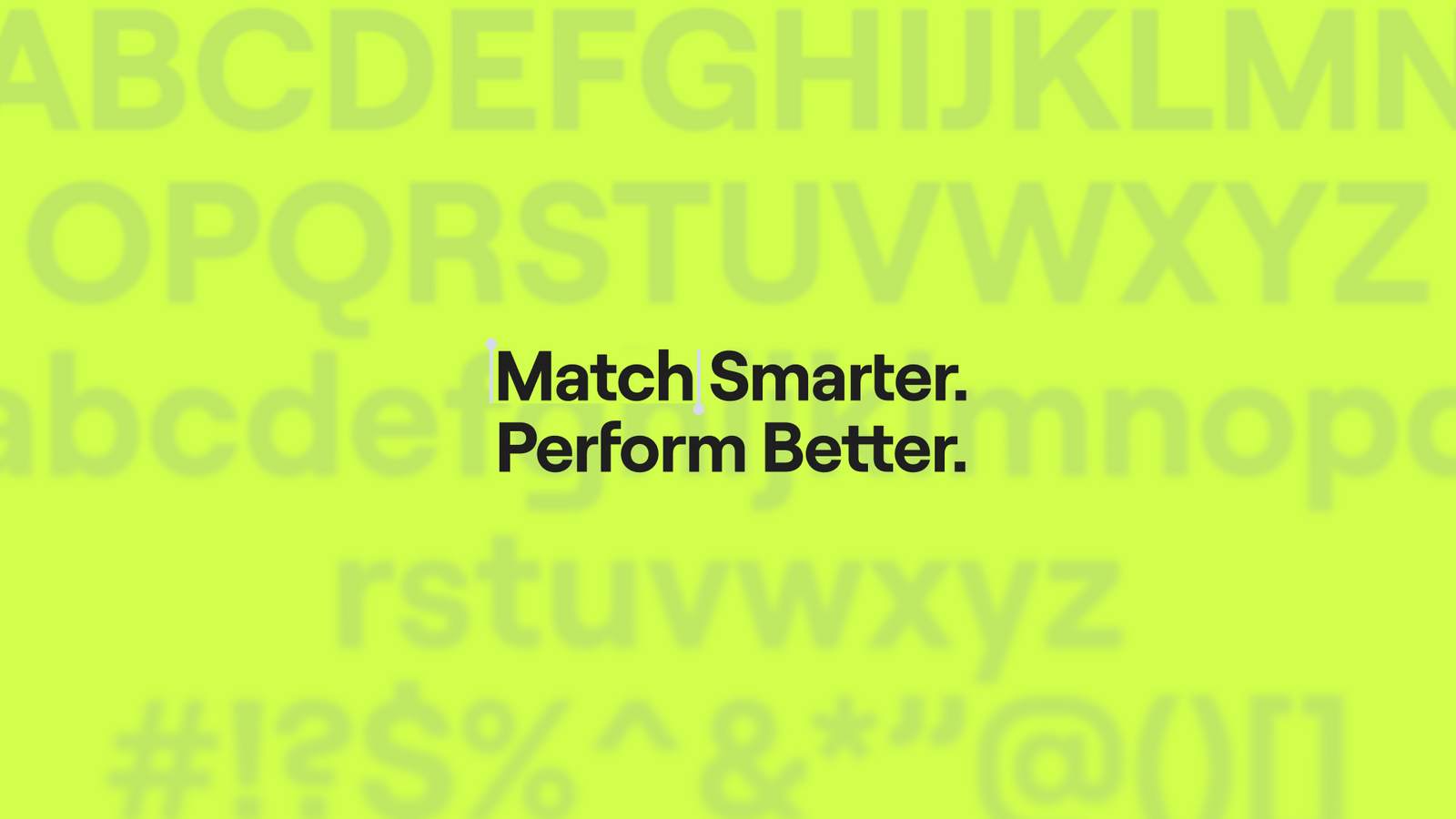
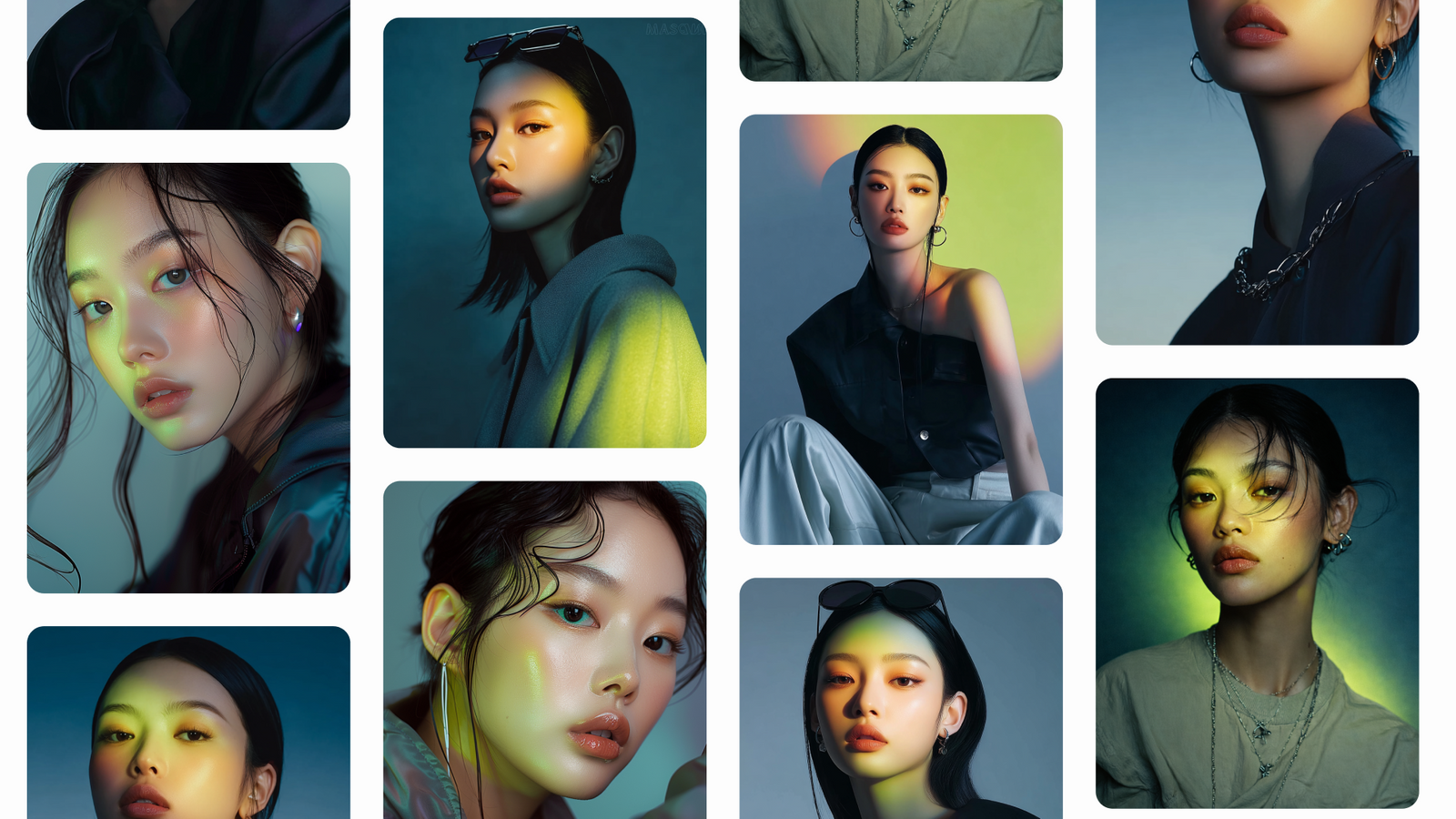
플렉스매치 리브랜딩Flexmatch Rebranding
크리에이터 탐색과 매칭을 ‘어디를 봐야 할지 모르는 상태에서 방향을 발견하는 경험’으로 해석했습니다.Creator discovery and matching was read as the experience of finding a direction when you do not know where to look.
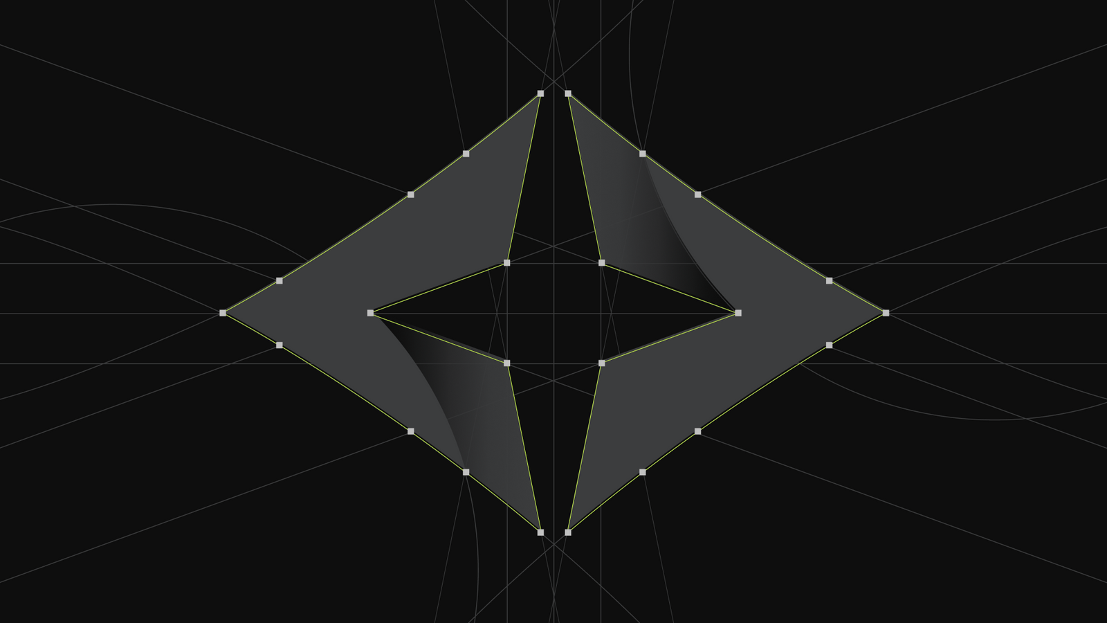
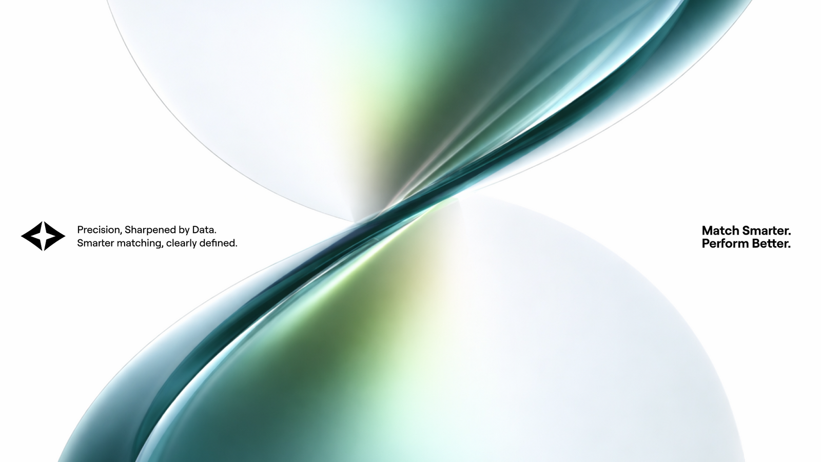
방향을 찾는 컴퍼스와 가능성의 발견을 상징하는 스파클을 중심으로, Flexmatch의 아이덴티티를 랜딩페이지와 크리에이터 커뮤니케이션까지 연결했습니다.A compass for orientation and a sparkle for the moment of discovery carry the Flexmatch identity through the landing pages and creator communications.
배경Background
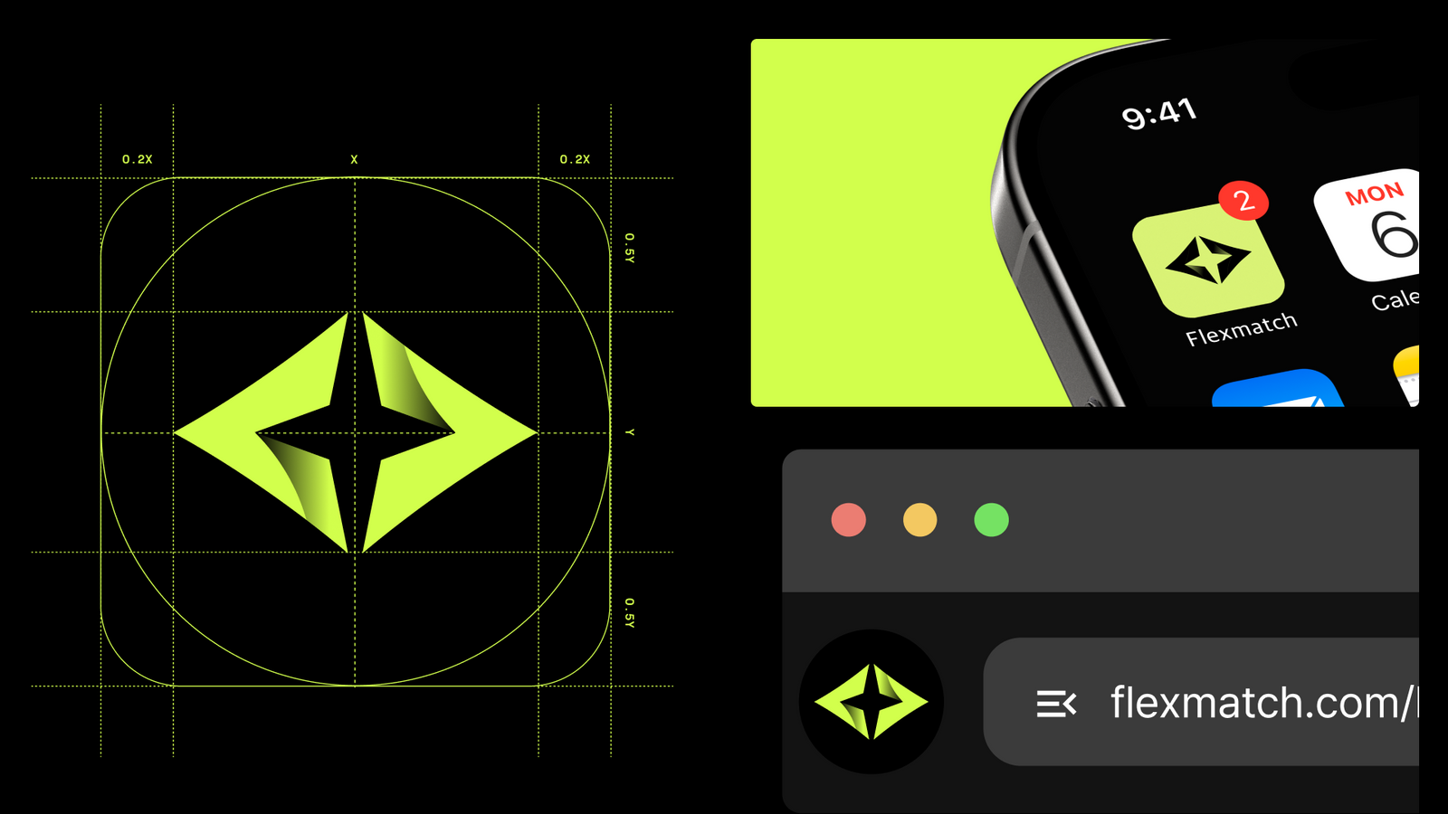
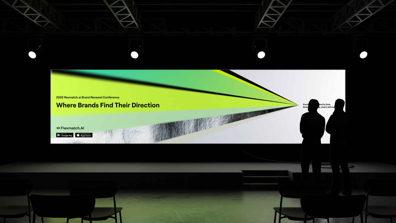
Flexmatch는 브랜드와 크리에이터의 탐색·매칭을 효율화하는 서비스입니다. 리브랜딩 이후에는 새로운 아이덴티티가 실제 디지털 접점에서 어떻게 작동하는지 보여주는 것이 중요했습니다. 기능을 설명하는 데 그치지 않고 사용자가 더 빠르게 후보를 발견하고 연결되는 흐름을 시각적으로 이해할 수 있도록 BX와 화면 경험을 함께 설계했습니다.Flexmatch makes discovery and matching between brands and creators more efficient. After the rebrand, the important thing was showing how the new identity actually behaves at digital touchpoints. Rather than explaining features, the BX and the screen experience were designed together so users can see the flow of finding candidates faster and connecting with them.
과제The Challenge
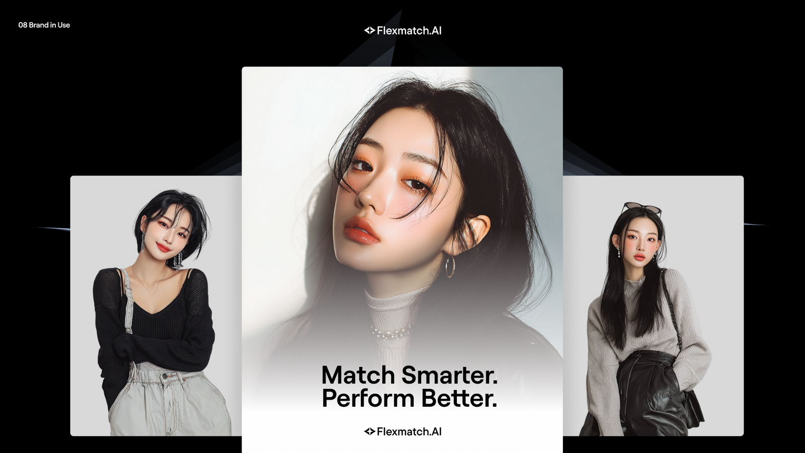
AI 서비스는 기술 자체를 전면에 내세울수록 비슷한 시각 언어로 수렴하기 쉽습니다. Flexmatch에는 ‘AI를 사용한다’는 설명보다 브랜드가 적합한 크리에이터를 찾는 과정이 얼마나 쉽고 직관적으로 바뀌는지를 보여주는 것이 더 중요했습니다. 인물 이미지가 강한 콘텐츠 환경에서도 브랜드 그래픽이 경쟁하지 않고 탐색과 매칭의 구조를 정리해야 했습니다.AI services converge on the same visual language the harder they push the technology itself. What mattered for Flexmatch was not saying that AI is involved but showing how much easier and more intuitive it becomes to find the right creator. In a content environment full of strong portraiture, the brand graphics had to organise the structure of search and matching rather than compete with the faces.
디자인 접근Design Approach
컴퍼스는 탐색의 기준과 방향을, 스파클은 적합한 상대를 발견했을 때의 직관적인 확신을 상징합니다. 두 요소를 카드, 배지, 데이터 구조, 크리에이터 키비주얼과 결합해 ‘탐색 → 발견 → 연결’의 흐름이 설명문보다 화면의 구조와 움직임에서 먼저 느껴지도록 했습니다.The compass stands for the criteria and direction of a search, the sparkle for the intuitive certainty of finding the right match. Both were combined with cards, badges, data structures and creator key visuals so the flow of search, discovery and connection is felt first through the structure and movement of the screen rather than through explanatory copy.
비주얼·경험 시스템Visual / Experience System
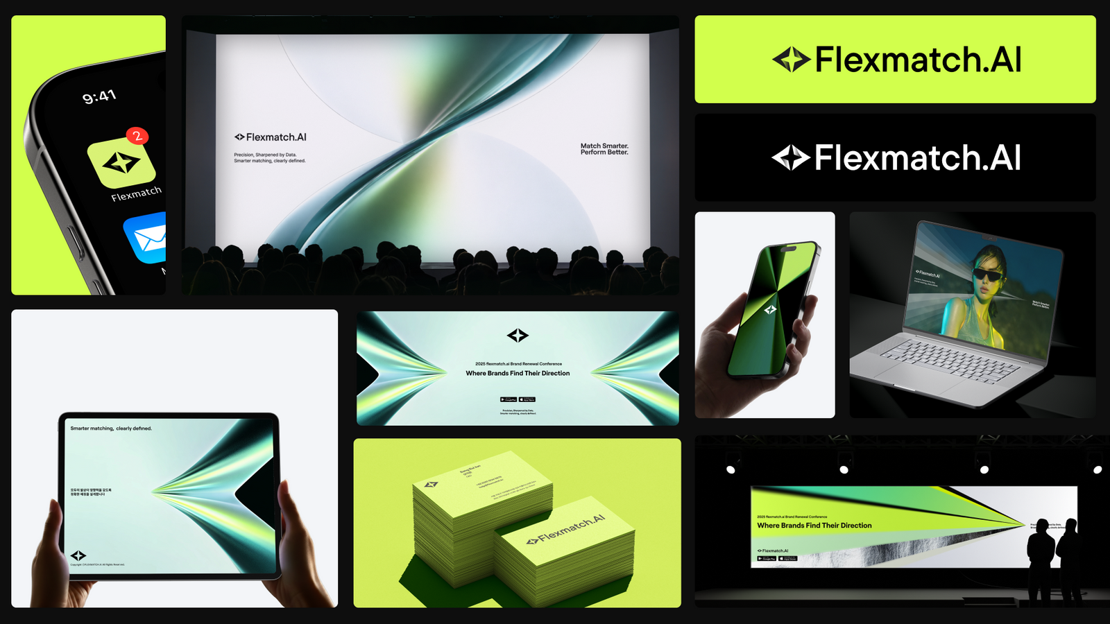
메인 PC 랜딩을 기준으로 서비스 소개서, 크리에이터용 모바일 랜딩, About Us에 동일한 그래픽 문법을 확장했습니다. 주요 스크롤 전환과 카드 움직임, 키비주얼 모션은 구현 참고용 프로토타입으로 정리해 디자인 의도와 개발 구현 사이의 간극을 줄였습니다.Starting from the main desktop landing page, the same graphic grammar was extended to the service deck, the creator mobile landing page and About Us. Major scroll transitions, card movement and key visual motion were documented as reference prototypes for implementation, closing the gap between design intent and engineering.
프로젝트의 의미What It Means
Flexmatch는 기술 카테고리보다 사용자가 얻게 되는 탐색의 속도와 발견의 경험을 앞세울 수 있는 브랜드 기반을 갖게 되었습니다. 상징과 인터페이스의 행동을 같은 원리로 연결해 서로 다른 디지털 접점에서도 하나의 서비스 경험이 이어지도록 설계했습니다.Flexmatch now leads with the speed of search and the experience of discovery rather than with a technology category. Symbol and interface behaviour follow the same principle, so one service experience carries through very different digital touchpoints.
작업 범위Scope
- Brand Identity
- Graphic Modules
- Creator Key Visual
- Main PC Landing
- Service Introduction Deck
- Creator Mobile Landing
- About Us
- Interaction Direction / Reference Prototype