탈잉 브랜드 아이덴티티Taling Brand Identity
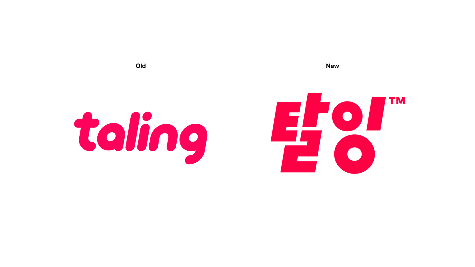
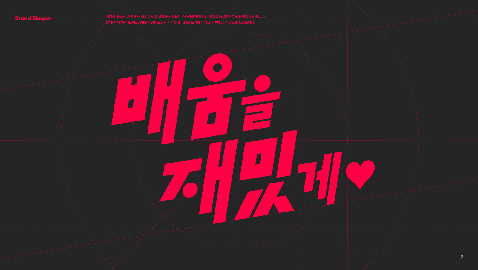
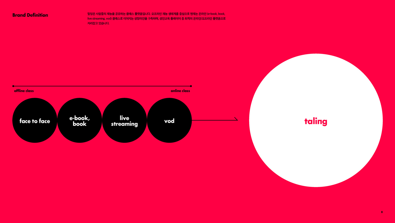
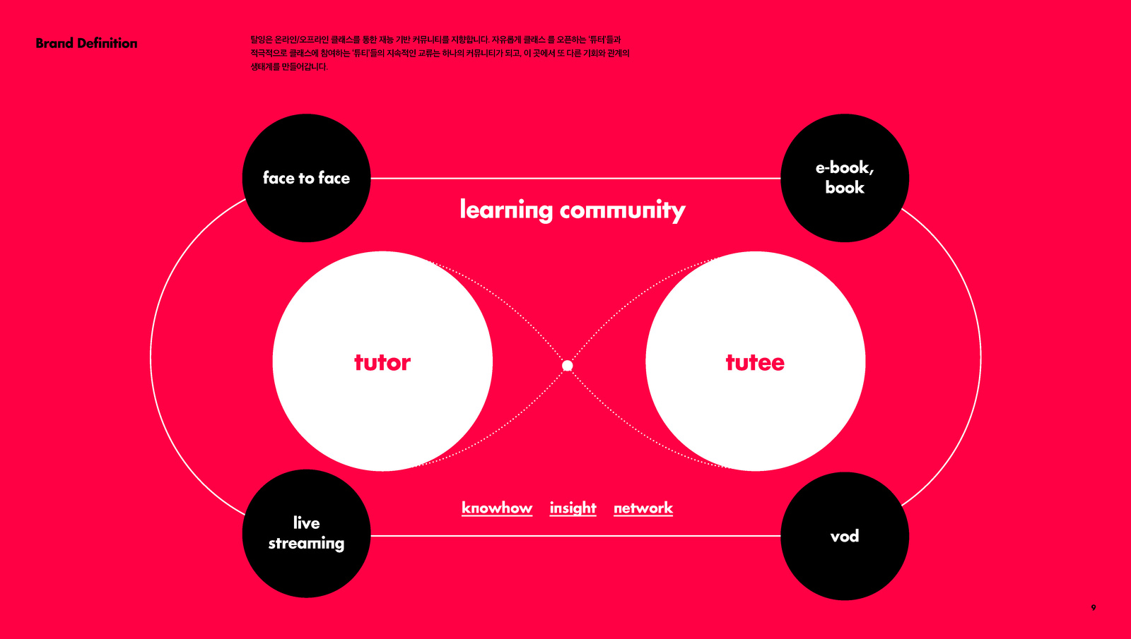
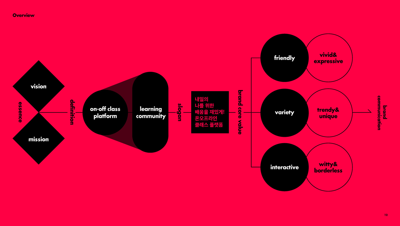
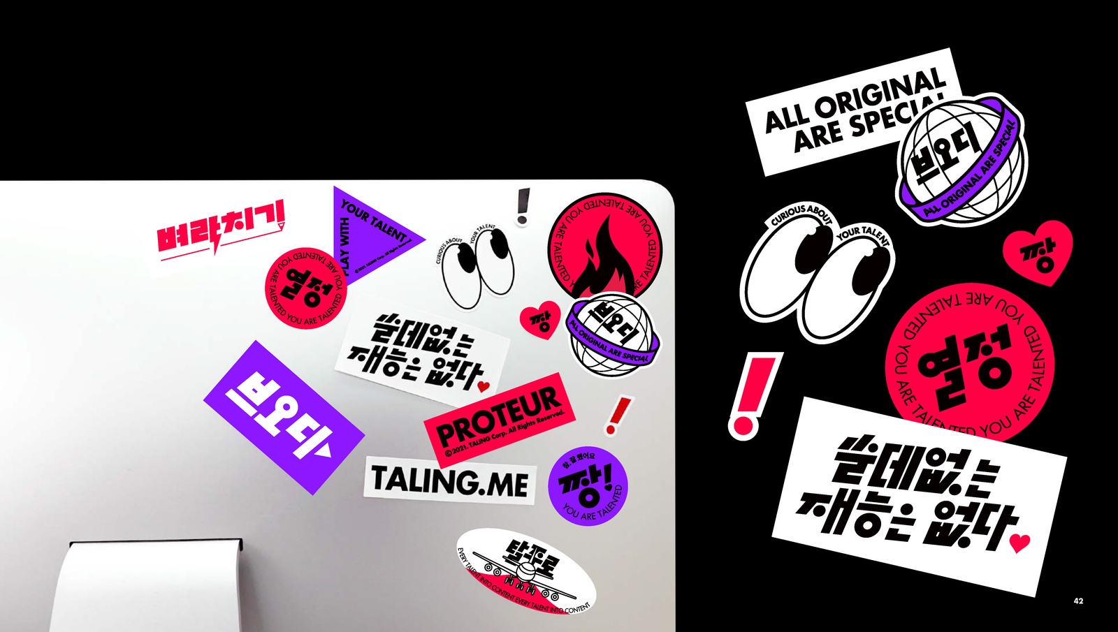
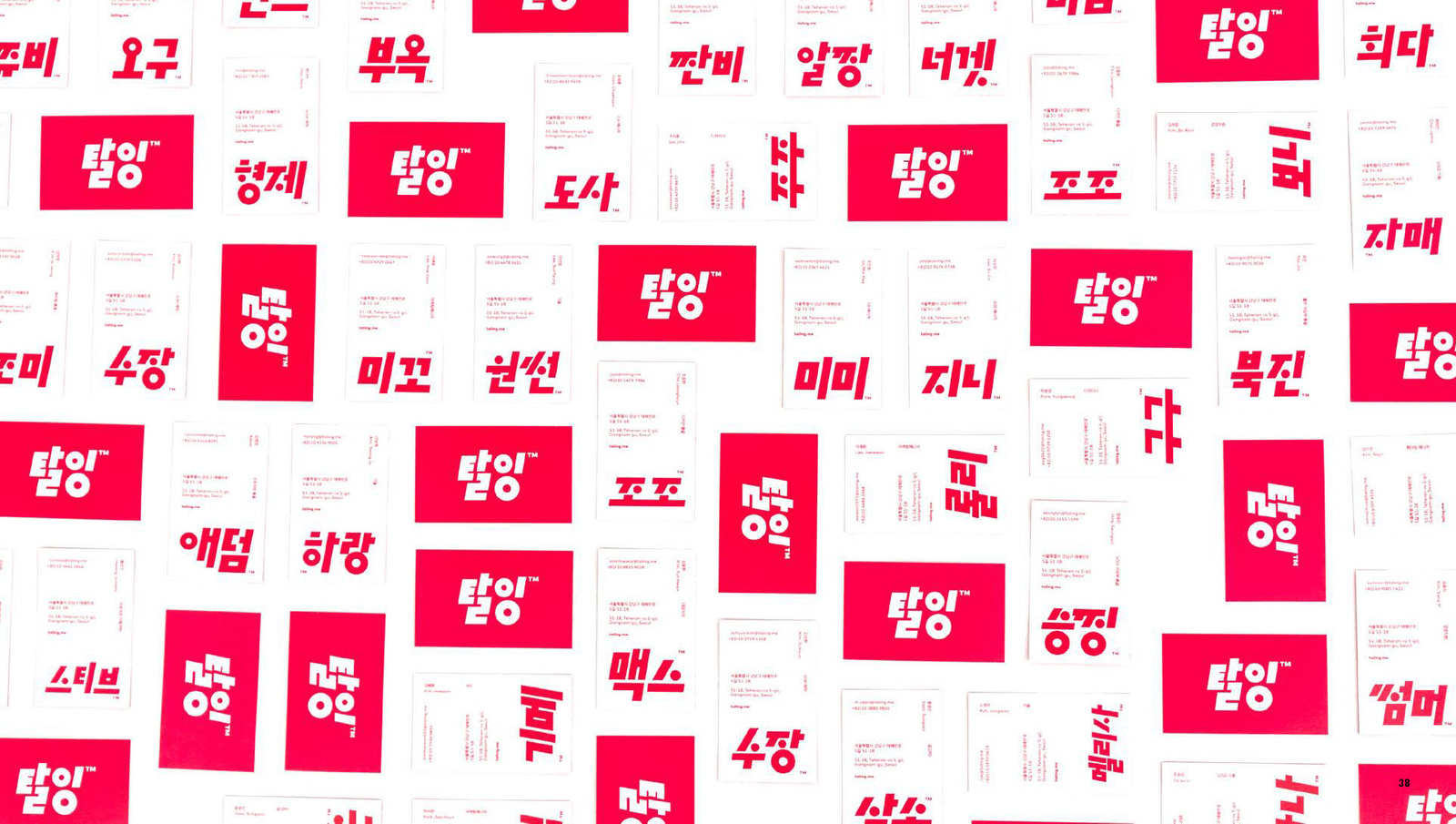
읽기 어려웠던 기존 서비스 이름을 명확한 한글 로고타입으로 재정비하고, 탈잉이 가진 자유로운 배움의 문화를 브랜드 아이덴티티로 정리했습니다.A service name that was hard to read was rebuilt as a clear Korean logotype, and the free culture of learning at Taling was organised into a brand identity.
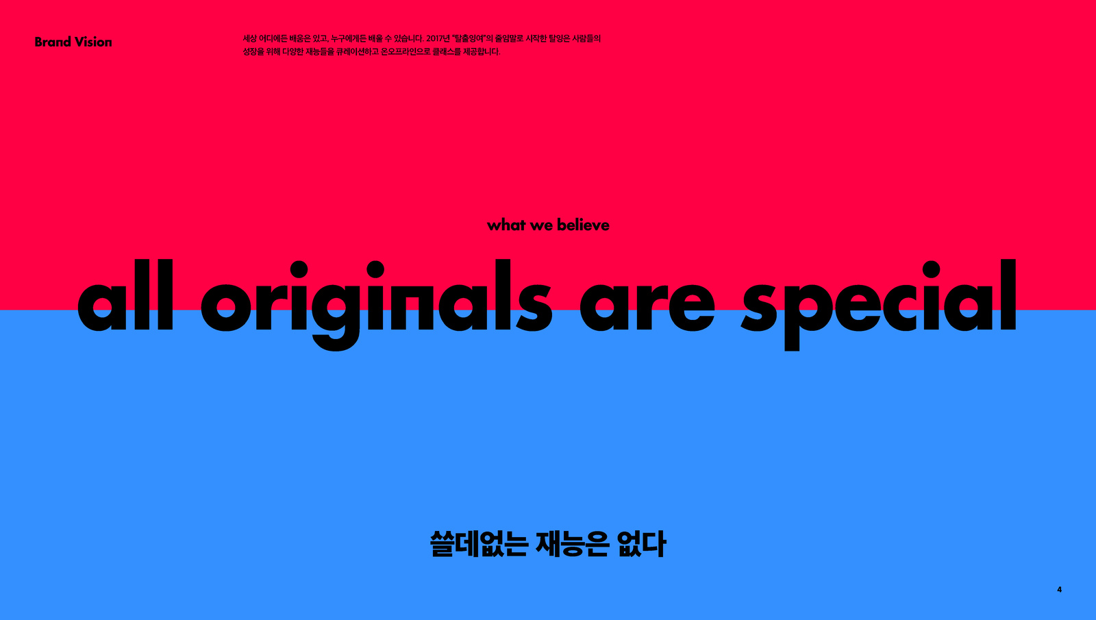
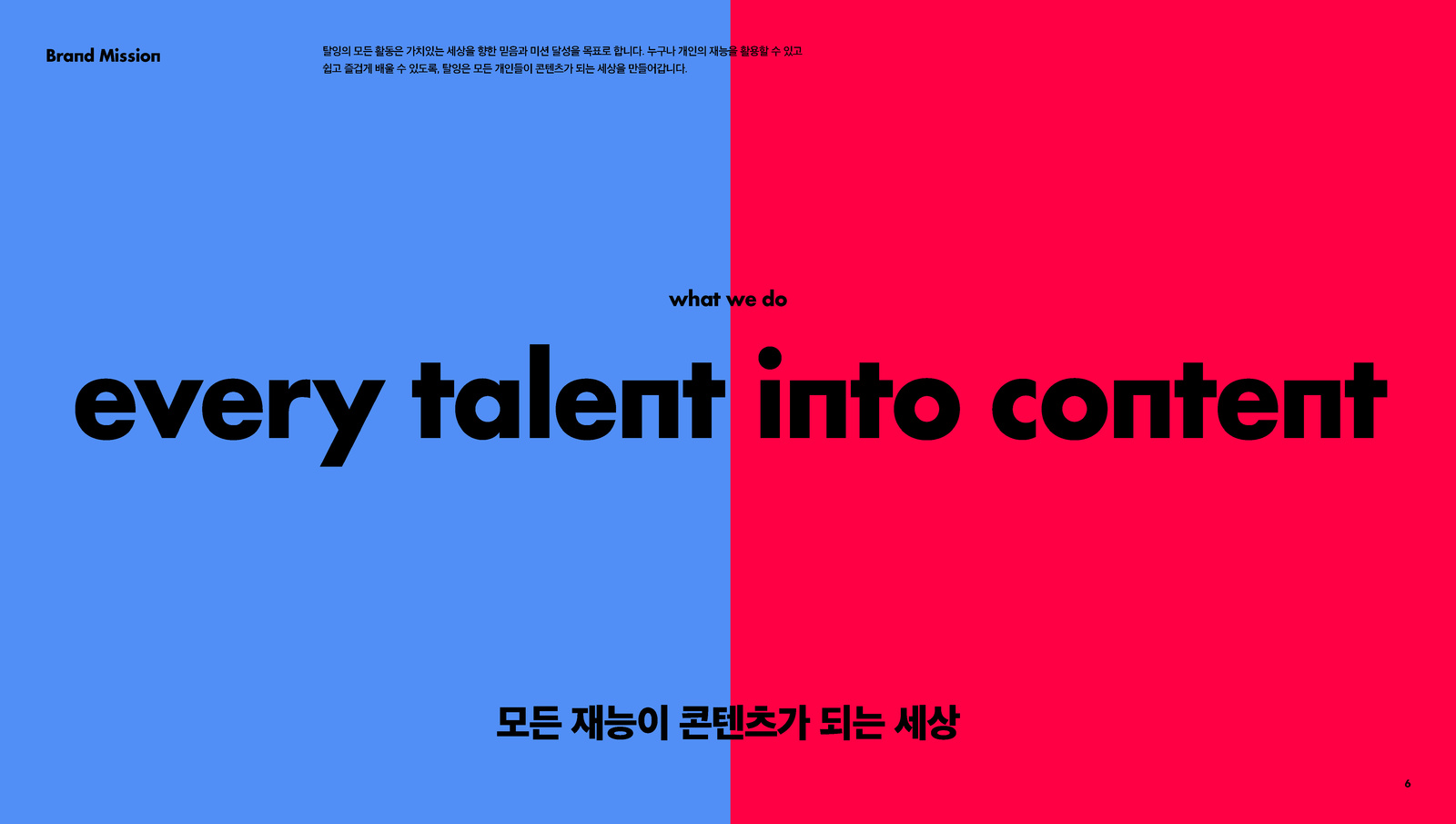
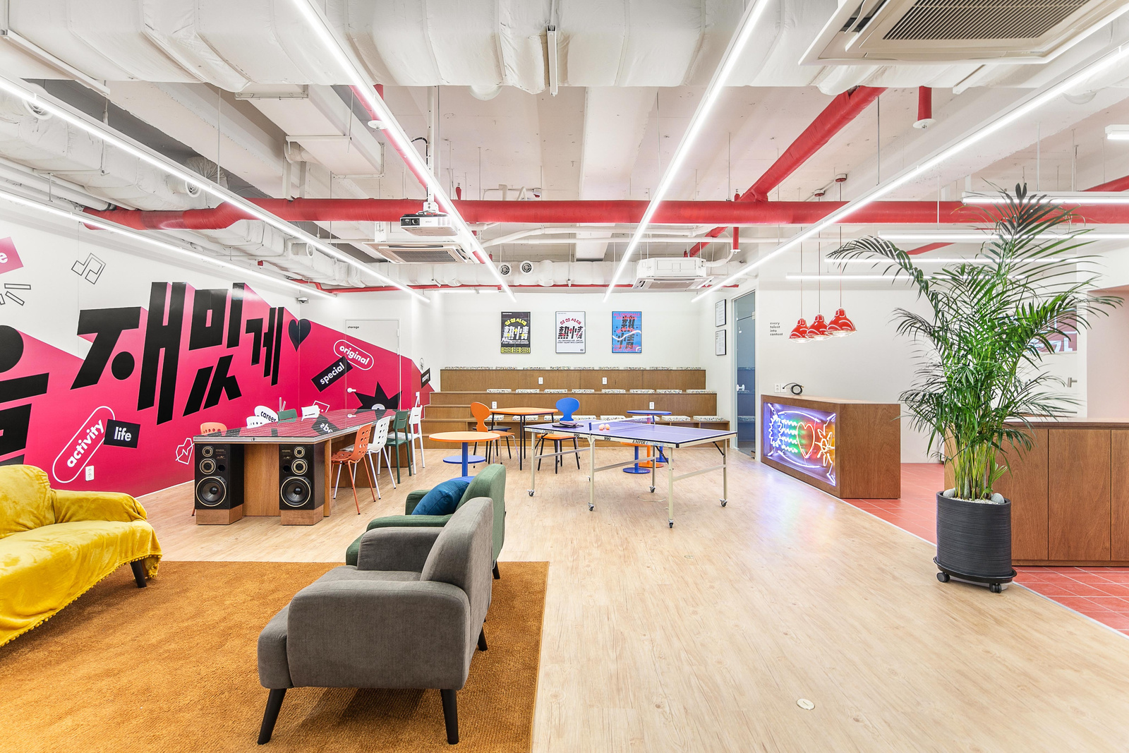
전사 인터뷰를 통해 내부의 언어를 수집하고, 유기적인 형태와 선명한 핑크를 중심으로 디지털 환경에서 강하게 인식되는 브랜드를 만들었습니다.Company wide interviews gathered the internal language, and organic forms with a vivid pink created a brand that registers strongly in digital environments.
배경Background
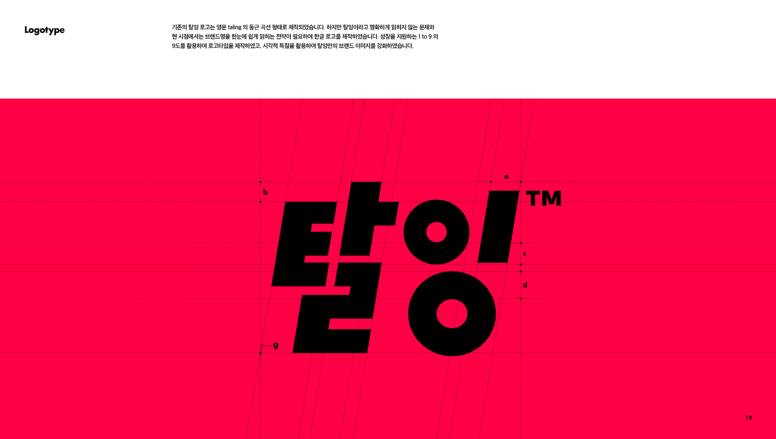
2020년부터 2022년까지 탈잉의 디자인·브랜드를 총괄하며 A3 서비스 UX, 탈잉 2.0 리브랜딩과 브랜드 아이덴티티를 함께 진행했습니다. 기존 로고는 서비스명이 한 번에 읽히지 않는 문제가 있었고, 빠르게 성장하는 VOD·러닝 시장에서 탈잉만의 문화와 시각적 존재감을 더 명확하게 만들 필요가 있었습니다.From 2020 to 2022 the work covered design and brand leadership at Taling, including A3 service UX and the Taling 2.0 rebrand and brand identity. The previous logo did not let the service name read in one pass, and in a fast growing VOD and learning market the culture and visual presence particular to Taling needed to be clearer.
과제The Challenge
서비스명을 정확하게 읽히게 하는 기능적 문제와, 배움을 너무 진지하고 무겁게 보이지 않게 하는 브랜드의 성격을 동시에 해결해야 했습니다. 퍼포먼스 광고와 모바일 콘텐츠처럼 경쟁이 치열한 화면에서 강하게 보이면서도, 조직 내부가 실제로 공감할 수 있는 언어가 필요했습니다.Two things had to be solved at once: the functional problem of making the service name legible, and the brand character of keeping learning from looking too serious and heavy. It had to stand out on crowded screens like performance advertising and mobile content while using language the organisation itself genuinely recognised.
디자인 접근Design Approach
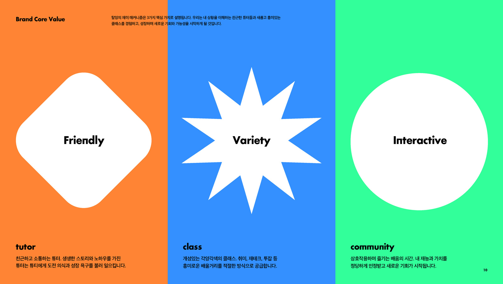
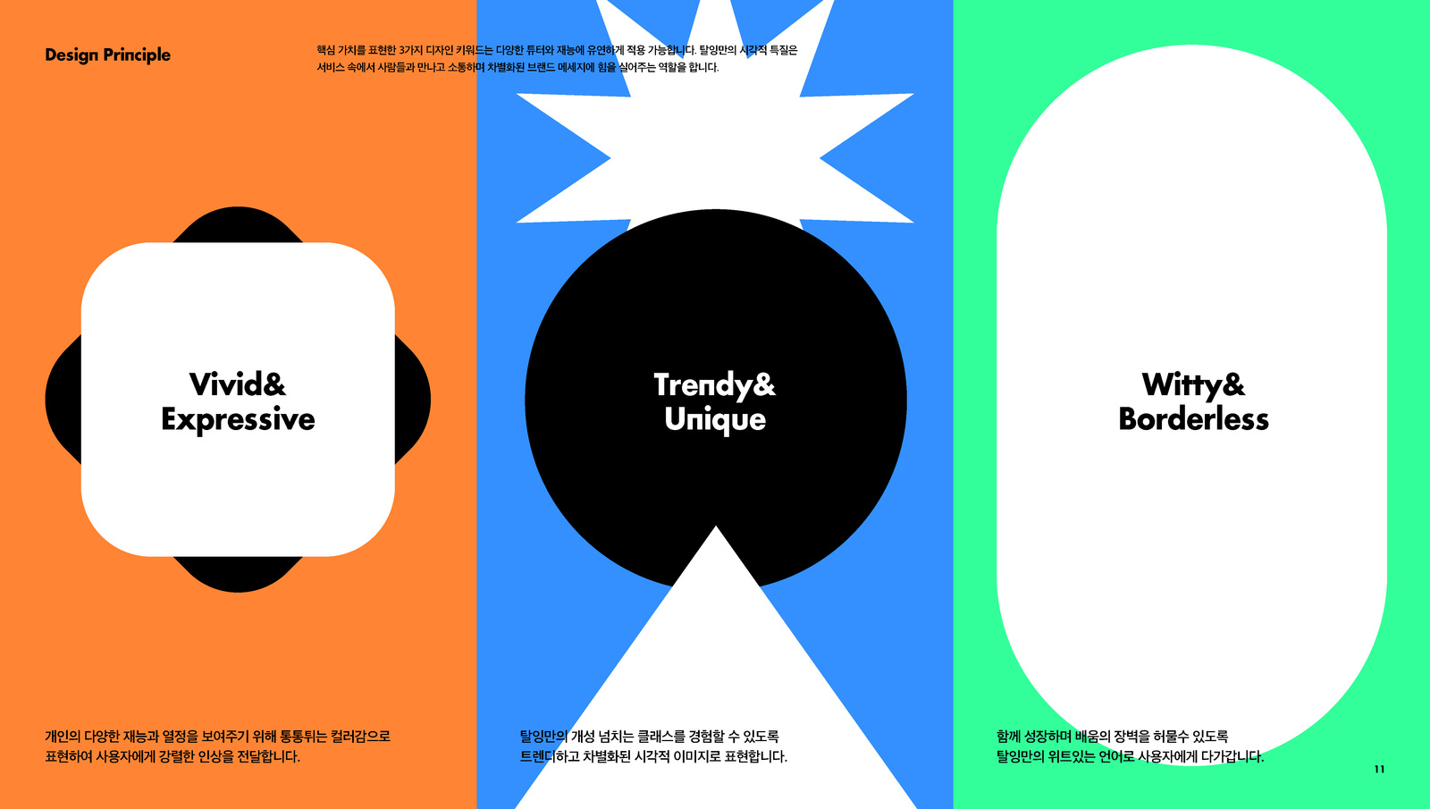
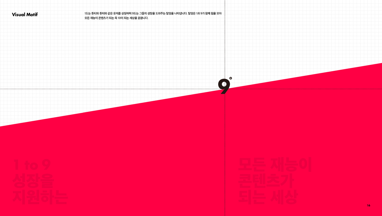
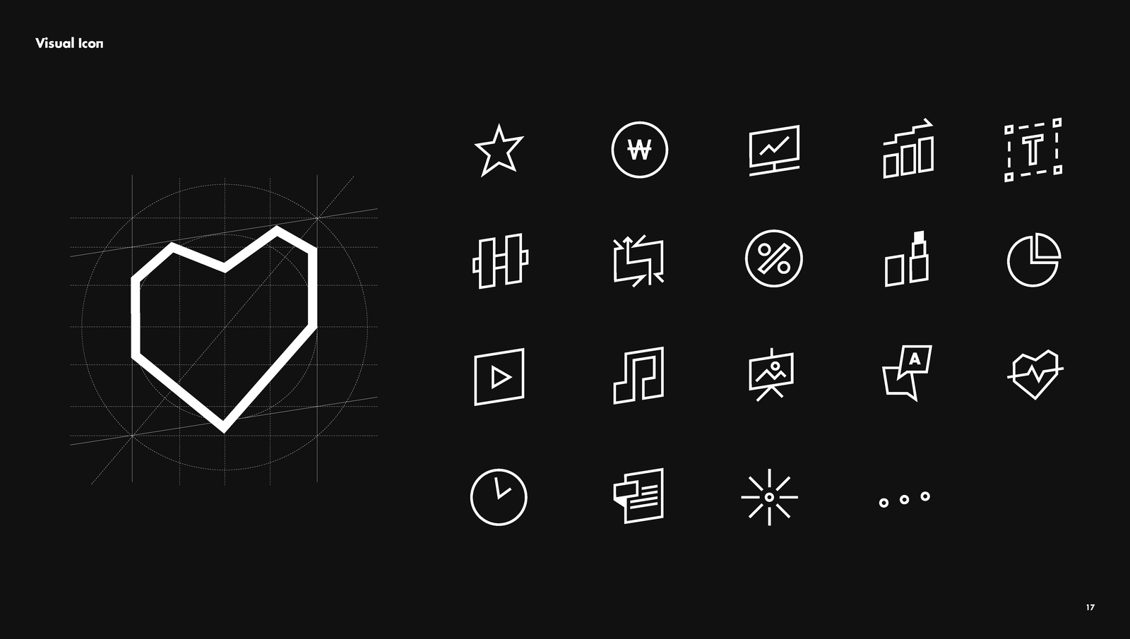
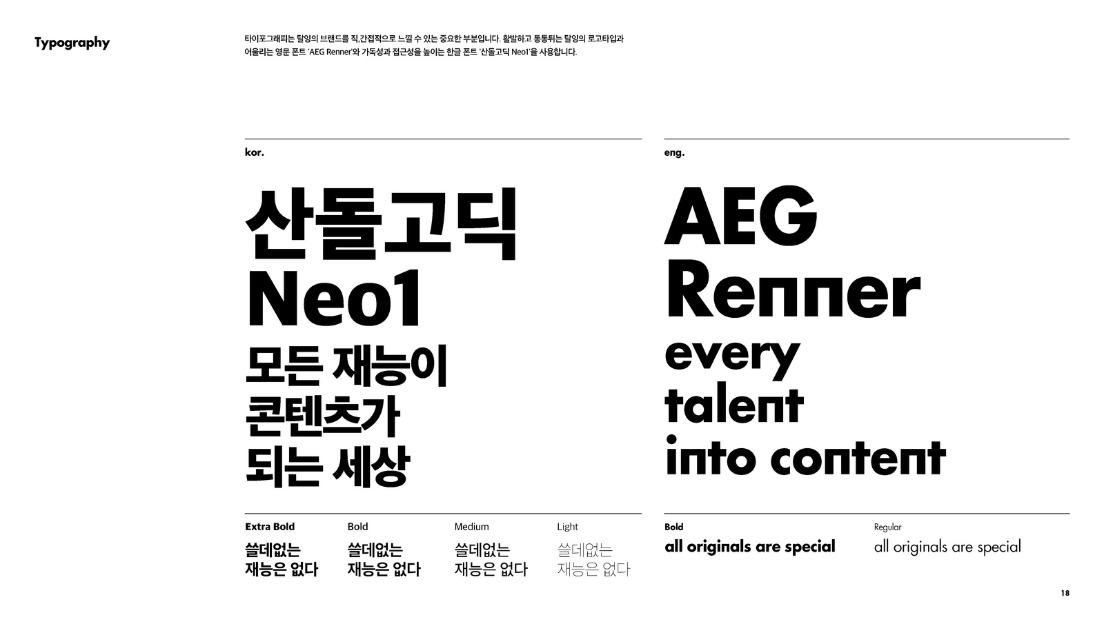
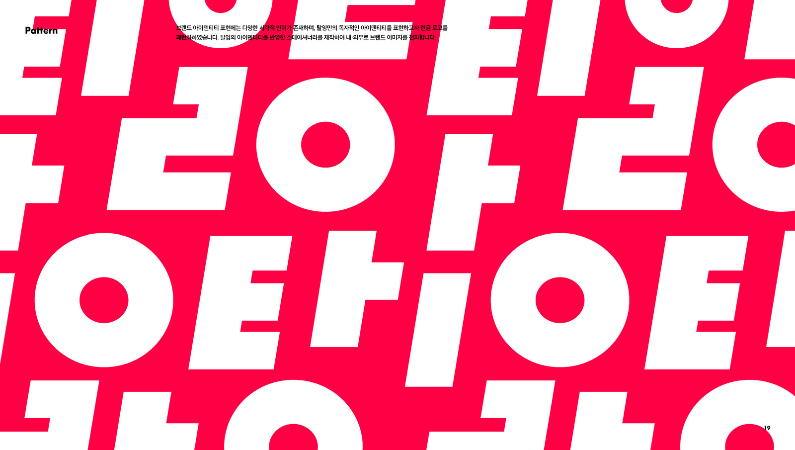
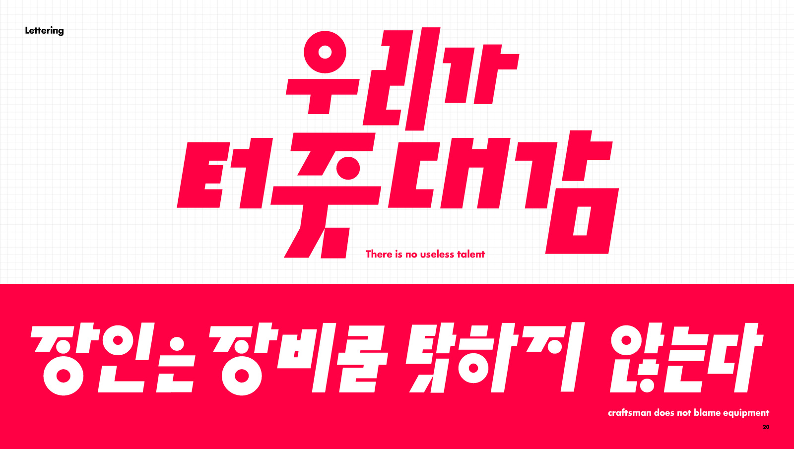
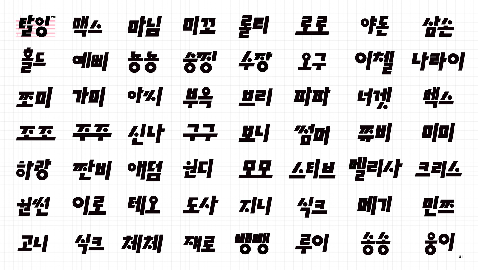
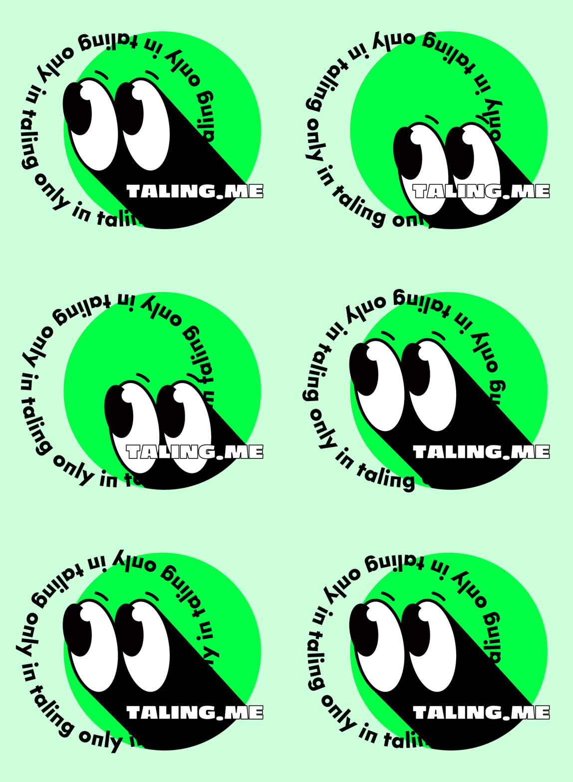
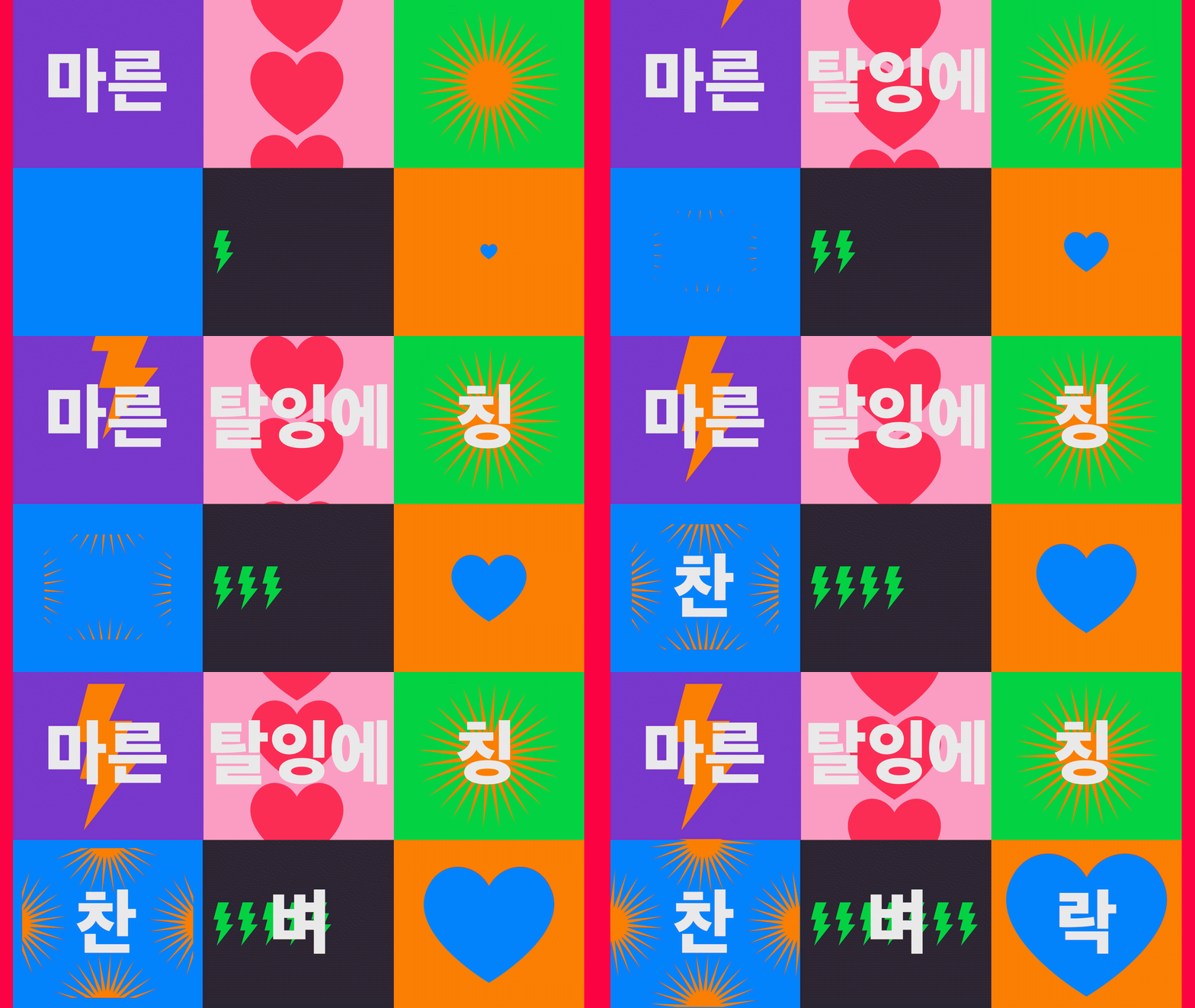
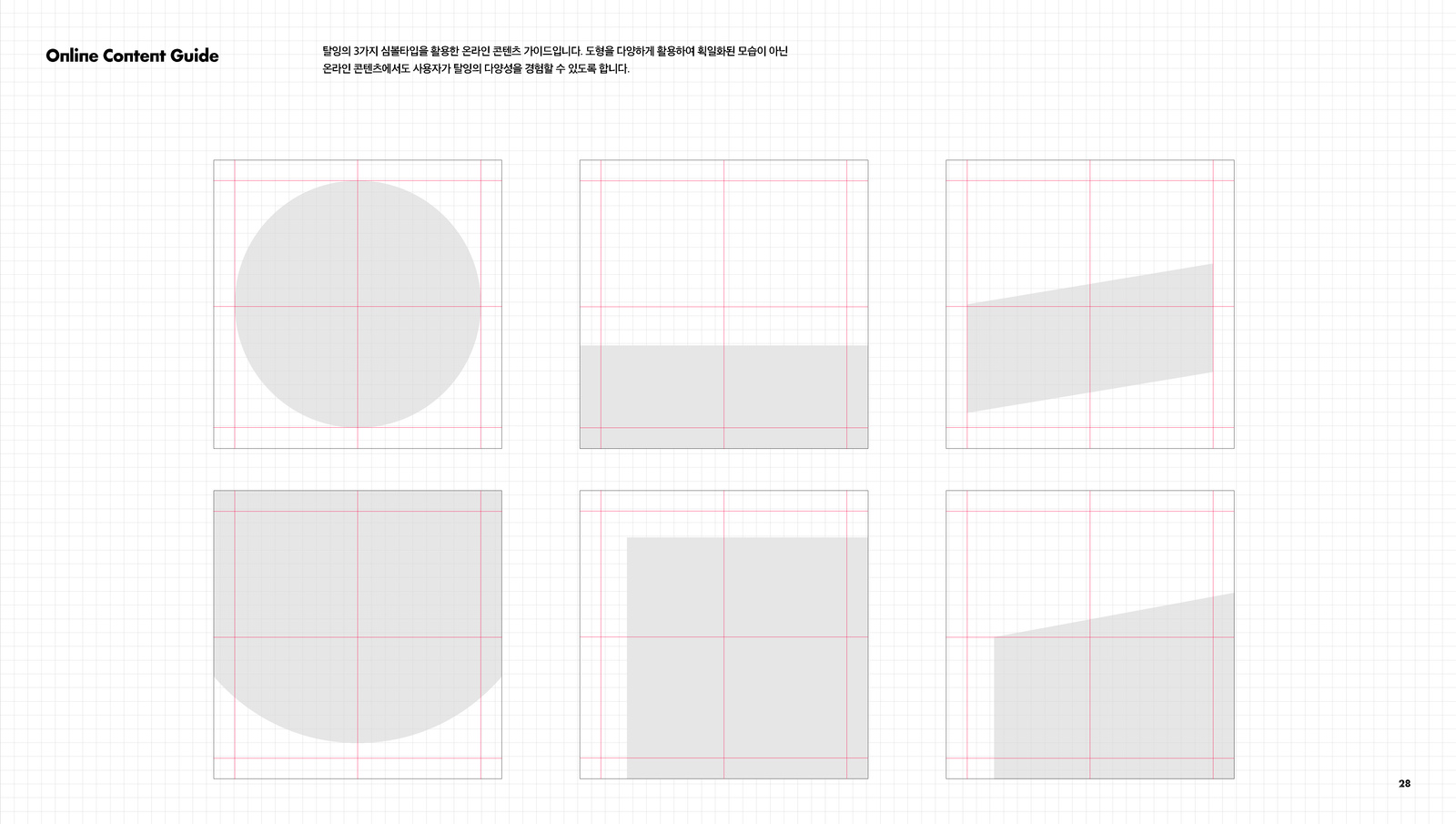
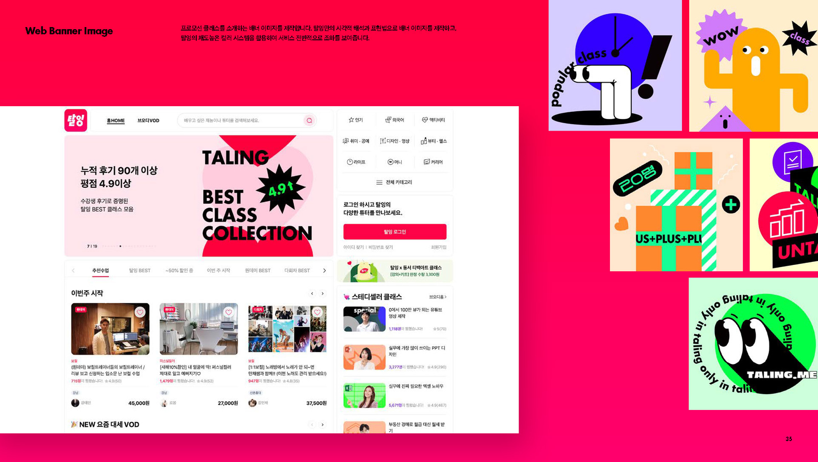
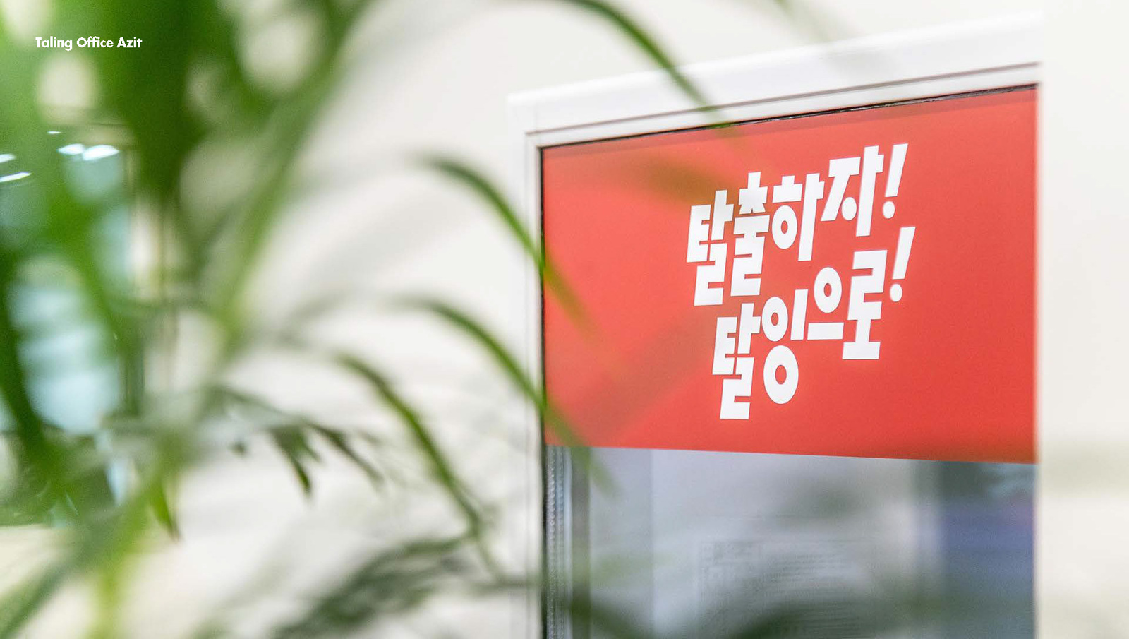
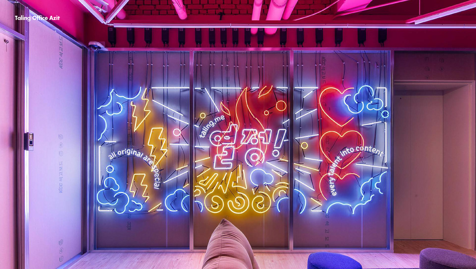
전사 인터뷰를 통해 구성원이 생각하는 탈잉의 문화와 강점을 확인하고 이를 브랜드 방향의 근거로 사용했습니다. 한글 로고타입은 서비스명이 명확하게 읽히도록 구조를 정리하고, 고정적이고 권위적인 교육의 인상보다 자유로운 배움과 사람의 움직임을 연상시키는 유기적인 형태를 시각 언어로 발전시켰습니다.Company wide interviews confirmed what members saw as Taling's culture and strengths, and that became the basis for the brand direction. The Korean logotype was restructured so the service name reads clearly, and the visual language grew into organic forms that suggest free learning and human movement rather than fixed, authoritative education.
비주얼·경험 시스템Visual / Experience System
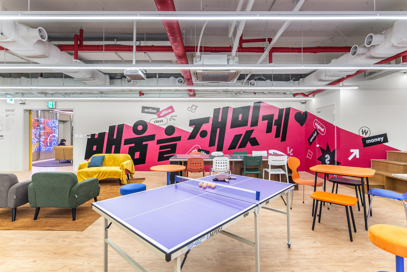
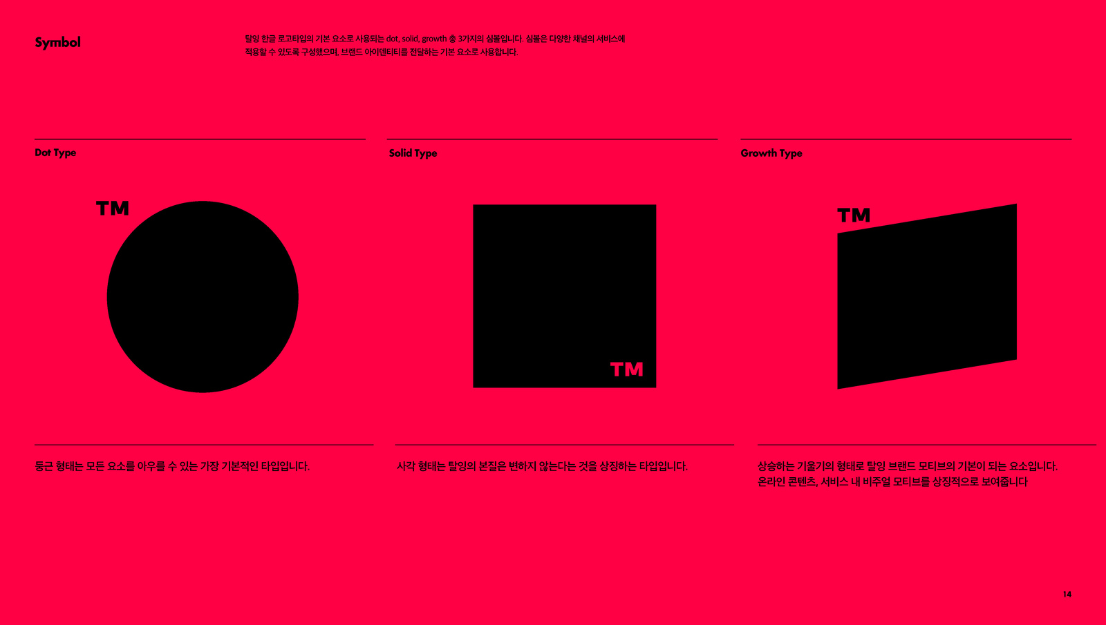
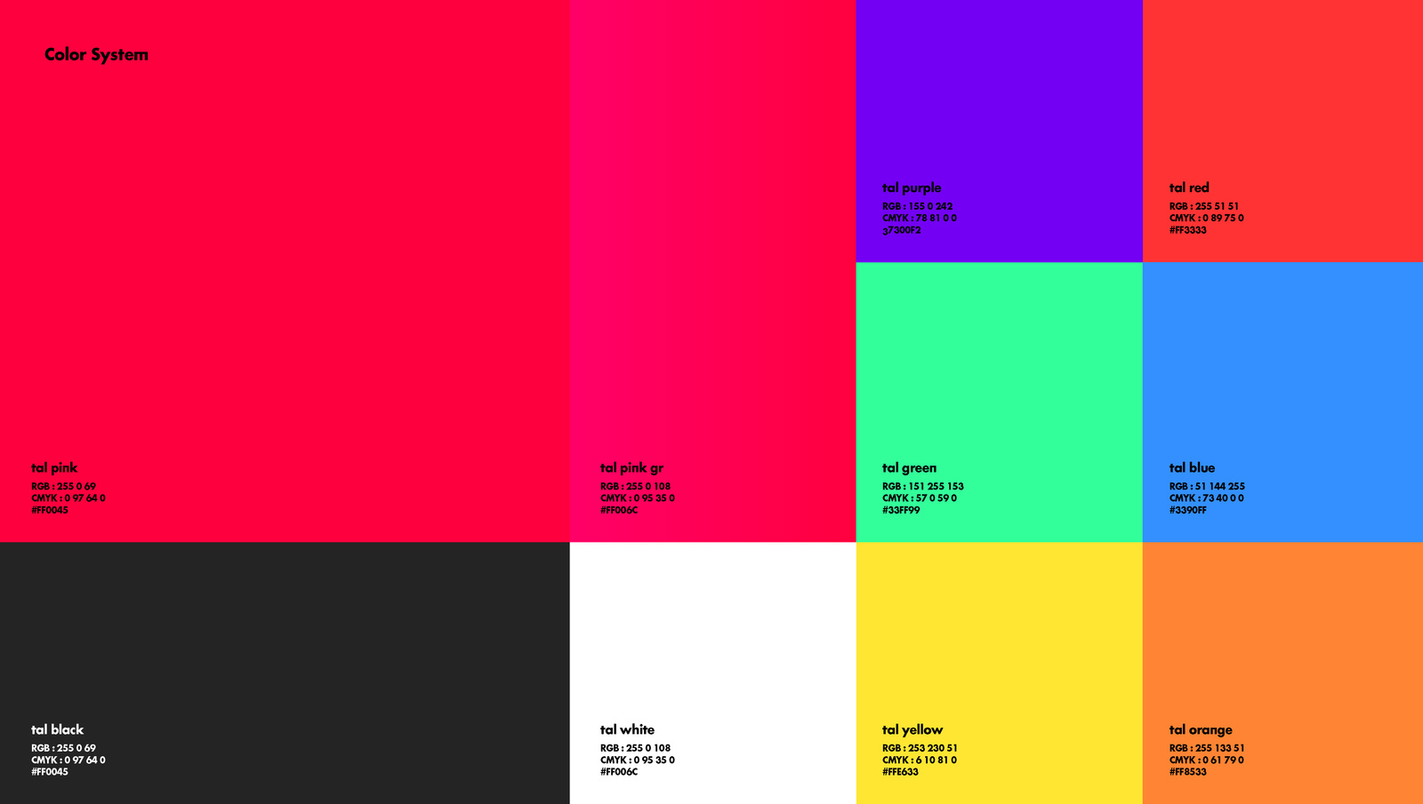
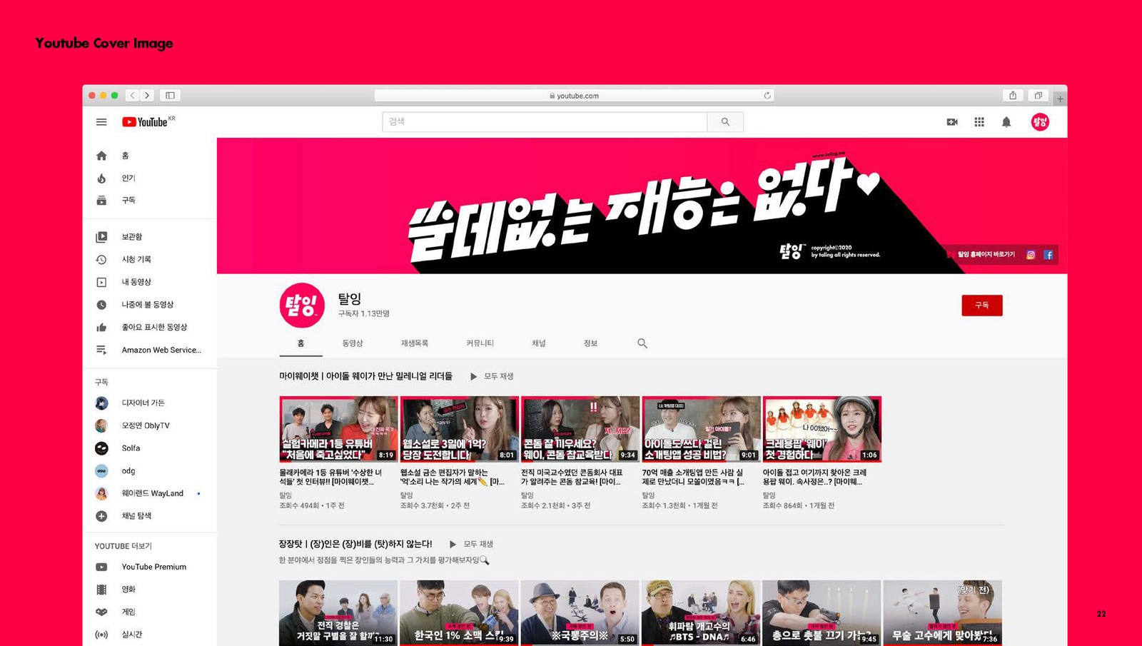
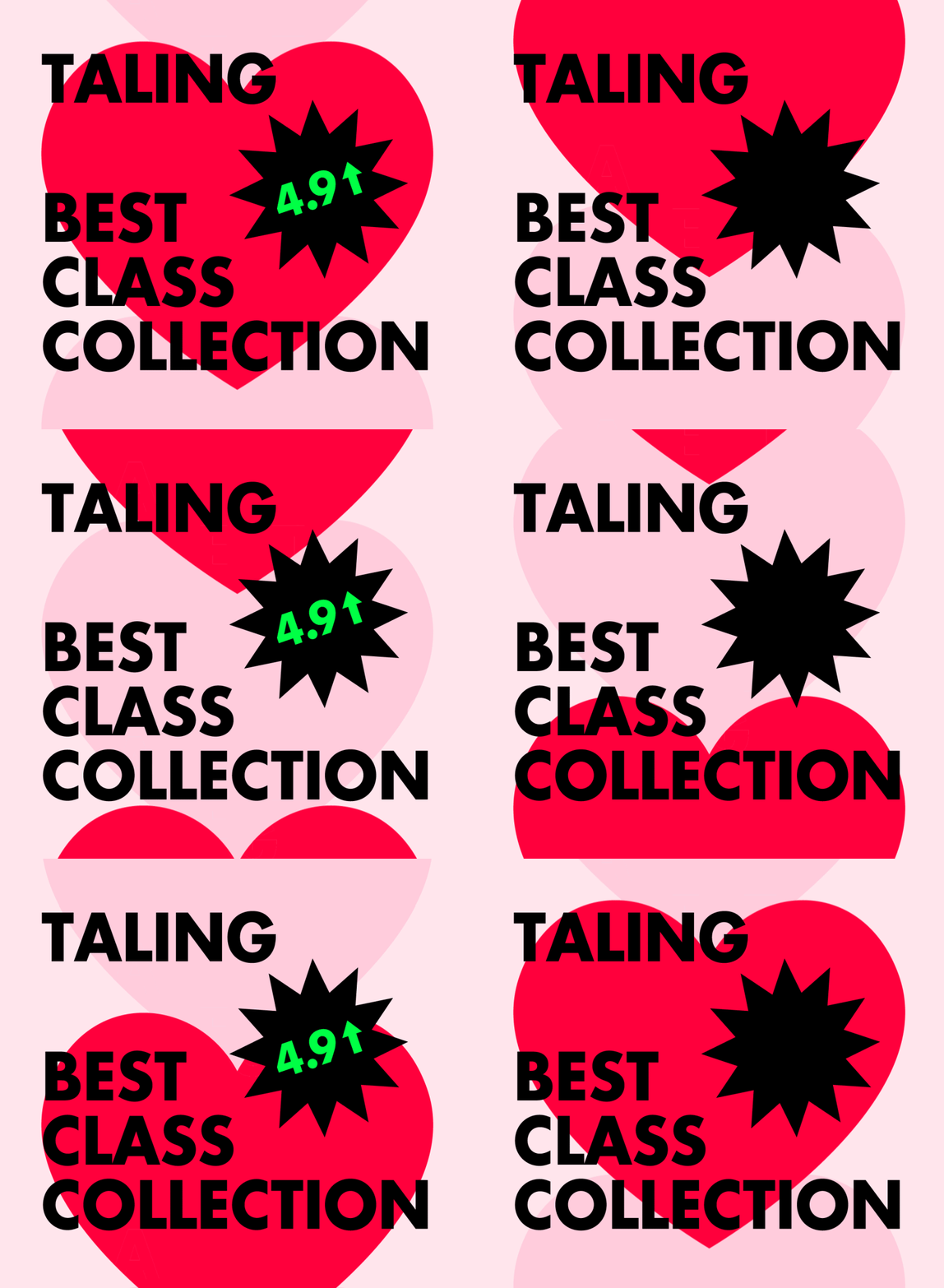
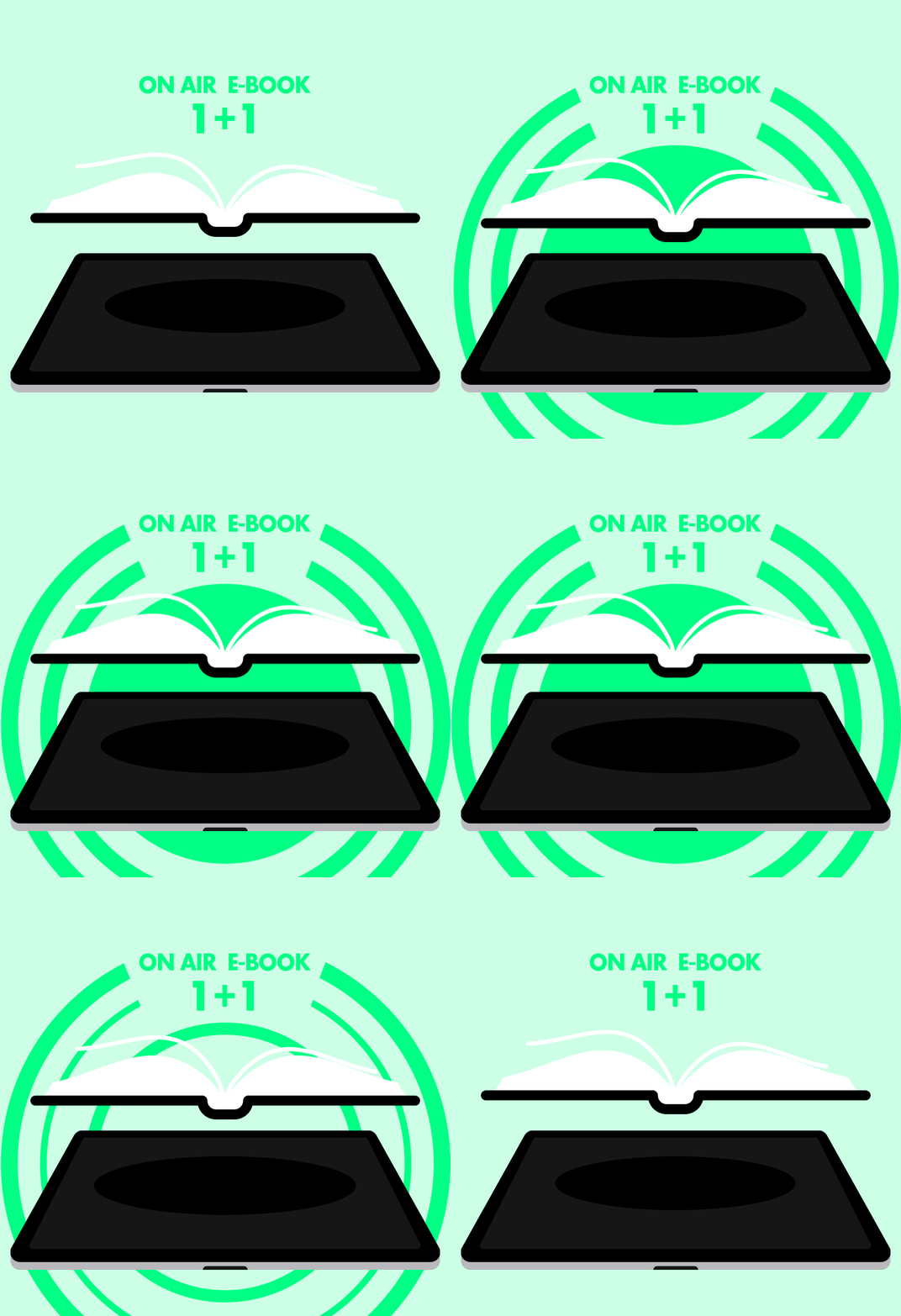
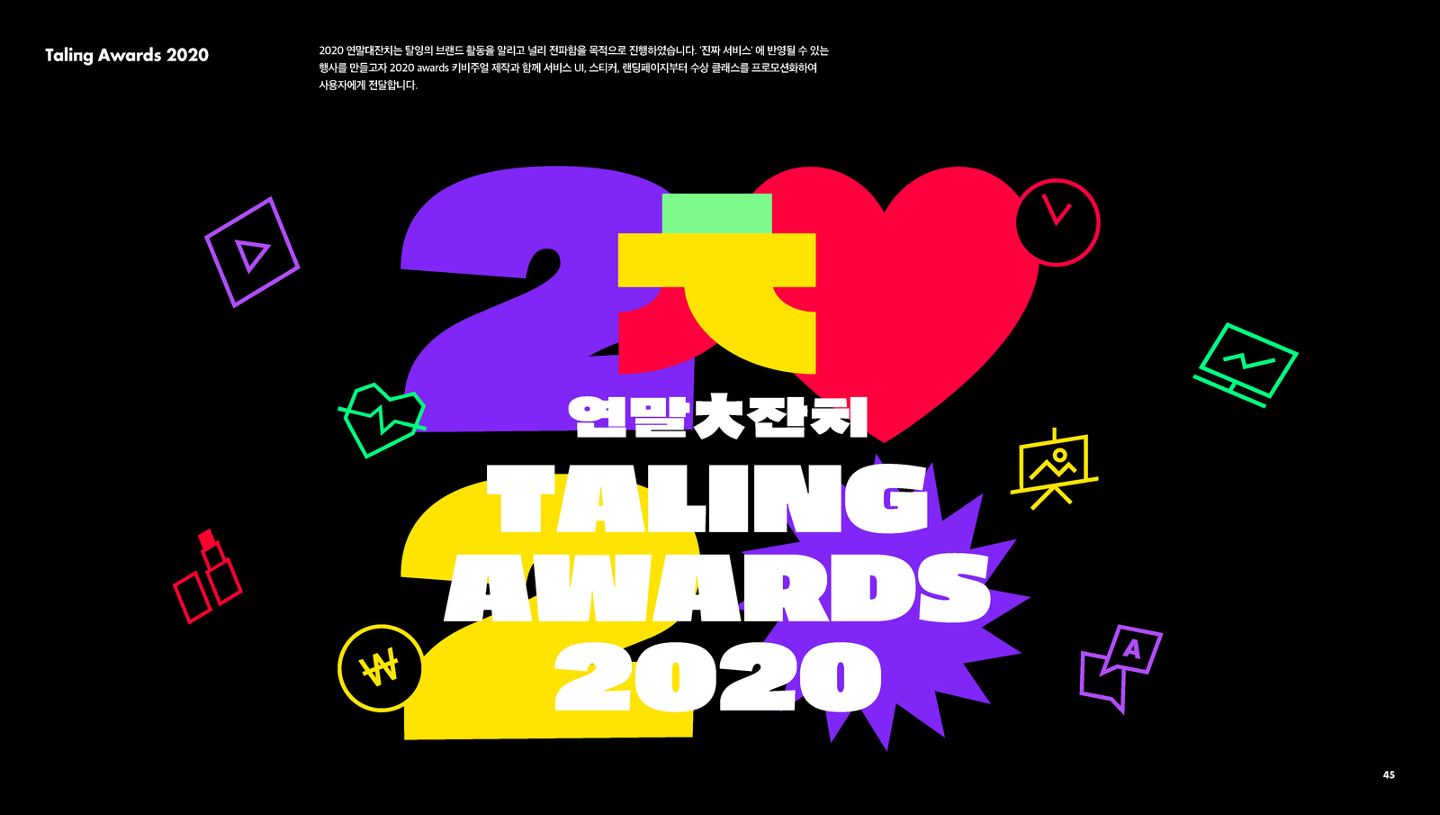
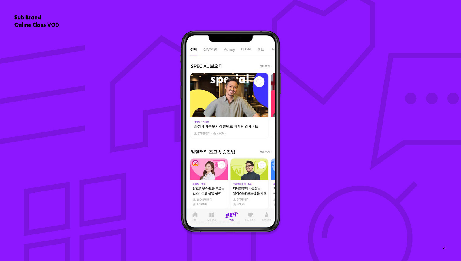
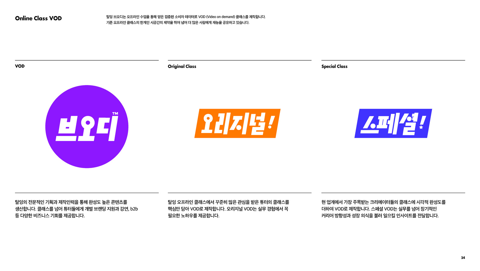
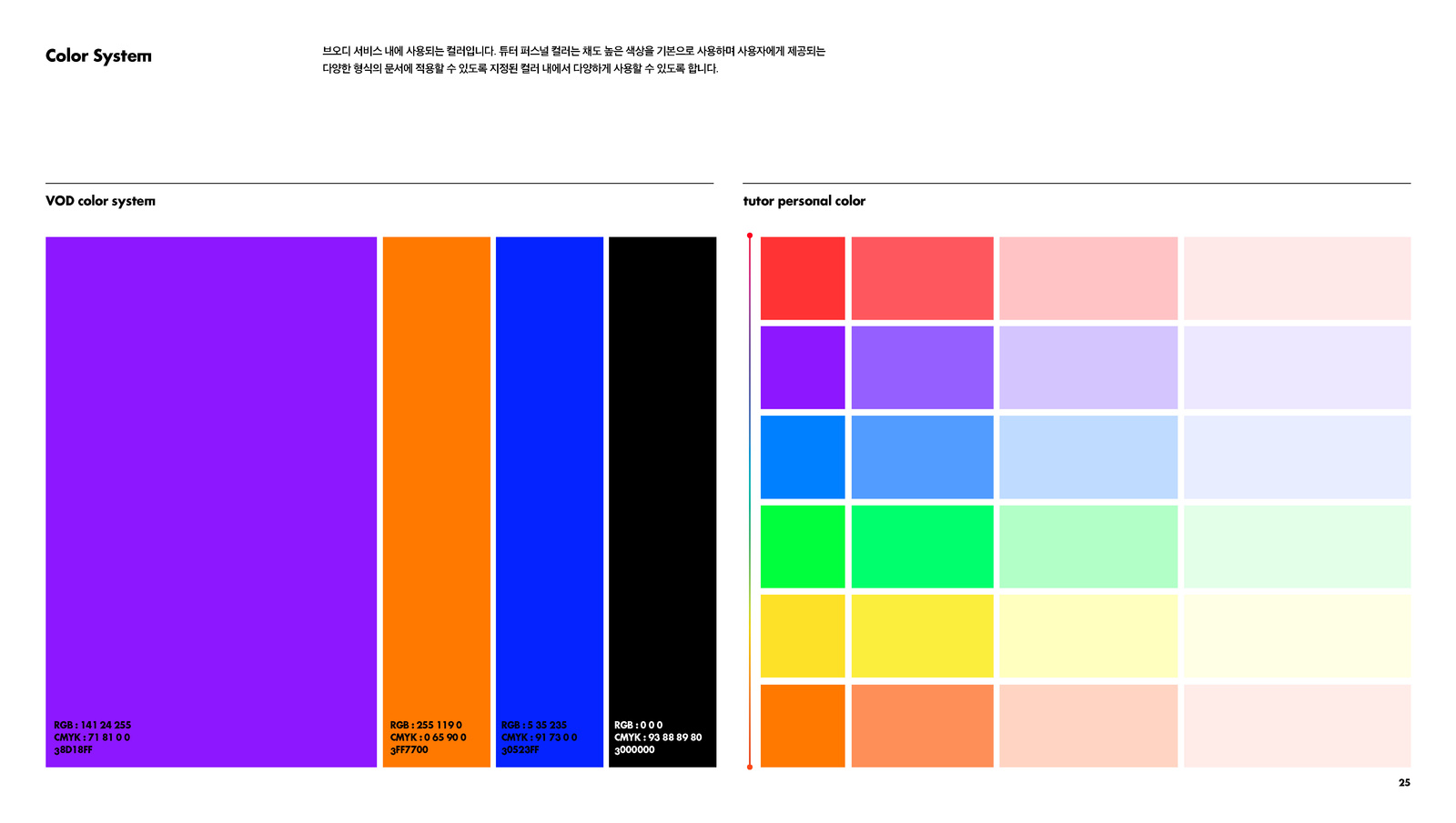
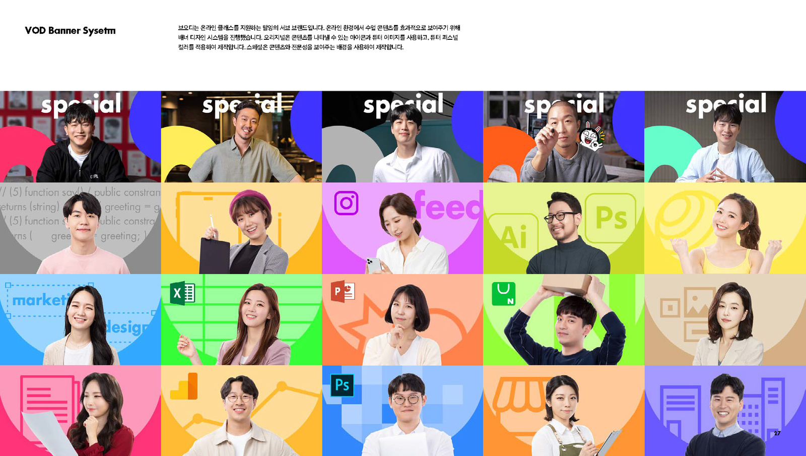
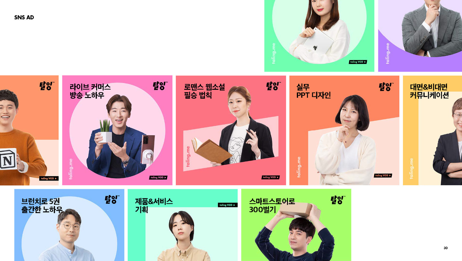
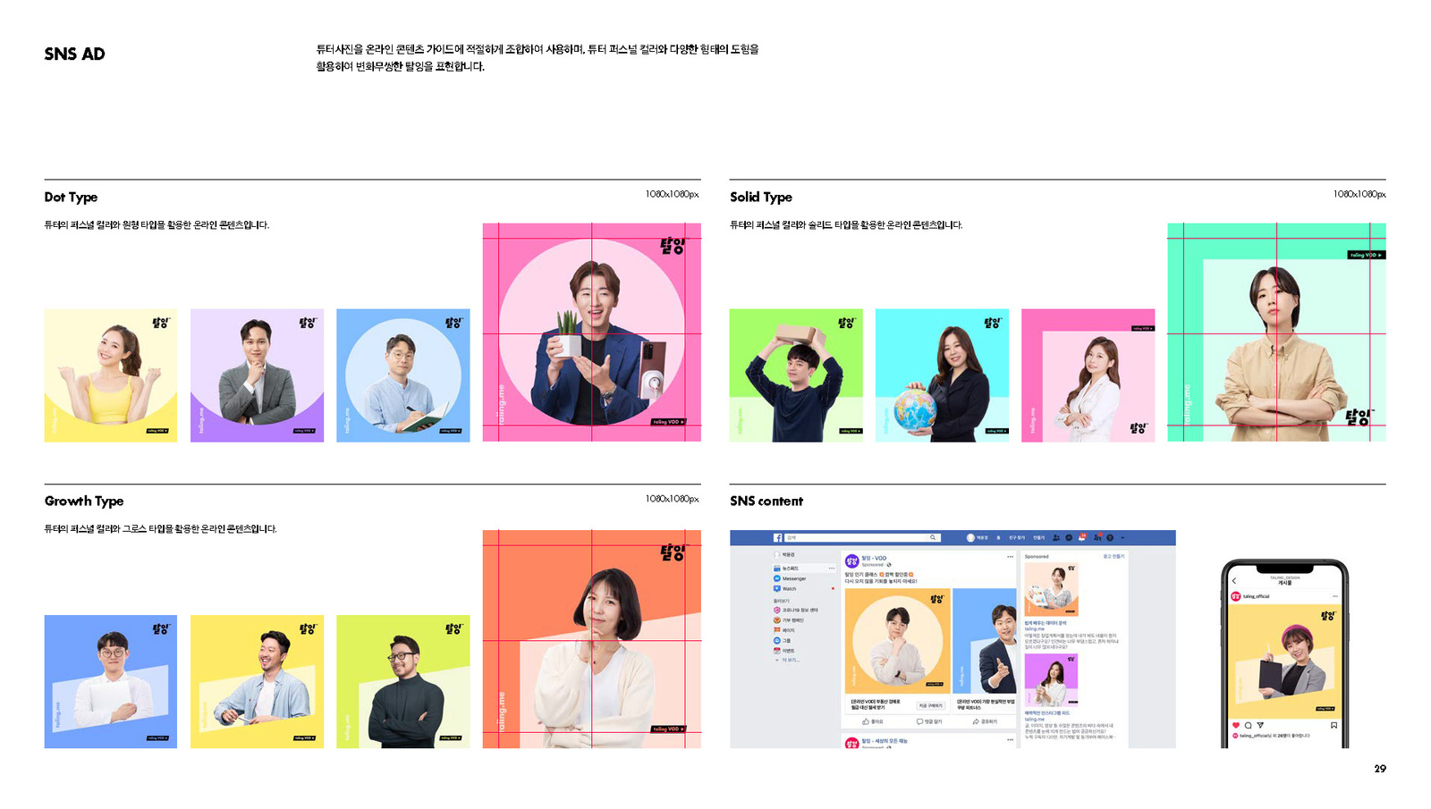
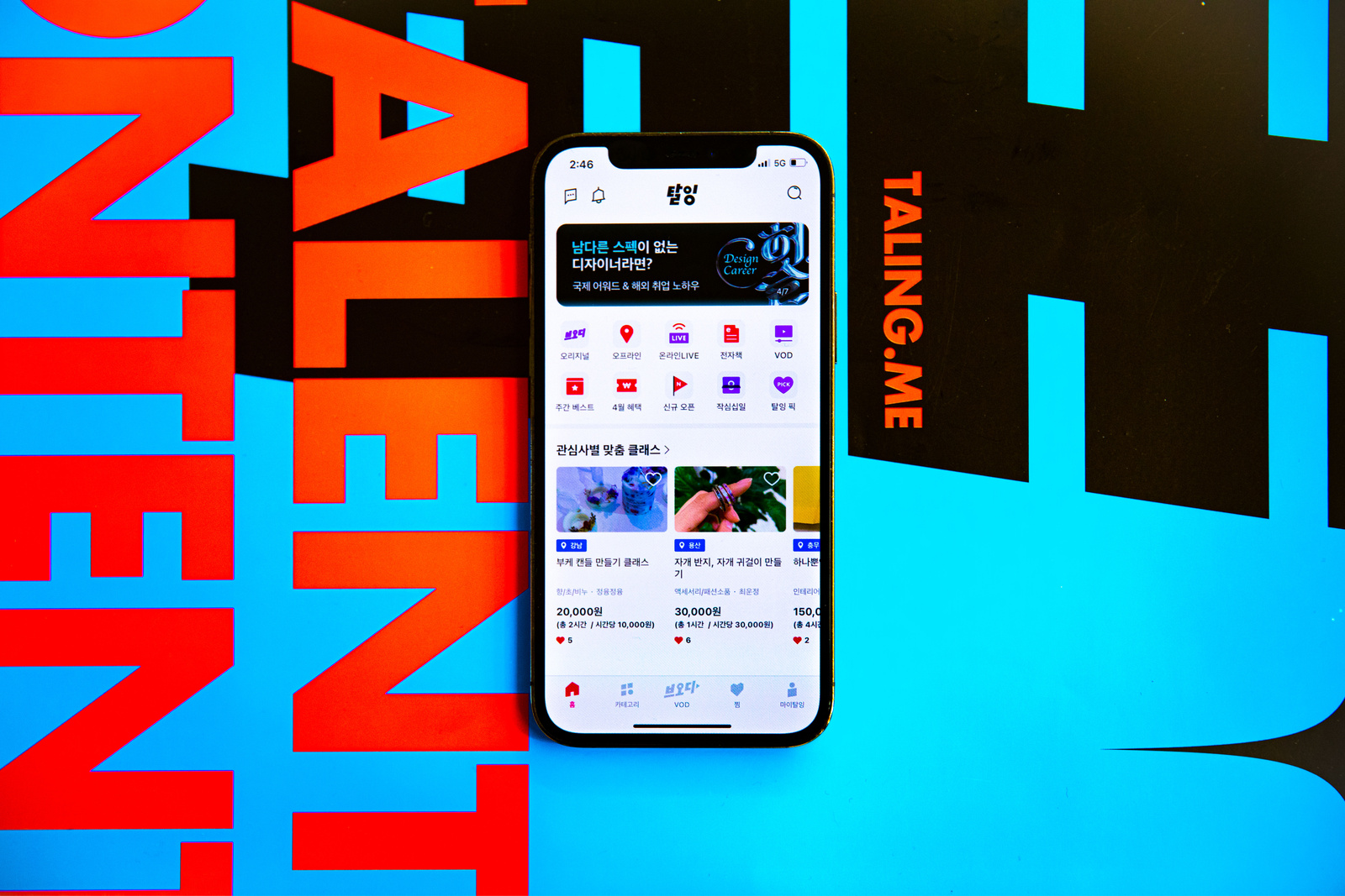
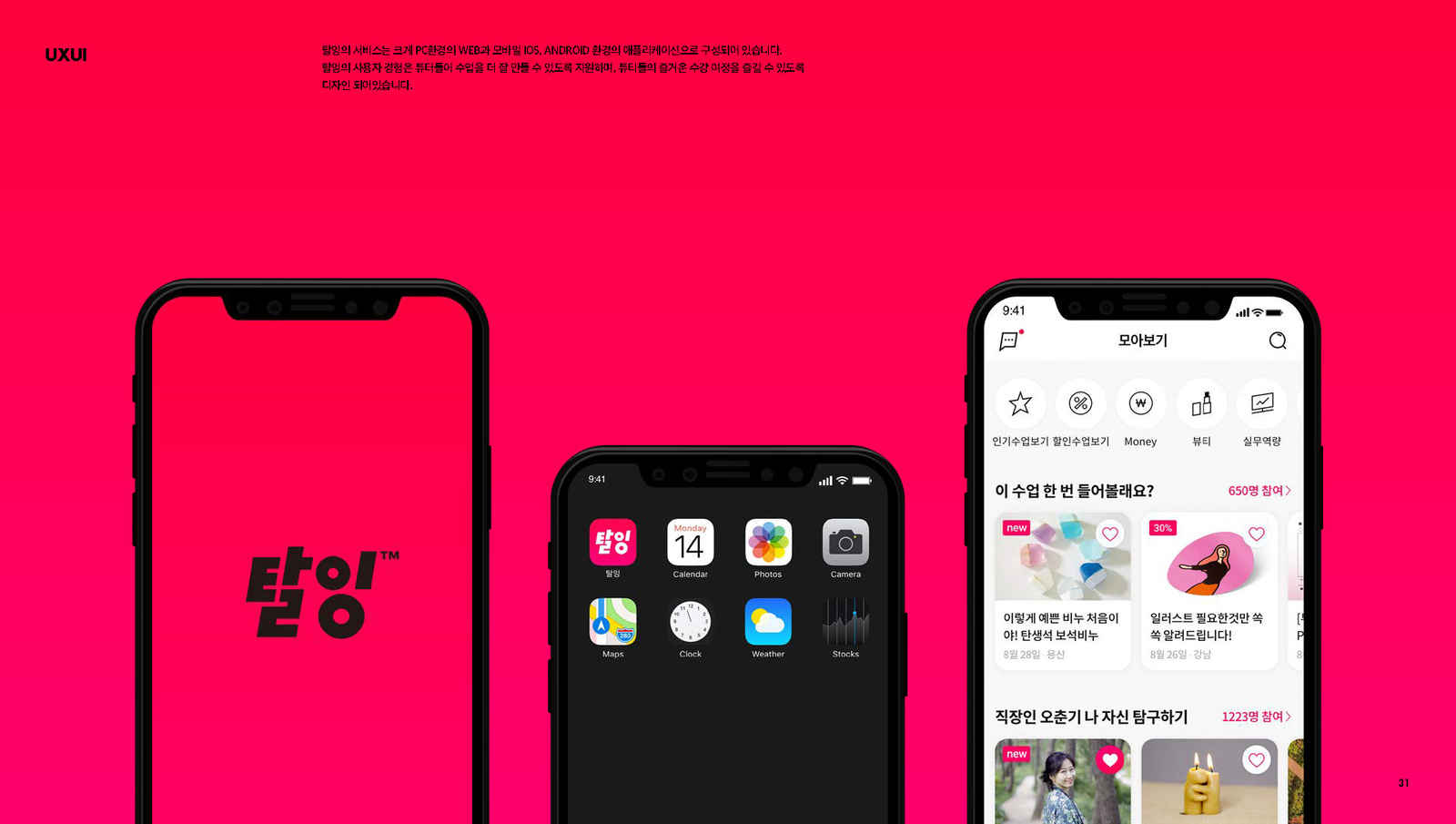
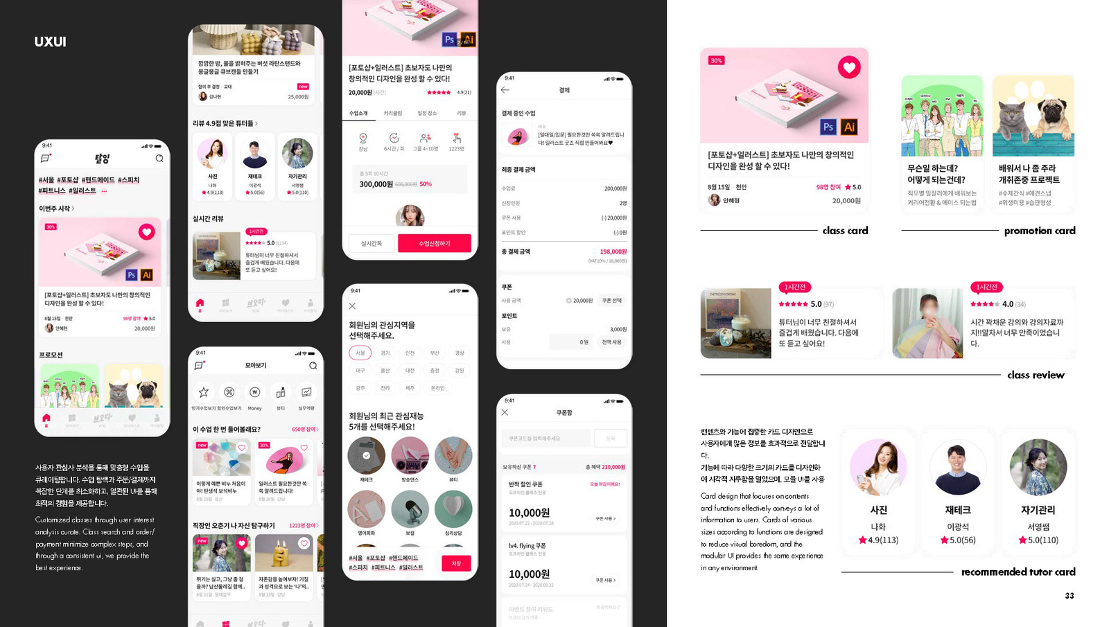
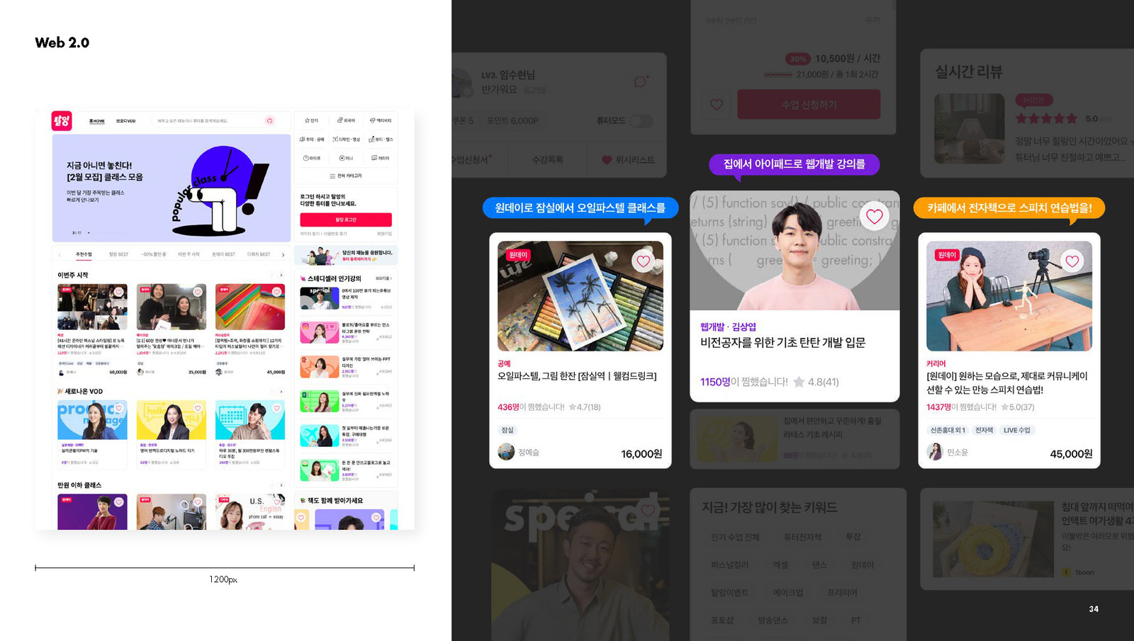
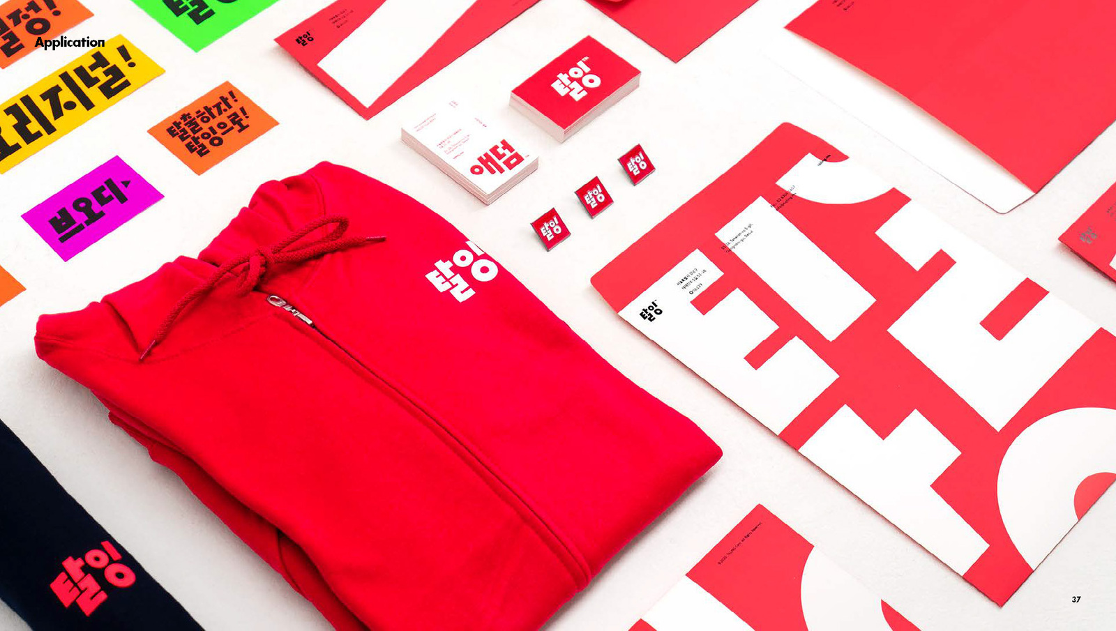
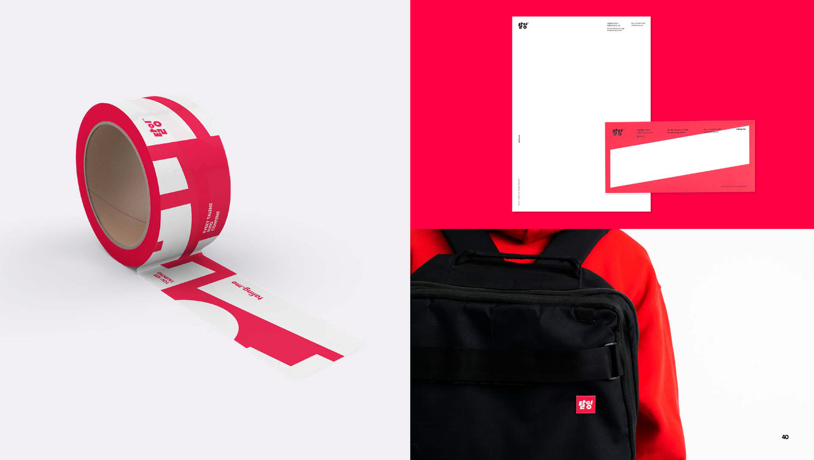
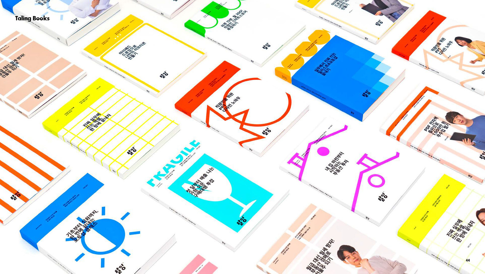
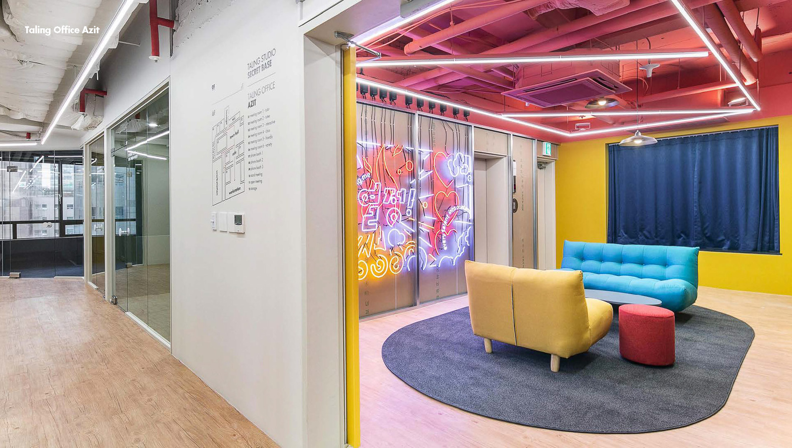
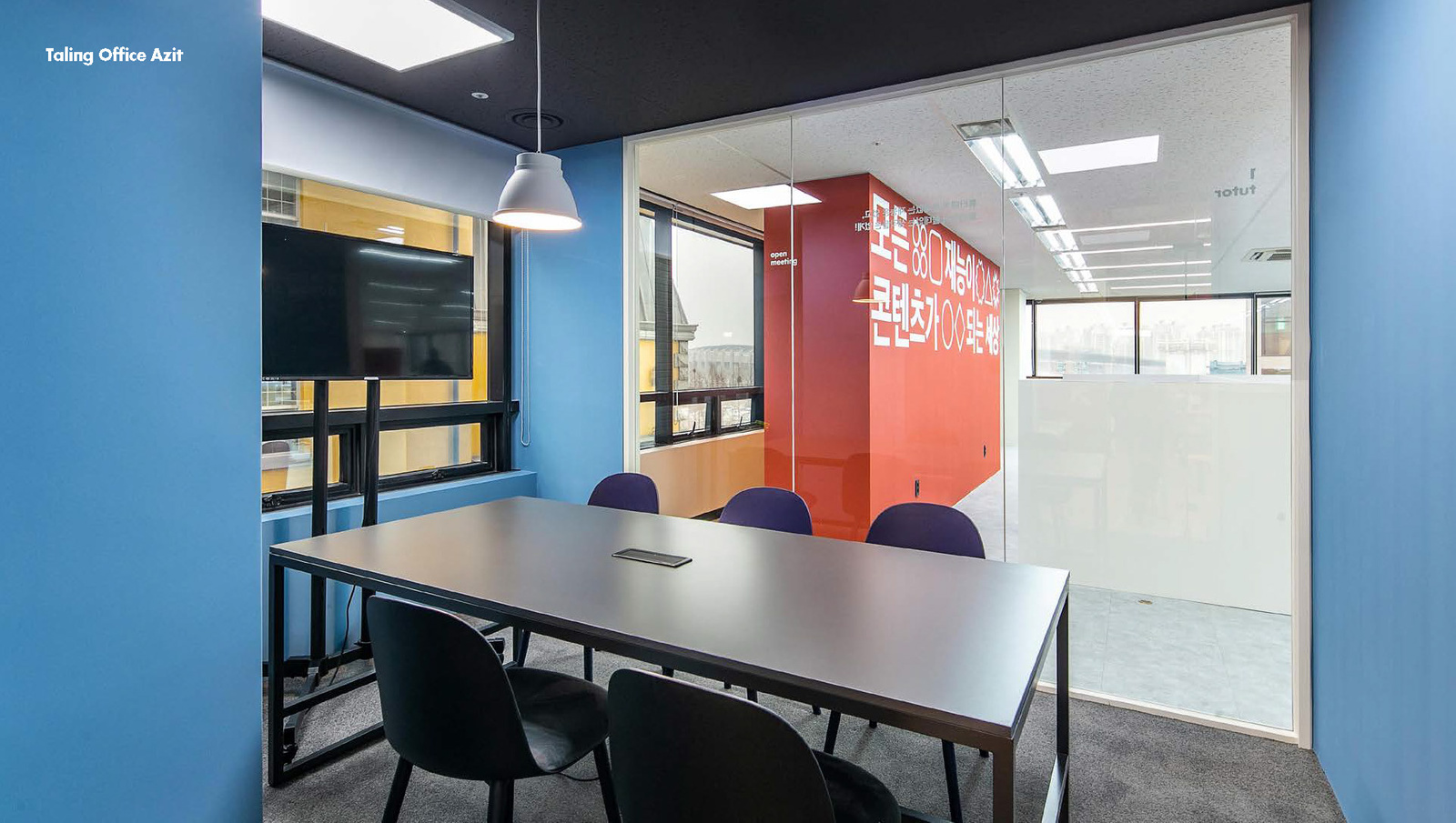
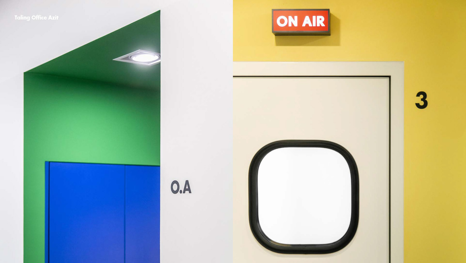
선명한 핑크를 주요 컬러로 사용해 진지한 톤이 많았던 VOD·교육 시장에서 빠르게 구분되도록 했습니다. 로고, 그래픽 형태, 컬러를 광고와 콘텐츠, 디지털 서비스 접점에 반복 적용할 수 있도록 정리해 브랜드와 사용자 경험이 분리되지 않게 운영했습니다.A vivid pink was used as the primary colour so the brand separates quickly in a VOD and education market full of serious tones. Logo, graphic forms and colour were organised for repeated application across advertising, content and digital service touchpoints so brand and user experience never split apart.
프로젝트의 의미What It Means
탈잉 브랜드 아이덴티티는 조직의 문화와 서비스의 사용성을 한 번에 정리한 인하우스 리브랜딩 프로젝트입니다. 읽히는 이름, 강한 색, 유기적인 그래픽을 통해 서비스 성장 단계에 맞는 더 선명한 브랜드 기반을 만들었습니다.The Taling brand identity is an in house rebrand that organised the culture of the organisation and the usability of the service in one pass. A readable name, strong colour and organic graphics built a clearer brand base suited to the growth stage of the service.
작업 범위Scope
- Brand / Organization Research
- Korean Logotype
- Brand Identity
- Vivid Pink Color System
- Organic Graphic Language
- Digital / Content Applications