별책부록 브랜드 디자인Byeolcheck Brand Design
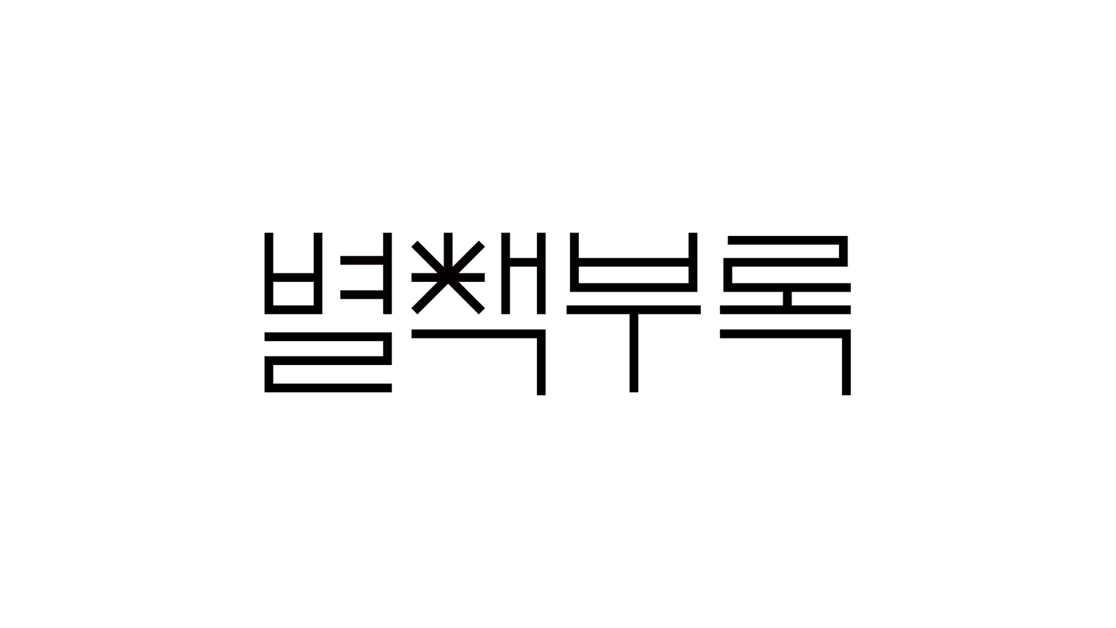
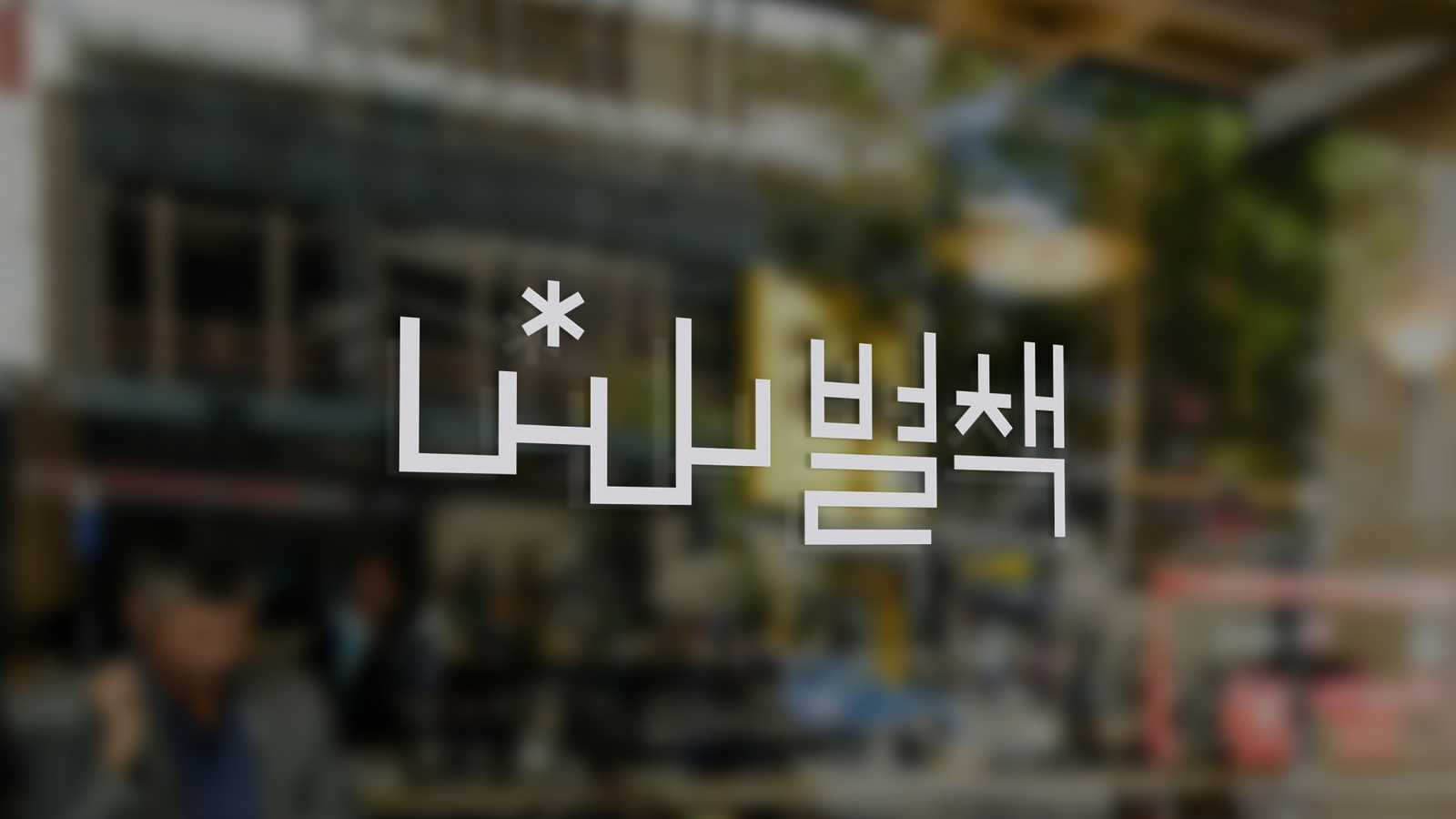
독립서점 ‘별책부록’의 이름을 한글 자소 안에 압축했습니다.The name of the independent bookstore Byeolcheck was compressed inside a Korean letterform.
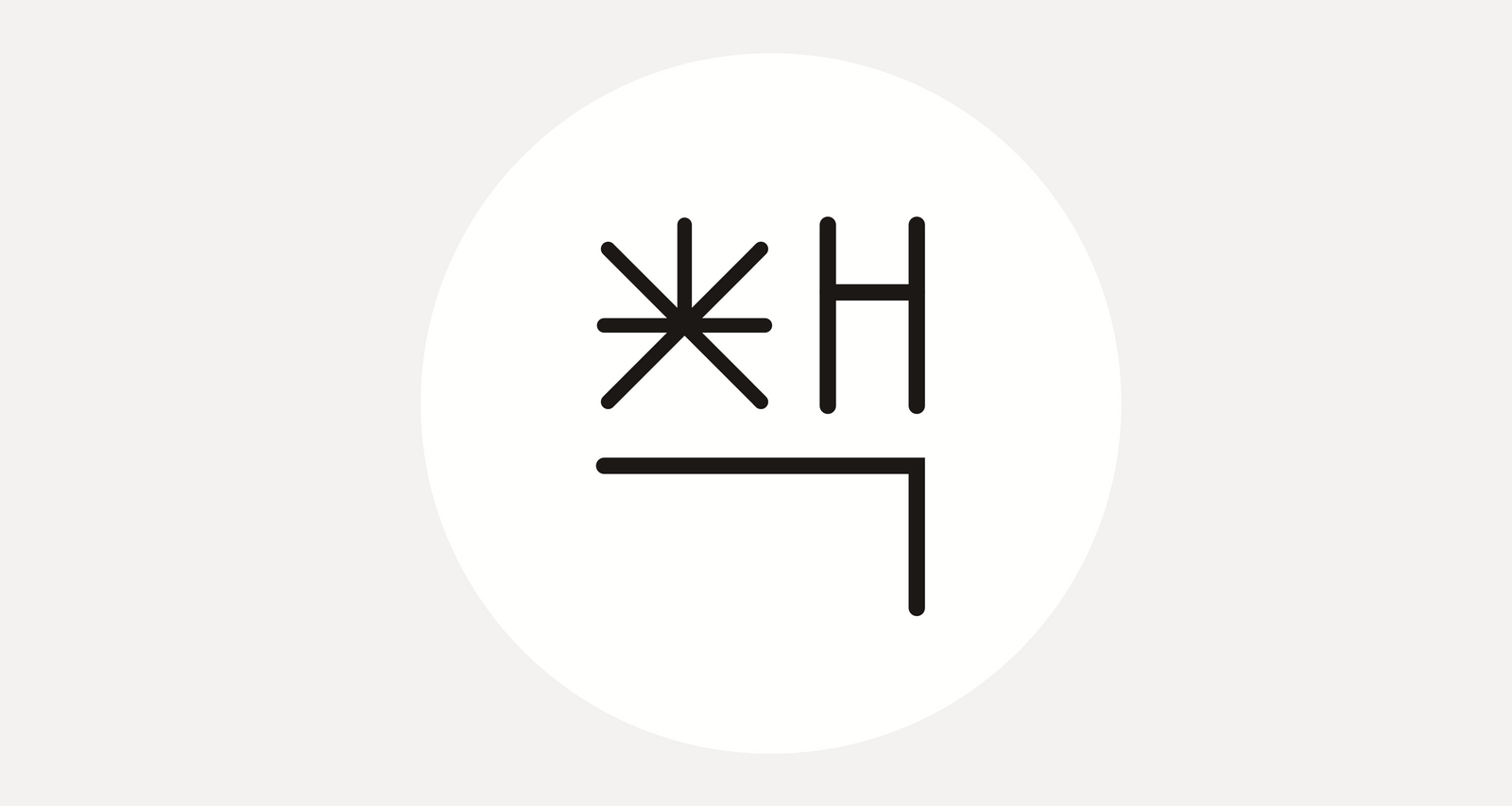
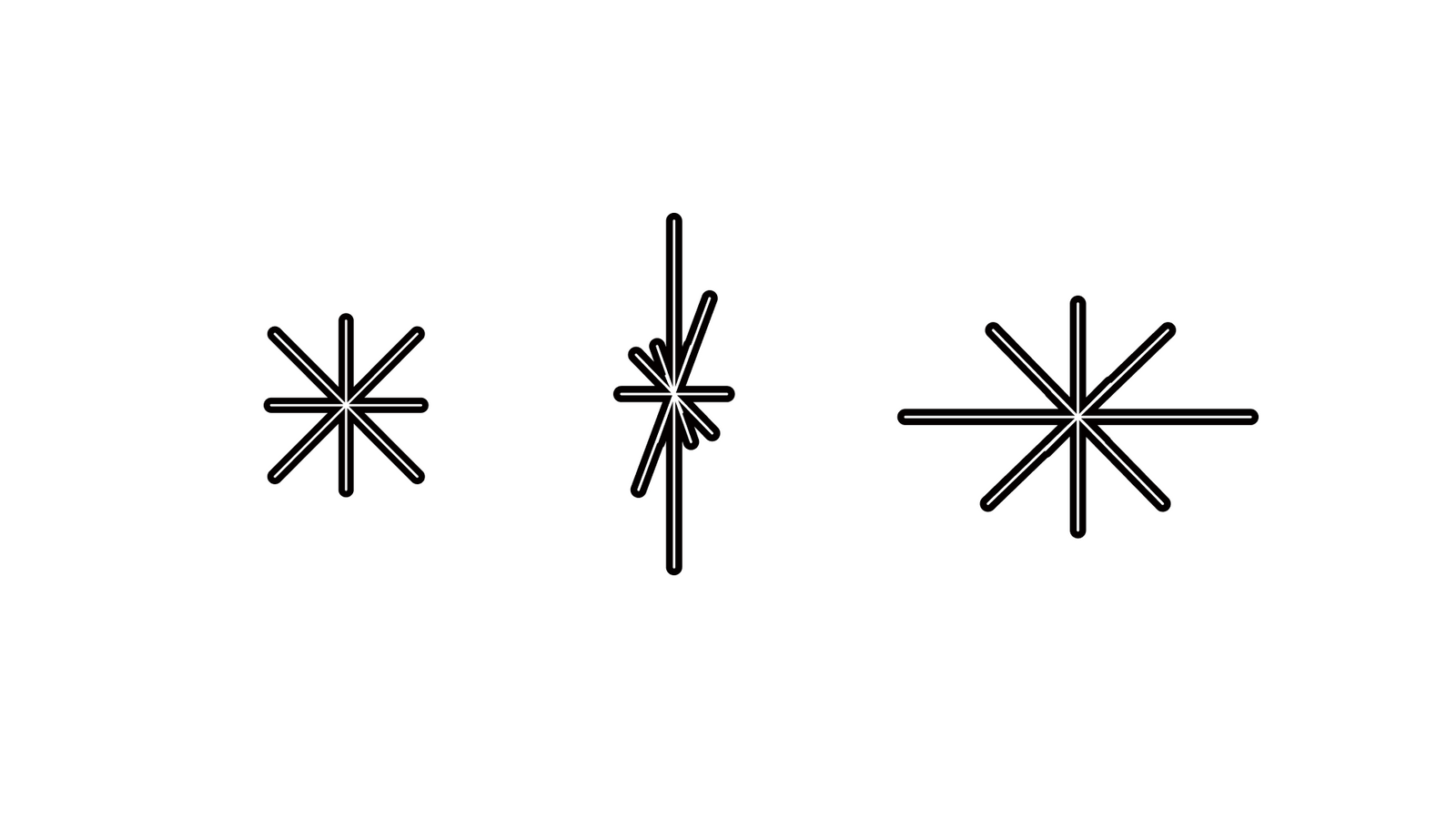
‘책’의 ㅊ을 열린 책의 형태로 바라보고 동시에 별을 연상시키는 구조를 결합해, 작은 문화 공간의 실험성과 친근함을 하나의 가변형 기호로 만들었습니다.The consonant in the syllable for book was read as an open book and combined with a structure that also recalls a star, turning the experimental and friendly character of a small cultural space into one variable sign.
배경Background
별책부록은 2014년 동교동에서 시작해 이후 해방촌으로 자리를 옮긴 독립서점입니다. 독립출판물과 작은 문화 공간이 가진 개성을 보여주면서도 간판, 인쇄물처럼 비율이 계속 달라지는 환경에 자연스럽게 적응하는 아이덴티티가 필요했습니다.Byeolcheck is an independent bookstore that began in Donggyo dong in 2014 and later moved to Haebangchon. It needed an identity that shows the character of independent publishing and a small cultural space while adapting naturally to signage and print where the proportions keep changing.
과제The Challenge
‘별’과 ‘책’을 모두 직접적인 그림으로 표현하면 쉽게 설명적인 로고가 될 수 있었습니다. 한글 이름의 특징을 살리면서도 외국인 방문객과 다양한 언어 환경에서 확장할 수 있고, 좁거나 긴 매체에서도 형태가 무너지지 않는 구조가 필요했습니다.Drawing both the star and the book as literal pictures would produce an explanatory logo. The mark had to make the most of the Korean name while extending to foreign visitors and other language environments, holding its form on narrow or elongated media.
디자인 접근Design Approach
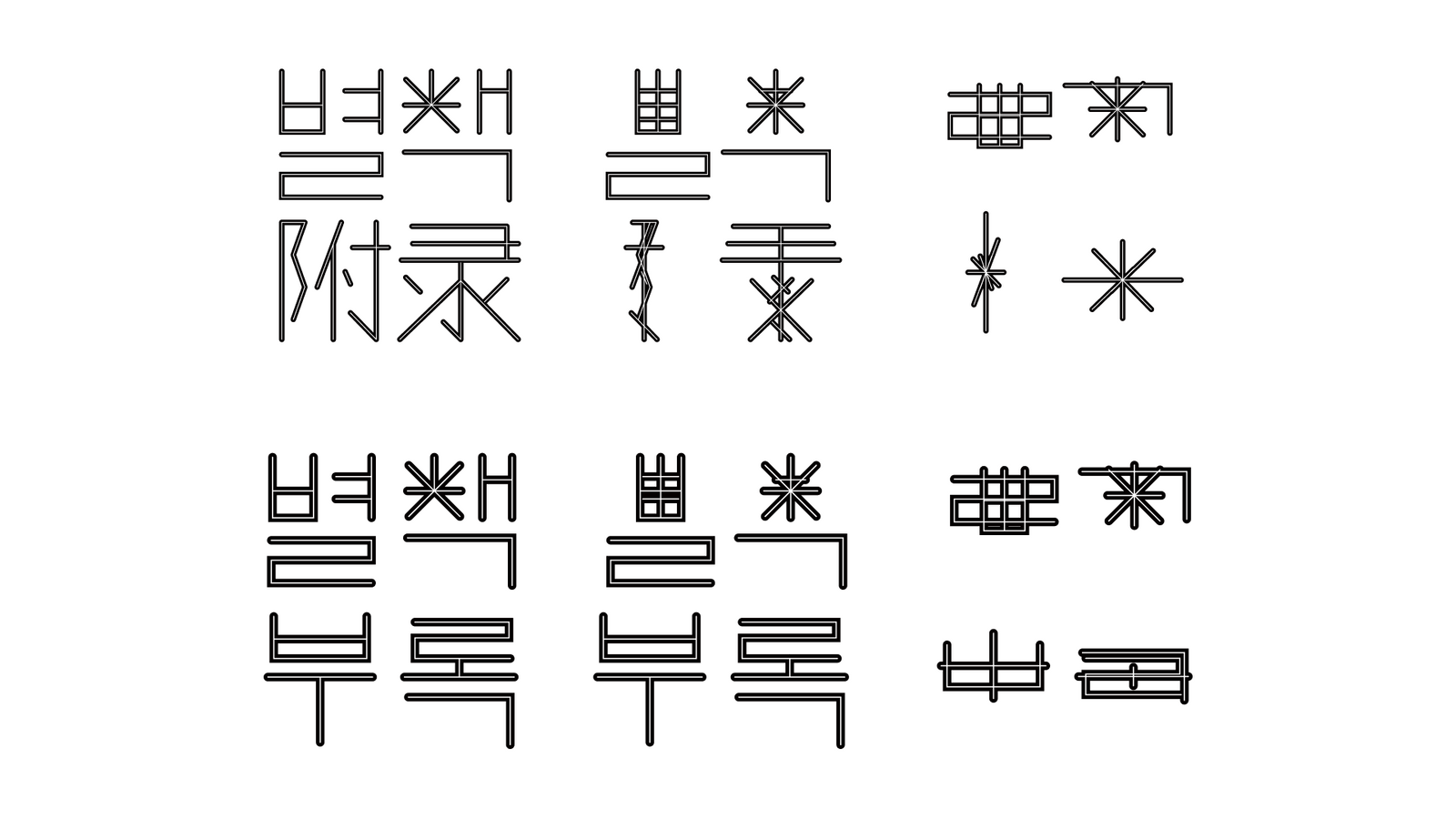
‘책’의 자음 ㅊ을 펼쳐진 책으로 해석하고, 획의 교차가 별의 형태를 함께 연상시키도록 구성했습니다. 선의 길이를 고정하지 않고 늘이거나 줄일 수 있게 만들어 한 개의 비율에 갇히지 않는 가변형 마크로 설계했습니다.The consonant of the syllable for book was interpreted as an opened book, and the crossing of the strokes was composed so it also suggests the form of a star. The lengths of the lines are not fixed but can stretch or shorten, making it a variable mark that is not trapped in one proportion.
비주얼·경험 시스템Visual / Experience System
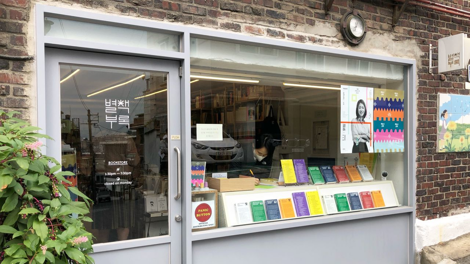
한글 심볼을 중심으로 간판과 인쇄물, 책갈피 등 다양한 비율에 맞춰 선의 길이와 배치를 변형할 수 있도록 했습니다. ‘별’이 가진 Star의 의미와 다른 문자 체계에서도 브랜드가 설명될 수 있도록 다국어 확장 가능성도 함께 고려했습니다.Around the Korean symbol, the line lengths and arrangement can be varied to suit signage, print and bookmarks at many proportions. Multilingual extension was considered too, so the meaning of star carried in the name can explain the brand in other writing systems.
프로젝트의 의미What It Means
별책부록은 브랜드 이름의 언어적 특징을 직접적인 그림이 아니라 한글 구조 속에서 발견한 프로젝트입니다. 작은 기호 하나가 공간과 인쇄물의 비율에 맞춰 계속 변하면서도 같은 서점으로 인식되는 유연한 아이덴티티를 만들었습니다.Byeolcheck is a project that found the linguistic character of a brand name inside Korean letter structure rather than in a literal picture. One small sign keeps changing with the proportions of space and print while still reading as the same bookstore.
작업 범위Scope
- Independent Bookstore Identity
- Korean Letterform Symbol
- Flexible Mark System
- Signage / Print Applications
- Multilingual Identity Consideration