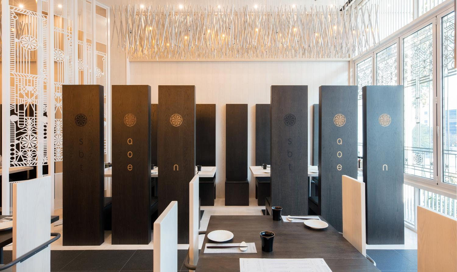
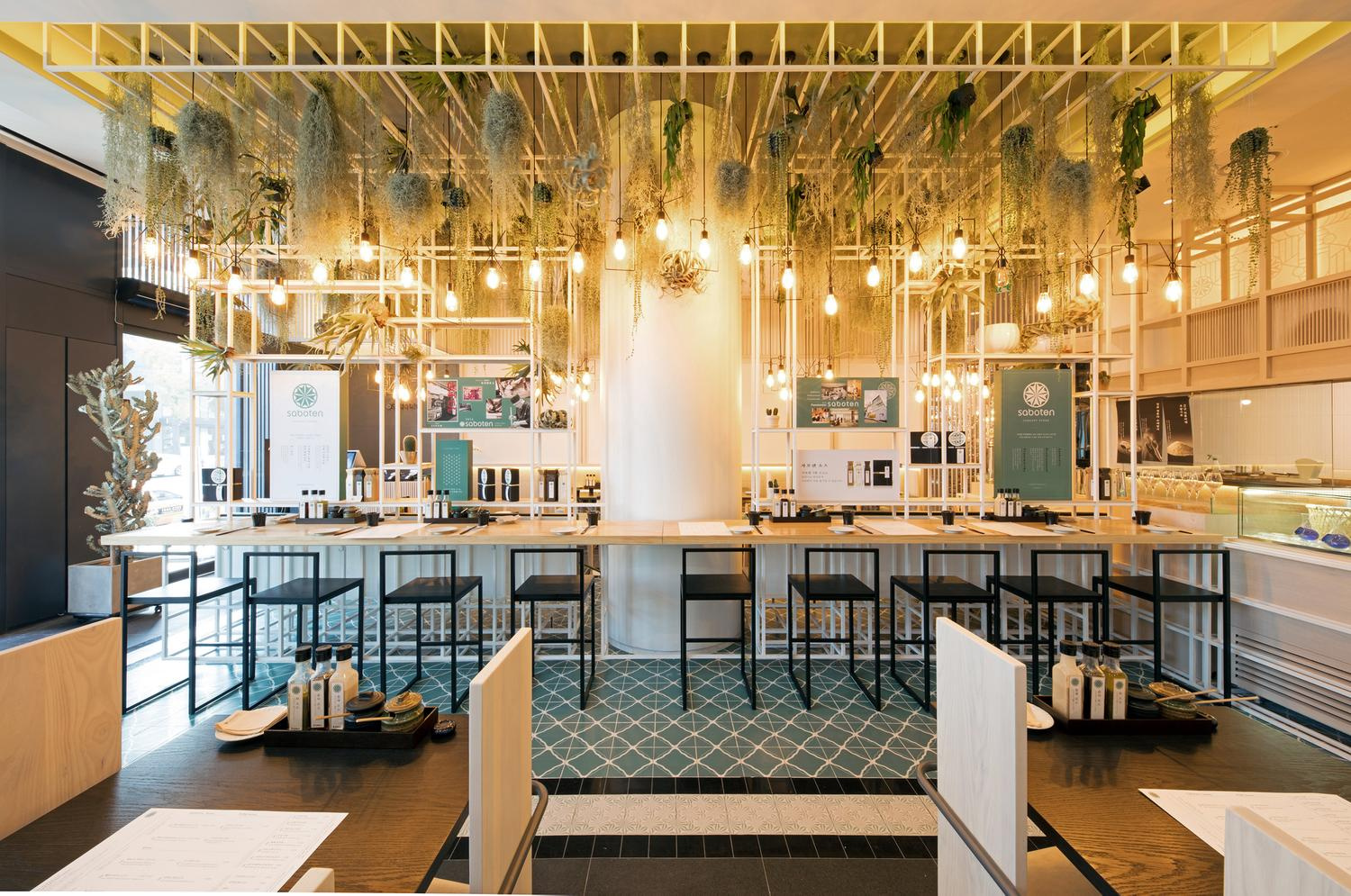
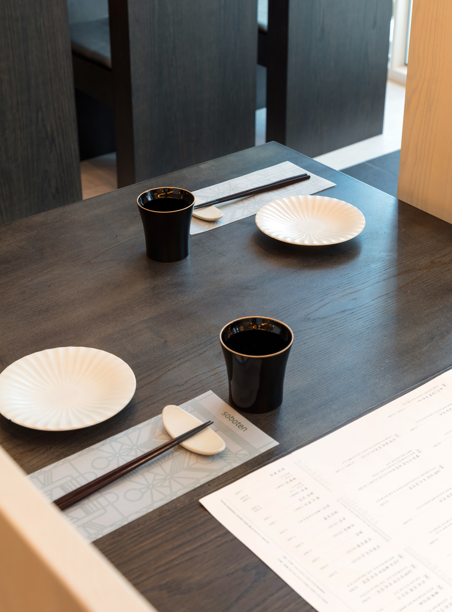
사보텐 스토어 브랜드 디자인Saboten Store Brand Design
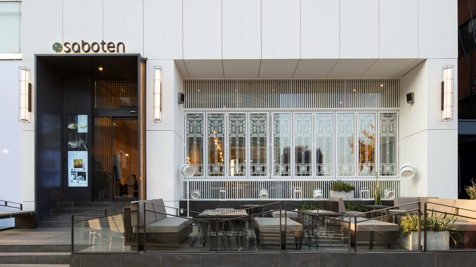
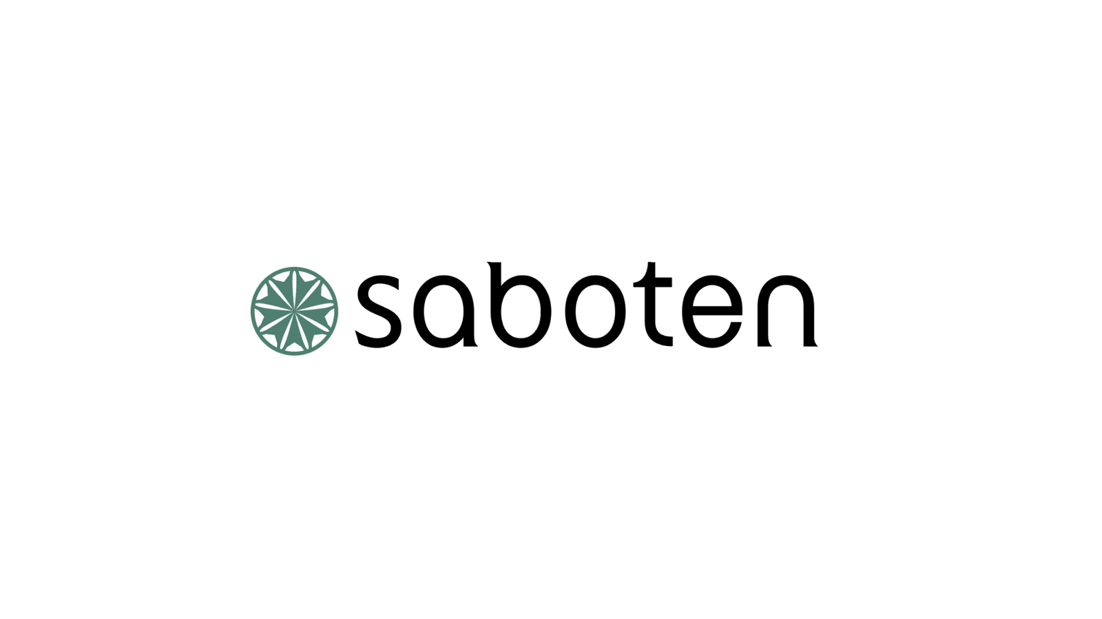
사보텐 한남동 플래그십 스토어를 위한 로고타입을 시작으로, 익숙한 돈카츠 브랜드의 아이덴티티를 새로운 리테일 환경에 맞게 재정비했습니다.Starting from a logotype for the Saboten flagship store in Hannam dong, the identity of a familiar tonkatsu brand was rebuilt for a new retail setting.
기존 인지 자산을 지우기보다 축적된 브랜드의 인상을 더 단정하고 현대적인 형태로 정리하는 데 집중했습니다.Rather than erasing existing recognition, the work concentrated on organising the accumulated impression into a cleaner and more contemporary form.
배경Background
사보텐은 오랜 시간 인지도를 쌓아온 돈카츠 브랜드로, 한남동 플래그십에서는 기존 매장과 구분되는 새로운 브랜드 표현이 필요했습니다. 익숙한 이름이 가진 신뢰를 유지하면서도 공간의 성격에 맞는 보다 정제된 인상을 만드는 것이 프로젝트의 출발점이었습니다.Saboten is a tonkatsu brand with long standing recognition, and the Hannam dong flagship called for a brand expression distinct from the existing stores. The starting point was keeping the trust in a familiar name while creating a more refined impression suited to the character of the space.
과제The Challenge
오래된 브랜드를 현대적으로 바꾸는 과정에서는 변화의 크기를 조절하는 일이 중요합니다. 지나치게 새로우면 기존 고객이 알고 있는 사보텐의 인상이 사라지고, 반대로 변화가 약하면 플래그십을 위한 새로운 시각적 이유가 생기지 않습니다.When modernising an established brand, controlling the size of the change is the difficult part. Too new and the impression of Saboten that existing customers know disappears; too slight and there is no visual reason for a flagship in the first place.
디자인 접근Design Approach
전통적인 일본 이미지를 직접적인 장식으로 추가하기보다 로고타입 자체의 비례와 균형을 다시 설계했습니다. 브랜드의 역사성을 상징물의 양으로 보여주는 대신, 글자의 형태와 간격, 전체 실루엣이 더 단정하고 안정적으로 보이도록 정리했습니다.Rather than adding traditional Japanese imagery as literal decoration, the proportion and balance of the logotype itself were redesigned. Instead of showing history through the quantity of symbols, the letterforms, spacing and overall silhouette were organised to look cleaner and more settled.
비주얼·경험 시스템Visual / Experience System
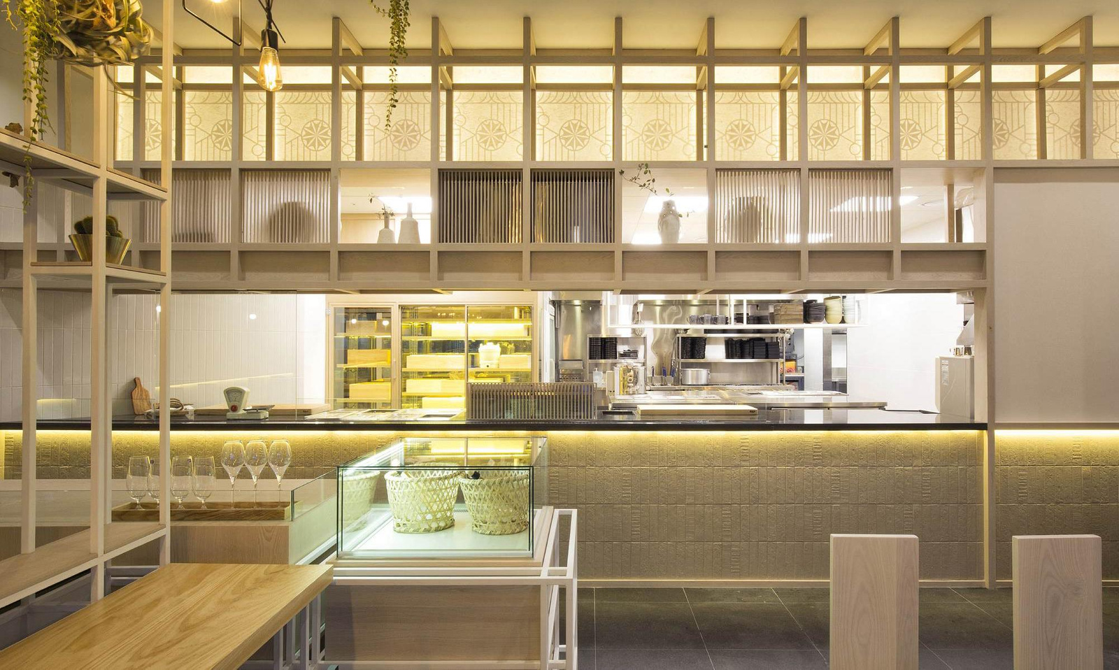
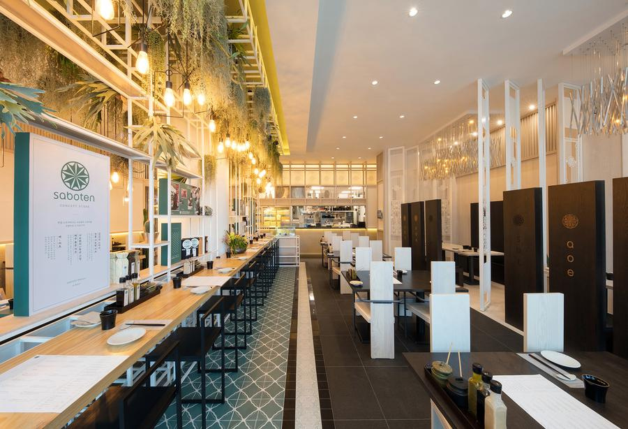
한남동 플래그십의 브랜드 표현을 기준으로 로고타입이 공간과 다양한 리테일 접점에서 일관되게 사용될 수 있는 방향을 정리했습니다. 핵심은 별도의 장식적 그래픽보다 로고타입 자체가 매장의 인상을 안정적으로 만드는 것이었습니다.Using the brand expression of the Hannam dong flagship as the reference, a direction was set for using the logotype consistently across the space and various retail touchpoints. The point was for the logotype itself to steady the impression of the store rather than any additional decorative graphics.
프로젝트의 의미What It Means
사보텐 스토어는 기존 브랜드 자산을 새 공간에 맞게 재해석한 리테일 아이덴티티 프로젝트입니다.Saboten Store is a retail identity project that reinterpreted existing brand assets for a new space.
작업 범위Scope
- Identity Redesign
- Hannam Flagship Logotype
- Retail Identity Direction