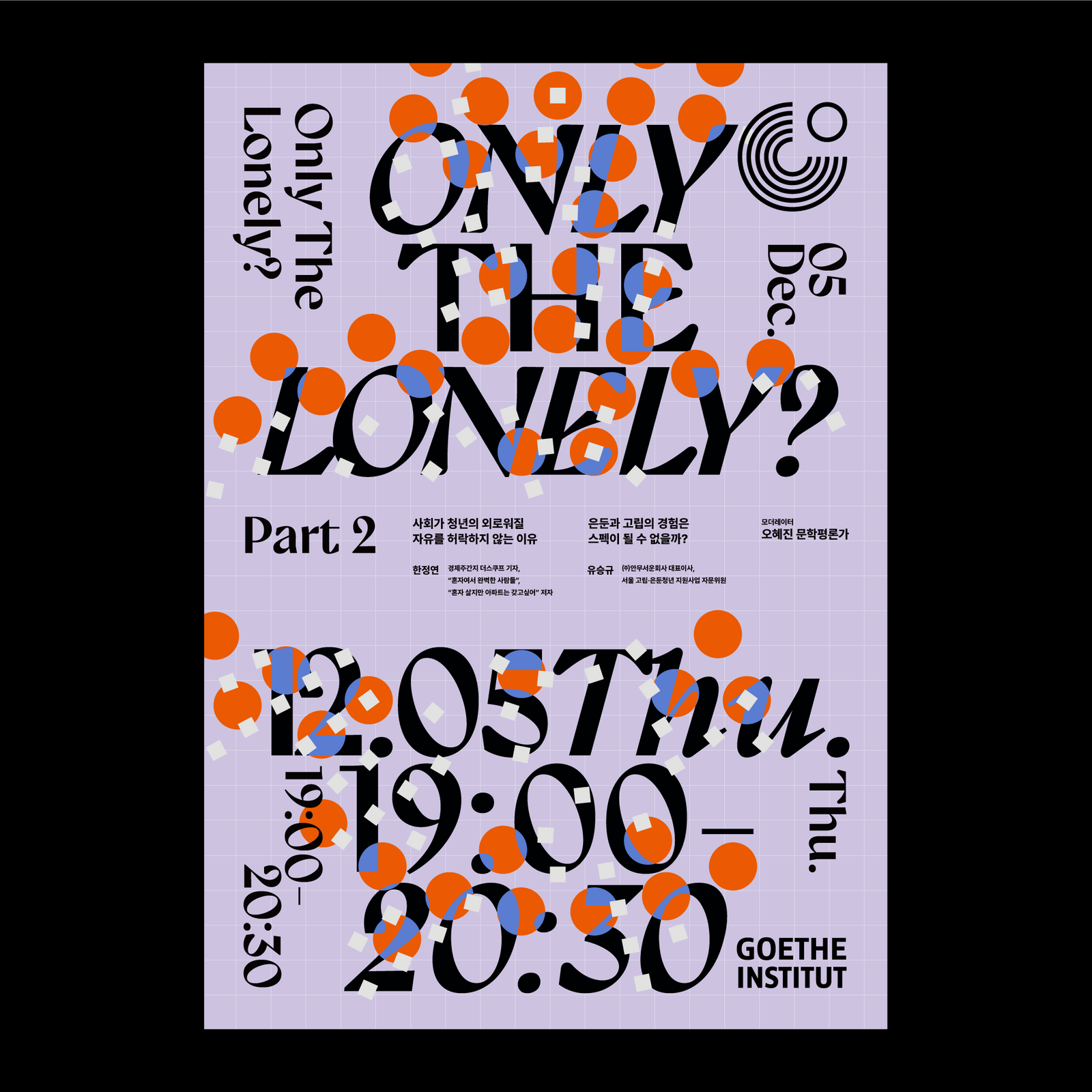
외로움에 대한 대화: ONLY THE LONELY?Goethe-Institut: Only the Lonely?, Graphic Design
괴테-인스티투트의 ‘Only the Lonely?’는 외로움을 단순한 결핍이 아니라, 사회적 규범 밖에서 스스로 선택하고 존재하는 방식까지 포함해 바라보는 두 차례의 대화 프로그램입니다.Only the Lonely? at the Goethe Institut is a two part conversation program that treats loneliness not only as a lack but as a way of choosing and existing outside social norms.
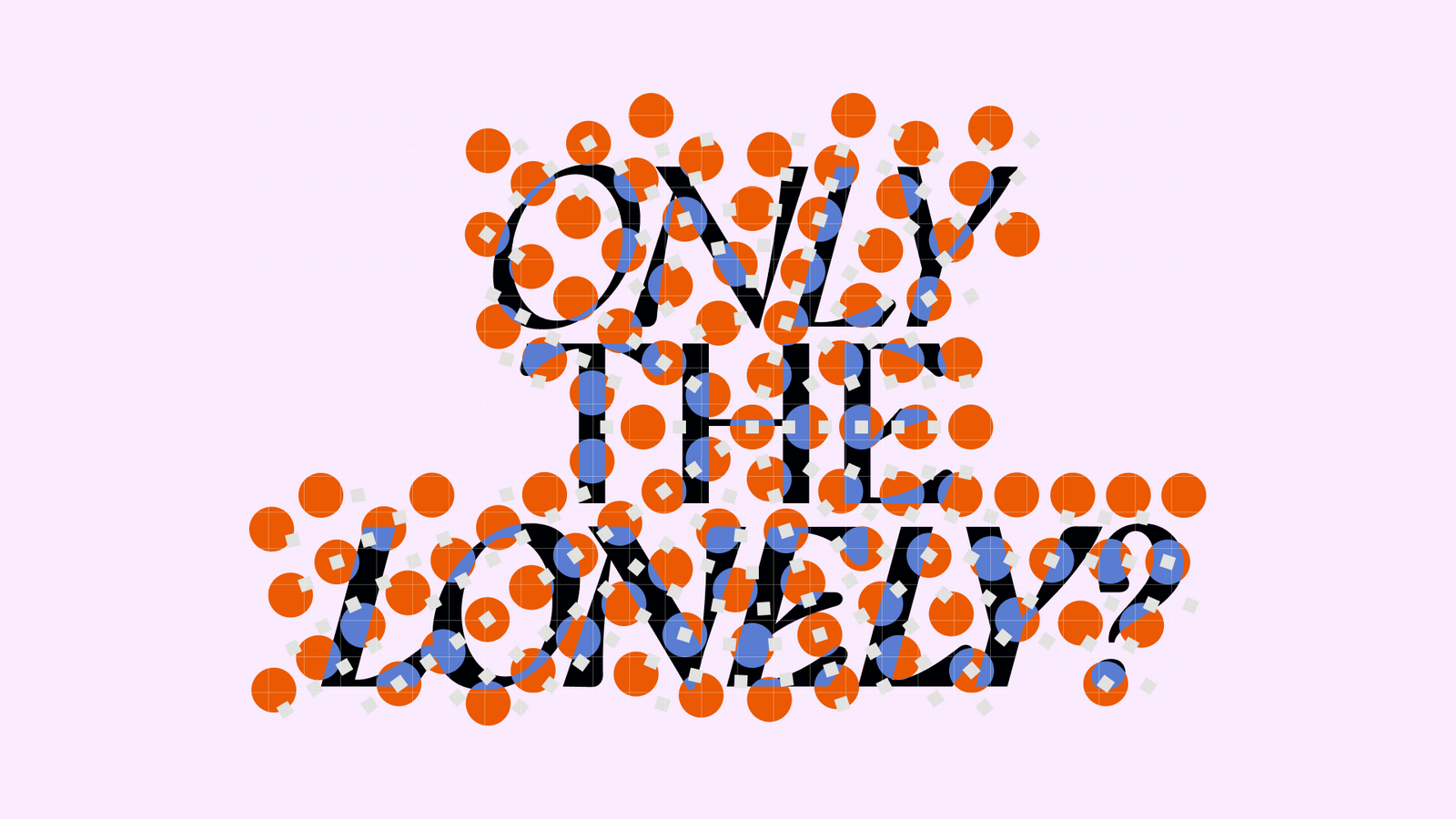
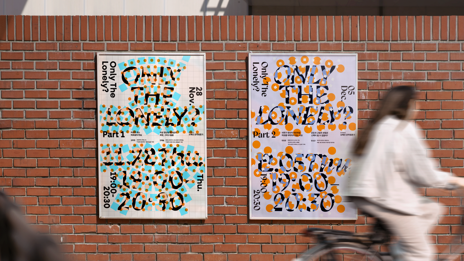
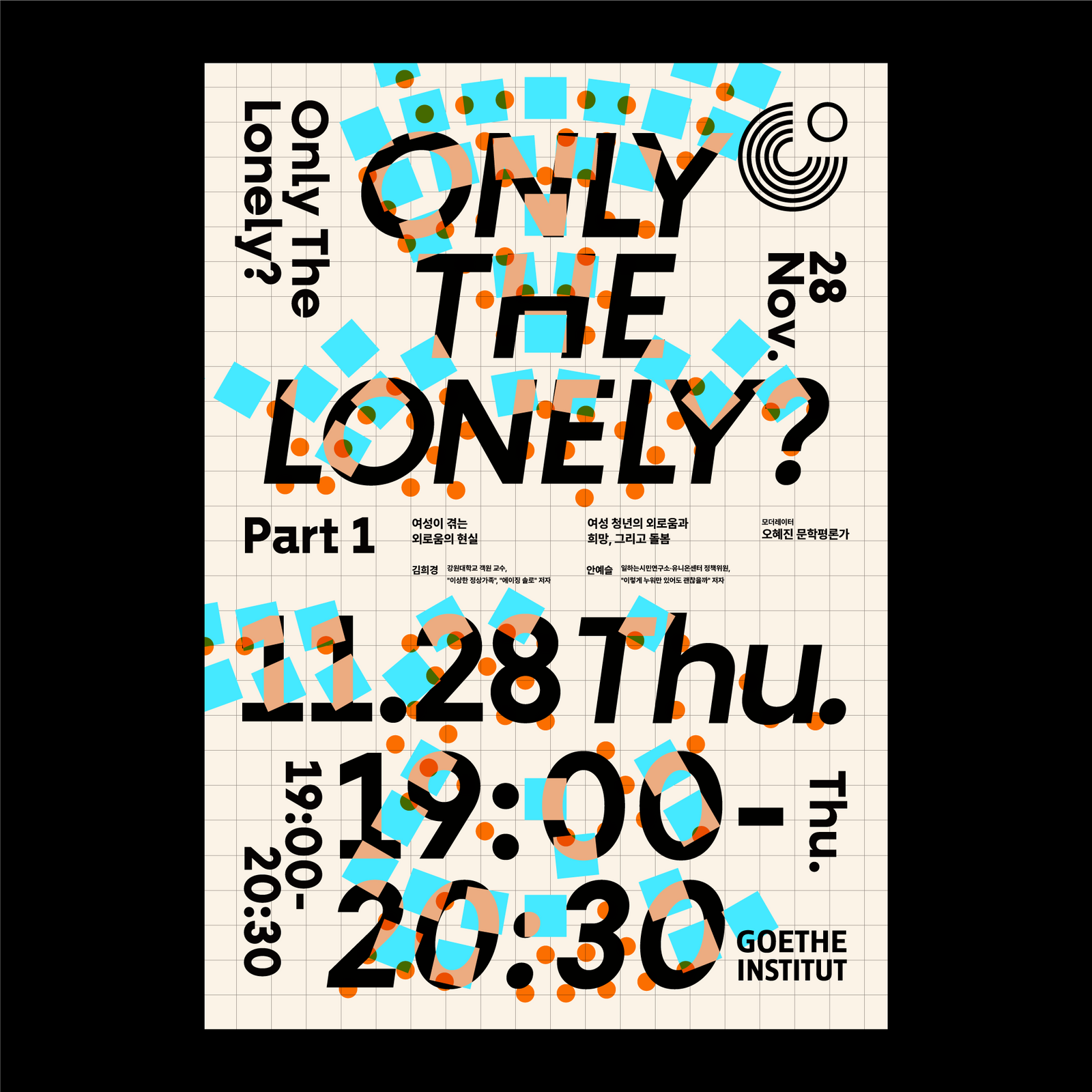
정해진 틀을 벗어나는 사각형과 원, 강한 색과 큰 타이포그래피로 서로 다른 삶의 위치와 소통을 시각화했습니다.Squares and circles that break out of a fixed frame, strong colour and large typography visualise different positions in life and the exchange between them.
배경Background
프로그램은 외로움이라는 감정을 부정적인 상태로만 규정하지 않고, 의도적으로 선택한 고독과 사회적 관습 밖에서 살아가는 삶의 방식까지 함께 다뤘습니다. 서로 다른 배경의 패널들이 각자의 경험과 관점을 나누는 두 번의 세션을 하나의 시각 언어로 연결할 필요가 있었습니다.The program refused to define loneliness only as a negative state, taking in chosen solitude and lives led outside social convention. Two sessions where panellists from different backgrounds share their own experiences and perspectives needed to be tied together by one visual language.
과제The Challenge
외로움을 고립이나 우울의 전형적인 이미지로 표현하지 않으면서도, 개인의 독립성과 타인과의 관계라는 두 측면을 동시에 보여줘야 했습니다. 디지털 홍보 환경에서는 프로그램의 성격이 즉각적으로 보이도록 강한 타이포그래피와 명확한 구조도 필요했습니다.Loneliness had to be expressed without the standard imagery of isolation or depression, while still holding two sides at once: individual independence and relation to others. In a digital promotion environment the character of the program had to read instantly, which called for strong typography and a clear structure.
디자인 접근Design Approach
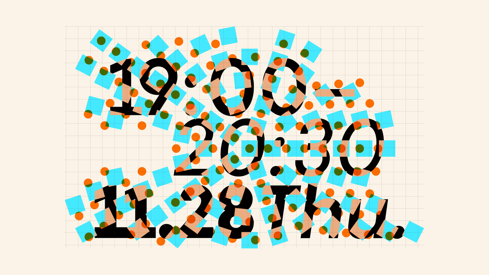
사회가 요구하는 규범과 정형화된 삶의 방식을 ‘그리드’로 보고, 요소가 그 틀을 벗어나는 방식으로 ‘틀에 맞춰 살지 않는다’는 태도를 표현했습니다. 사각형은 각자가 점유하는 고유한 위치와 자율성을, 원은 인간의 완결성과 감정을 상징하며 두 형태가 만나고 교차하는 장면으로 다양성과 대화를 보여줍니다.The norms society asks for and the standardised shape of a life were treated as a grid, and elements stepping outside that frame express the attitude of not living to fit. The square stands for the distinct position and autonomy each person occupies, the circle for human wholeness and feeling, and the scenes where the two meet and cross show diversity and dialogue.
비주얼·경험 시스템Visual / Experience System
선명한 컬러 조합과 크고 과감한 타이포그래피, 그리드 안팎을 이동하는 사각형과 원을 중심으로 디지털 프로모션 그래픽을 구성했습니다. 세션별 정보가 달라져도 같은 형태 규칙을 공유해 하나의 프로그램 시리즈로 인식되도록 했습니다.Digital promotion graphics were built around vivid colour pairings, large and unhesitant typography, and squares and circles moving in and out of the grid. Session information changes while the same rules of form are shared, so the sessions read as one series.
프로젝트의 의미What It Means
‘Only the Lonely?’의 그래픽은 외로움을 하나의 감정 이미지로 규정하지 않고, 개인이 차지하는 위치와 관계의 방식으로 번역했습니다. 사회적 틀을 벗어나는 움직임과 서로 다른 형태의 상호작용을 통해 프로그램의 질문 자체를 시각적으로 드러냈습니다.The graphics for Only the Lonely? translated loneliness into positions people occupy and ways of relating rather than fixing it as a single emotional image. Movement out of the social frame and interaction between different forms make the question of the program visible in itself.
작업 범위Scope
- Graphic Identity
- Digital Promotion
- Typography System
- Grid / Shape System
- Session Graphics