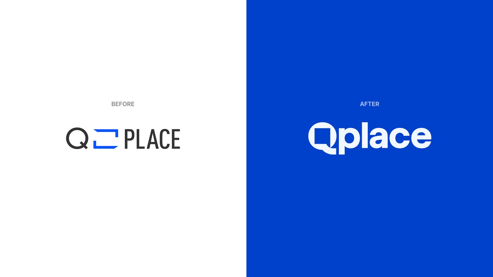
큐플레이스 리브랜딩Qplace Rebranding
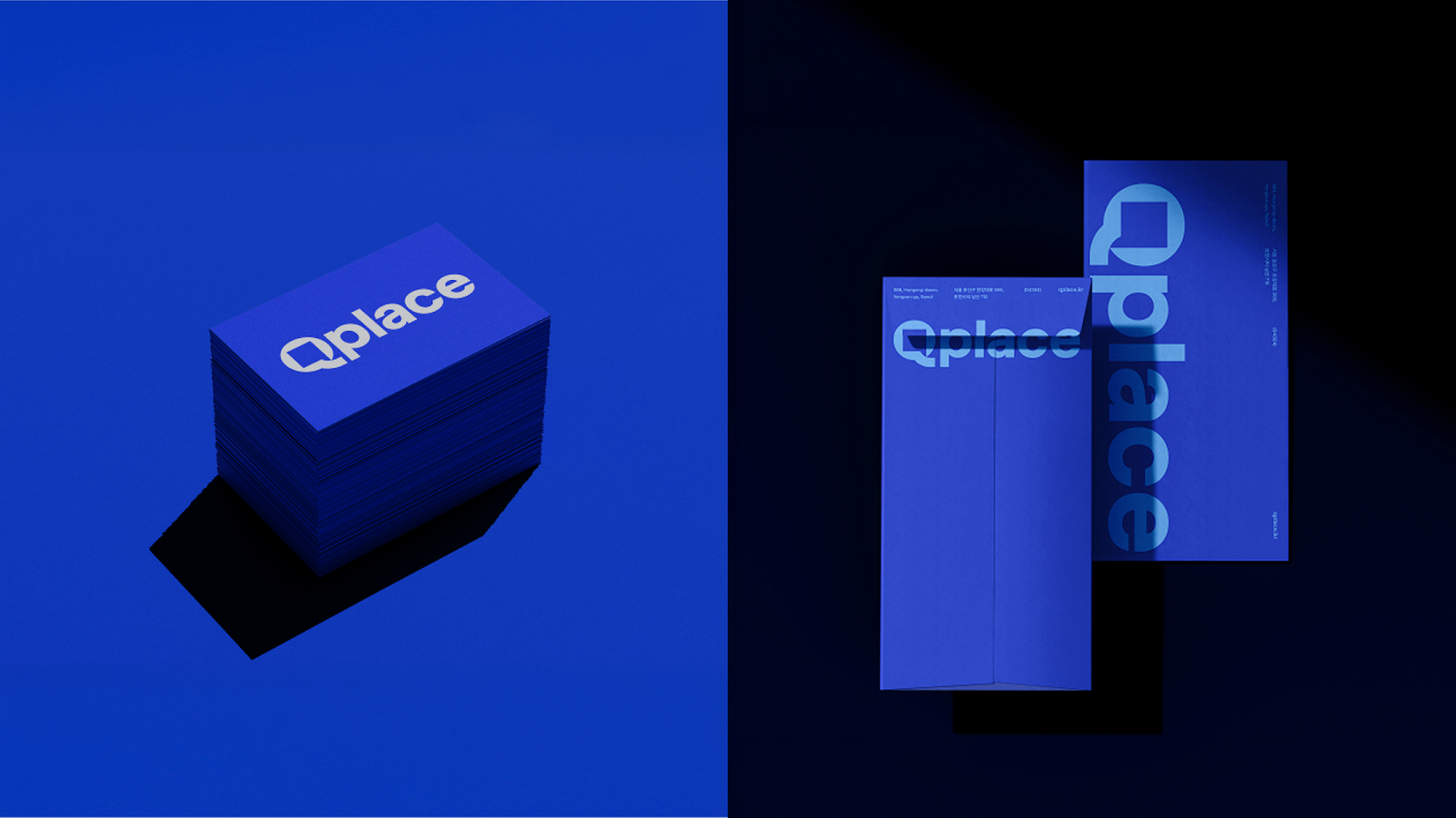
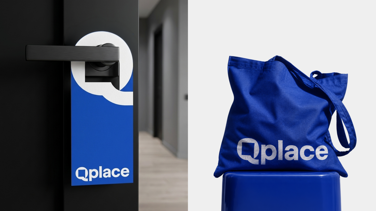
상업공간 인테리어를 비교하고 선택하는 Qplace의 서비스 경험을 ‘열린 문’이라는 직관적인 상징으로 재구성했습니다.Qplace helps people compare and choose commercial interior partners, and that experience was rebuilt around one intuitive symbol, an open door.
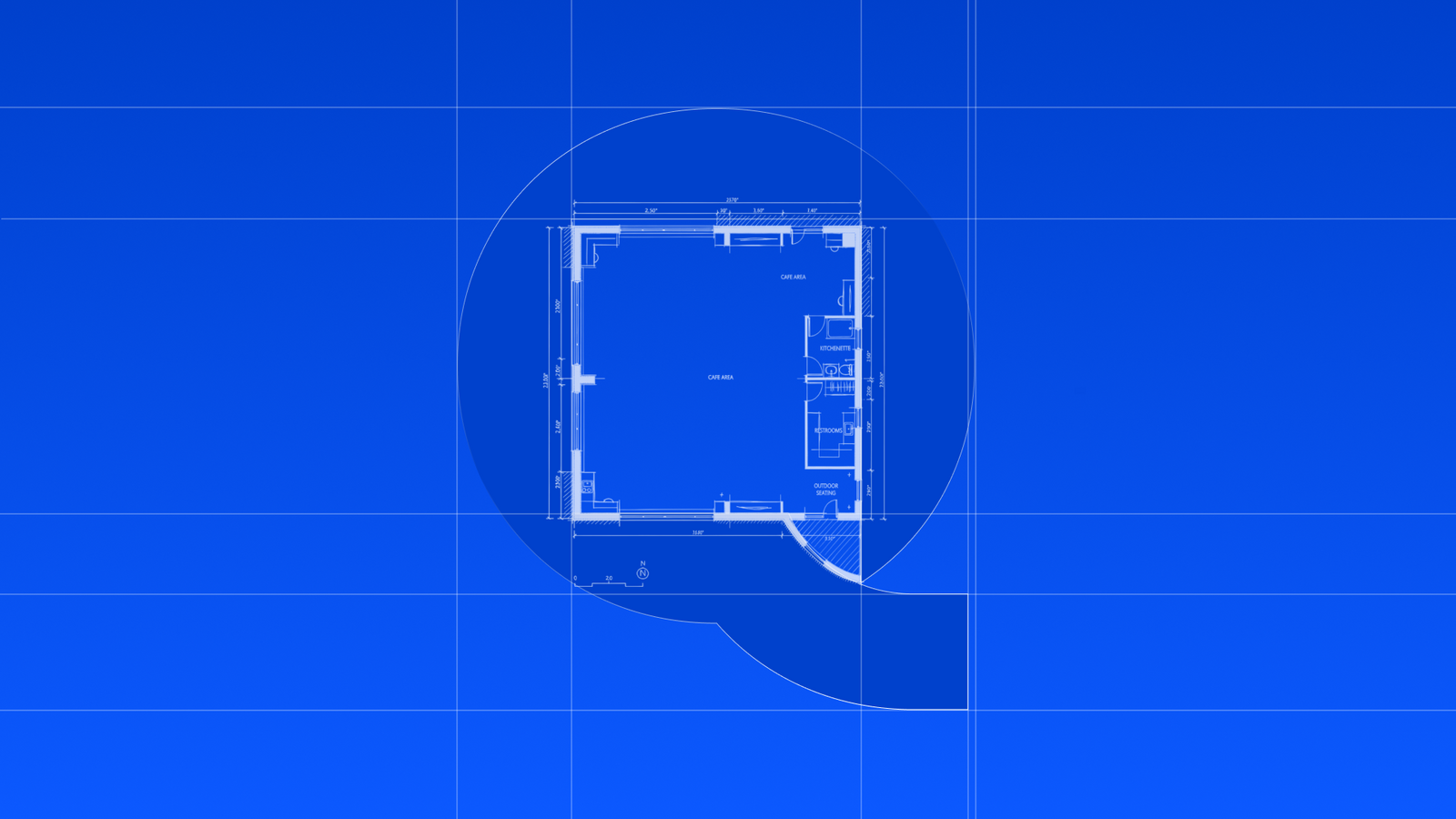
평면도에서 볼 수 있는 문이 열리는 궤적을 말풍선의 꼬리와 연결해, 공간을 여는 서비스와 자영업자 커뮤니티의 대화를 하나의 심볼에 담았습니다.The arc a door traces on a floor plan doubles as the tail of a speech bubble, holding both the opening of a space and the conversation between owners in a single mark.
배경Background
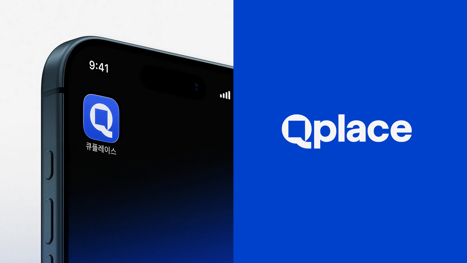
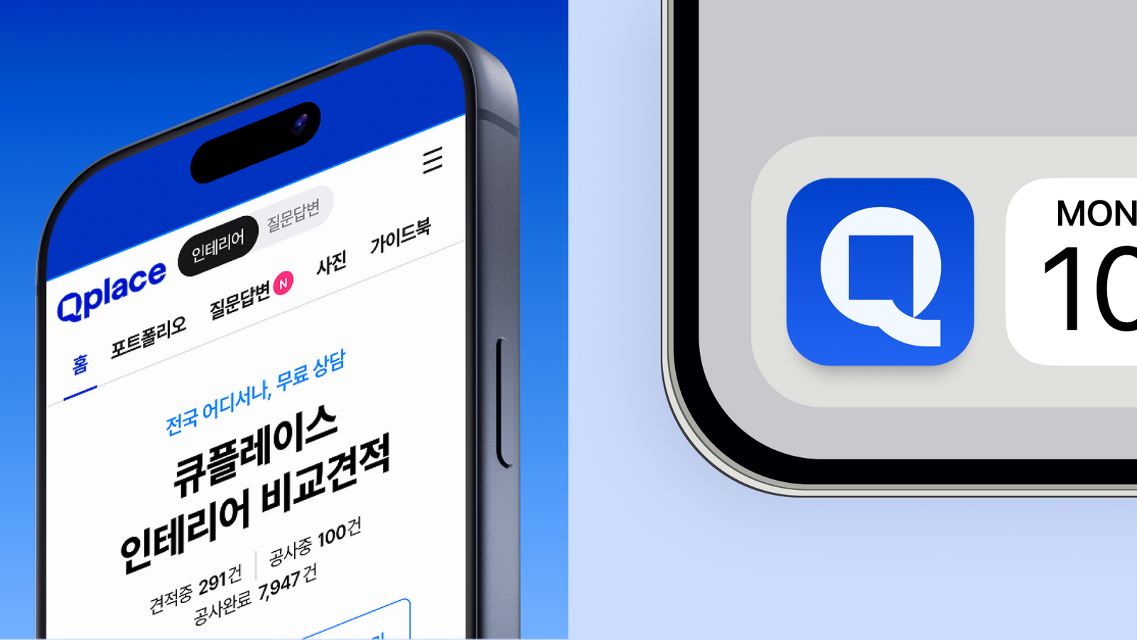
Qplace는 창업자와 매장 운영자가 인테리어 파트너를 탐색하고 비교하는 서비스입니다. 브랜드는 공간에 대한 감각뿐 아니라 견적과 파트너 선택 과정에서 필요한 신뢰와 명료함을 함께 보여줘야 했고, 새로운 아이덴티티가 웹·앱과 마케팅 접점에서도 일관되게 작동해야 했습니다.Qplace is a service where founders and store operators search for and compare interior partners. The brand had to show a feel for space alongside the clarity and confidence people need while reviewing quotes and choosing a partner, and the new identity had to hold up consistently across web, app and marketing.
과제The Challenge
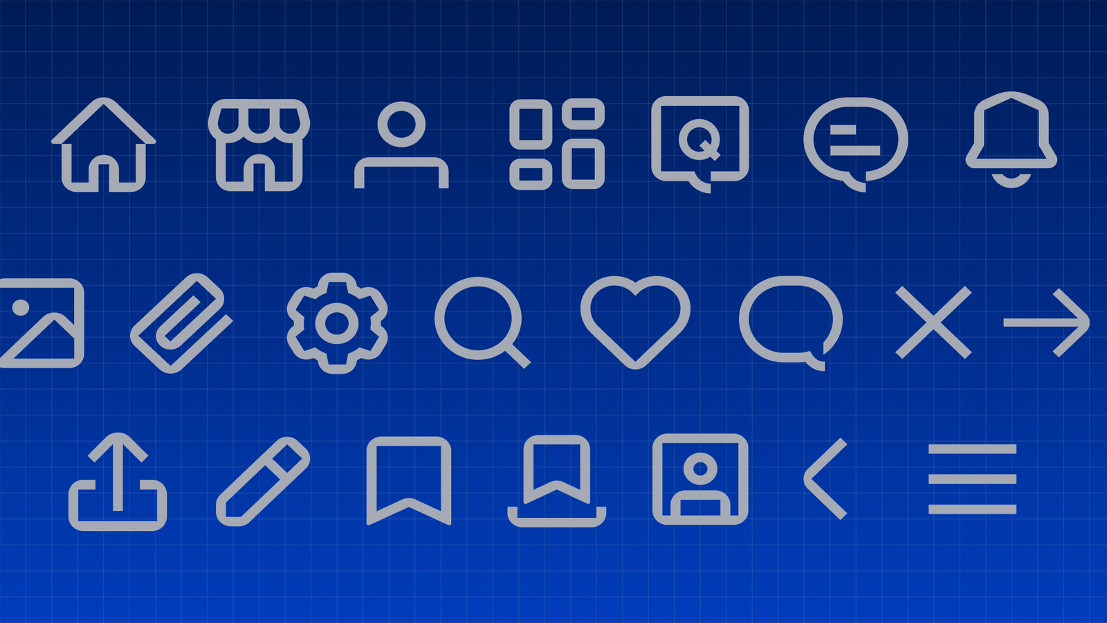
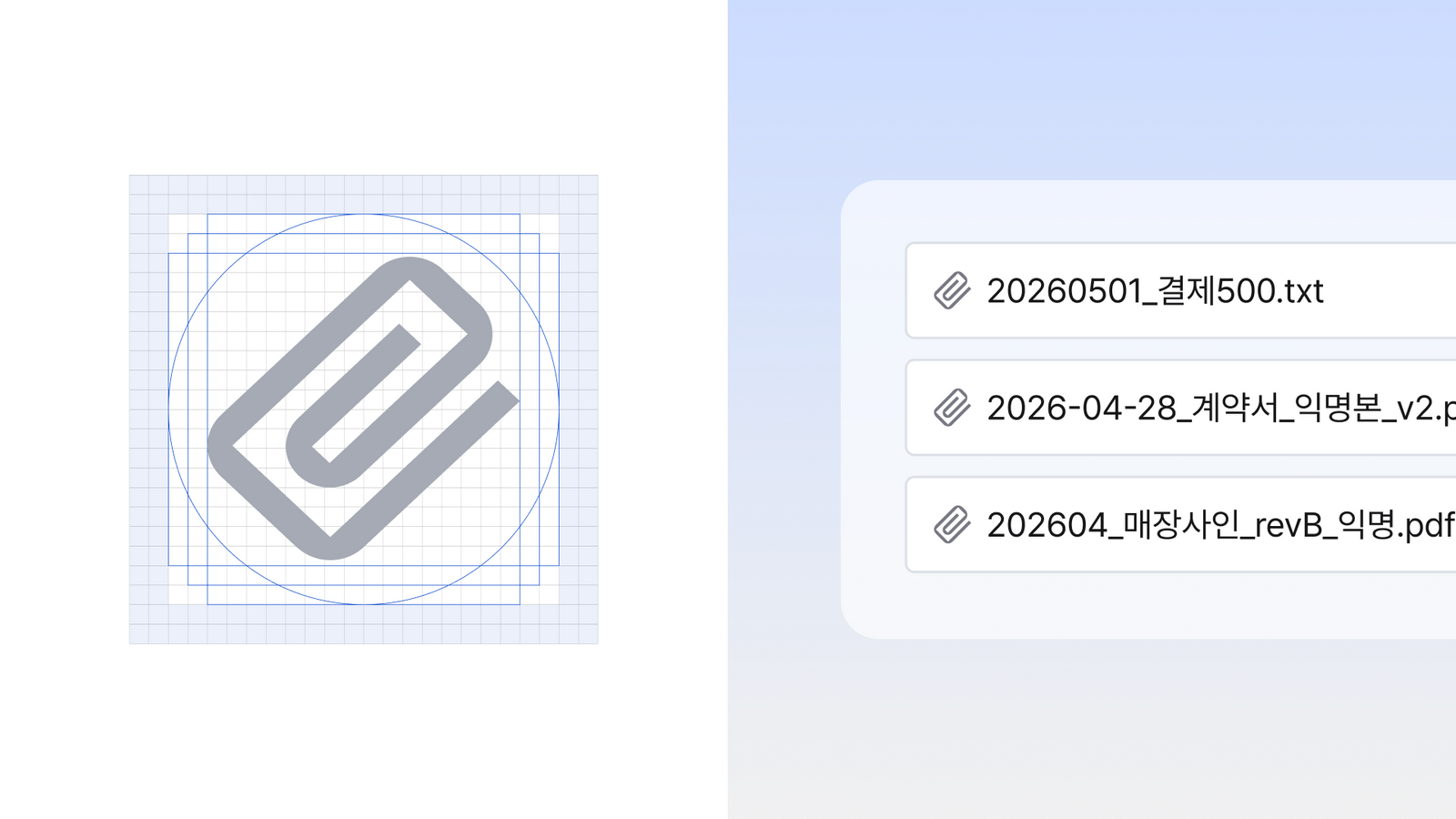
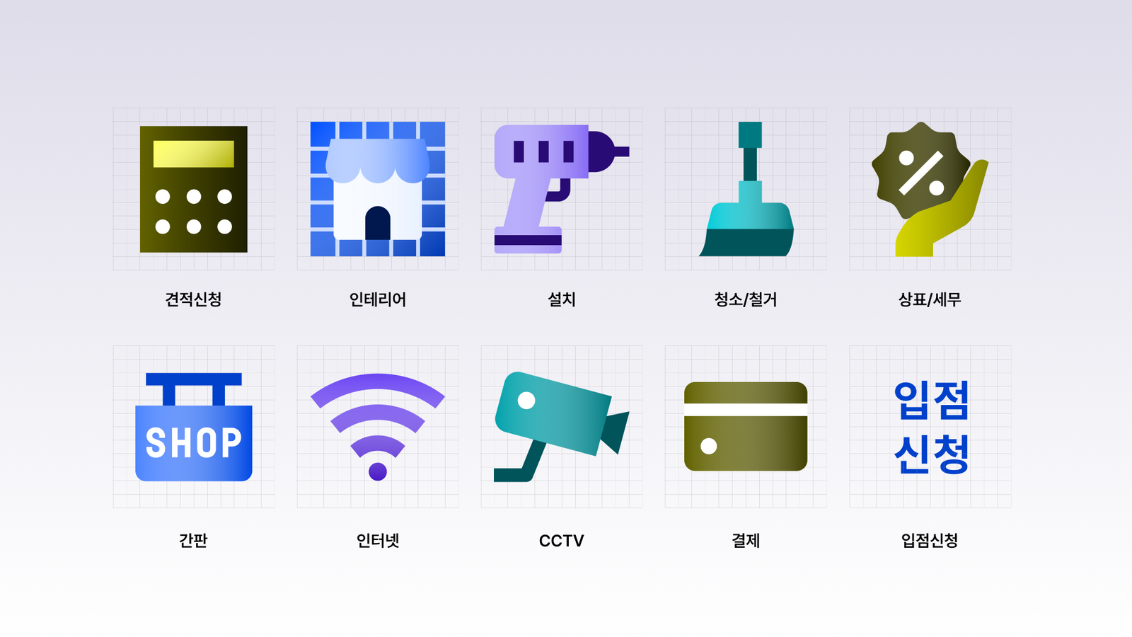
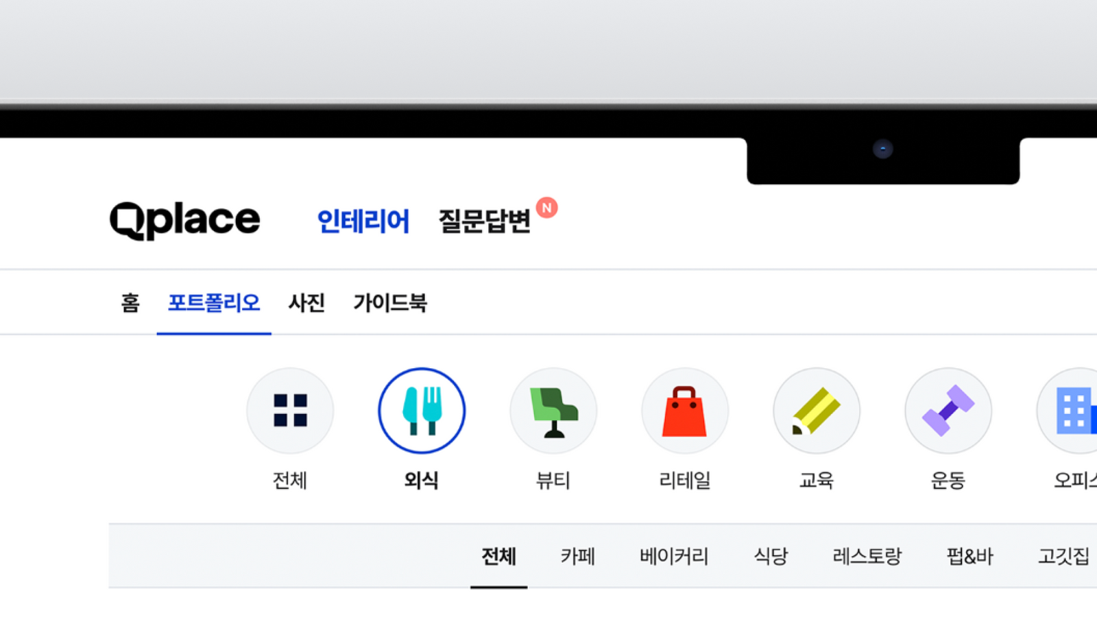
공간을 다루는 브랜드의 개성을 만들면서도 디지털 제품의 사용성을 해치지 않는 균형이 중요했습니다. 기능 전달을 위한 UI 아이콘과 브랜드를 기억시키는 전용 그래픽의 역할을 구분하고, 새로운 기능과 콘텐츠가 늘어날 때도 같은 서비스로 인식될 수 있는 반복 가능한 기준이 필요했습니다.The balance mattered: give a space driven brand real character without hurting the usability of a digital product. Functional UI icons and memorable brand graphics needed separate roles, and the system needed a repeatable standard so the service still reads as itself as features and content keep growing.
디자인 접근Design Approach
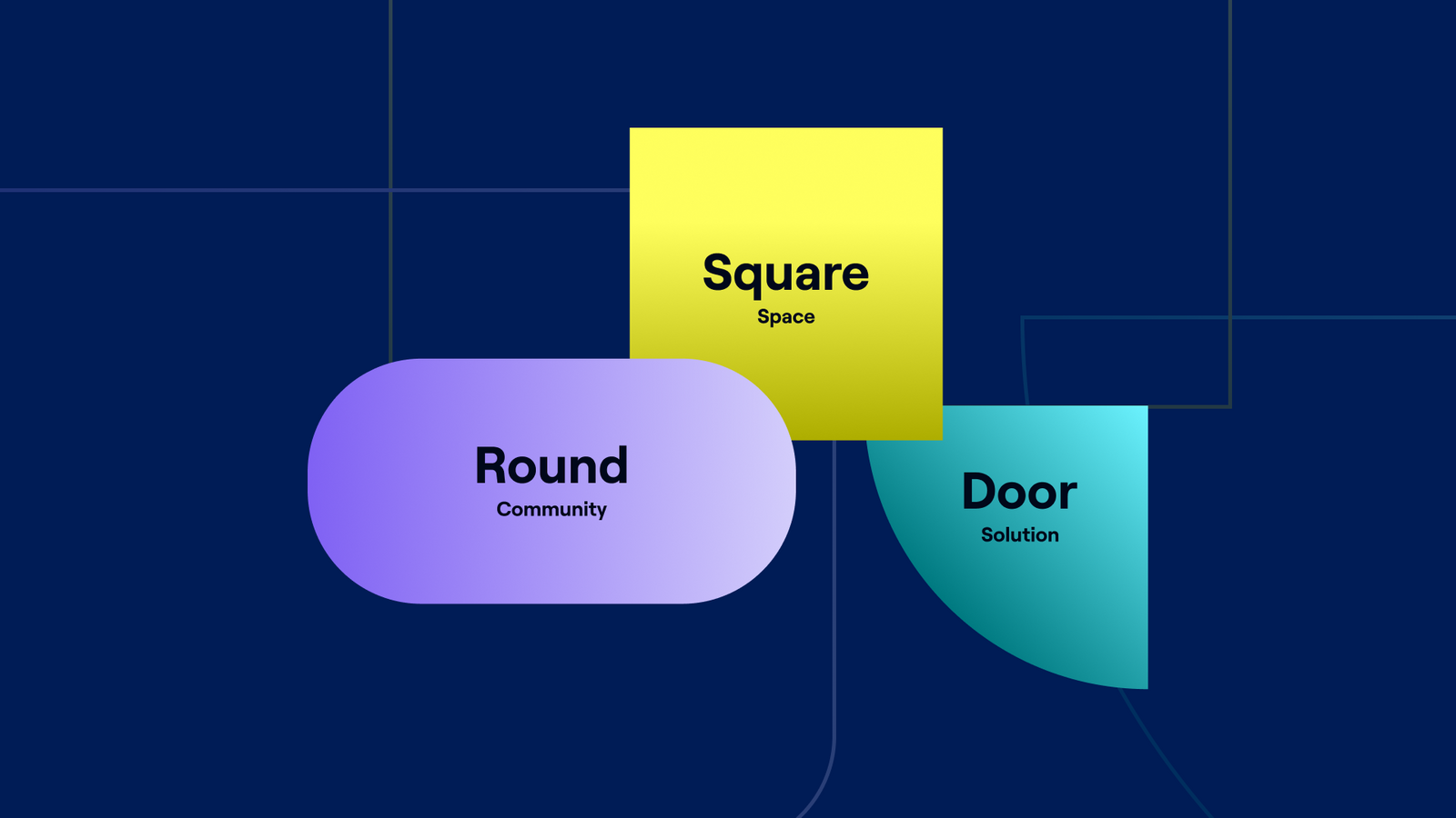
인테리어 평면도에서 가장 보편적으로 발견할 수 있는 ‘열린 문’의 형태를 출발점으로 삼았습니다. 문이 회전하며 만드는 궤적은 새로운 공간으로 들어가는 움직임을 보여주는 동시에 말풍선의 꼬리처럼 읽혀, Qplace가 제공하는 공간 탐색과 사용자 간 정보 교류를 하나의 기호로 결합합니다.The starting point was the open door, the most common form you find on any interior floor plan. The arc a door makes as it swings shows the movement into a new space and reads as the tail of a speech bubble at the same time, joining the search for space and the exchange of information between users into one sign.
비주얼·경험 시스템Visual / Experience System
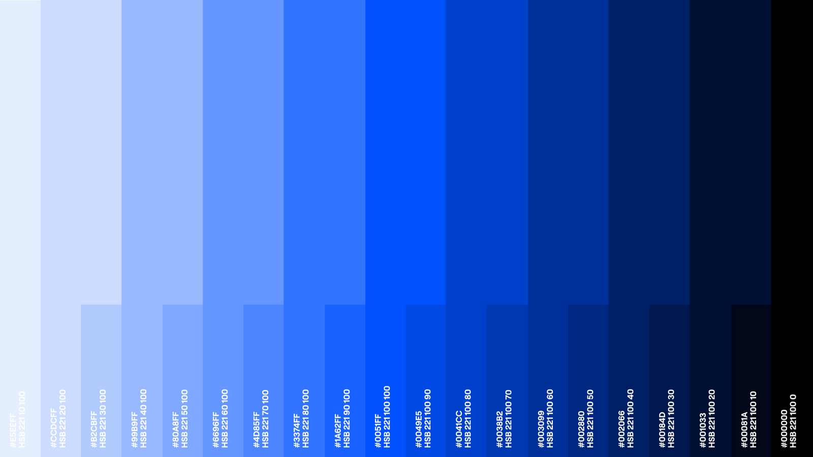
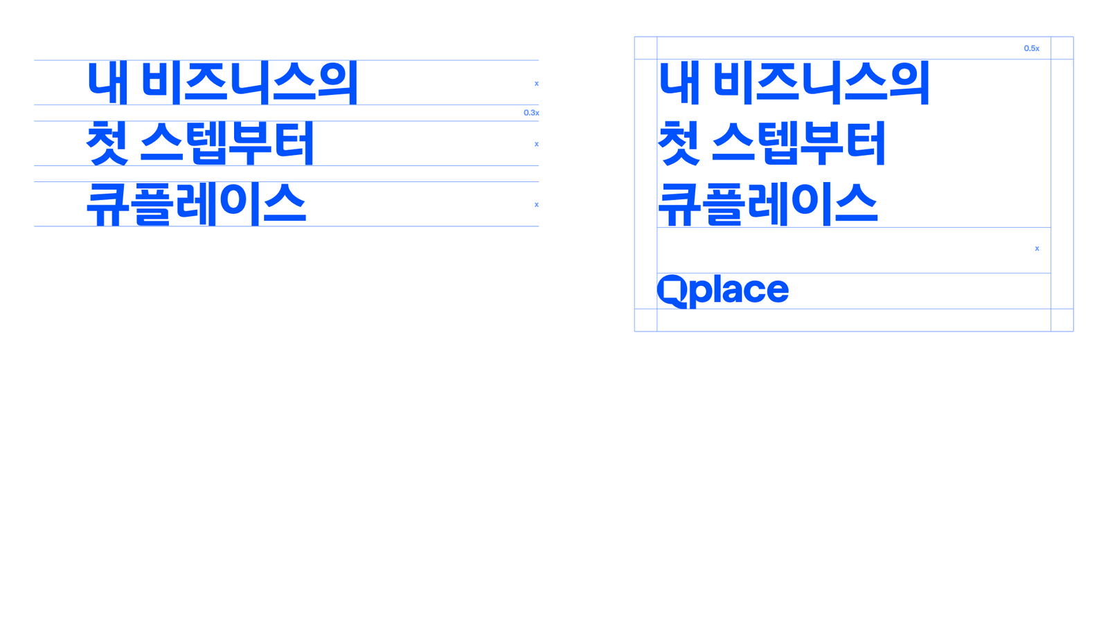
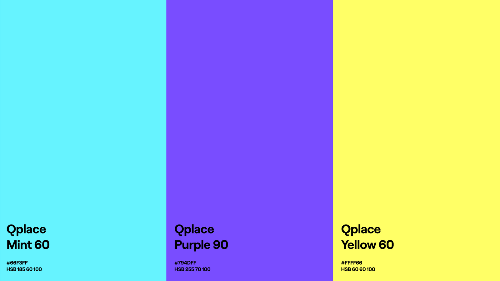
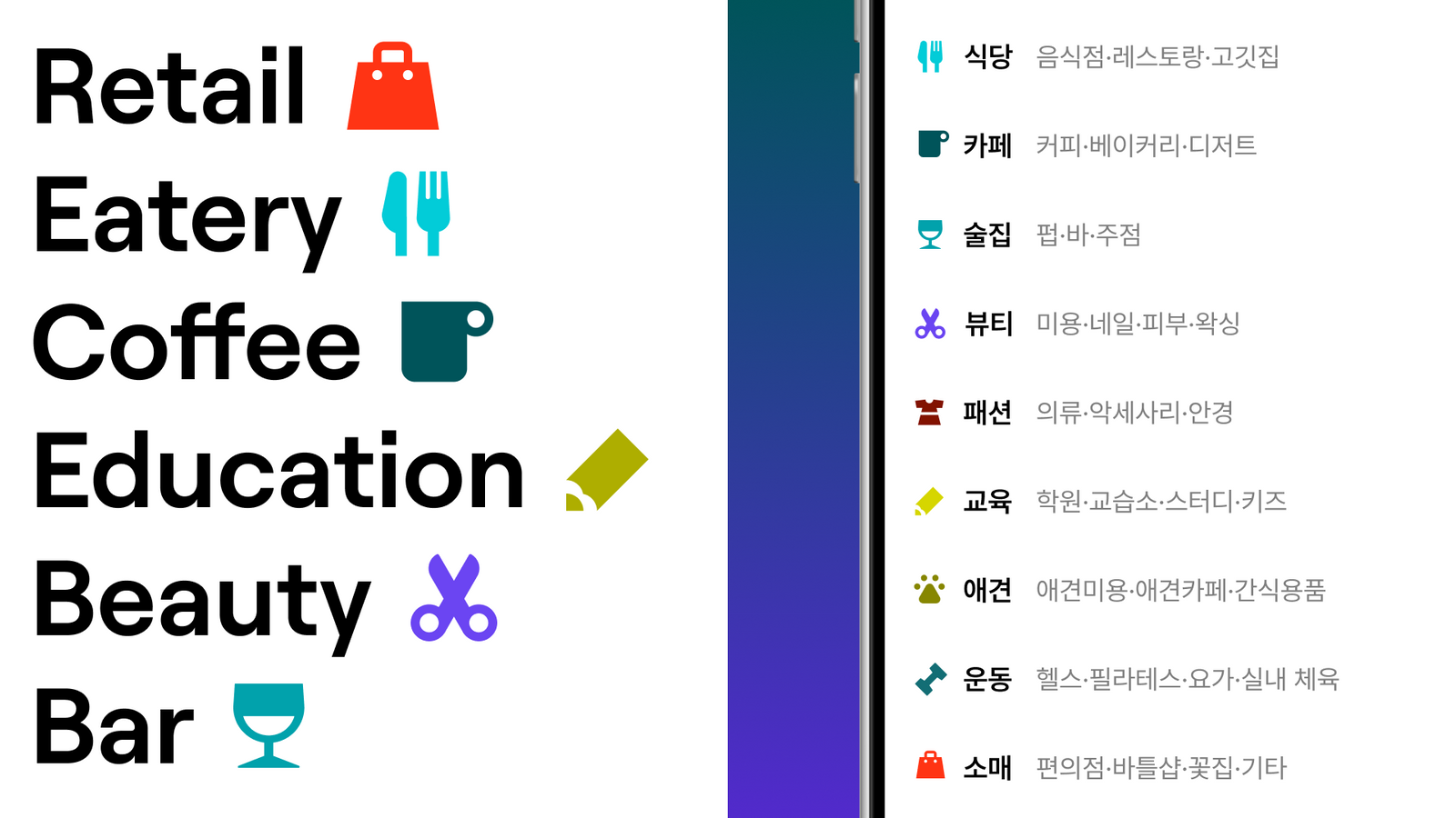
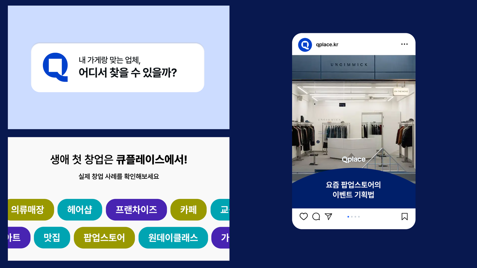
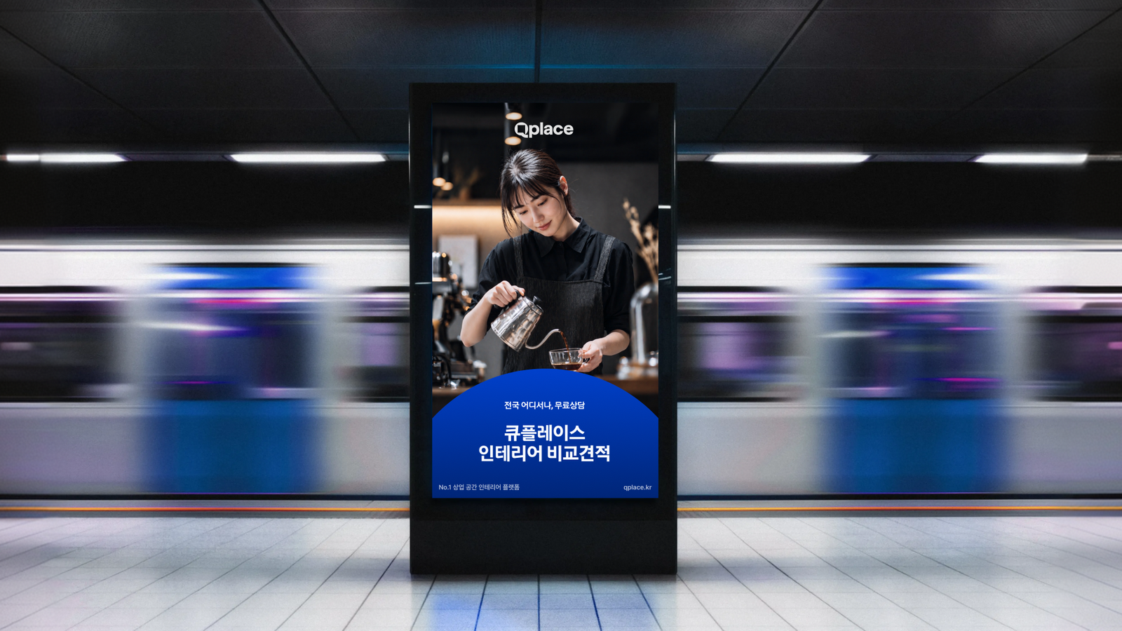
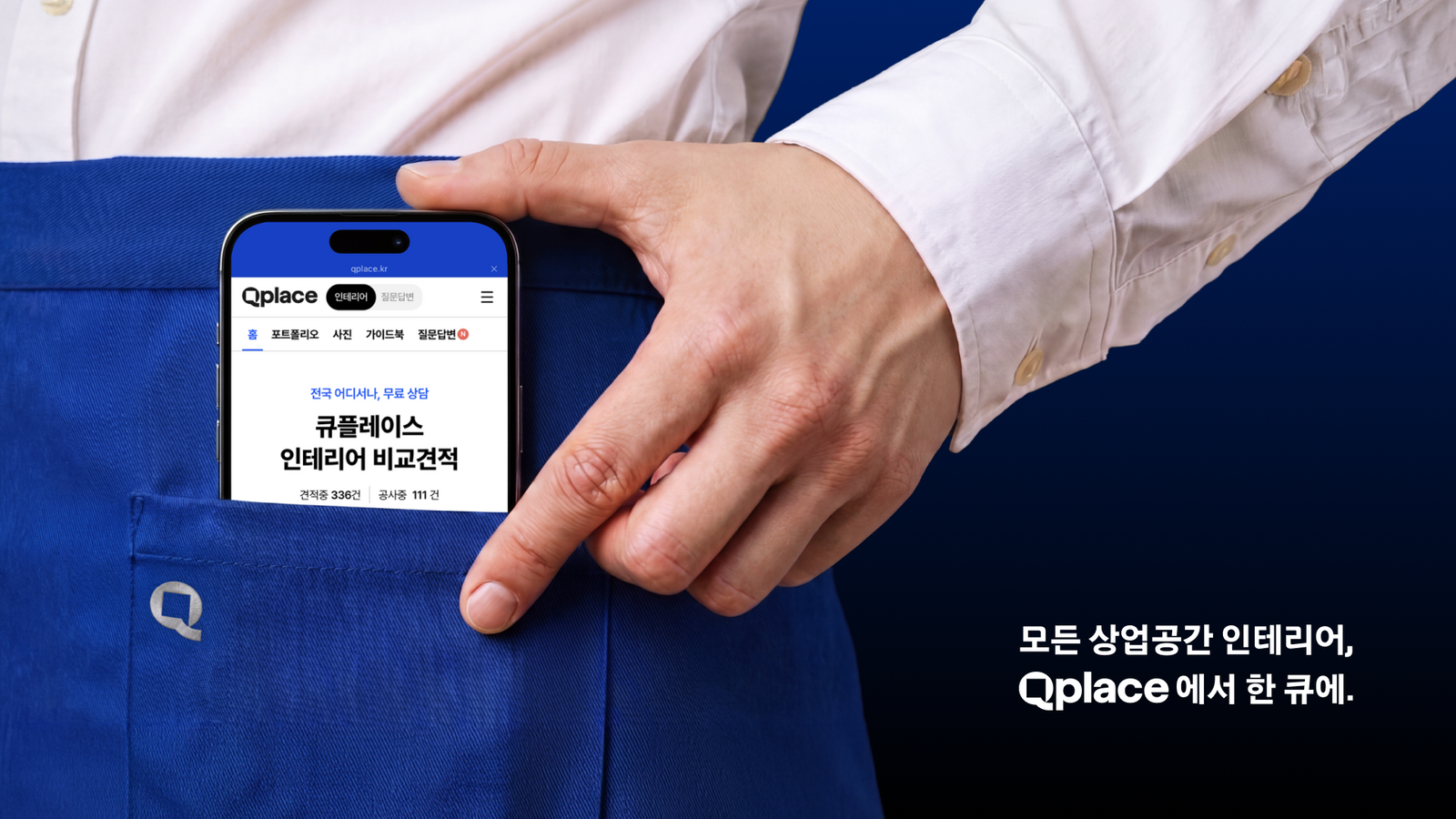
심볼의 구조를 기준으로 기능 아이콘과 브랜드 전용 아이콘을 구분하고, 마케팅 이미지 프레임, 온드미디어 썸네일, 프로덕트 배너 등 반복 제작되는 접점까지 확장했습니다. 제품에서는 정보 전달의 명료함을 우선하고, 마케팅에서는 브랜드 인상을 더 강하게 사용할 수 있도록 표현의 밀도를 조절했습니다.Using the structure of the symbol as the baseline, functional icons and brand icons were separated, then extended to the pieces that get produced over and over: marketing image frames, owned media thumbnails and product banners. Product surfaces prioritise clarity of information while marketing surfaces carry the brand impression harder, with the density of expression tuned for each.
프로젝트의 의미What It Means
Qplace 리브랜딩은 로고를 교체하는 데서 끝나지 않고 공간·대화·디지털 사용성을 하나의 운영 언어로 연결한 프로젝트입니다. 서비스가 확장되어도 동일한 인상을 유지할 수 있도록 심볼과 아이콘, 콘텐츠 템플릿을 하나의 체계로 정리했습니다.The Qplace rebrand did not stop at replacing a logo. It connected space, conversation and digital usability into one operating language, organising symbol, icons and content templates as a single system so the service keeps the same impression as it expands.
작업 범위Scope
- Brand Identity
- Symbol / Logotype
- Digital Application
- Functional & Brand Icon System
- Marketing Image Frame
- Owned-media Thumbnail System
- Product Banner Templates