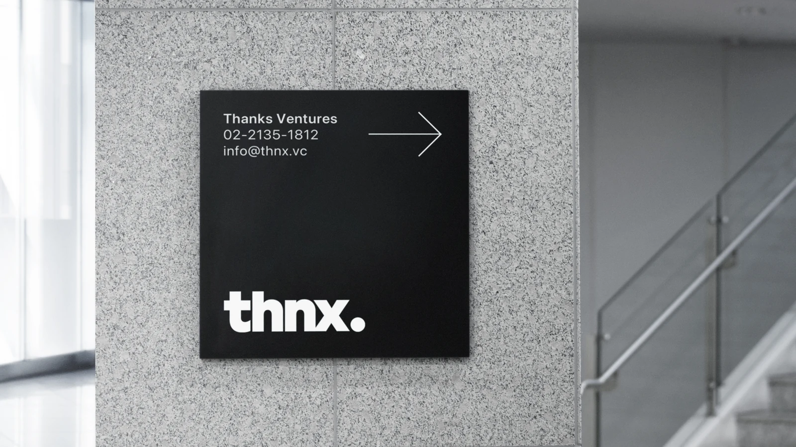
땡스 벤처스 브랜드 디자인Thanks Ventures Brand Design
‘Thanks’를 THNX로 압축하고, 문서의 마지막에 찍히는 마침표처럼 브랜드를 설계했습니다.Thanks was compressed into THNX and the brand was designed like the full stop that ends a document.
투자 관계의 시작과 끝에 남는 ‘고마움’이라는 태도를 과장된 상징 대신 짧은 워드마크와 마침표의 위치로 표현했습니다.The attitude of gratitude that remains at the beginning and end of an investment relationship is expressed through a short wordmark and the position of a period rather than an inflated symbol.
배경Background
벤처 투자사는 수많은 스타트업과 관계를 맺고 긴 시간 동안 성장 과정을 함께합니다. Thanks Ventures라는 이름이 가진 친근하고 독특한 인상을 유지하면서도, 투자사로서 필요한 신뢰와 절제된 태도를 함께 보여주는 아이덴티티가 필요했습니다.A venture investor builds relationships with many startups and stays with them through long stretches of growth. The identity had to keep the friendly and distinctive impression in the name Thanks Ventures while showing the trust and restraint an investor needs.
과제The Challenge
‘Thanks’의 감정적 의미를 직접적인 손짓이나 하트 같은 이미지로 표현하면 브랜드가 지나치게 가벼워질 수 있었습니다. 반대로 투자사의 신뢰만 강조하면 이름이 가진 고유한 태도가 사라집니다. 단순한 형식 안에서 관계의 의미를 남기는 방법이 필요했습니다.Expressing the emotional meaning of thanks through a literal gesture or a heart would make the brand too light. Emphasising only investor credibility would erase the attitude particular to the name. The work needed a way to leave the meaning of the relationship inside a simple format.
디자인 접근Design Approach
브랜드명을 THNX로 줄이고, ‘thanks’가 대화의 끝에 자연스럽게 놓이는 말이라는 점에 주목했습니다. 워드마크를 문서와 화면의 오른쪽 아래에 배치하고 마침표를 함께 사용해, 하나의 관계와 문장이 좋은 방식으로 끝나기를 바라는 브랜드의 태도를 시각적 사용 규칙으로 만들었습니다.The name was shortened to THNX, drawing on the fact that thanks sits naturally at the end of a conversation. The wordmark is placed at the lower right of documents and screens with a period, turning the wish that a relationship and a sentence end well into a visual rule of use.
비주얼·경험 시스템Visual / Experience System
색상은 블랙과 화이트로 제한해 이름의 개성이 과도하게 가벼워지지 않도록 균형을 잡았습니다. THNX와 마침표, 오른쪽 아래의 배치 규칙을 중심으로 문서와 커뮤니케이션에 반복 적용할 수 있는 단순한 시스템을 구성했습니다.Colour was limited to black and white so the personality of the name does not tip into levity. Around THNX, the period and the lower right placement rule, a simple system was composed for repeated use across documents and communication.
프로젝트의 의미What It Means
THNX는 ‘감사’라는 추상적인 가치를 상징물로 설명하기보다 실제 커뮤니케이션의 끝맺음 방식으로 바꾼 아이덴티티입니다. 적은 요소로 투자 관계에 대한 브랜드의 태도를 분명하게 남기는 데 집중했습니다.THNX is an identity that turned the abstract value of gratitude into a way of closing real communication rather than explaining it with a symbol. It concentrates on leaving the brand's attitude towards investment relationships clear with very few elements.
작업 범위Scope
- Naming / Abbreviation: THNX
- Wordmark
- Period / Placement Rule
- Black & White Identity
- Corporate Communication Applications