









브랜드가 아직 작동하지만 낡기 시작한 시점입니다. 이미 값을 치른 자산은 지키고, 더 이상 벌어들이지 못하는 것만 새로 합니다. 서체와 컬러, 레이아웃과 톤을 손보되 시장에 다시 배우라고 요구하지 않습니다.The brand still works, but it is starting to date. We keep the equity you have already paid for and renew what has stopped earning: type, colour, layout, tone, without asking the market to relearn you.
모두와 같은 축에서 겨루는 한 받을 수 있는 값에 천장이 생깁니다. 비교 자체가 성립하지 않는 축으로 브랜드를 옮깁니다.Competing on the same axis as everyone else caps what you can charge. We move the brand onto an axis where the comparison stops working.
한 시장을 위해 만든 브랜드가 다음 시장에서 온전히 살아남는 일은 드뭅니다. 무엇이 고정되어야 하고 무엇이 휘어야 하는지를 가릅니다. 네이밍과 로마자 표기, 그리고 체계 중 밖으로 나갈 수 있는 부분입니다.A brand built for one market rarely survives the next one intact. We find what has to stay fixed and what must bend: naming, romanization, and the parts of the system that travel.
공개적으로 무언가 잘못됐거나, 성장이 멈춘 기간이 하락으로 읽히기 시작한 상태입니다. 시장이 다시 볼 이유와, 가리킬 수 있는 눈에 띄는 변화 하나를 브랜드가 만들어야 합니다.Something has gone wrong publicly, or growth has stalled long enough to be read as decline. The brand has to give the market a reason to look again, and one visible change to point at.
인원이 규칙보다 빨리 늘었습니다. 팀마다 저마다의 브랜드를 만들고 있습니다. 디자이너가 그 자리에 없어도 버티는 체계를 세웁니다.Headcount outran the rules. Every team is making its own version of the brand. We set a system that holds without a designer in the room.
아직 아무것도 없고, 그래서 제대로 잡는 비용이 가장 싼 때입니다. 네이밍과 아이덴티티, 첫 1년의 접점을 함께 설계해 런칭일이 브랜드가 스스로를 처음 만나는 날이 되지 않게 합니다.Nothing exists yet, the cheapest moment to get it right. Naming, identity and the first year of touchpoints are built together, so launch day is not the first time the brand meets itself.
제품군이 네이밍 규칙보다 빨리 늘어났습니다. 위계를 정리합니다. 무엇이 모브랜드 이름을 달고, 무엇이 제 이름을 가질 자격이 있으며, 무엇은 애초에 브랜드가 아니었어야 하는지를 가릅니다.Lines multiplied faster than the naming rules did. We set the hierarchy: what carries the parent name, what earns its own, and what should never have been a brand.
제품은 시장에 맞는데 가치가 전달되지 않는 상태입니다. 실제 값어치와 시장이 지금 읽고 있는 값 사이의 간극을 좁힙니다.The product fits the market but the value does not land. We close the gap between what you are actually worth and what the market currently reads.
실사에서 디자인은 회사가 얼마나 잘 운영되는지의 증거로 읽힙니다. 성과에 이해를 정렬하는 파트너십이 맞물리는 지점입니다.Diligence reads design as evidence of how well the company is run. This is where our outcome-aligned partnership comes in.
한 지붕 아래 놓인 두 브랜드는 보통 버는 것보다 드는 것이 큽니다. 무엇이 살아남고 무엇이 흡수되며, 합쳐진 것을 이제 무엇이라 부를지를 정합니다.Two brands under one roof usually cost more than they earn. We decide what survives, what is absorbed, and what the combined thing is now called.
보이는 법보다 그것이 무엇인지를 먼저 합의합니다. 그 뒤 로고타입·타이포그래피·컬러·모션·프로덕트 UI까지 모든 접점을 하나의 언어로 설계해, 매대·화면·공간에서 같은 브랜드로 읽히게 만듭니다.Before how it looks, we settle what it is. Then we design every touchpoint (logotype, typography, colour, motion, product UI) in one language, so the brand reads the same on shelf, screen, and space.
성과에 이해를 정렬합니다. 초기 브랜드와는 창업자 곁에서 함께 짓습니다. 우리의 이해가 청구서 크기가 아니라 당신의 성장에 걸리도록.We align with outcomes. For early-stage brands we build alongside the founders, so our incentive is your growth, not the size of the invoice.
브랜드가 물리적 장소가 되는 지점을 설계하고 감리합니다. 리테일과 오피스 공간을 브랜드 고유의 언어로 짓고, 팀 내 건축사가 프로젝트를 이끕니다.Where a brand becomes a physical place, we design and manage it: retail and office space built in the brand’s own language, led by a registered architect on our team.
포스터와 패키지, 인쇄물처럼 손에 남는 결과물을 만듭니다. 화면에서 정한 체계가 종이와 잉크, 물성 위에서도 같은 브랜드로 서는지는 여기서 판가름납니다.Posters, packaging and printed matter, the work that stays in the hand. Whether a system decided on screen still reads as the same brand on paper, ink and material is settled here.
생성형 AI를 프로세스 자체에 녹입니다. 더 많은 방향을 더 빠르게 탐색하고, 가장 강한 안을 확장 가능한 시스템으로 만듭니다.We fold generative AI into the process itself, exploring more directions faster, and turning the strongest into systems that scale.
전용 서체는 브랜드에 고유한 목소리를 줍니다. 서체와 그것을 둘러싼 타입 시스템을 함께 설계합니다. 비용이 아니라 반복 노출로 회수되는 자산입니다.A custom typeface gives a brand its own voice. We design the face and the type system around it: an asset, not a cost, recouped through repeated exposure.
듀당스는 강력한 브랜드 디자인으로 작은 도전을 흐름으로 바꾸는 크리에이티브 스튜디오입니다.Duedance is a creative studio that turns small challenges into movements through strong brand design.
우리 일은 브랜딩과 아이덴티티, 프로덕트 디자인, 공간, 그리고 디지털 경험을 아우릅니다. 브랜드·UX·공간을 하나의 매트릭스로 다루며, ‘어떻게 보이나’보다 ‘무엇인가’를 먼저 증명합니다.Our work spans branding and identity, product design, space and digital experience. We treat brand, UX and space as one matrix, proving what a thing is before how it looks.
우리는 만들어드리고 끝나는 대신, 될 때까지 함께 성장시킵니다. 이것이 우리가 스스로를 4세대 브랜딩 에이전시라 부르는 이유입니다.Rather than building and handing over, we keep growing it with you until it works. That is why we call ourselves a fourth-generation branding agency.
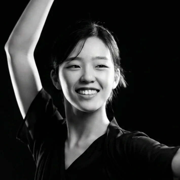
Lead Designer
jmyee@duedance.com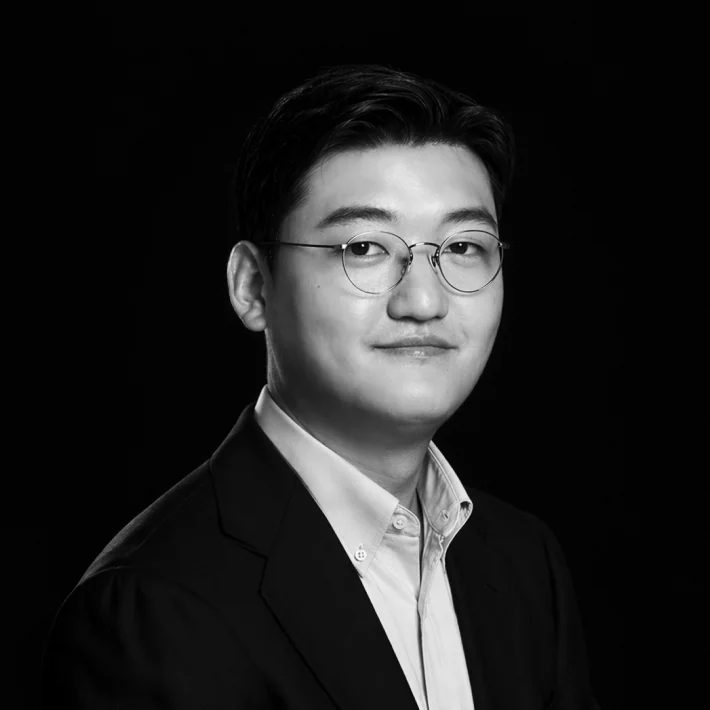
Lead Designer
wjyoon@duedance.com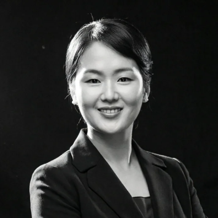
Interior PJM Lead
ymkim@duedance.com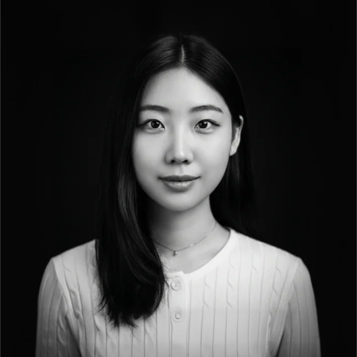
Interaction Designer
sykim@duedance.com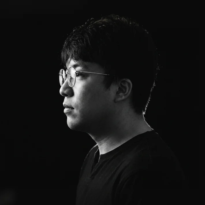
Business Development
jhkim@duedance.com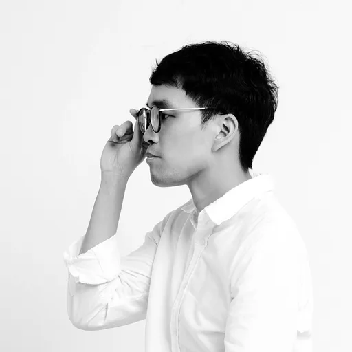
Editor / Brand Marketer
ywcha@duedance.com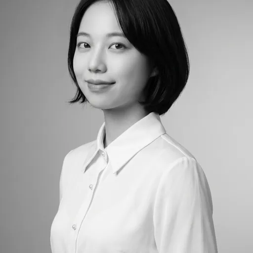
Brand Marketer
mjkim@duedance.com네이버에서 브랜드 디자이너로 커리어를 시작한 조중현은 이후 IT 프롭테크 스타트업에서 최고 디자인 책임자(CDO)로 근무했습니다. 현재는 작동하는 디자인을 통해 고객의 비즈니스를 성장시키는 브랜드 디자인 스튜디오 듀당스를 이끌고 있으며, 금융권 엑셀러레이터 디캠프에서 자문 활동을 하고 있습니다. 루브르 국립장식미술관의 Korea NOW! 전과 제5회 타이포잔치, 러시아 타이포마니아 페스티벌 전시 등에 참여하였고, étape(프랑스), It's Nice That(미국) 등에 소개되었습니다. 모스크바 예술대학, 대만 곤산과학대학교, 홍익대학교 등에서 디자인 워크숍을 주최했으며, 디자인코리아 페스티벌과 Adobe Make It 등에서 연사로 활동합니다. 국내 디자이너들과 함께 '대강포스터제'를 기획·주도하고 있으며, 합정 오색칠, 홍대 슬릿, 성수동 자그마치와 오르에르, 한남동 히바린, 책바 등 리테일 프로젝트부터 일민미술관 '불멸사랑', 탈잉·로톡 리브랜딩까지 시각 아이덴티티 디자인 활동을 펼치고 있습니다.Joonghyun Cho began his career as a brand designer at Naver, then served as Chief Design Officer at an IT proptech startup. He now leads Duedance, a brand design studio that grows its clients' businesses through design that works, and advises at D.Camp, the banking sector's accelerator. His work has been shown at Korea NOW! (Musée des Arts Décoratifs, Louvre), the 5th Typojanchi, and Typomania in Russia, and featured in étape (France) and It's Nice That (US). He has led design workshops at Moscow State Art University, Kunshan University of Science and Technology in Taiwan, and Hongik University in Korea, and speaks at Design Korea Festival and Adobe Make It. He founded and directs Daegang Poster Festival. His identity work spans retail (Osechill, Slit, Zagmachi, Orer, Hibarin, Cheagbar) and the rebranding of Taling and LawTalk.
글을 쓰고, 글씨를 쓰고, 글자를 설계하고 가르치는 등 타이포그래피와 관련된 모든 분야에 관심을 두고 있습니다. 산돌과 티랩에서 폰트 디자이너로 근무하였고 현재 타이틀 레터링, 다양한 기업 전용서체, 일반 판매용 서체를 디자인합니다. 월간 《디자인》, 《비즈한국》 등에 디자인 칼럼과 에세이를 기고했으며 각종 온·오프라인 플랫폼에서 서체 디자인 강의를 진행합니다. 2021년 출간한 에세이집 《글자 속의 우주》를 시작으로 꾸준한 저술 활동을 이어가고 있습니다.Donghoon Haan works across every field that touches typography: writing, lettering, drawing type and teaching it. He worked as a font designer at Sandoll and Tlab, and now designs title lettering, custom corporate typefaces and retail typefaces. He has written design columns and essays for Monthly Design and Bizhankook, and teaches type design on online and offline platforms. Since his 2021 essay collection 《글자 속의 우주》, he has kept writing.
듀당스 서울 여의도 오피스Duedance Seoul Yeouido Office
서울특별시 영등포구 여의서로 43 (여의도동, 한서리버파크) 1113호 · 07239 1113, 43, Yeouiseo-ro, Yeongdeungpo-gu, Seoul 07239, Republic of Korea
듀당스를 거쳐간 사람들
Duedance Alumni
BX Designer
정승관 Seungkwan Jung
Assistant Designer
소진이 Jinlee So
Freelance Designer
이한이 Hani Lee
Freelance Designer
김지윤 Jiyoon Kim
Freelance Designer
김성우 Sungwoo Kim
Thank You
Duedance Studio · Seoul
Branding · BI · CI · BX · AX
We take design equity, bet alongside you, and keep growing it until it works
Now taking projects for rebranding, identity, space and product
New Business · contact@duedance.com
43 Yeouiseo ro, Yeongdeungpo gu, Seoul
© 2026 Duedance. All rights reserved.