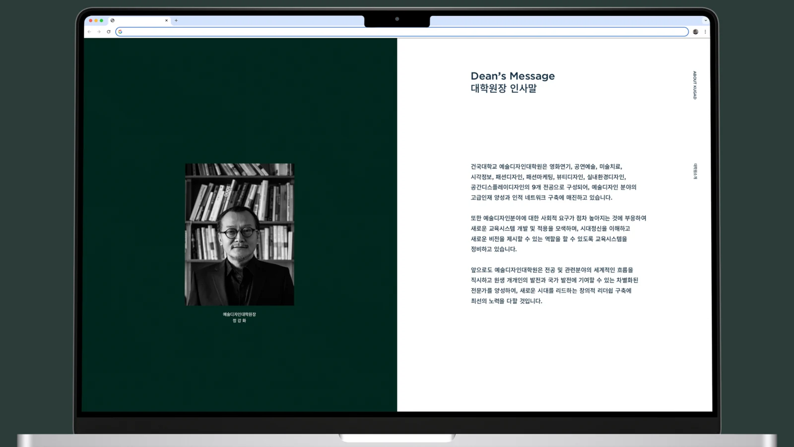
건국대학교 예술디자인대학원 브랜드 아이덴티티Konkuk University Graduate School of Art & Design Identity
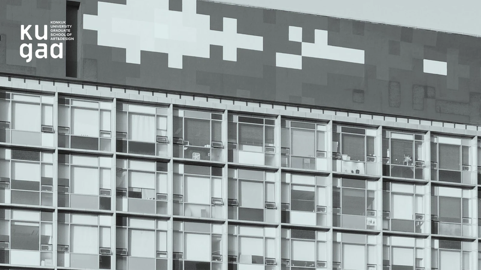
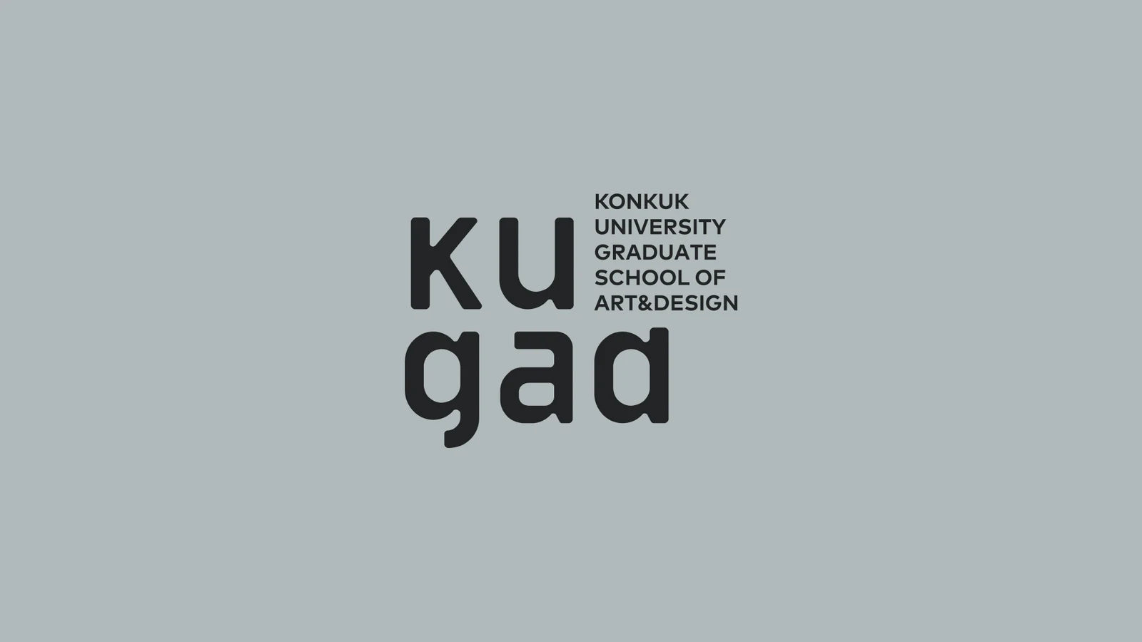
건국대학교 예술디자인대학원의 독립적인 정체성과 구성원의 자부심을 높이기 위한 브랜드 아이덴티티를 설계했습니다.A brand identity was designed to raise the independent standing of the Konkuk University Graduate School of Art and Design and the pride of its members.
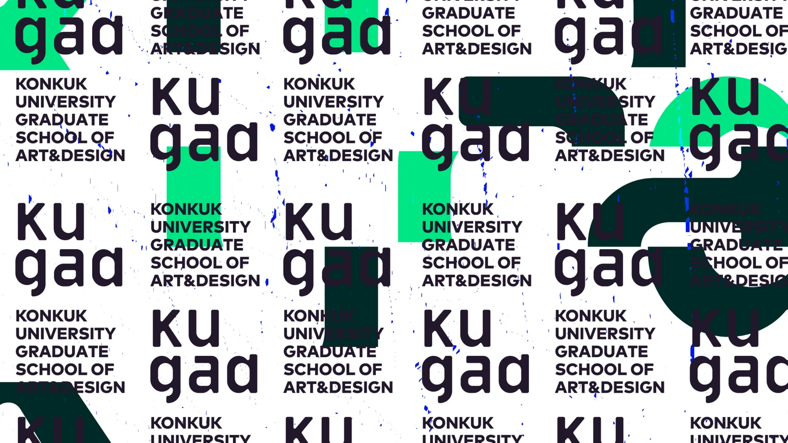
본교의 선명한 그린과 구분되는 차분한 색을 사용하고, 다양한 전공과 연구가 공존하는 대학원의 성격을 유연하게 변형되는 패턴으로 표현했습니다.A calm palette distinct from the vivid green of the main university, and a pattern that flexes freely, express a school where many majors and lines of research coexist.
배경Background
대학원은 대학 전체의 역사와 신뢰를 공유하면서도 학부와는 다른 연구의 깊이와 전문성을 보여줘야 합니다. 특히 예술과 디자인의 여러 분야가 함께 존재하기 때문에 하나의 고정된 이미지로 모든 전공을 규정하기보다, 공통의 소속감과 다양성을 동시에 담을 수 있는 별도의 아이덴티티가 필요했습니다.A graduate school shares the history and trust of the whole university while showing a depth of research and expertise different from undergraduate study. With many fields of art and design present, it needed its own identity that holds shared belonging and diversity at once rather than one fixed image over every major.
과제The Challenge
건국대학교의 강한 브랜드 자산과 연결성을 잃지 않으면서도 예술디자인대학원이 독립적으로 인식되어야 했습니다. 본교의 대표색인 선명한 그린과 시각적으로 구분하고, 전공과 행사에 따라 내용이 계속 바뀌어도 같은 대학원으로 보이는 유연한 시스템을 만들어야 했습니다.The strong brand equity of Konkuk University and the connection to it could not be lost, yet the Graduate School of Art and Design had to be recognised independently. It needed visual separation from the vivid green of the main university and a flexible system that still reads as one school as content keeps changing by major and by event.
디자인 접근Design Approach
고정된 하나의 상징보다 다양한 조합과 변형이 가능한 패턴 시스템을 중심에 두었습니다. 차분한 컬러 팔레트를 사용해 본교의 생생한 그린과 차별화하고, 학술적 신뢰와 예술·디자인의 실험성이 함께 느껴지도록 시각적 밀도를 조절했습니다.A pattern system open to many combinations and variations took the centre instead of one fixed symbol. A calm colour palette differentiates it from the vivid green of the university, and the visual density was tuned so academic credibility and the experimentation of art and design are felt together.
비주얼·경험 시스템Visual / Experience System
패턴과 타이포그래피, 색의 조합을 전공·행사·홍보 콘텐츠에 맞춰 바꿀 수 있도록 구성했습니다. 내용이 달라져도 기본 구조와 톤이 유지되어 대학원 전체의 정체성이 축적되는 방식입니다.Pattern, typography and colour combinations can be changed to suit majors, events and promotional content. As the content varies, the base structure and tone hold, which is how the identity of the school as a whole accumulates.
프로젝트의 의미What It Means
예술디자인대학원의 아이덴티티는 본교 브랜드의 단순한 하위 버전이 아니라, 대학원의 연구와 창작 문화를 별도의 시각 언어로 보여주는 시스템입니다. 통일성과 다양성이 동시에 필요한 교육기관의 특성을 유연한 아이덴티티로 풀어냈습니다.The Graduate School of Art and Design identity is not a simple sub version of the university brand but a system that shows the school's research and creative culture in its own visual language. It resolves the need for unity and diversity in an educational institution through a flexible identity.
작업 범위Scope
- Graduate School Identity
- Flexible Pattern System
- Calm Color Palette
- Typography / Layout
- Academic / Promotional Applications