불멸사랑 전시 그래픽 디자인Immortality in the Cloud, Exhibition Graphic Design
2019년 일민미술관 ‘불멸사랑: Immortality in the Cloud’의 그래픽 디자인을 진행했습니다.Graphic design for Immortality in the Cloud at Ilmin Museum of Art in 2019.
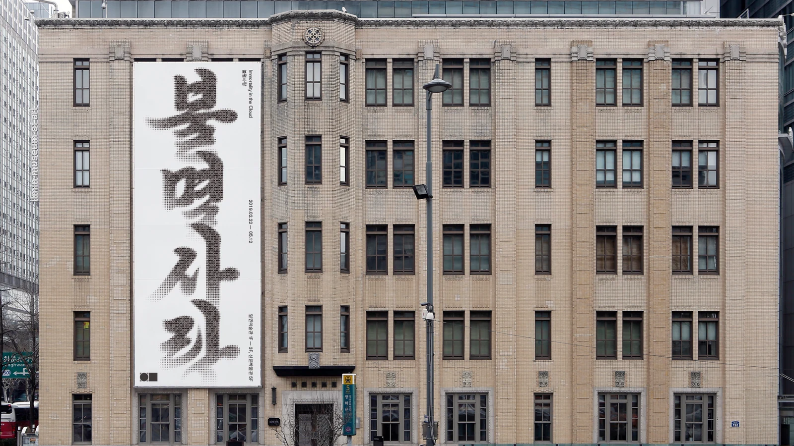
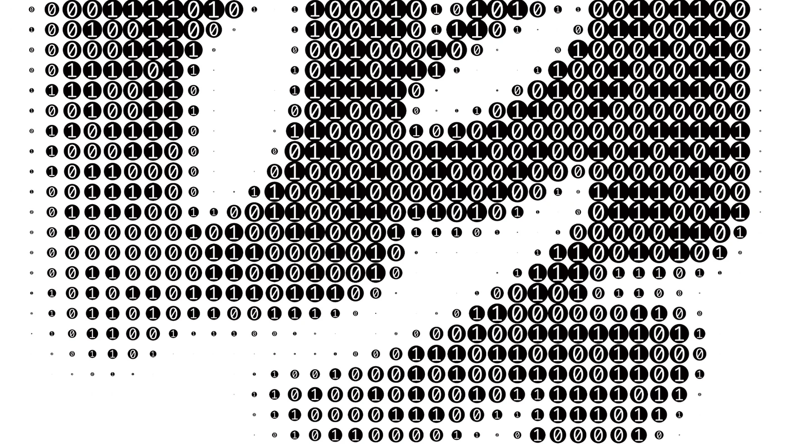
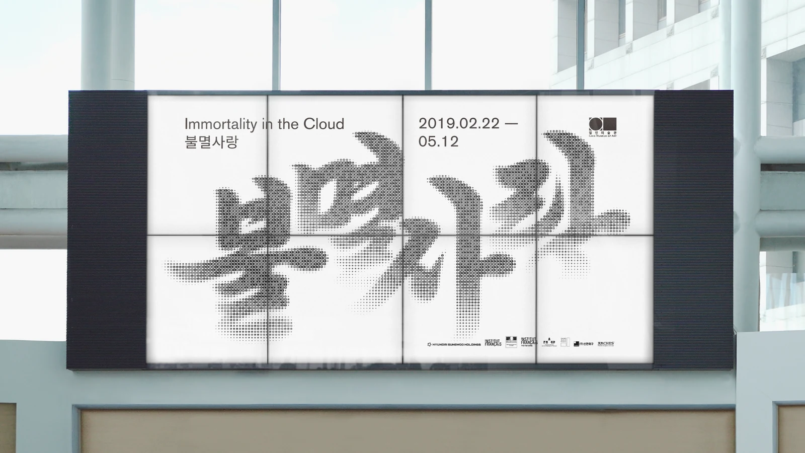
디지털 정보의 최소 단위인 0과 1을 수없이 모아 한글 ‘불멸사랑’ 타이포그래피를 구성하고, ‘클라우드 시대의 불멸’이라는 전시의 질문을 제목 자체의 구조로 시각화했습니다.Countless zeros and ones, the smallest unit of digital information, were gathered to build the Korean title typography, making the exhibition's question about immortality in the cloud visible in the structure of the title itself.
배경Background
2019년 2월 22일부터 5월 12일까지 열린 ‘불멸사랑’은 역사·신화·종교와 동시대 디지털 환경 속에서 인간이 상상해온 불멸의 의미를 다룬 전시입니다. 오늘날 기억과 정보가 클라우드에 저장되고 복제되는 환경을 전시 제목과 그래픽 언어에 연결하는 것이 중요한 출발점이었습니다.Running from 22 February to 12 May 2019, the exhibition examined the meanings of immortality that humans have imagined across history, myth and religion alongside the contemporary digital environment. Connecting an era where memory and information are stored and copied in the cloud to the exhibition title and its graphic language was the important starting point.
과제The Challenge
불멸을 무한대 기호나 신화적 이미지로 직접 표현하면 전시가 다루는 동시대성이 약해질 수 있고, 반대로 데이터 이미지만 강조하면 기술 전시처럼 보일 수 있었습니다. 철학적인 주제와 디지털 환경을 동시에 담으면서도 전시 제목이 명확하게 읽히는 타이포그래피가 필요했습니다.Expressing immortality through an infinity sign or mythic imagery directly would weaken the contemporaneity the exhibition deals with, while emphasising only data imagery would make it look like a technology show. The typography had to hold a philosophical subject and a digital environment at once while keeping the title clearly legible.
디자인 접근Design Approach
0과 1이라는 이진수의 최소 단위를 작은 요소로 반복해 ‘불멸사랑’이라는 한글 글자를 만들었습니다. 멀리서는 하나의 제목으로 읽히고 가까이에서는 수많은 데이터 단위의 집합으로 보이는 구조를 통해, 하나의 기억과 이미지가 디지털 정보의 축적으로 존재하는 상황을 표현했습니다.The binary units zero and one were repeated as small elements to build the Korean characters of the title. From a distance it reads as one title and up close as a mass of countless data units, expressing how a single memory or image exists as an accumulation of digital information.
비주얼·경험 시스템Visual / Experience System
0과 1로 구성된 타이포그래피를 전시의 핵심 그래픽 자산으로 사용해 포스터와 인쇄·홍보물, 전시 도록과 협업 굿즈 등으로 확장했습니다. 매체가 달라져도 이진수로 구성된 제목의 구조가 전시를 식별하는 중심 장치로 유지되도록 했습니다.The typography built from zeros and ones served as the core graphic asset of the exhibition, extending to posters, print and promotion, the exhibition publication and collaboration goods. As the medium changes, the binary structure of the title stays as the central device identifying the exhibition.
프로젝트의 의미What It Means
‘불멸사랑’은 추상적인 전시 주제를 별도의 상징으로 덧붙이기보다 제목의 문자 구조 안에 직접 담은 프로젝트입니다. 0과 1의 집합으로 만들어진 한글 타이포그래피가 디지털 시대의 기억과 불멸이라는 전시의 질문을 직관적으로 연결합니다.Immortality in the Cloud put an abstract exhibition subject directly inside the letter structure of the title rather than adding a separate symbol. Korean typography made from sets of zeros and ones connects the exhibition's question about memory and immortality in the digital age intuitively.
작업 범위Scope
- Exhibition Graphic Design
- Title Typography
- Binary 0 / 1 Graphic System
- Poster / Promotion
- Exhibition Publication
- Collaboration Goods