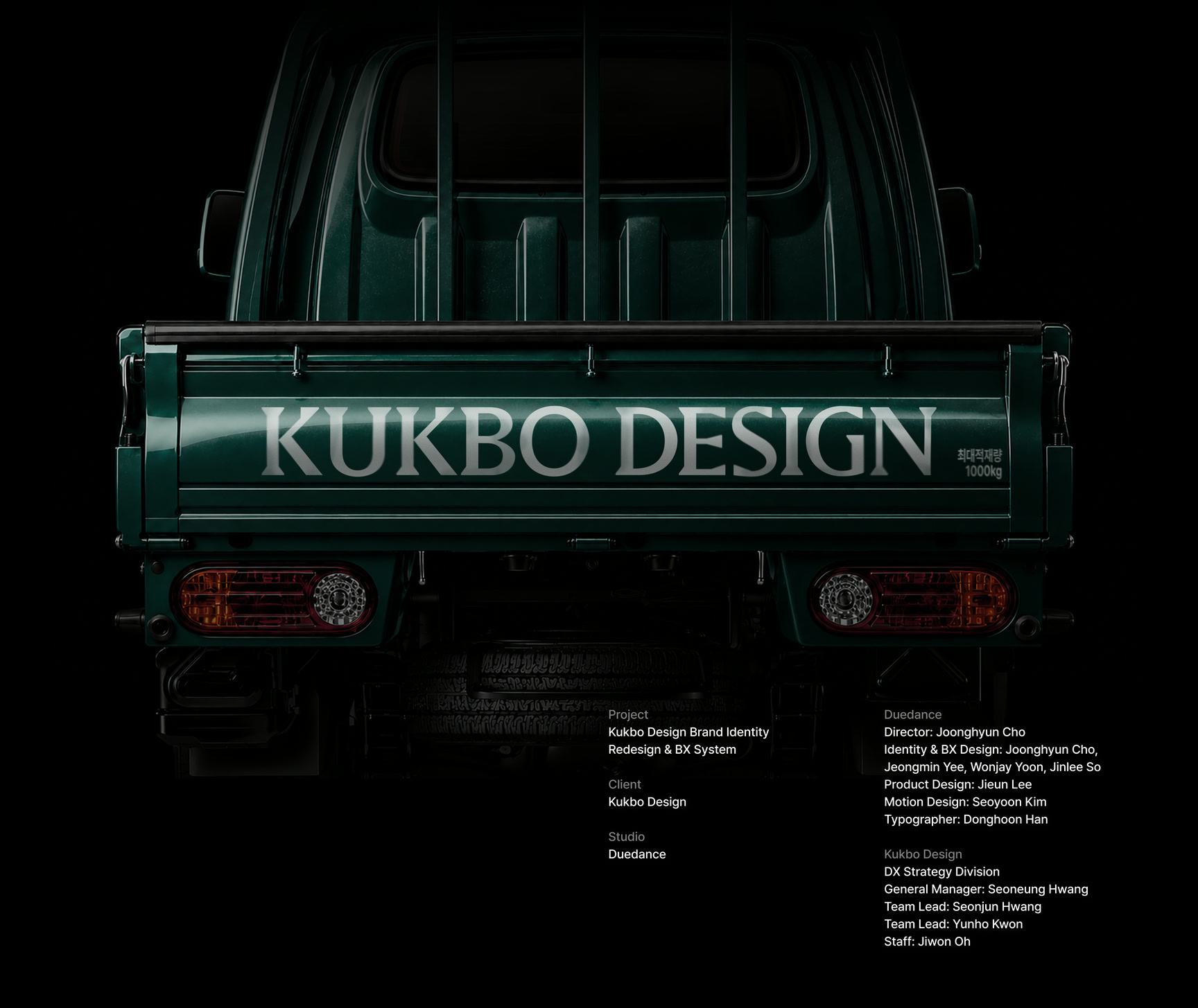
국보디자인 아이덴티티 리뉴얼KUKBO DESIGN Identity Renewal
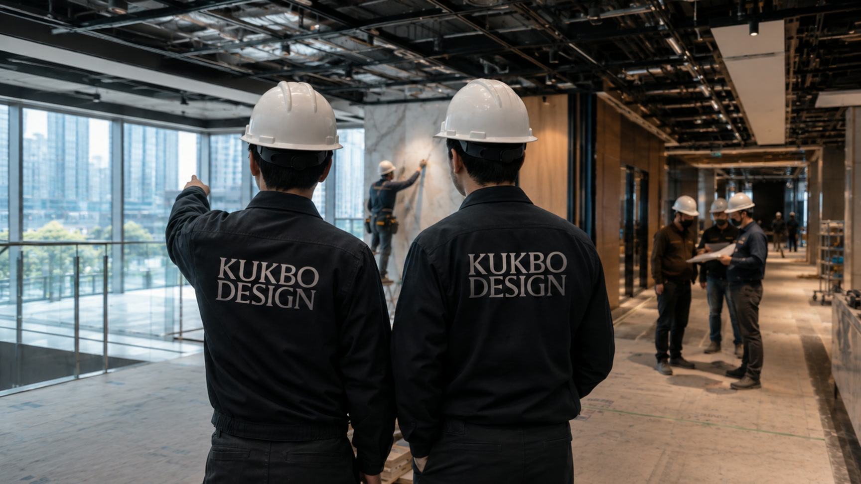
오랜 실내건축 업력을 가진 국보디자인의 규모와 전문성을 ‘업계의 기준’이라는 태도로 재정리했습니다.The scale and expertise of Kukbo Design, built over decades in interior architecture, were reorganised around the attitude of setting the standard for the industry.
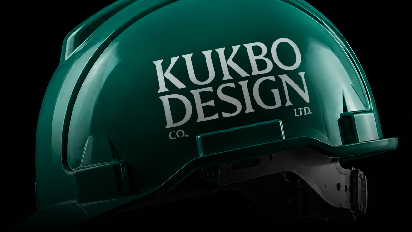
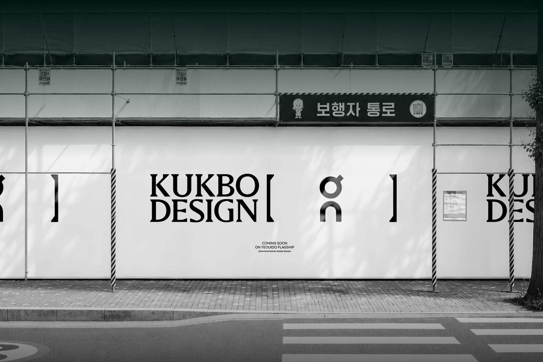
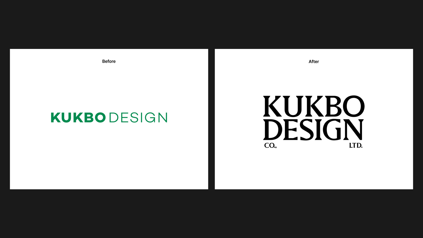
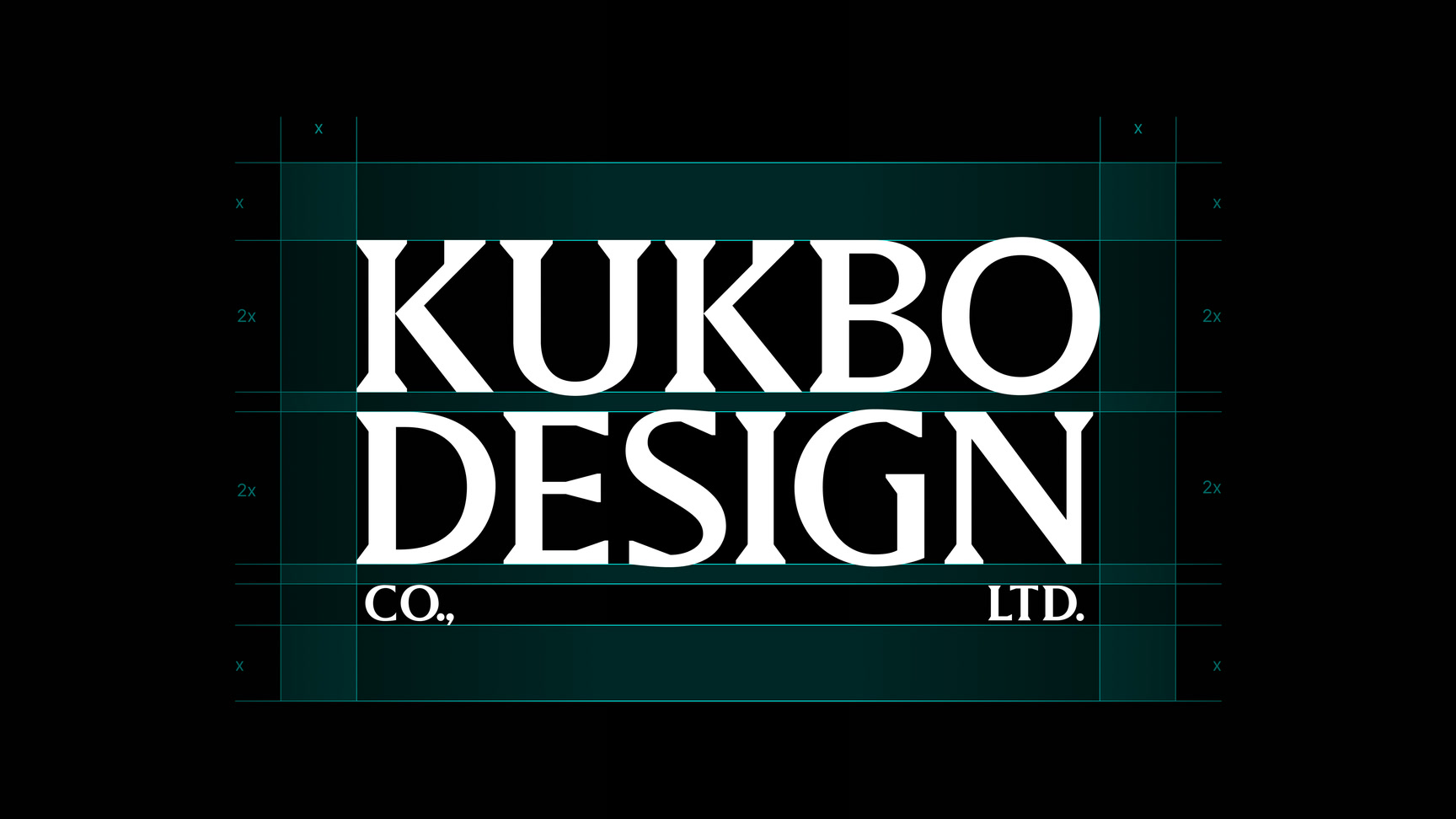
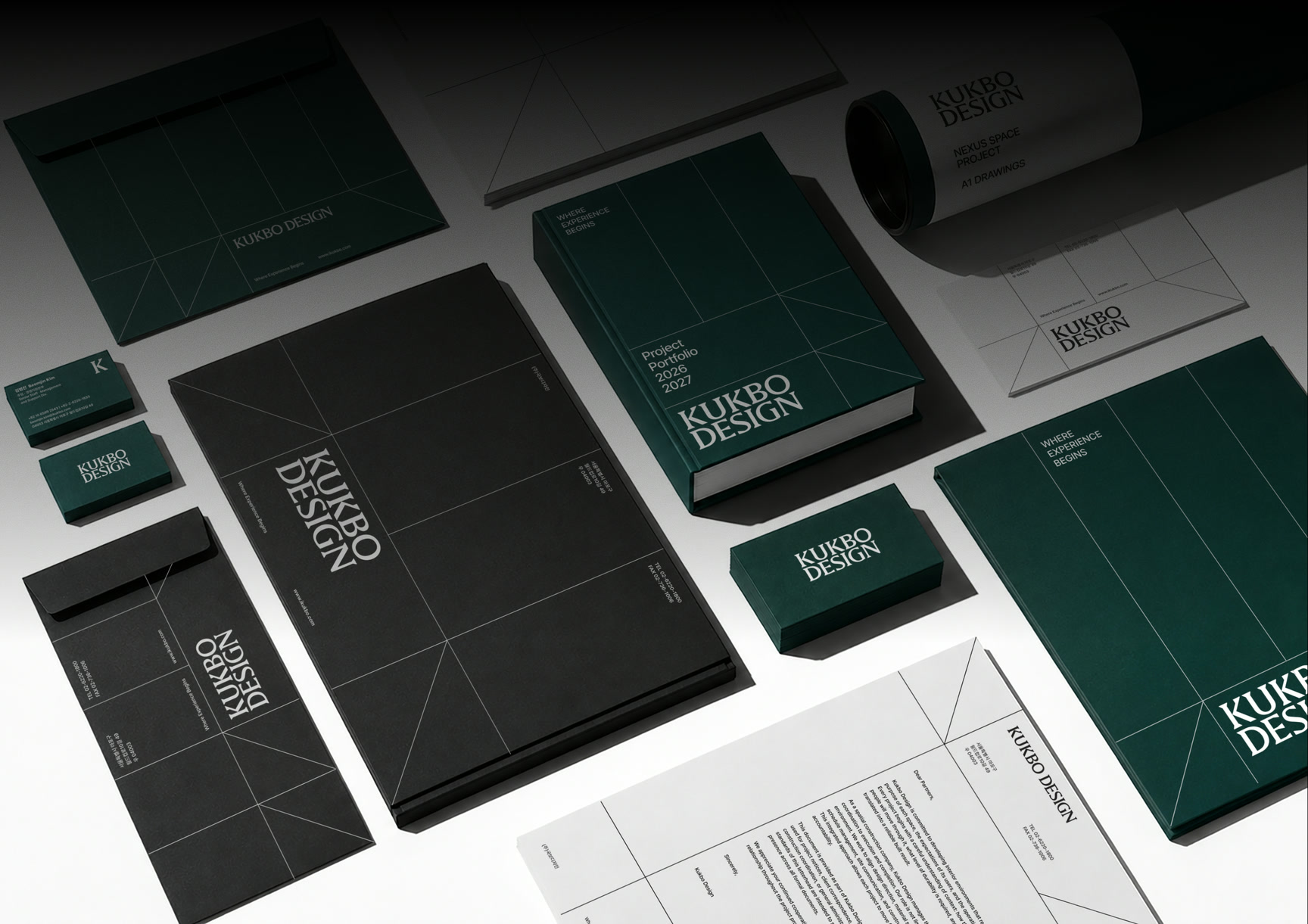
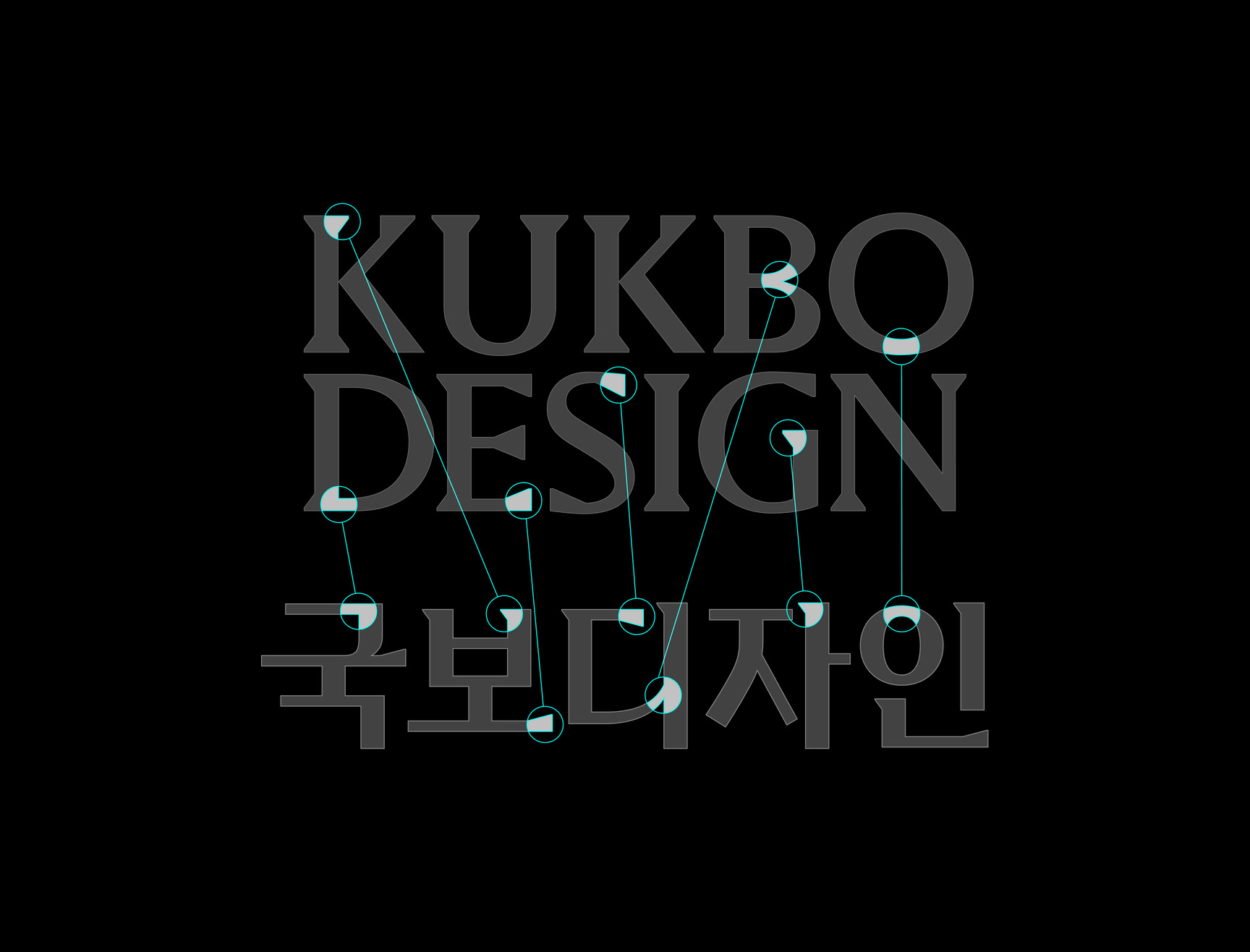
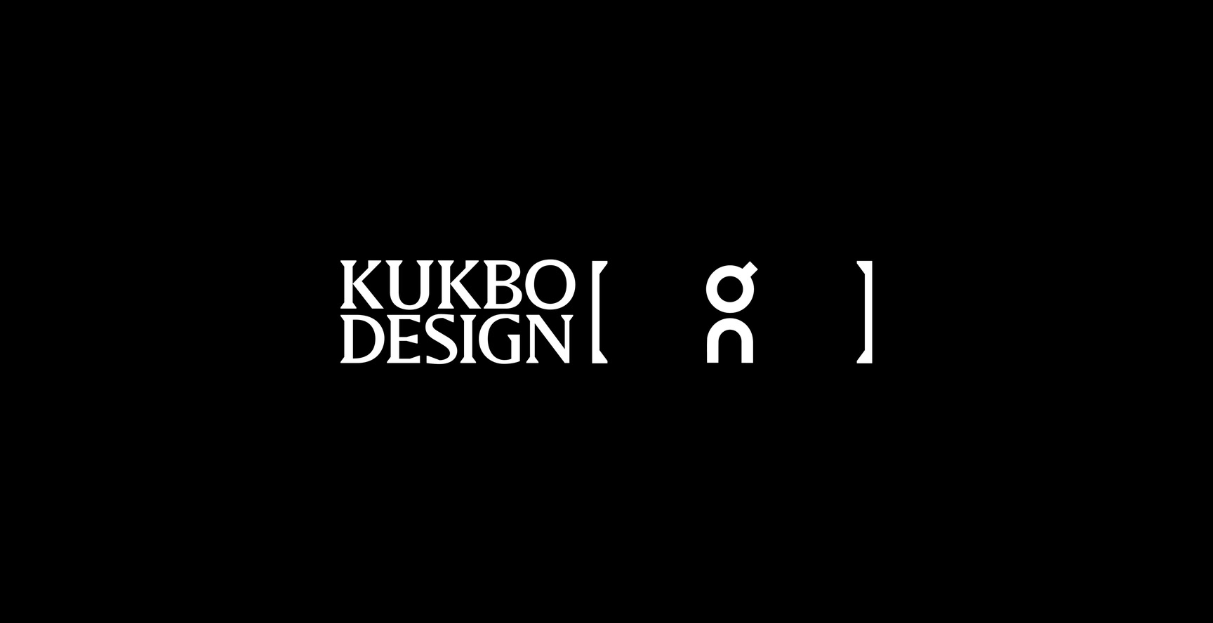
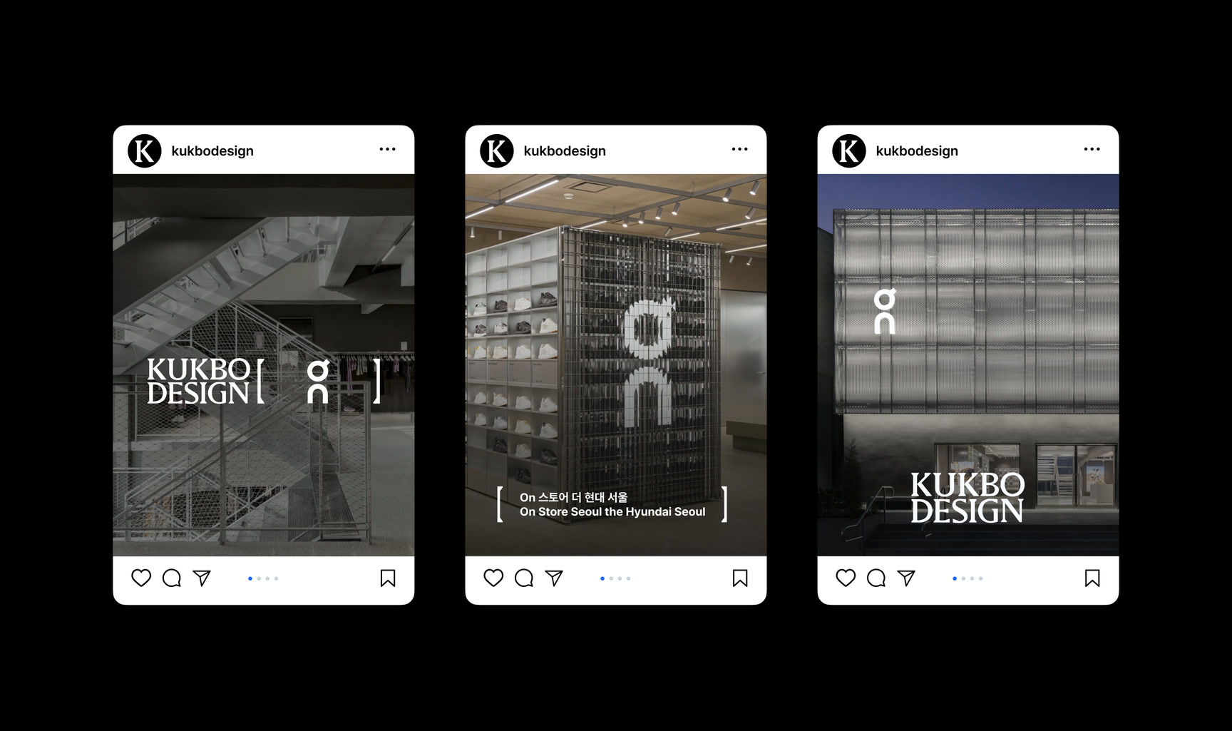
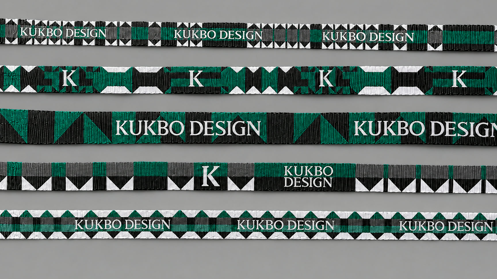
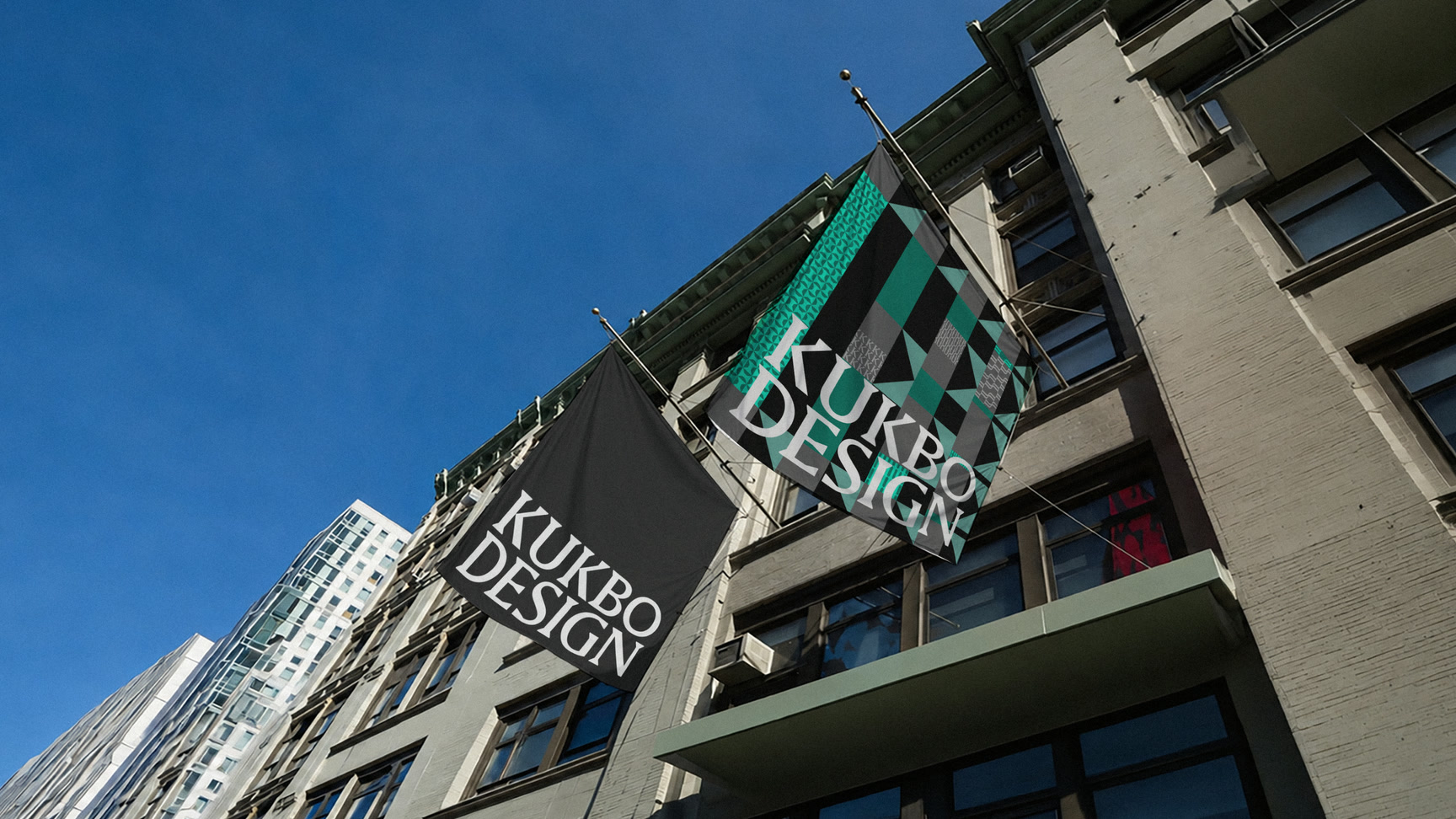
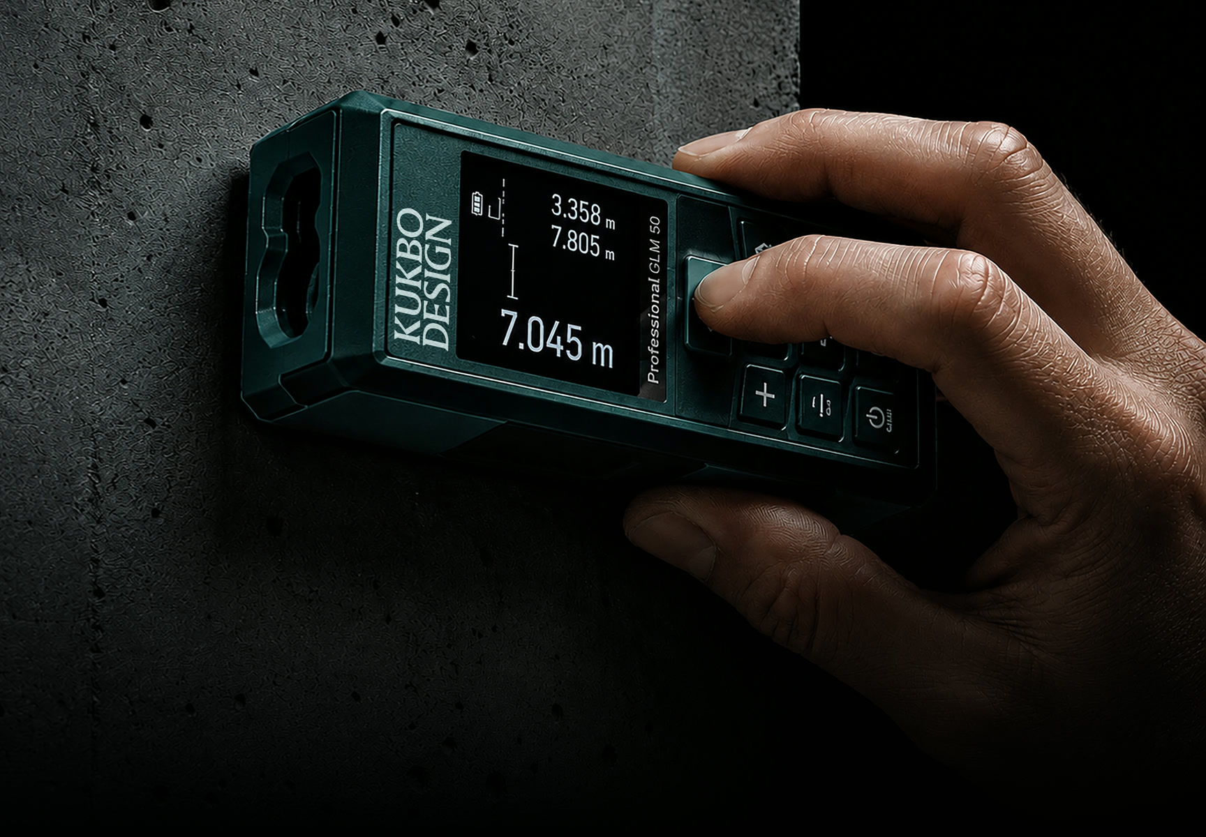
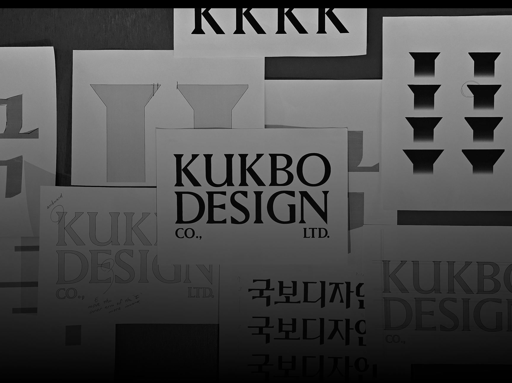
KUKBO와 DESIGN을 두 줄로 쌓은 워드마크, 세리프 K 심볼, Black & White와 KUKBO Green, 그래픽 모티프와 그리드까지 하나의 시스템으로 구축했습니다.A wordmark stacking KUKBO and DESIGN on two lines, a serif K symbol, black and white with KUKBO Green, graphic motif and grid were built as one system.
배경Background
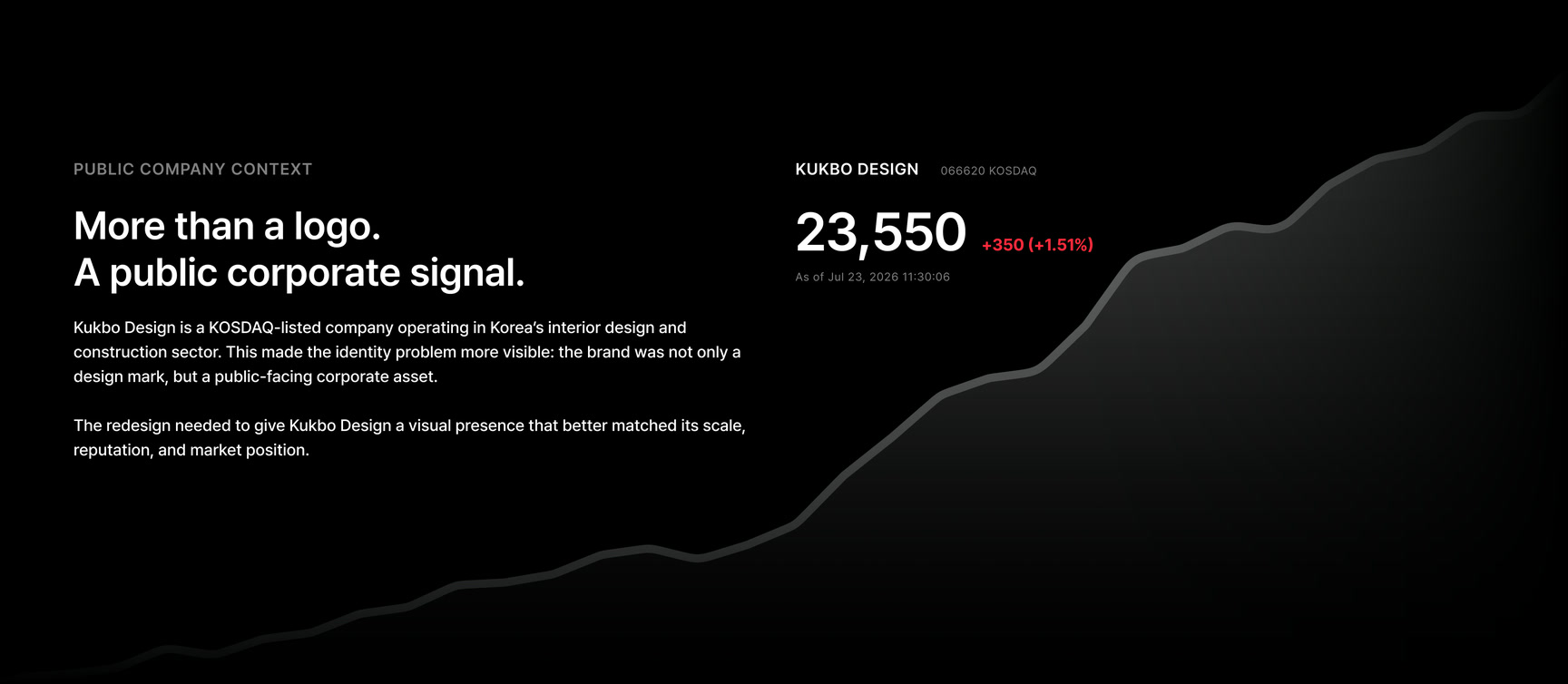
국보디자인은 오랜 프로젝트 경험과 전문성을 축적한 실내건축 기업이지만, 기존 아이덴티티는 회사가 가진 규모와 업력을 충분히 전달하기 어려웠습니다. 축적된 신뢰를 유지하면서 오늘의 공간 비즈니스에서 더 단단하고 명확하게 보이도록 브랜드의 기준을 다시 세웠습니다.Kukbo Design is an interior architecture firm with long project experience and deep expertise, but the previous identity struggled to convey the scale and the history the company holds. The brand standard was rebuilt so the accumulated trust remains while the firm reads more solidly and clearly in today's spatial business.
과제The Challenge
실내건축 업계의 익숙한 건축적 상징을 반복하면 쉽게 비슷한 이미지로 수렴하고, 반대로 지나치게 가볍게 바꾸면 기업의 무게가 사라질 수 있습니다. 전문성을 유지하면서 경쟁사와 다른 조형 문법을 만들고, 사인·문서·디지털처럼 규모가 다른 접점까지 확장해야 했습니다.Repeating the architectural symbolism familiar to the interior industry converges quickly on similar images, while changing too lightly loses the weight of the company. The work had to keep the expertise, create a formal grammar different from competitors, and extend to touchpoints at very different scales including signage, documents and digital.
디자인 접근Design Approach
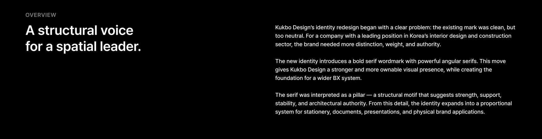
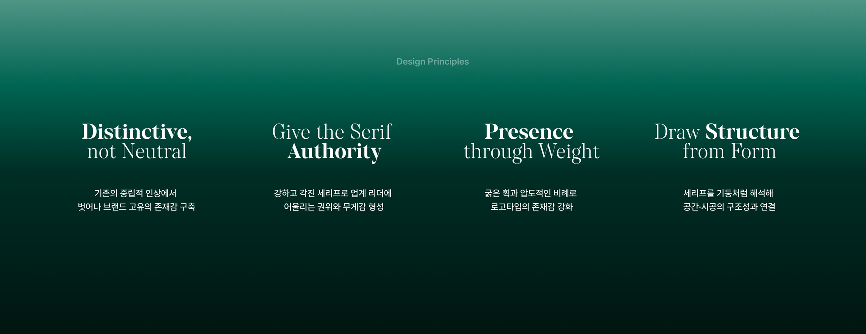
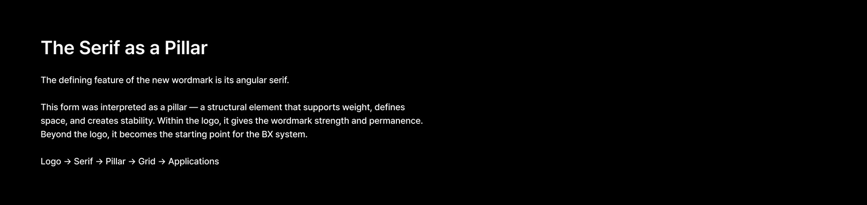
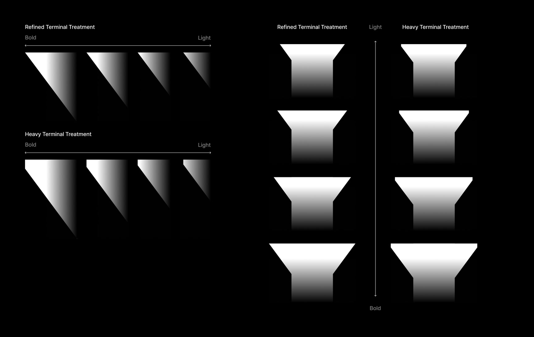
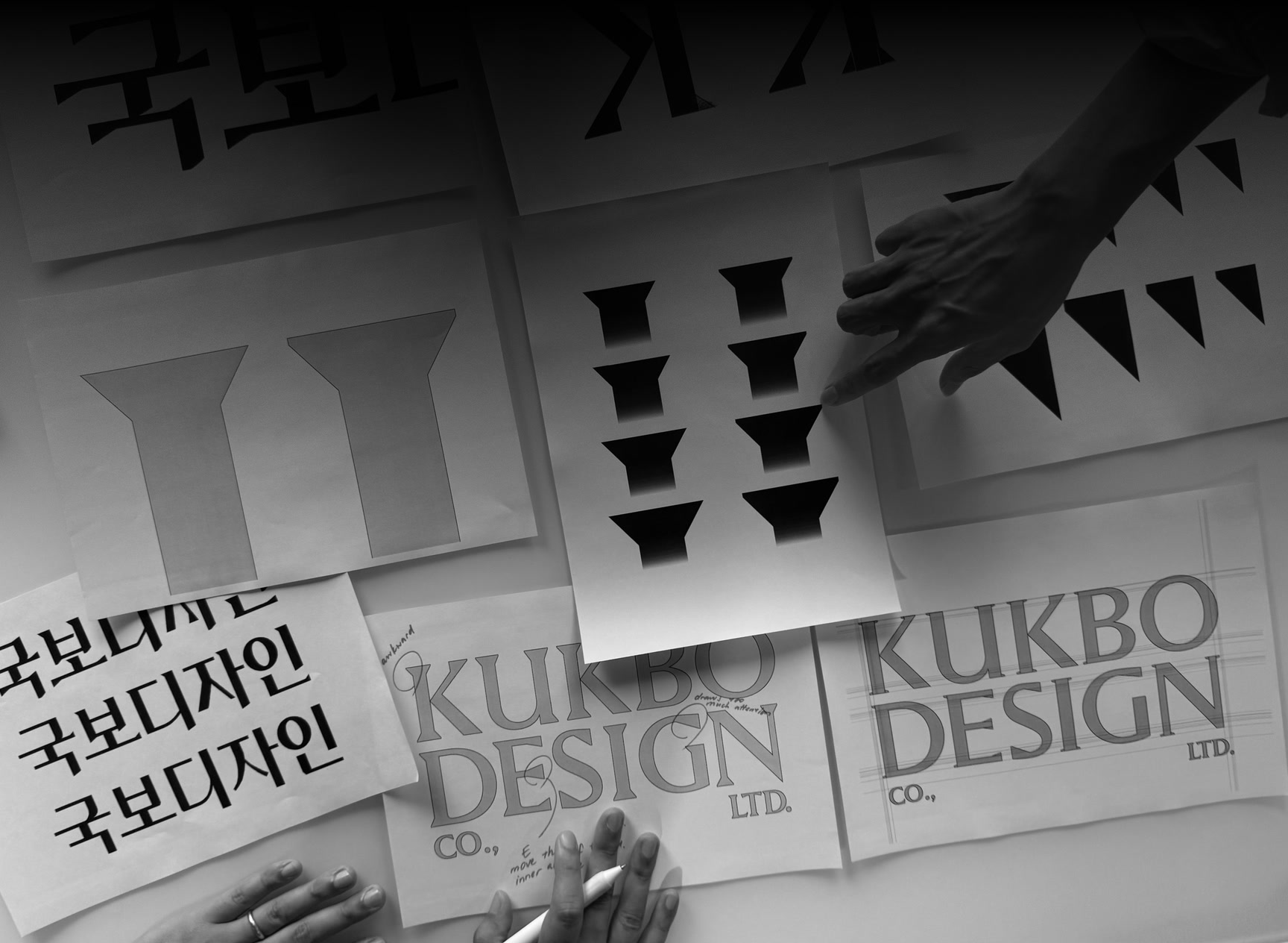
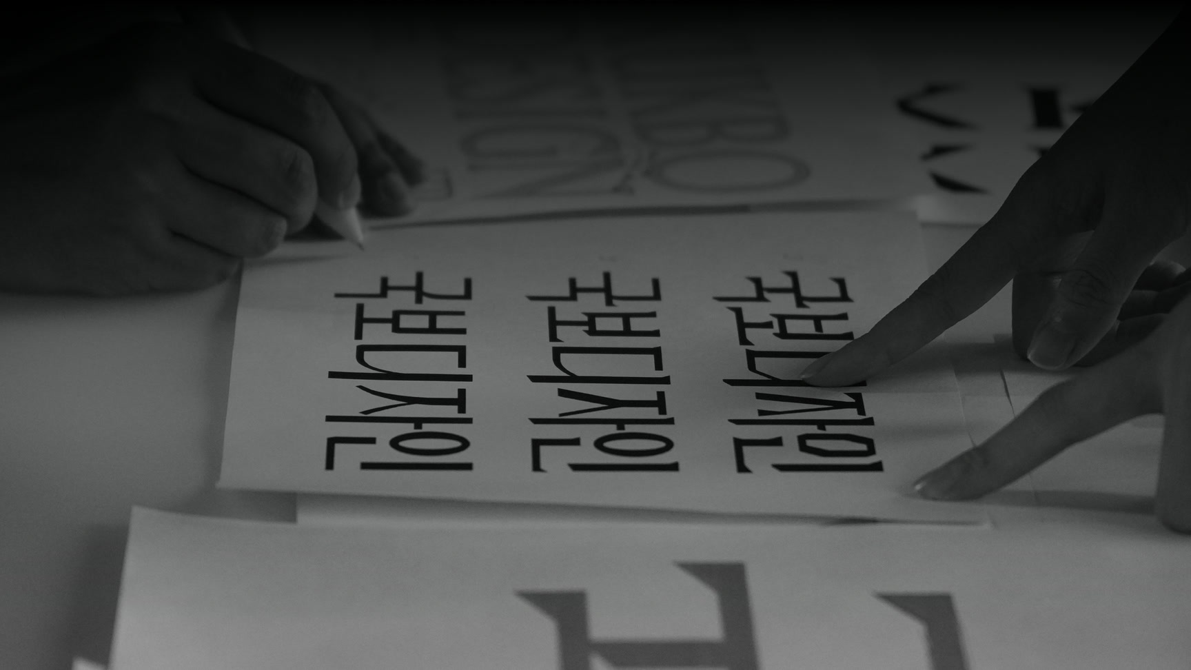
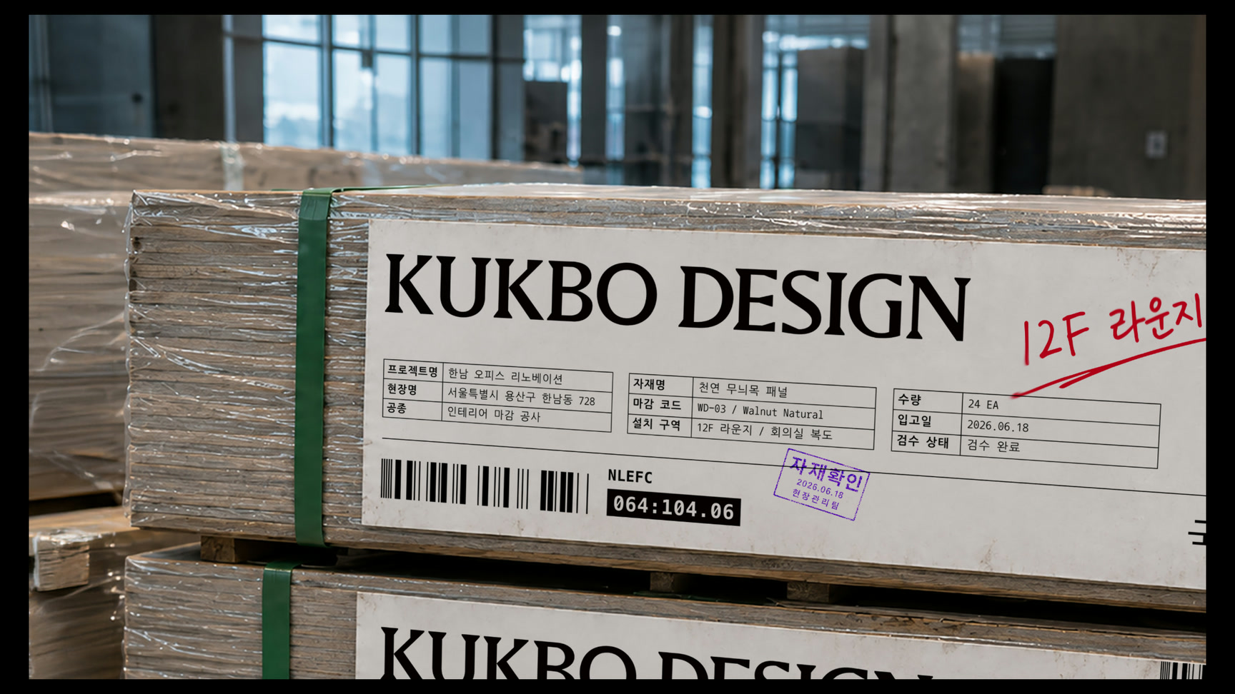
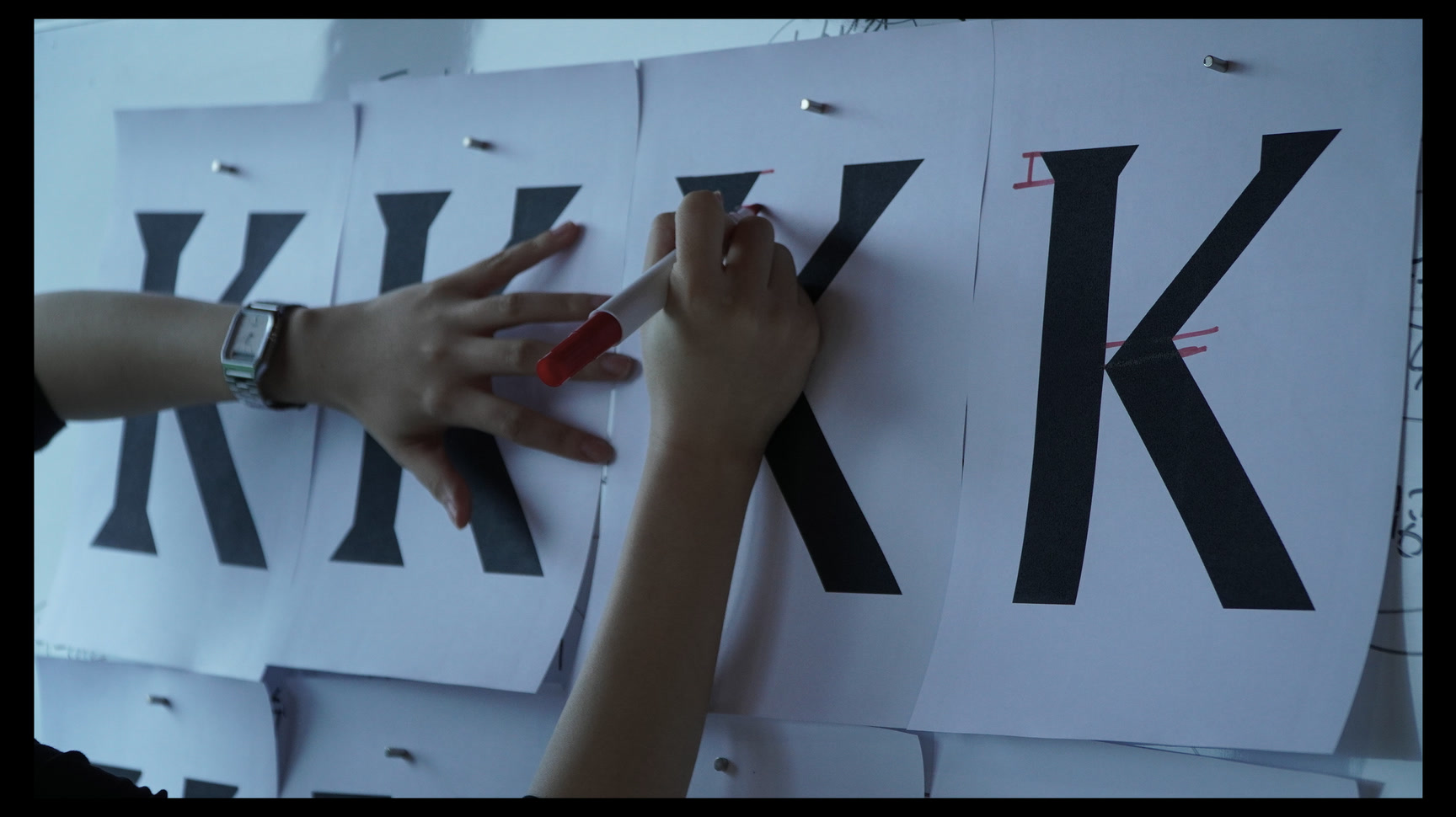
공간을 지탱하는 ‘기둥’의 구조감을 브랜드의 핵심 조형으로 해석하고, 각진 세리프와 수직·수평 축이 단단하게 만나는 형태를 워드마크와 K 심볼에 반영했습니다. KUKBO와 DESIGN을 두 줄로 쌓아 밀도와 부피감을 만들고, 공식 시그니처와 축약형 심볼이 환경에 맞게 작동하도록 체계를 정리했습니다.The structural feeling of the column that supports a space was read as the core form of the brand, and angular serifs meeting firmly on vertical and horizontal axes were reflected in the wordmark and the K symbol. KUKBO and DESIGN stack on two lines to create density and volume, and the system was organised so the official signature and the abbreviated symbol each work in their own setting.
비주얼·경험 시스템Visual / Experience System
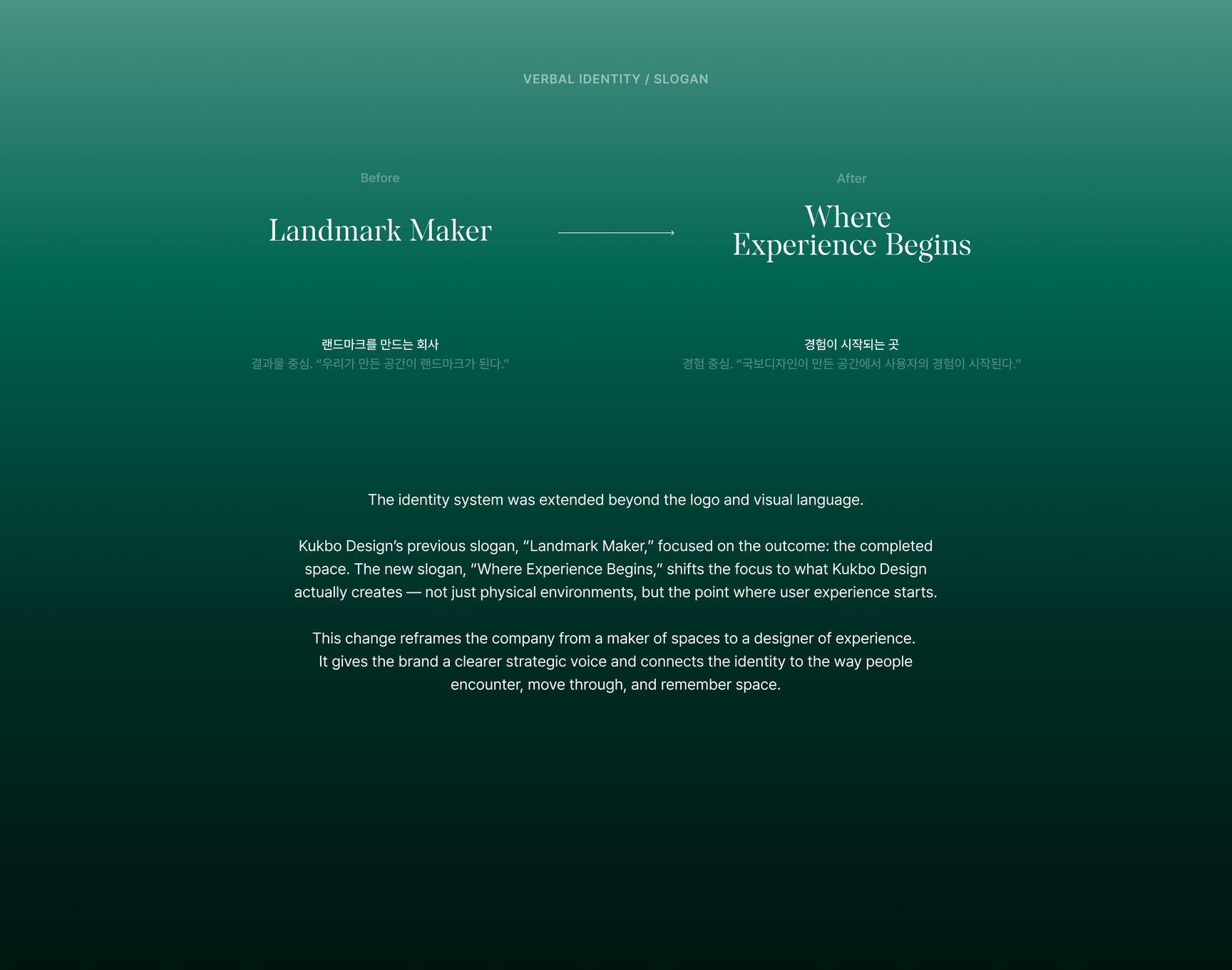
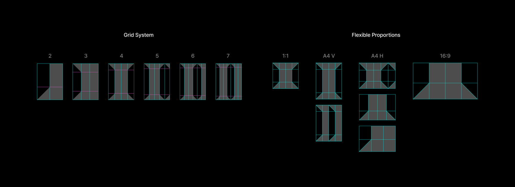
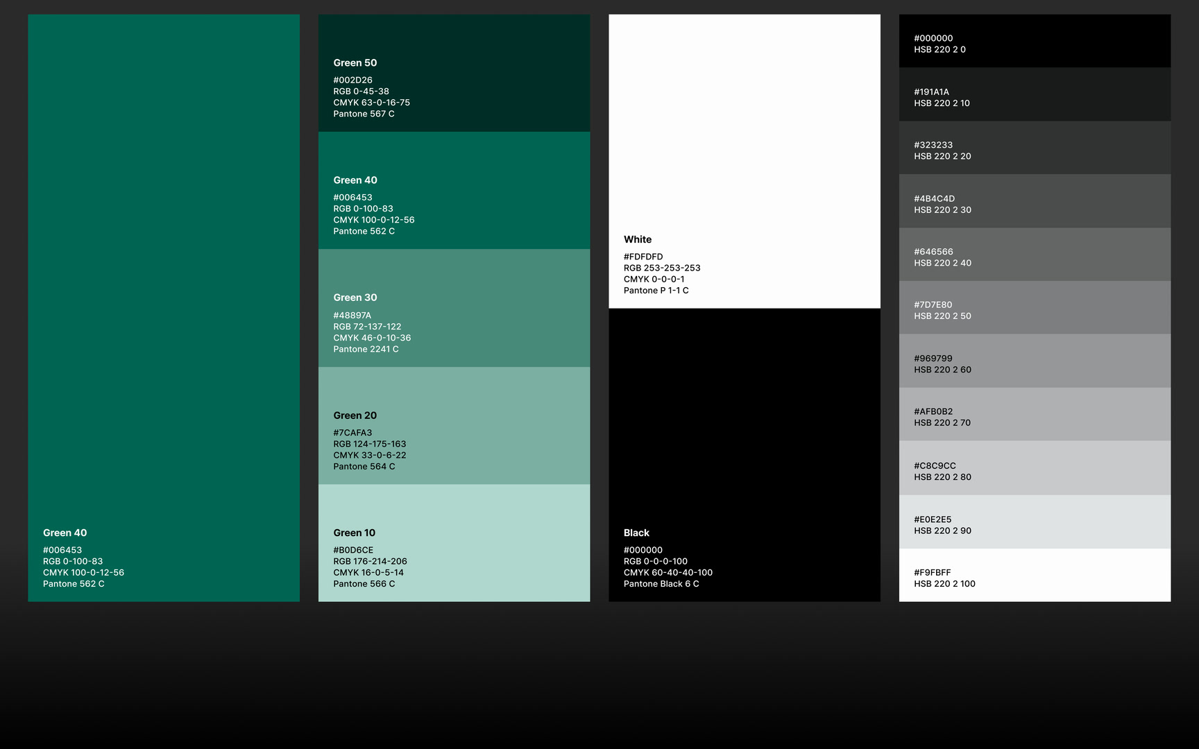
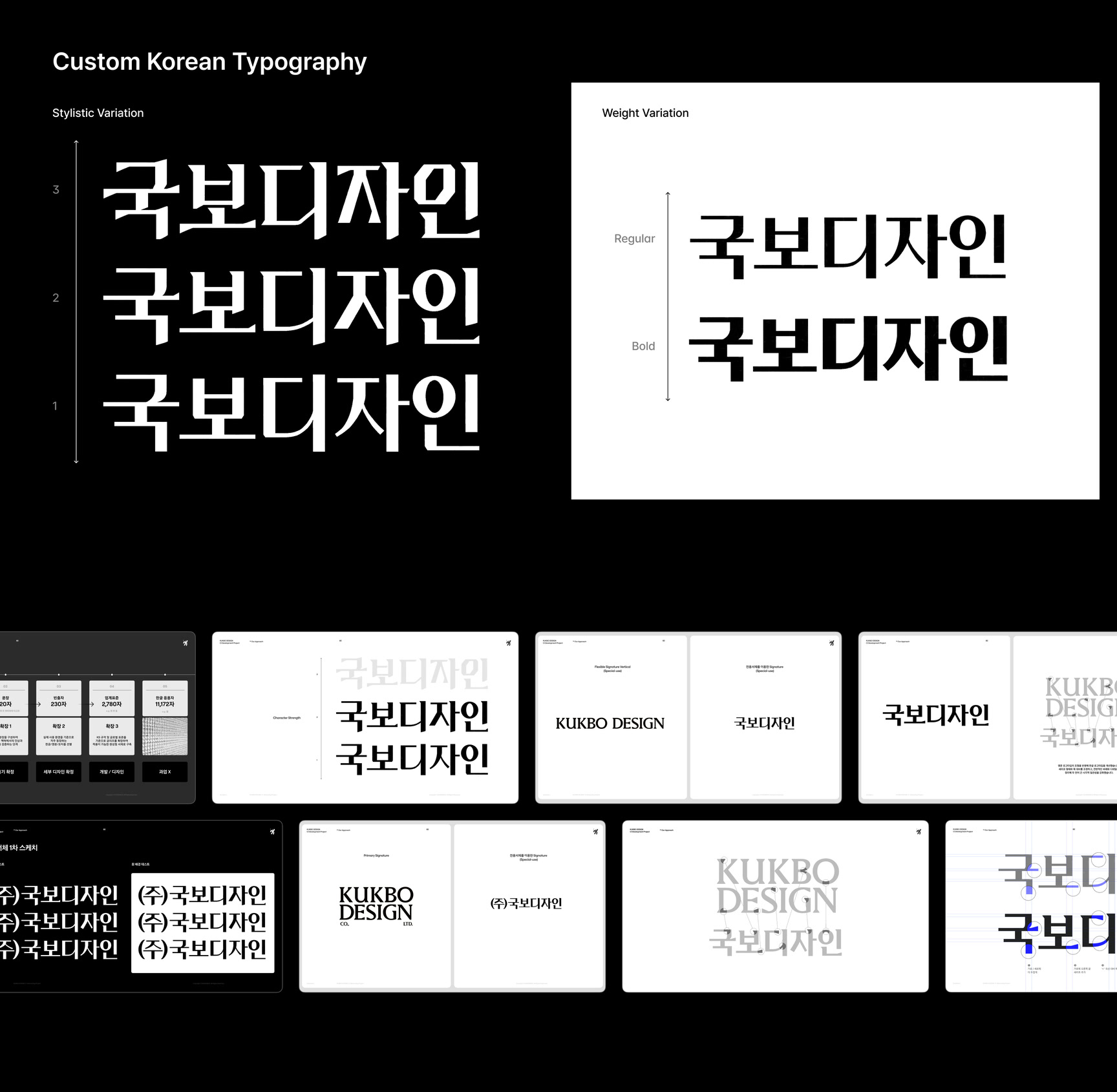
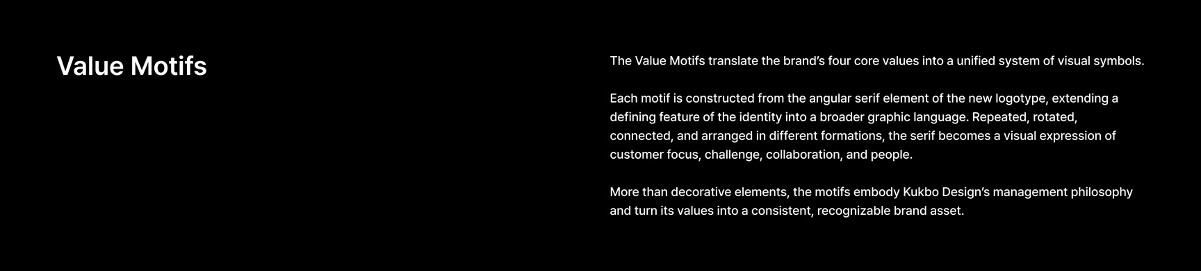
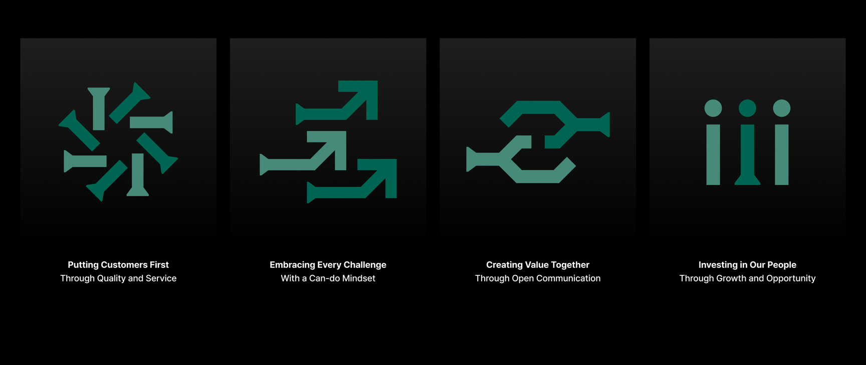
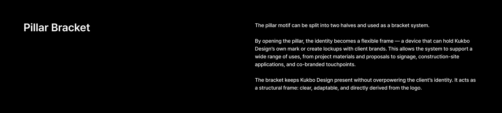
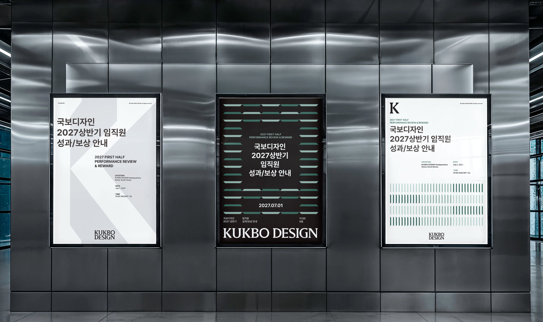
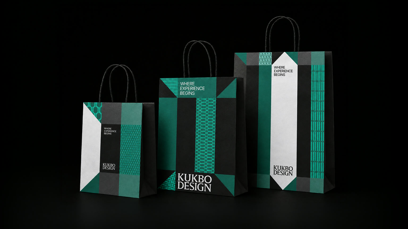
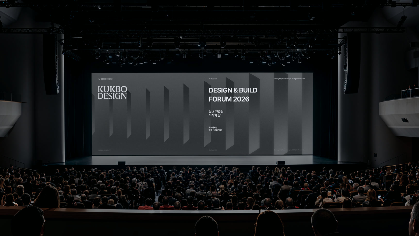
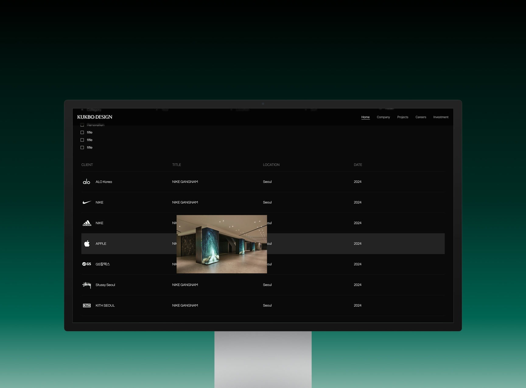
KUKBO White와 Black을 Primary Color로 사용하고 KUKBO Green을 단계별 보조 컬러로 확장했습니다. K의 사선에서 추출한 모티프를 반복·크롭해 패턴과 운동감을 만들고, Pretendard Variable과 유연한 그리드를 결합해 소셜부터 대형 그래픽, 공식 문서까지 같은 규칙으로 운영했습니다. 슬로건은 Divider와 K 세리프에서 파생한 Bracket Lockup으로 위계를 조절합니다.KUKBO White and Black serve as primary colours with KUKBO Green extending as a graded secondary. A motif drawn from the diagonal of the K is repeated and cropped to create pattern and movement, and Pretendard Variable combines with a flexible grid so social, large format graphics and official documents all run on the same rules. The slogan uses a bracket lockup derived from the divider and the K serif to control hierarchy.
프로젝트의 의미What It Means
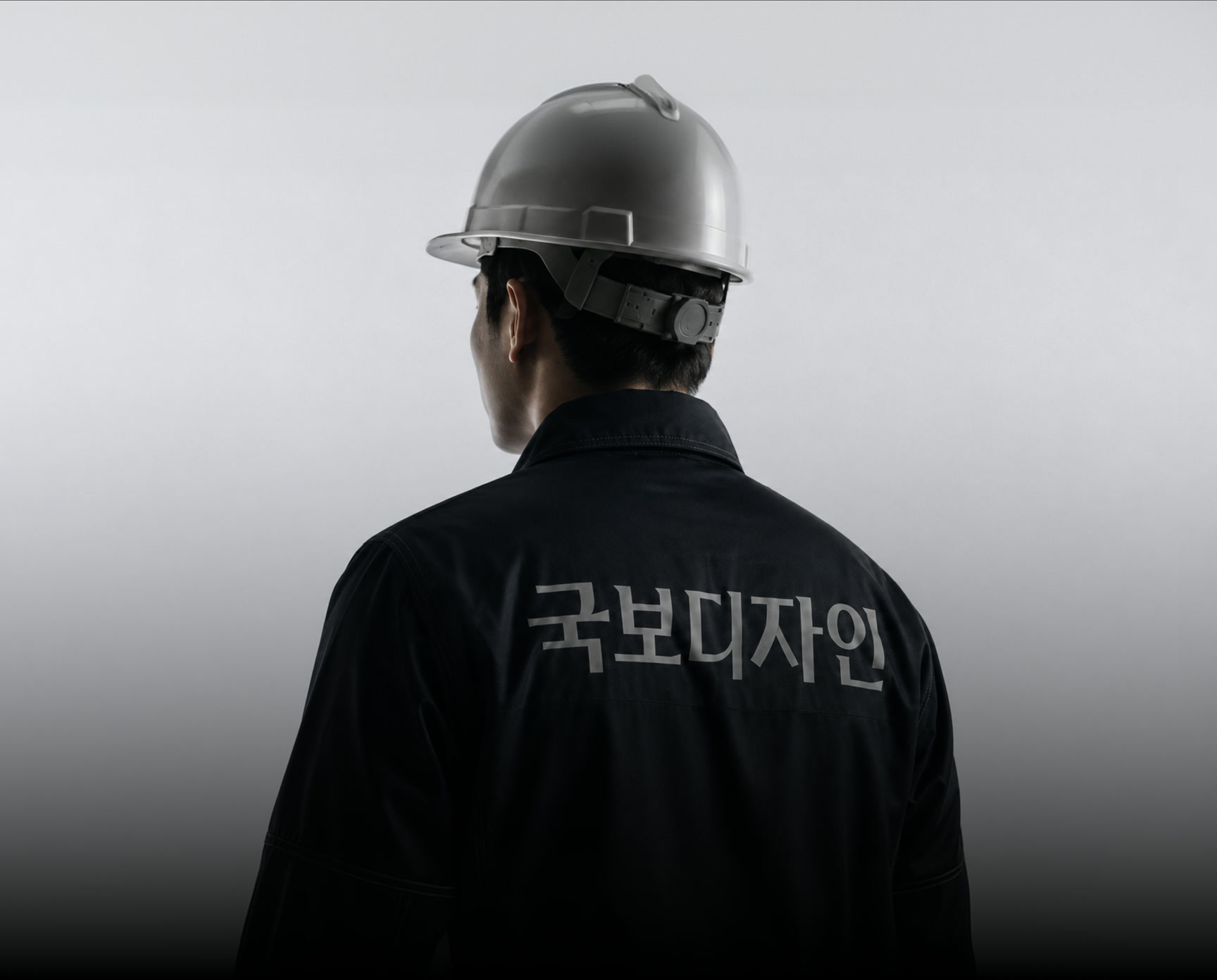
국보디자인 리뉴얼은 수십 년간 축적된 업력을 앞으로 반복 사용할 수 있는 디자인 시스템으로 전환한 프로젝트입니다. 로고, 컬러, 모티프와 레이아웃이 각각의 장식이 아니라 ‘기준을 만드는 회사’라는 하나의 태도를 설명하도록 정렬했습니다.The Kukbo Design renewal converted decades of accumulated experience into a design system that can be used repeatedly. Logo, colour, motif and layout are aligned so they explain one attitude, a company that sets the standard, rather than working as separate decoration.
작업 범위Scope
- Brand Strategy & Audit
- Wordmark & Symbol
- Signature System
- Color System
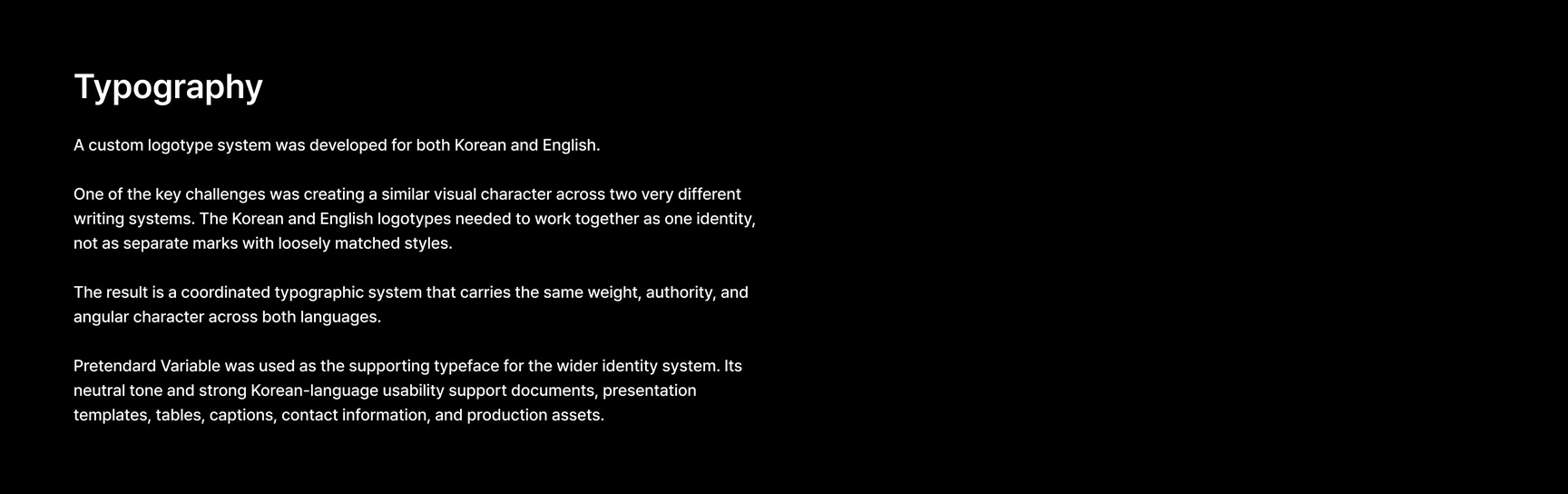
- Typography
- Graphic Motif
- Grid / Layout
- Slogan Lockup
- Brand Guidelines
- Brand Application Direction