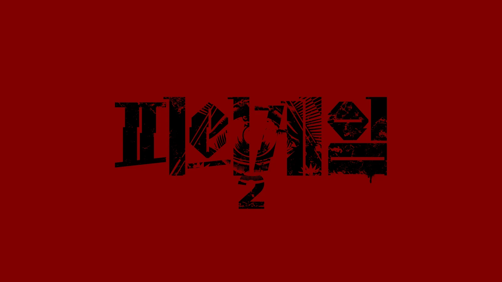
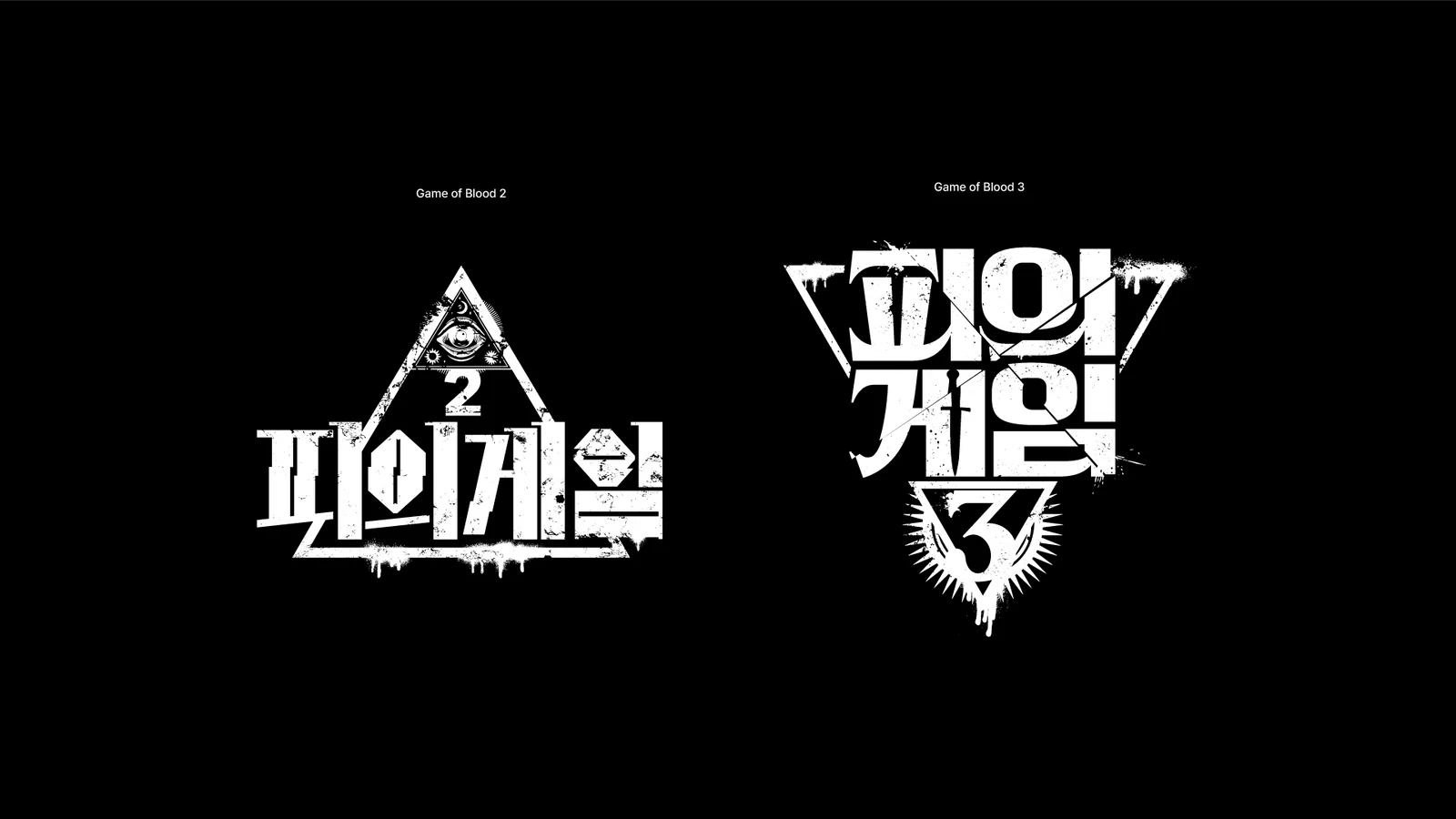
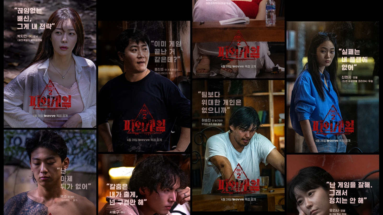
피의게임2 프로그램 아이덴티티 디자인Bloody Game 2 Program Identity
<피의게임2>의 프로그램 아이덴티티와 주요 소품 그래픽을 디자인했습니다.The program identity and the main prop graphics for Bloody Game 2 were designed around the image of the gaze and the eye.
음모와 감시, 계급 경쟁이 반복되는 프로그램의 긴장을 ‘시선’과 ‘눈’의 이미지로 구조화하고, 포스터와 게임 접점까지 일관된 분위기로 연결했습니다.Conspiracy, surveillance and class competition run through the show, and that tension carries consistently from the posters to the game touchpoints.
배경Background
서바이벌 프로그램의 아이덴티티는 방송 타이틀뿐 아니라 출연자와 게임, 현장 소품, 홍보 포스터가 같은 세계관 안에 있다고 느끼게 해야 합니다. <피의게임2>에서는 누군가가 서로를 바라보고 감시하는 불편한 긴장과 계급 구조가 핵심적인 시각 단서였습니다.The identity of a survival program has to make the broadcast title, the contestants, the games, the on set props and the promotional posters feel like one world. For Bloody Game 2 the uncomfortable tension of people watching and surveilling each other, along with the class structure, was the key visual clue.
과제The Challenge
자극적인 피나 폭력 이미지를 직접 사용하지 않고도 프로그램 특유의 불안과 권력 관계를 전달해야 했습니다. 동시에 참가자별 캐릭터를 살리는 포스터와 전체 프로그램을 대표하는 메인 그래픽이 서로 다른 캠페인처럼 보이지 않아야 했습니다.The anxiety and power relations particular to the show had to come across without using graphic blood or violence directly. At the same time the posters that bring out individual contestants and the main graphic representing the whole program could not look like separate campaigns.
디자인 접근Design Approach
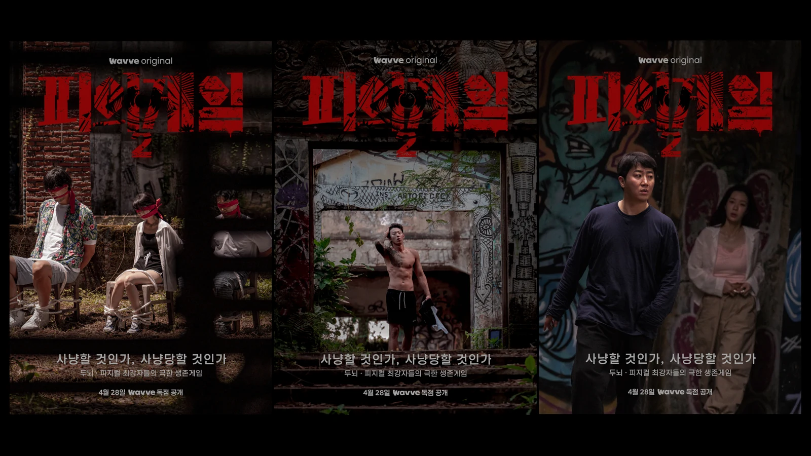
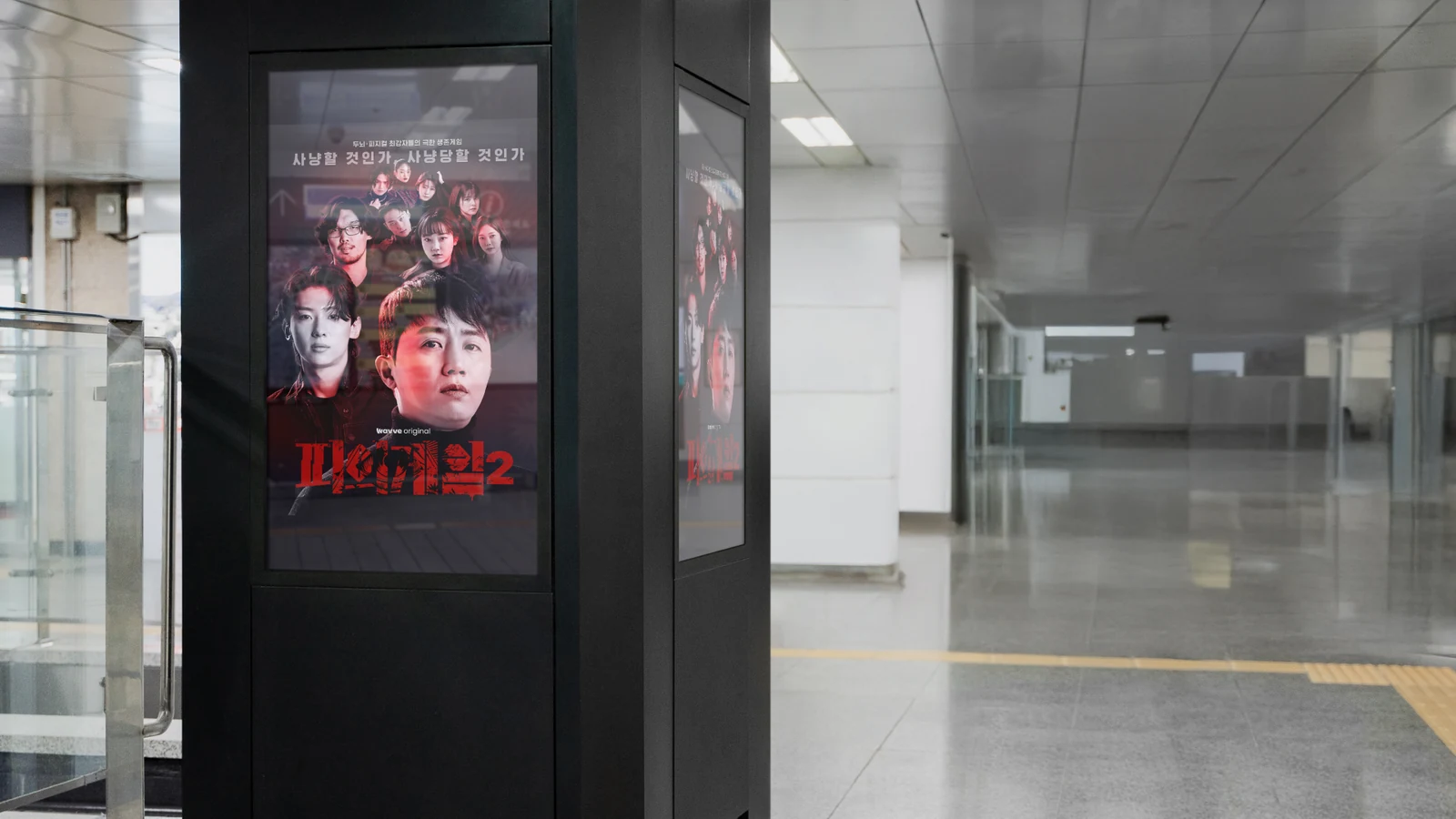
누군가의 시선이 항상 존재하는 상황을 ‘눈’으로 표현해 음모와 감시의 감각을 시각화했습니다. 메인 포스터에서는 어둡고 붉은 분위기와 피라미드형 인물 배치를 활용해 계급과 위계를 암시하고, 캐릭터 포스터에는 참가자가 현장에서 즉흥적으로 남긴 문장을 사용해 개인의 성격을 드러냈습니다.The situation of always being watched was expressed through the eye, visualising conspiracy and surveillance. The main poster uses a dark red atmosphere and a pyramid arrangement of figures to imply rank and hierarchy, while the character posters use sentences the contestants improvised on set to bring out individual personality.
비주얼·경험 시스템Visual / Experience System
메인 포스터, 티저, 캐릭터 포스터와 프로그램 아이덴티티, 게임 소품을 같은 시각 언어로 연결했습니다. 티저에서는 익숙한 참가자와 현장 스틸을 활용해 프로그램의 실제 긴장을 보여주고, 소품 그래픽은 촬영 현장에서 세계관을 유지하는 기능적 장치로 설계했습니다.Main poster, teaser, character posters, program identity and game props were connected through the same visual language. The teaser uses familiar contestants and on set stills to show the real tension of the show, and the prop graphics function on set as devices that keep the world intact.
프로젝트의 의미What It Means
<피의게임2>는 프로그램의 세계관을 홍보 이미지에만 머물게 하지 않고 실제 게임과 출연자 경험까지 연결한 프로젝트입니다. ‘시선’이라는 하나의 단서를 통해 감시, 계급, 생존의 긴장을 다양한 접점에 일관되게 적용했습니다.Bloody Game 2 did not leave the world of the program in its promotional images but carried it into the actual games and the contestant experience. One clue, the gaze, applies surveillance, class and survival consistently across many touchpoints.
작업 범위Scope
- Program Identity
- Title / Graphic System
- Main / Teaser / Character Posters
- On-set Props / Game Graphics