여왕벌게임 그래픽 디자인The Game of Queen Bee Graphic Design
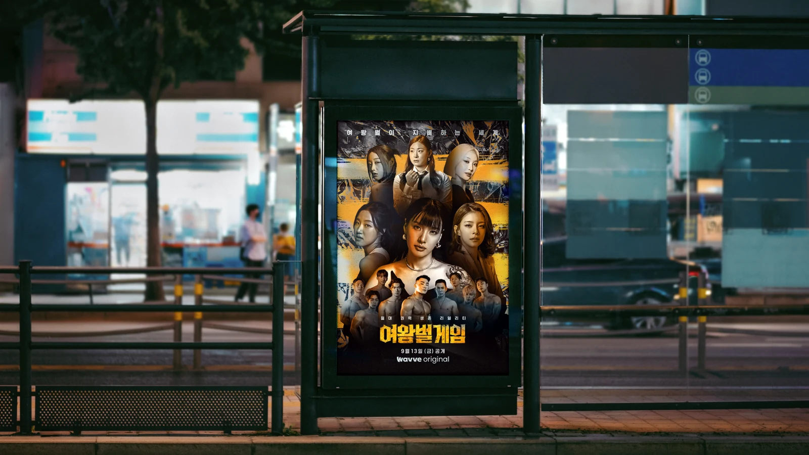
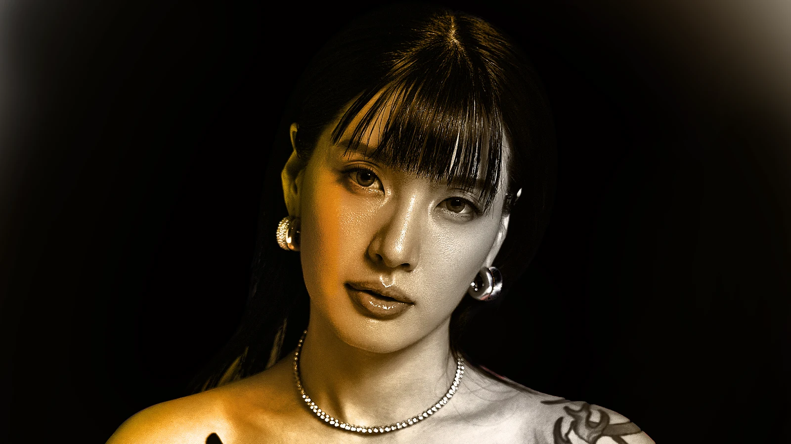
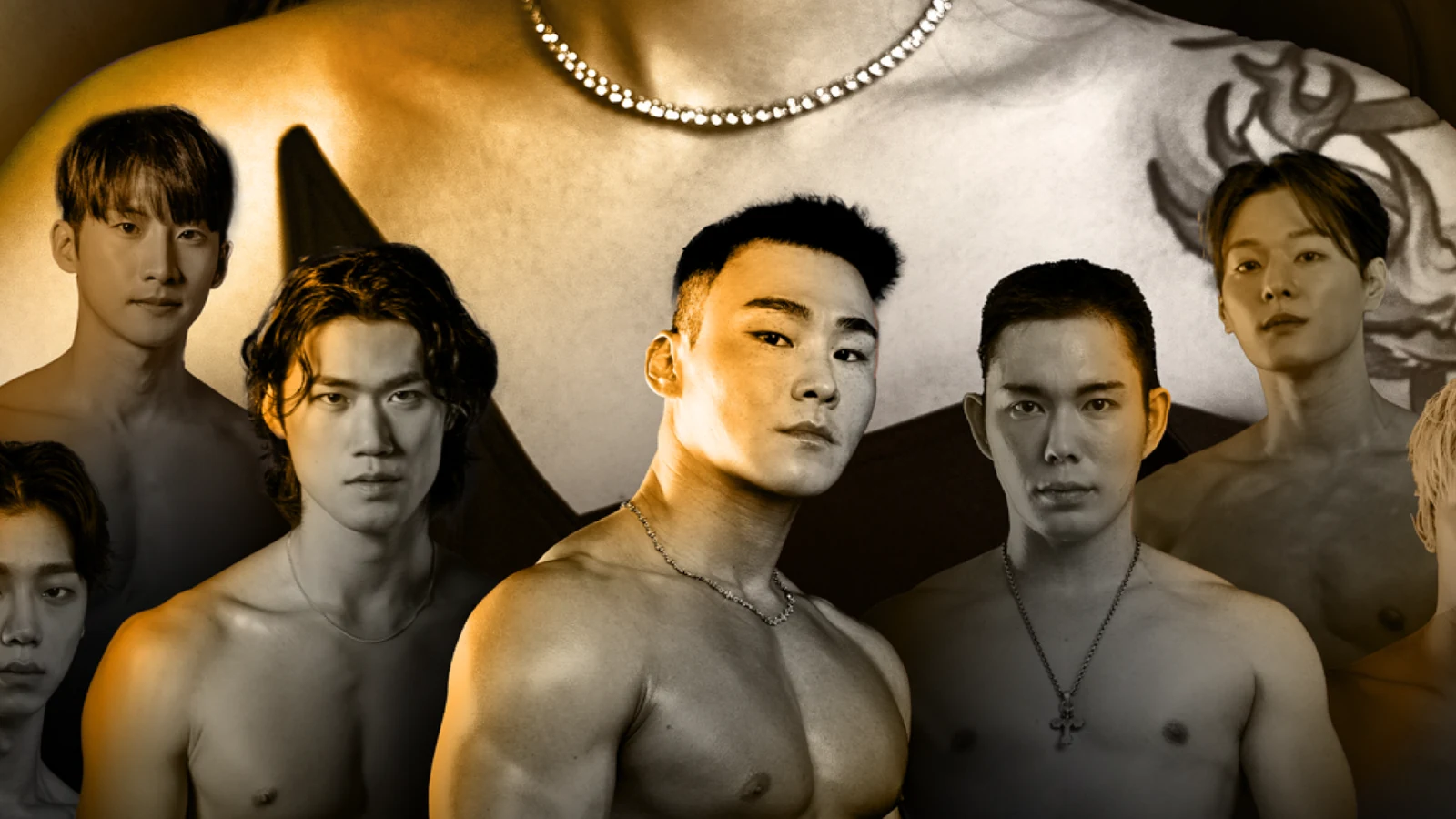
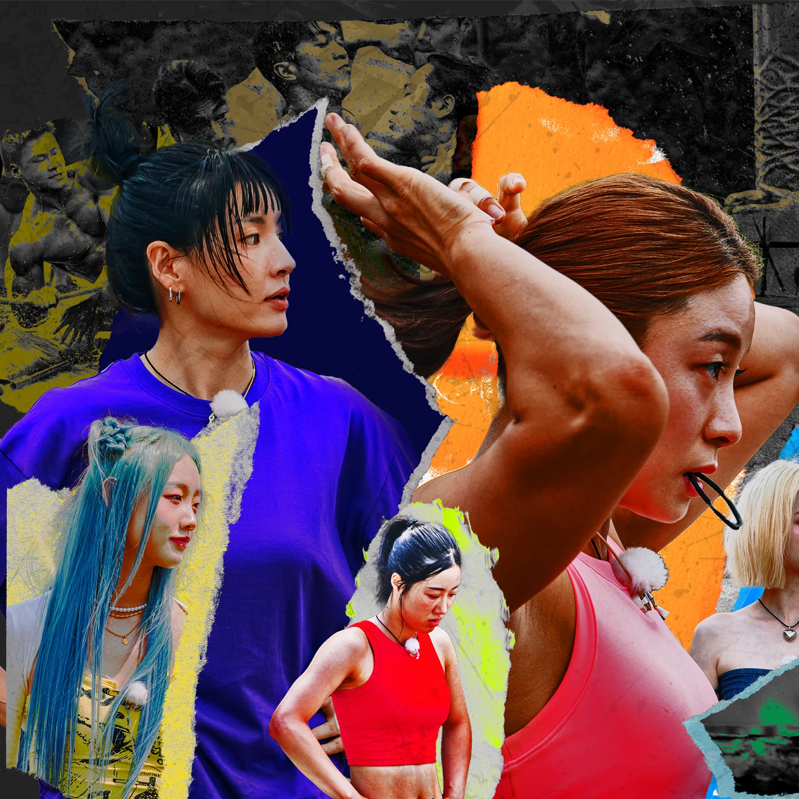
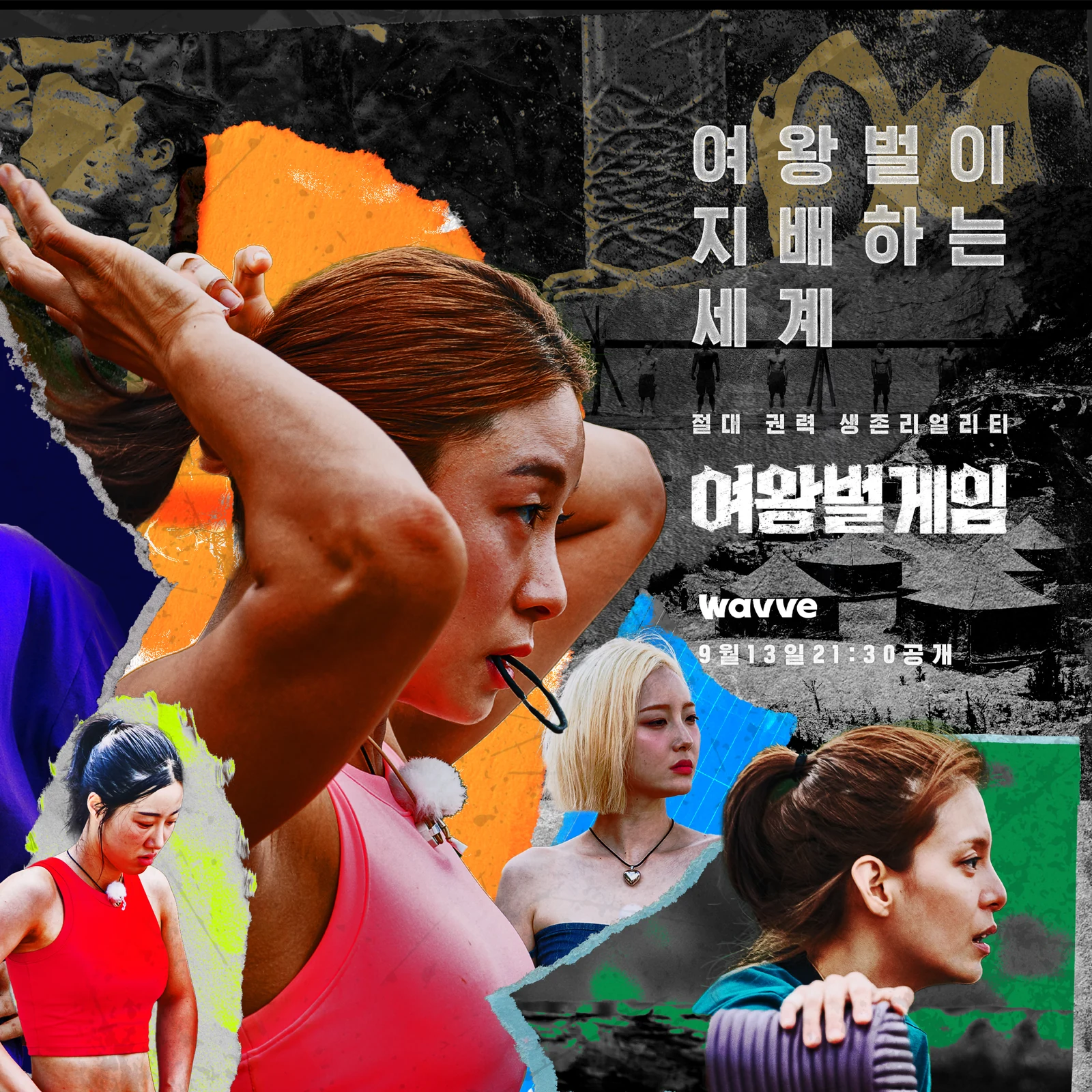
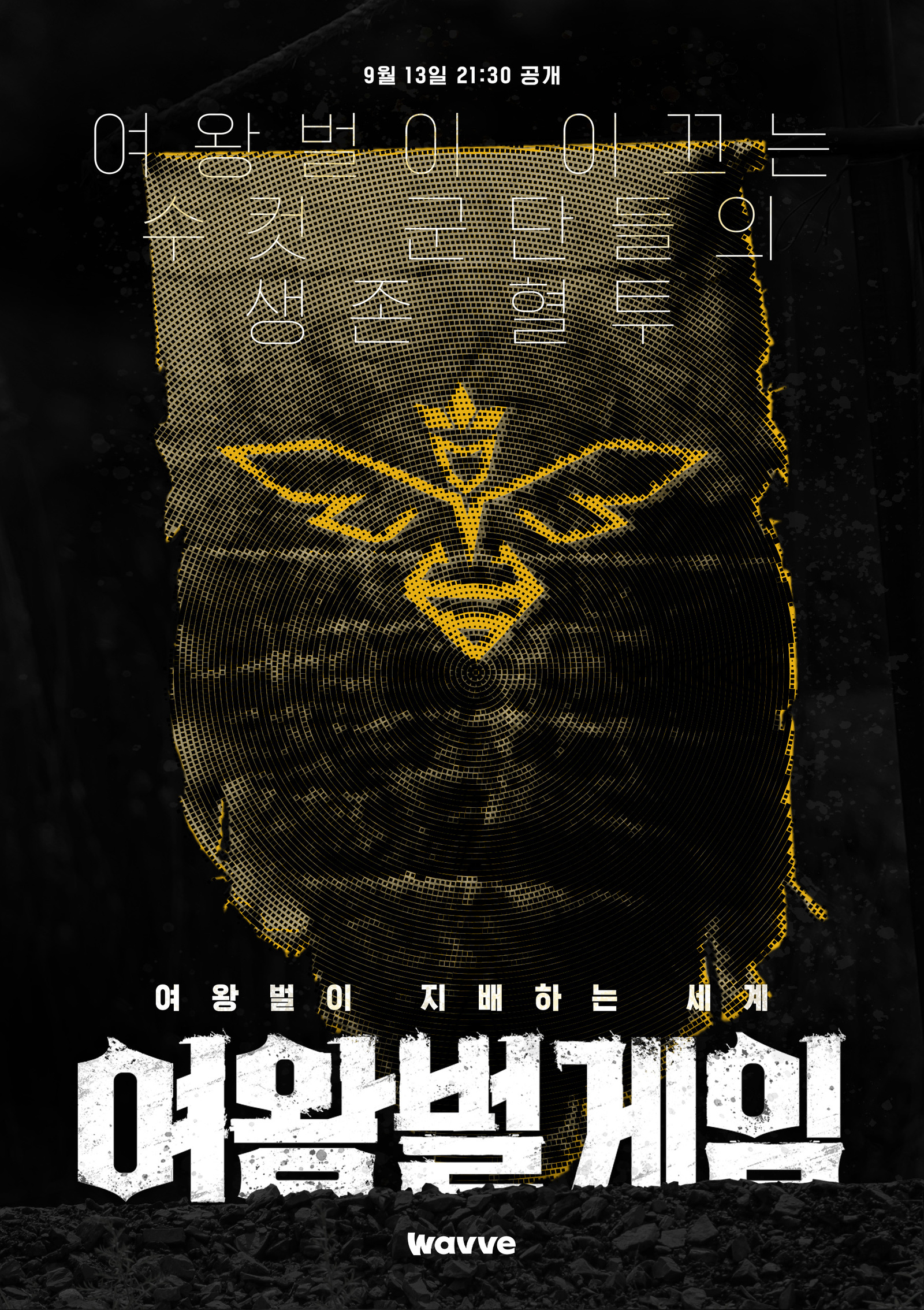
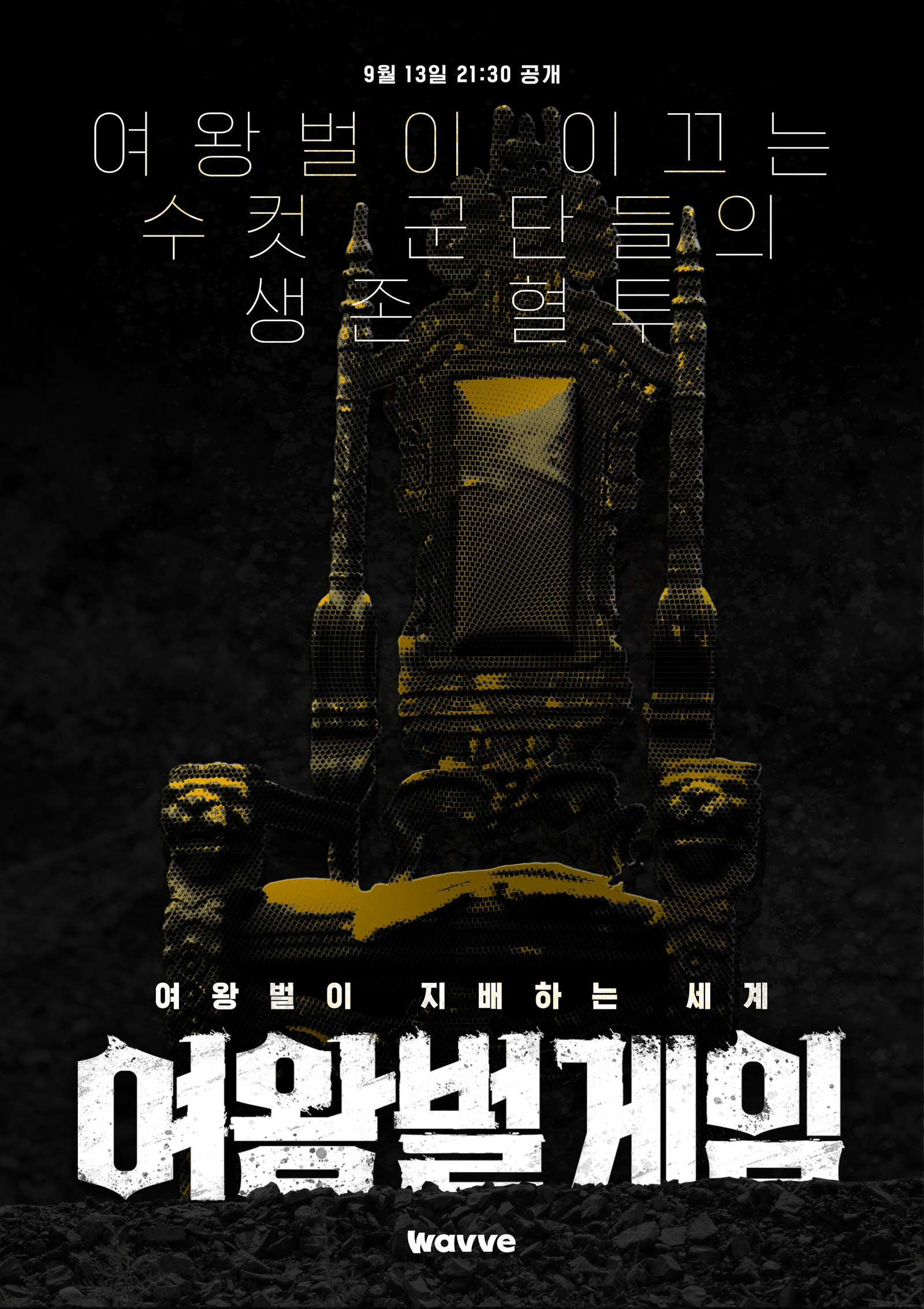
Wavve <여왕벌게임>의 홍보 그래픽은 여왕벌과 수벌의 위계·경쟁 관계를 인물의 크기와 배치만으로 즉각 이해할 수 있도록 설계했습니다.The promotional graphics for Wavve's The Game of Queen Bee let you read the hierarchy and rivalry between queen and drones from scale and placement alone.
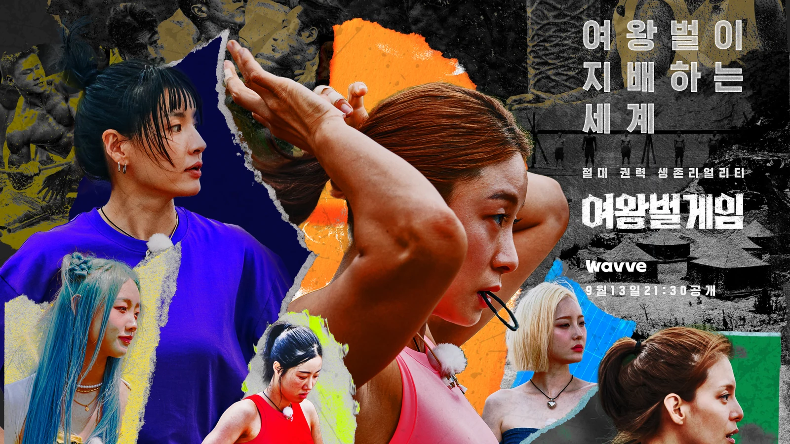
강한 사진 보정과 질감, 벌의 이미지를 사용해 프로그램의 공격적인 생존 경쟁과 관계 구조를 포스터에 압축했습니다.Heavy retouching, texture and the image of the bee compress the aggressive competition and the relationships of the show into a poster.
배경Background
프로그램의 핵심은 여성 리더와 남성 참가자 사이의 관계와 경쟁 구조였습니다. 프로그램 아이덴티티 전체를 새로 만드는 작업보다, 시청자가 한 장의 이미지에서 누가 중심이고 어떤 긴장이 존재하는지 이해할 수 있는 마케팅 그래픽이 중요했습니다.The heart of the program was the relationship and competition between a female leader and the male contestants. Rather than building a whole program identity, what mattered was marketing graphics where a viewer understands from one image who is at the centre and what tension exists.
과제The Challenge
출연자가 많은 서바이벌 포스터는 인물 정보를 모두 보여주려다 메시지가 약해지기 쉽습니다. 인물의 얼굴을 유지하면서도 관계와 위계를 먼저 읽히게 하고, 메인·티저·가로형·인물별 포스터가 서로 다른 캠페인처럼 보이지 않도록 공통 규칙을 만들어야 했습니다.Survival posters with large casts weaken their message trying to show every face equally. The work had to keep the faces recognisable while making relationship and rank read first, and give the main, teaser, horizontal and individual posters a shared rule so they do not look like separate campaigns.
디자인 접근Design Approach
여성 리더를 상단과 중심에 크게 배치하고 남성 참가자를 아래에 두어 ‘여왕벌과 수벌’의 위계를 시각적으로 직관화했습니다. 벌의 이미지와 거친 질감, 강한 대비의 사진 보정을 결합해 설명보다 먼저 경쟁과 긴장이 느껴지도록 했습니다.The female leader sits large at the top and centre with the male contestants below, making the queen and drone hierarchy immediately legible. Bee imagery, coarse texture and high contrast retouching combine so competition and tension are felt before anything is explained.
비주얼·경험 시스템Visual / Experience System
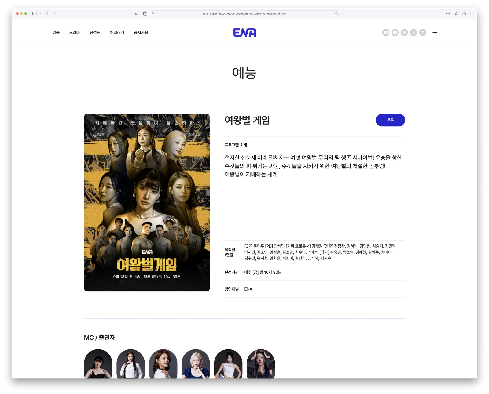
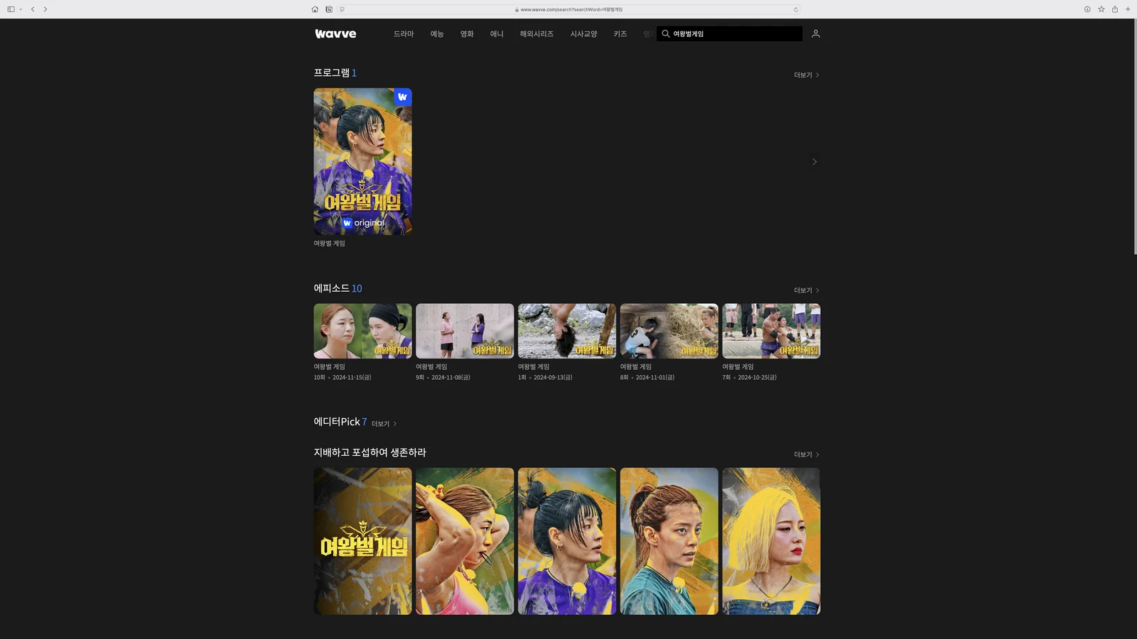
메인 포스터의 인물 위계와 사진 처리 원칙을 기준으로 티저, 가로형 키비주얼, 인물별 서브 포스터까지 확장했습니다. 인물 수와 포맷이 달라져도 크기 관계와 구도, 보정의 강도를 유지해 하나의 프로모션 시스템으로 보이도록 했습니다.The figure hierarchy and photographic treatment of the main poster set the rule, then extended to teasers, horizontal key visuals and individual cast posters. As the number of people and the format change, the size relationships, composition and strength of retouching hold, keeping it one promotional system.
프로젝트의 의미What It Means
<여왕벌게임>의 그래픽은 프로그램의 복잡한 설정을 장식적인 이미지보다 인물의 관계와 위계로 전달했습니다. 포스터가 ‘누가 중심이고 어떤 관계가 충돌하는지’를 한눈에 이해시키는 정보 장치로 작동하도록 한 프로젝트입니다.The graphics for The Game of Queen Bee delivered a complicated premise through relationships and rank rather than decorative imagery. The poster works as an information device that makes clear at a glance who is central and which relationships collide.
작업 범위Scope
- Main Poster
- Teaser Poster
- Horizontal Key Visual
- Cast / Sub Posters
- Photo Retouching
- Promotional Graphic System