밴드 잭킹콩 아이덴티티 디자인Jackingcong Band Identity Design
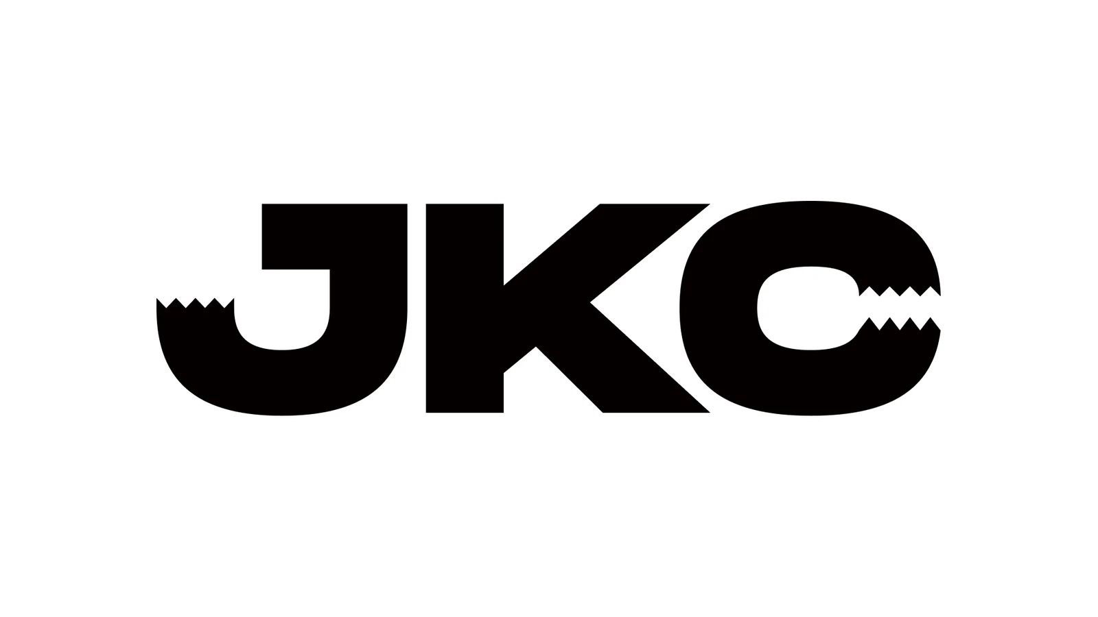
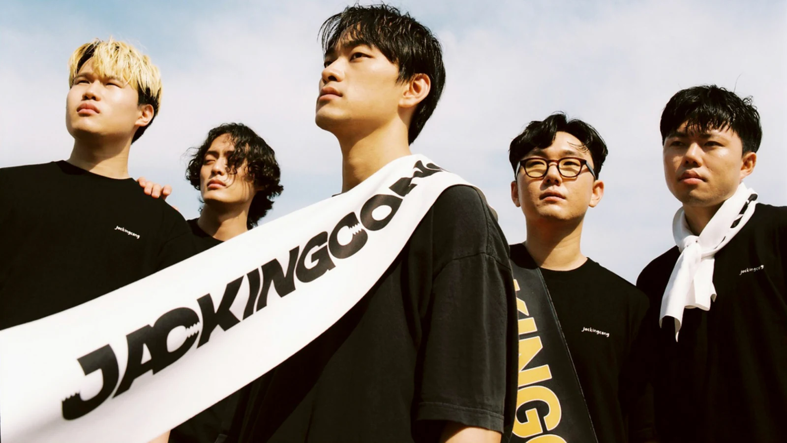
밴드 Jackingcong의 이름이 가진 King Kong의 힘과 밴드의 유쾌한 리듬을 하나의 로고타입에 담았습니다.The force of King Kong inside the name Jackingcong and the band's cheerful rhythm were put into a single logotype.
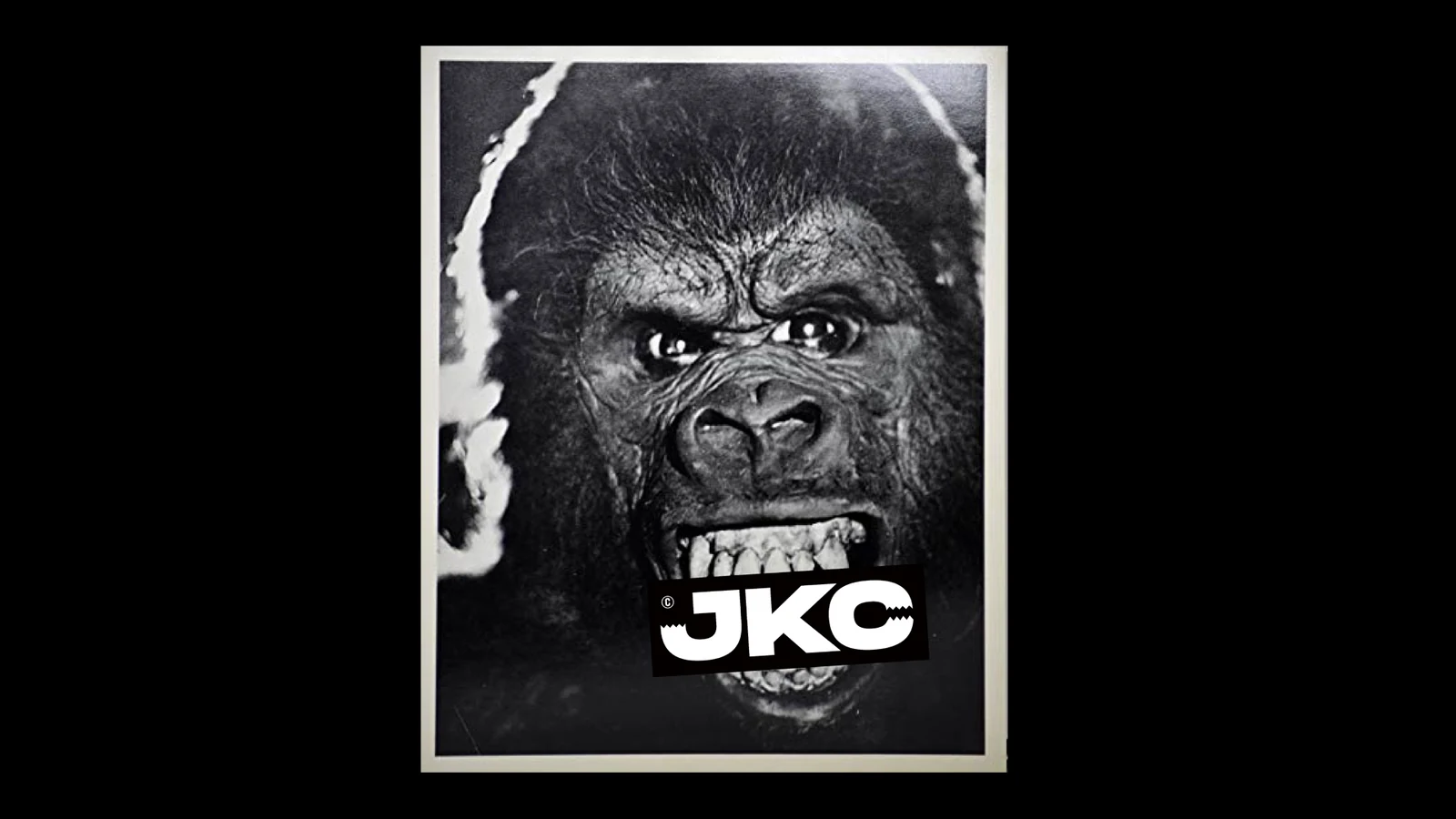
J와 C에 킹콩의 이빨을 연상시키는 형태를 적용해 강하고 거친 인상 안에 귀여운 표정을 만들고, 긴 이름은 JKC로 축약해 다양한 환경에서 사용할 수 있도록 했습니다.Forms recalling Kong's teeth in the J and the C create a playful expression inside a strong, rough impression, and the long name shortens to JKC for wider use.
배경Background
밴드의 아이덴티티는 장르를 직접적으로 설명하는 상징보다 음악을 듣기 전에도 팀의 태도와 캐릭터를 느끼게 하는 것이 중요합니다. Jackingcong은 이름 자체에 강한 이미지와 리듬이 있어, 별도의 심볼을 덧붙이기보다 문자 안에서 밴드의 성격을 만드는 방향을 선택했습니다.For a band identity, making people feel the attitude and character of the group before they hear the music matters more than a symbol that explains the genre. Jackingcong already had a strong image and rhythm in the name itself, so the direction was to build the band's personality inside the letters rather than adding a separate symbol.
과제The Challenge
‘King Kong’의 강한 이미지를 그대로 사용하면 무겁고 공격적으로 보일 수 있고, 반대로 귀여운 인상만 강조하면 밴드의 힘이 약해질 수 있었습니다. 긴 밴드명 역시 작은 포스터나 디지털 환경에서 빠르게 인식하기 어려웠습니다.Using the strong image of King Kong directly could read heavy and aggressive, while leaning only on cuteness would weaken the band's force. The long name was also hard to recognise quickly on a small poster or in digital settings.
디자인 접근Design Approach
로고타입의 J와 C에 이빨을 연상시키는 형태를 삽입해 힘과 장난스러움이 동시에 느껴지는 표정을 만들었습니다. 전체 이름의 리듬을 유지하면서도 필요할 때는 JKC라는 축약형을 사용해 더 짧고 직관적인 식별 체계를 갖추도록 했습니다.Tooth like forms were set into the J and the C of the logotype, creating an expression where power and mischief are felt at the same time. The rhythm of the full name is preserved while the abbreviated JKC gives a shorter and more immediate identification system when needed.
비주얼·경험 시스템Visual / Experience System
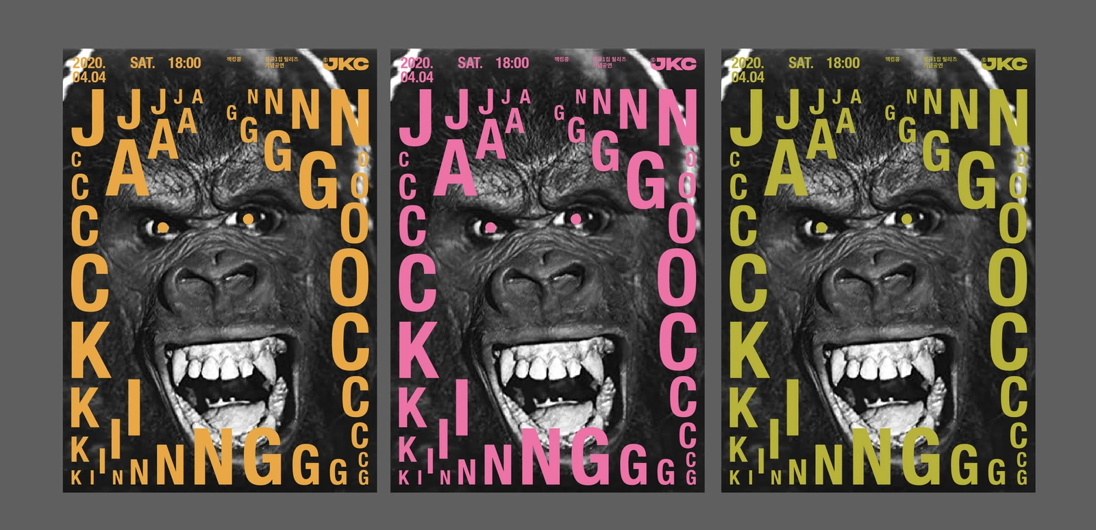
풀네임과 JKC 축약형이 서로 같은 캐릭터를 공유하도록 형태의 무게와 리듬을 맞췄습니다. 공연 포스터나 작은 디지털 표기처럼 공간이 제한된 환경에서도 밴드의 인상이 유지될 수 있는 기본 아이덴티티 구조를 만들었습니다.The weight and rhythm of the forms were matched so the full name and the JKC abbreviation share the same character. It gives a base identity structure that holds the band's impression even where space is limited, such as concert posters or small digital lockups.
프로젝트의 의미What It Means
Jackingcong의 아이덴티티는 밴드 이름의 언어적 이미지를 별도의 일러스트 없이 글자의 성격으로 바꾼 프로젝트입니다. 강함과 유머를 동시에 담은 문자 구조가 팀의 기억점으로 작동하도록 했습니다.The Jackingcong identity turned the linguistic image of the band name into the personality of the letters without a separate illustration. A letterform structure carrying both force and humour works as the memory point for the group.
작업 범위Scope
- Band Identity
- Custom Logotype
- J / C Character Detail
- JKC Abbreviation
- Basic Graphic Applications