포티에 브랜드 경험 디자인Portier Brand Experience Design
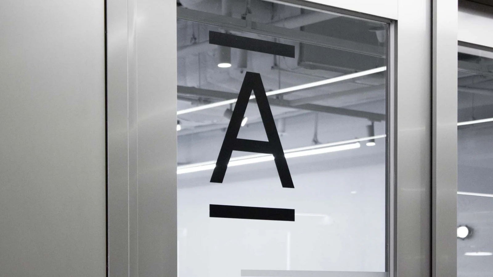
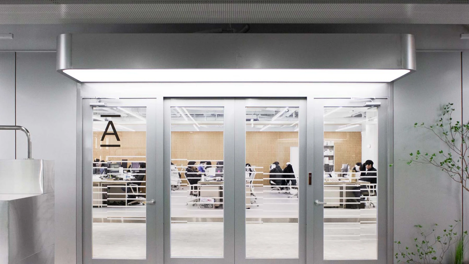
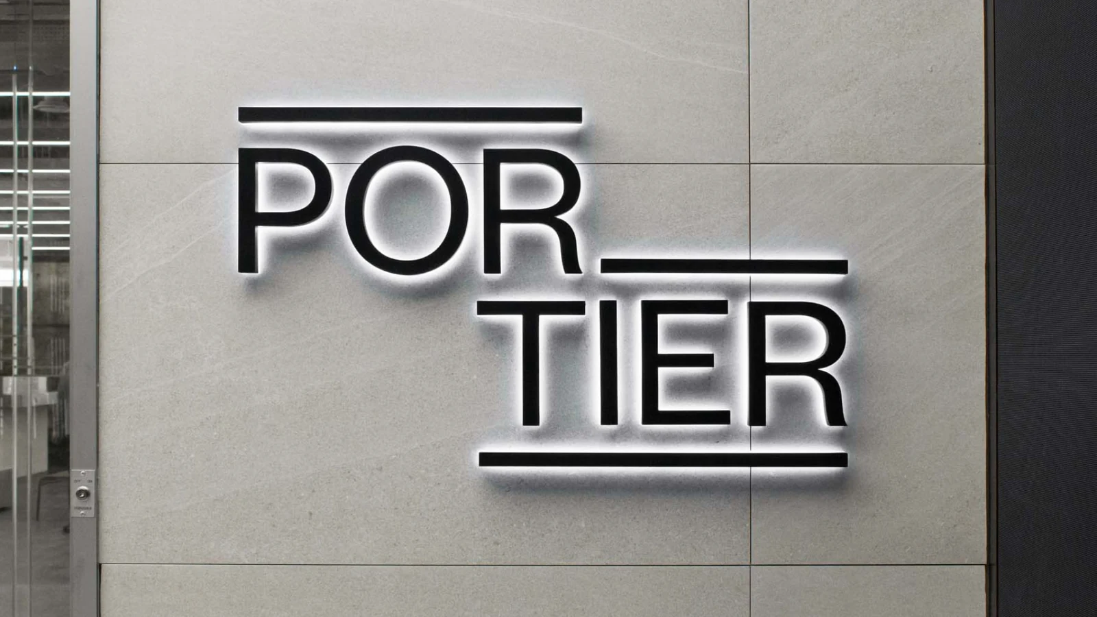
완성형 오피스 ‘Portier’를 단순한 공간 상품의 이름이 아니라 입주자가 접하는 전체 경험을 설명하는 브랜드로 설계했습니다.Portier, a fully serviced office, was designed as a brand that describes the whole experience a tenant meets rather than the name of a space product.
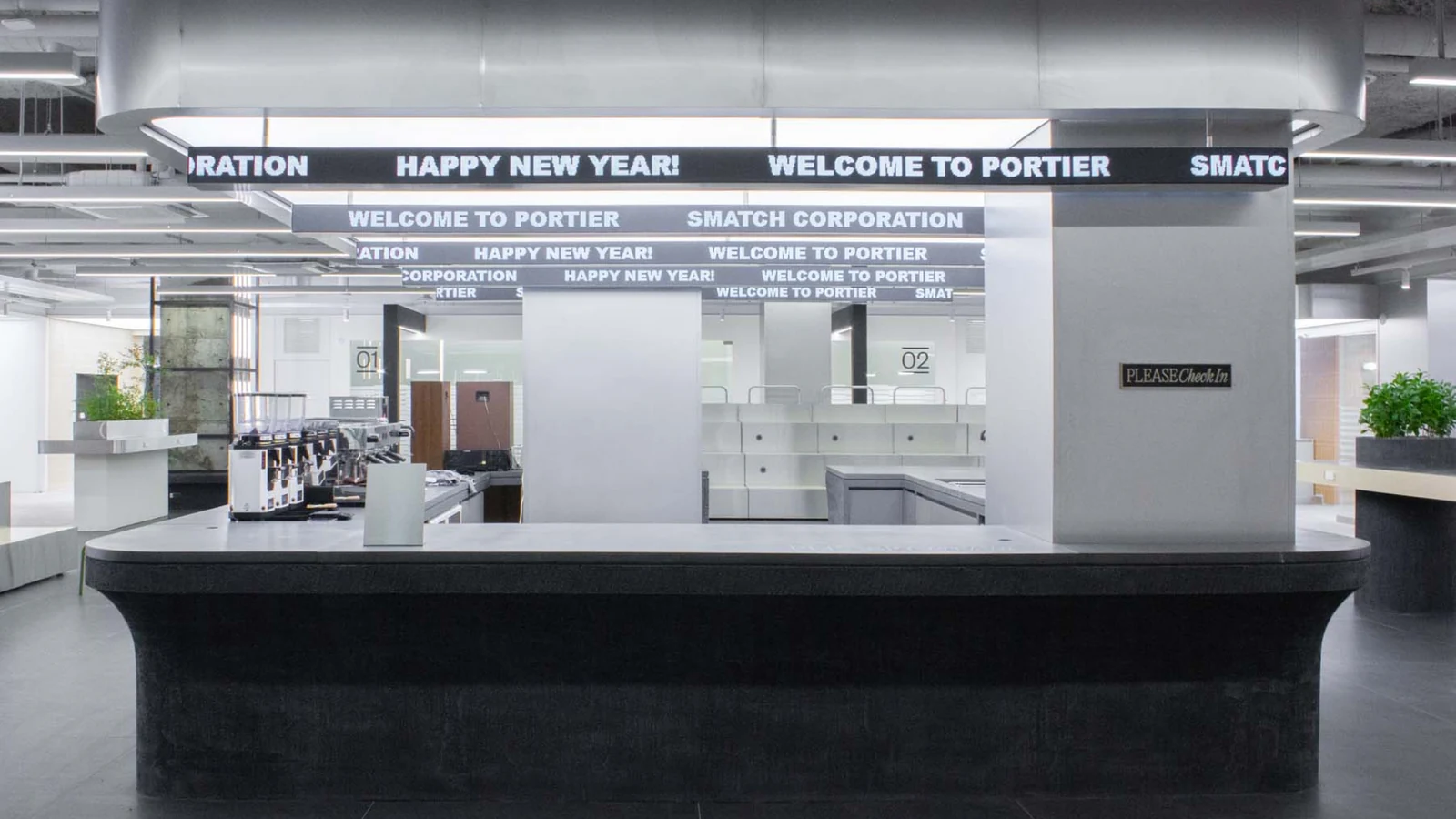
오피스 브랜드 아이덴티티와 주요 적용물을 디렉팅하고, 공간 안의 카페 브랜드까지 네이밍·아이덴티티·BX 관점에서 연결했습니다.The office brand identity and its main applications were directed, and the cafe inside the space was connected through naming, identity and BX.
배경Background
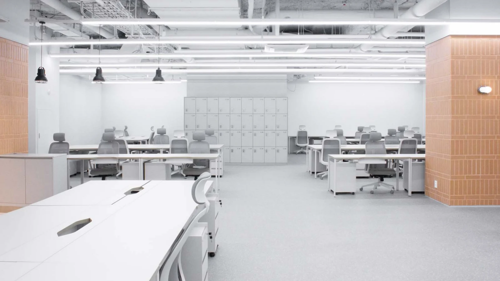
완성형 오피스는 공간의 물리적 완성도뿐 아니라 처음 브랜드를 접하고, 공간을 방문하고, 실제로 사용하는 과정에서 일관된 인상을 만들어야 합니다. Portier에서는 인테리어와 별개로 공간 상품을 기억하게 하는 브랜드 언어와 적용 기준이 필요했습니다.A fully serviced office has to create a consistent impression not only in the physical finish of the space but across first contact with the brand, the visit, and everyday use. Portier needed a brand language and application standard that makes the space product memorable independently of the interior.
과제The Challenge
오피스 브랜드와 공간 안의 개별 서비스가 서로 다른 브랜드처럼 보이지 않으면서도 각 접점의 역할은 구분되어야 했습니다. 공간 디자인을 시각 아이덴티티가 과도하게 설명하지 않고, 이름과 그래픽이 사용 경험을 정리하는 역할을 하도록 균형을 맞췄습니다.The office brand and the individual services inside it could not look like separate brands, yet each touchpoint still needed a distinct role. The balance was set so that the visual identity does not over explain the space design and the name and graphics instead organise the experience of using it.
디자인 접근Design Approach
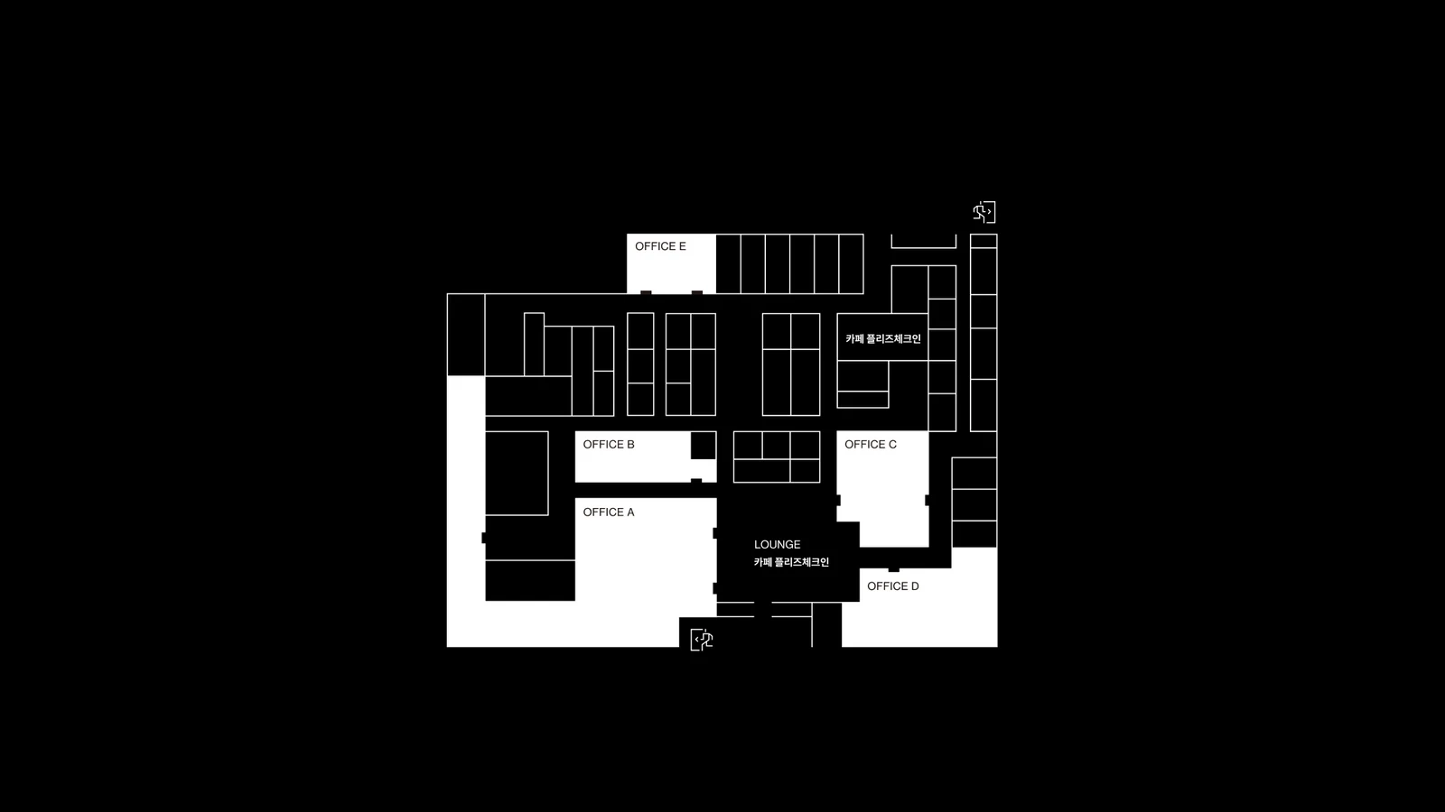
Portier의 브랜드 아이덴티티와 어플리케이션을 중심으로 공간 상품의 기본 인상을 정리하고, 카페는 별도의 네이밍과 아이덴티티를 설계하되 전체 공간 경험과 충돌하지 않도록 디렉팅했습니다. 하나의 공간 안에서 마스터 경험과 개별 접점이 자연스럽게 연결되는 구조를 만들었습니다.The basic impression of the space product was set through the Portier identity and its applications, while the cafe was given its own naming and identity, directed so it does not collide with the wider spatial experience. The result is a structure where a master experience and individual touchpoints connect naturally inside one space.
비주얼·경험 시스템Visual / Experience System
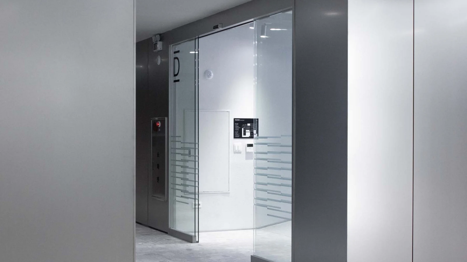
브랜드 표기와 주요 공간·운영 어플리케이션, 카페의 네이밍과 아이덴티티를 하나의 BX 관점에서 조율했습니다. 각 접점이 기능적으로는 독립적이지만 사용자가 경험하는 전체 인상은 하나로 이어지도록 시각적 위계와 역할을 정리했습니다.Brand notation, the main spatial and operational applications, and the naming and identity of the cafe were coordinated from a single BX viewpoint. Each touchpoint stays functionally independent while the visual hierarchy and roles keep the overall impression continuous for the user.
프로젝트의 의미What It Means
Portier는 공간 자체를 디자인한 프로젝트가 아니라, 완성된 공간 상품이 고객에게 어떻게 보이고 기억되는지를 브랜드 경험으로 구조화한 프로젝트입니다. 오피스와 그 안의 서비스가 하나의 경험으로 연결될 수 있는 기준을 만들었습니다.Portier was not a project about designing the space itself but about structuring how a finished space product is seen and remembered as a brand experience. It set the standard that lets an office and the services inside it read as one experience.
작업 범위Scope
- Office Brand Identity
- Brand Applications / Direction
- In-space Café Naming
- Café Identity / BX Direction
- Spatial Brand Experience Coordination